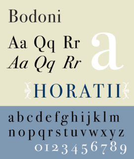
Bodoni is the name given to the serif typefaces first designed by Giambattista Bodoni (1740–1813) in the late eighteenth century and frequently revived since. Bodoni's typefaces are classified as Didone or modern. Bodoni followed the ideas of John Baskerville, as found in the printing type Baskerville—increased stroke contrast reflecting developing printing technology and a more vertical axis—but he took them to a more extreme conclusion. Bodoni had a long career and his designs changed and varied, ending with a typeface of a slightly condensed underlying structure with flat, unbracketed serifs, extreme contrast between thick and thin strokes, and an overall geometric construction.
Royal Joh. Enschedé is a printer of security documents, stamps and banknotes based in Haarlem, Netherlands. Joh. Enschedé specialises in print, media and security. The company hosted the Museum Enschedé until 1990 and has branches in Amsterdam, Brussels and Haarlem.
In metal typesetting, a font was a particular size, weight and style of a typeface. Each font was a matched set of type, one piece for each glyph, and a typeface consisting of a range of fonts that shared an overall design.

Goudy Old Style is an old-style serif typeface originally created by Frederic W. Goudy for American Type Founders (ATF) in 1915.
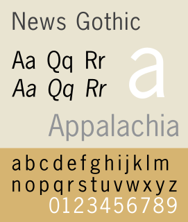
News Gothic is a sans-serif typeface in the grotesque or industrial style. It was designed by Morris Fuller Benton and released in 1908 by his employer American Type Founders (ATF). News Gothic is similar in proportion and structure to Franklin Gothic, also designed by Benton, but lighter.
The Bauer Type Foundry was a German type foundry founded in 1837 by Johann Christian Bauer in Frankfurt am Main. Noted typeface designers, among them Lucian Bernhard, Konrad Friedrich Bauer, Walter Baum, Heinrich Jost, Imre Reiner, Friedrich Hermann Ernst Schneidler, Emil Rudolf Weiß, and Heinrich Wienyck, designed typefaces for the company.

Sjoerd Hendrik de Roos, better known as S.H. de Roos, was a Dutch type designer, book cover designer and artist.

Robert Hunter Middleton was an American book designer, painter, and type designer. Born in Glasgow, Scotland he came to Chicago in 1908 where he studied at the School of the Art Institute. He joined the design department of the Ludlow Typograph Company in 1923 and served as director of the department of typeface design from 1933–71. In 1944 he began operating a private press, The Cherryburn Press. He died in Chicago.
Sidney Clyde Gaunt was an American typographer and artist.
Barnhart Brothers & Spindler Type Foundry was founded as the Great Western Type Foundry in 1873. It became Barnhart Brothers & Spindler ten years later. It was a successful foundry known for innovative type design and well designed type catalogs. Oz Cooper, Will Ransom, Robert Wiebking, and Sidney Gaunt all designed for BB&S. It was bought out by American Type Founders in 1911 with the proviso that the merger would not take effect for twenty years, so that the employees would have a chance to find new work or retire over time. The foundry was finally closed in 1933.
Robert Wiebking (1870–1927) was a German-American engraver typeface designer who was known for cutting type matrices for Frederic Goudy from 1911 to 1926.
Sol Hess was an American typeface designer. After a three-year scholarship course at Pennsylvania Museum School of Industrial Design, he began at Lanston Monotype in 1902, rising to typographic manager in 1922. He was a close friend and collaborator with Monotype art director Frederic Goudy, succeeding him in that position in 1940. Hess was particularly adept at expanding type faces into whole families, allowing him to complete 85 faces for Monotype, making him America's fourth most prolific type designer. While he was with Monotype, Hess worked on commissions for many prominent users of type, including, Crowell-Collier, Sears Roebuck, Montgomery Ward, Yale University Press, World Publishing Company, and Curtis Publishing for whom he re-designed the typography of their Saturday Evening Post.

The Intertype Corporation produced the Intertype, a typecasting machine closely resembling the Linotype, and using the same matrices as the Linotype. It was founded in New York in 1911 by Hermann Ridder, of Ridder Publications, as the International Typesetting Machine Company, but purchased by a syndicate for $1,650,000 in 1916 and reorganized as the Intertype Corporation.
The Inland Type Foundry was an American type foundry established in 1894 in Saint Louis, Missouri and later with branch offices in Chicago and New York City. Although it was founded to compete directly with the "type trust", and was consistently profitable, it was eventually sold to ATF.
Monotype fonts were developed by the Monotype company. This name has been used by three firms. Two of them had their roots in "hot metal" or lead type in the printing industry. They could not adapt when the market changed as computer, offset and photographic systems became dominant. These were
Edwin W. Shaar was an American writer, graphic artist and typeface designer. He was an assistant art director at Lanston Monotype before becoming director of the type design program at Intertype. He also designed Phototypesetting faces.