Architype Albers

Last updated
ArchiAlbers.png
Category Sans-serif
Classification Geometric Sans-serif
Designer(s) Freda Sack
David Quay
Josef Albers
Foundry The Foundry
Date created 1926–1931
Date released 1997

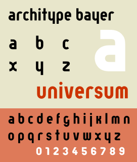
Architype Albers is a modular stencil sans-serif typeface based upon a series of experiments between 1926 and 1931 by Josef Albers, German designer, educator and typographer, (1888–1976). The Architype Albers typeface is one of a collection of several revivals of early twentieth century typographic experimentation designed by Freda Sack and David Quay of The Foundry.

Sans-serif letter form that does not have extending features called "serifs" at the end of strokes

In typography and lettering, a sans-serif, sans serif, gothic, or simply sans letterform is one that does not have extending features called "serifs" at the end of strokes. Sans-serif fonts tend to have less line width variation than serif fonts. In most print, they are often used for headings rather than for body text. They are often used to convey simplicity and modernity or minimalism.

Typeface set of characters that share common design features

In typography, a typeface is a set of one or more fonts each composed of glyphs that share common design features. Each font of a typeface has a specific weight, style, condensation, width, slant, italicization, ornamentation, and designer or foundry. For example, "ITC Garamond Bold Condensed Italic" means the bold, condensed-width, italic version of ITC Garamond. It is a different font from "ITC Garamond Condensed Italic" and "ITC Garamond Bold Condensed", but all are fonts within the same typeface, "ITC Garamond". ITC Garamond is a different typeface from "Adobe Garamond" or "Monotype Garamond". There are thousands of different typefaces in existence, with new ones being developed constantly.

Josef Albers German-American artist and educator

Josef Albers was a German-born American artist and educator whose work, both in Europe and in the United States, formed the basis of modern art education programs of the twentieth century.

Contents

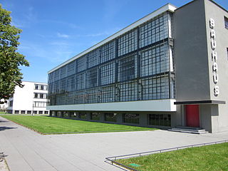
Albers studied art in Berlin, Essen, Germany, and Munich before enrolling as a student at the Weimar Bauhaus in 1920. He began teaching in the preliminary course of the Department of Design in 1922, and was promoted to professor in 1925, the year the Bauhaus moved to Dessau. He taught there until the school was closed by the Nazis in 1933.

Bauhaus school in Germany that combined crafts and the fine arts

The Staatliches Bauhaus, commonly known as the Bauhaus, was a German art school operational from 1919 to 1933 that combined crafts and the fine arts, and was famous for the approach to design that it publicized and taught.

Albers designed a series of stencil faces while teaching at the Dessau Bauhaus. The typeface is based on a limited palette of geometric forms combined in a size ratio of 1:3. Drawn on a grid, the elements of square, triangle, and circle combine to form letters with an economy of form. Never intended for text, the face was designed for use on posters and in large-scale signs.

See also

Architype Bayer

Architype Bayer is a geometric sans-serif typeface based upon the 1927 experimentation of Herbert Bayer. Bayer reacted to the Germanic use of capitalization for all nouns by abandoning uppercase. His new case combined characters based on the Carolingian minuscule with uppercase K rescaled to top-align on the mean line. The Bayer Architype typeface is one of a collection of several revivals of early twentieth century typographic experimentation designed by Freda Sack and David Quay of The Foundry.

Architype Renner

Architype Renner is a geometric sans-serif typeface reproducing the experimental alternate characters of Paul Renner's 1927–29 typeface Futura for the Bauer foundry. Renner's original design for Futura shows the influence of Herbert Bayer's experimental "Universal" alphabet. The alternate characters Renner proposed for Futura were mostly deleted from the face's character set, resulting in a more conventional, and perhaps more economically successful typeface.

Architype Schwitters

Architype Schwitters is a geometric sans-serif typeface based upon a 1927 phonetic alphabet designed by Kurt Schwitters (1887–1948). The digital revival, shown at right, was produced by Freda Sack and David Quay of The Foundry.

Related Research Articles

Herbert Bayer was an Austrian and American graphic designer, painter, photographer, sculptor, art director, environmental and interior designer, and architect. He was instrumental in the development of the Atlantic Richfield Company's corporate art collection until his death in 1985.

Max Bill Swiss architect, painter and sculptor

Max Bill was a Swiss architect, artist, painter, typeface designer, industrial designer and graphic designer.

Braggadocio (typeface)

Braggadocio is a geometrically constructed sans-serif stencil typeface designed by W.A. Woolley in 1930 for the Monotype Corporation. The design was based on Futura Black.

Anni Albers artist

Anni Albers was a German-born American textile artist and printmaker credited with blurring the lines between traditional craft and art.

Bart van der Leck Dutch painter, designer and ceramist

Bart van der Leck was a Dutch painter, designer, and ceramicist. With Theo van Doesburg and Piet Mondrian he founded the De Stijl art movement.

International Typographic Style

The International Typographic Style, also known as the Swiss Style, is a graphic design style that emerged in Russia, the Netherlands, and Germany in the 1920s and was developed by designers in Switzerland during the 1950s. The International Typographic Style has had profound influence on graphic design as a part of the modernist movement, impacting many design-related fields including architecture and art. It emphasizes cleanness, readability, and objectivity. Hallmarks of the style are asymmetric layouts, use of a grid, sans-serif typefaces like Akzidenz Grotesk, and flush left, ragged right text. The style is also associated with a preference for photography in place of illustrations or drawings. Many of the early International Typographic Style works featured typography as a primary design element in addition to its use in text, and it is for this that the style is named. The influences of this graphic movement can still be seen in design strategy and theory to this day.

DIN 1451 sans-serif font, used on german traffic signs

DIN 1451 is a sans-serif typeface that is widely used for traffic, administrative and technical applications.

Architype van der Leck

Architype van der Leck is a geometric sans-serif typeface based upon the 1941 typeface designed by Bart van der Leck for the Dutch magazine Flax, a journal of the De Stijl art movement.

Architype Van Doesburg

Architype Van Doesburg is a geometric sans-serif typeface based upon a 1919 alphabet designed by Theo van Doesburg, a cofounder of the De Stijl art movement. The digital revival shown at right was produced by Freda Sack and David Quay of The Foundry.

Fette Fraktur

Fette Fraktur is a blackletter typeface of the sub-classification Fraktur designed by the German punchcutter Johann Christian Bauer (1802–1867) in 1850. The C.E. Weber Foundry published a version in 1875, and the D Stempel AG foundry published the version shown at right in 1908.

Fodor is a geometrical typeface designed by Dutch graphic designer and type designer Wim Crouwel, around 1973.

Gridnik geometrical typeface

Gridnik is a geometrical typeface designed by Dutch graphic designer Wim Crouwel, in 1974. It is the digital version of the typewriter typeface Olivetti Politene.

Bauhaus Dessau Foundation art museum

The Bauhaus Dessau Foundation is a Foundation under public law. It is a centre of research, teaching and experimental design. The Foundation in its current form was founded by the German Federal Government, the state of Saxony-Anhalt and the town Dessau in 1994. It is based in the historical Bauhaus Building in Dessau-Roßlau. The Foundation’s staff with about 60 employees includes architects, town planners, sociologists, cultural scientists, artists and art historians.

J.G. Schelter & Giesecke was a German type foundry and manufacturer of printing presses started 1819 in Leipzig by punchcutter Johann Schelter and typefounder Christian Giesecke. The foundry was nationalized in 1946 by the new German Democratic Republic, forming Typoart, Dresden.

Bauhaus and its Sites in Weimar, Dessau and Bernau Joint World Heritage Site, comprising six separate sites associated with Bauhaus art school. Designated in 1996, extended 2017.

Bauhaus and its Sites in Weimar, Dessau and Bernau is a joint World Heritage Site in Germany, comprising six separate sites which are associated with the Bauhaus art school. It was designated in 1996, initially with four sites and in 2017 two further sites were added.

References

International Standard Book Number Unique numeric book identifier

The International Standard Book Number (ISBN) is a numeric commercial book identifier which is intended to be unique. Publishers purchase ISBNs from an affiliate of the International ISBN Agency.