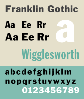
Franklin Gothic and its related faces are a large family of realist sans-serif typefaces developed by the type foundry American Type Founders (ATF) and credited to its head designer Morris Fuller Benton. “Gothic” was a contemporary term meaning sans-serif.

Braggadocio is a geometrically constructed sans-serif stencil typeface designed by W.A. Woolley in 1930 for the Monotype Corporation. The design was based on Futura Black.
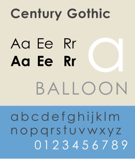
Century Gothic is a sans-serif typeface in the geometric style, released by Monotype Imaging in 1991. It is strongly influenced by the font Futura, though with a higher x-height, and its design history also derives from two separate typefaces intended as Futura competitors. It is a digital typeface that has never been made into actual foundry type.

Bookman or Bookman Old Style, is a serif typeface. A wide, legible design that is slightly bolder than most body text faces, Bookman has been used for both display typography and for printing at small sizes such as in trade printing, and less commonly for body text. In advertising use it is particularly associated with the graphic design of the 1960s and 1970s, when revivals of it were very popular.
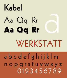
Kabel is a sans-serif typeface designed by German designer Rudolf Koch, and released by the Klingspor foundry from 1927 onwards.

Rudolf Koch was a German type designer. He was also a master of lettering, calligraphy, typography and illustration. Commonly known for his typefaces created for the Klingspor Type Foundry, his most widely used typefaces include Neuland and Kabel.
H. Berthold AG was one of the largest and most successful type foundries in the world for most of the modern typographic era, making the transition from foundry type to cold type successfully and only coming to dissolution in the digital type era.

Bulmer is the name given to a serif typeface originally designed by punchcutter William Martin around 1790 for the Shakespeare Press, run by William Bulmer (1757–1830). The types were used for printing the Boydell Shakespeare folio edition.
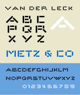
Architype van der Leck is a geometric sans-serif typeface based upon the 1941 typeface designed by Bart van der Leck for the Dutch magazine Flax, a journal of the De Stijl art movement.

Architype Van Doesburg is a geometric sans-serif typeface based upon a 1919 alphabet designed by Theo van Doesburg, a cofounder of the De Stijl art movement. The digital revival shown at right was produced by Freda Sack and David Quay of The Foundry.

Tasse is a revival of Paul Renner's Steile Futura. The family consists of 4 weights and 5 widths each, but no italic fonts were made. Nelson maintained Renner's alternative characters, adding additional alternate characters. The face is licensed by Font Bureau.

New Alphabet is a parametric typeface designed by Wim Crouwel, released in 1967. It embraced the limitations of the display technology that it was displayed on by only using horizontal and vertical strokes. This meant that some of the letters had little resemblance to the letters they were supposed to represent. New Alphabet was notably used on of Joy Divisions 1988 album Substance
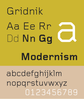
Gridnik is a geometrical typeface designed by Dutch graphic designer Wim Crouwel, in 1974. It is the digital version of the typewriter typeface Olivetti Politene.
Ludwig & Mayer was a German type foundry in Frankfurt am Main, Germany. Many important designers worked for the Ludwig and Mayer type foundry, including Heinrich Jost, Karlgeorg Hoefer, Helmut Matheis, and most notably Jakob Erbar, whose Erbar Book was one of the first geometric sans-serif typefaces, predating both Paul Renner's Futura and Rudolf Koch's Kabel by some five years. Starting in 1925, Ludwig & Mayer types were distributed in the United States by Continental Type Founders Association. When the foundry ceased operations in 1984, rights to the typefaces was transmitted to the Neufville Foundry.

In typography, Erbar or Erbar-Grotesk is a sans-serif typeface in the geometric style, one of the first designs of this kind released as type. Designer Jakob Erbar's aim was to design a printing type which would be free of all individual characteristics, possess thoroughly legible letter forms, and be a purely typographic creation. His conclusion was that this could only work if the type form was developed from a fundamental element, the circle. Erbar-Grotesk was developed in stages; Erbar wrote that he had originally sketched out the design in 1914 but had been prevented from working on it due to the war. The original version of Erbar was released in 1926, following Erbar's "Phosphor" titling capitals of 1922 which are very similar in design.