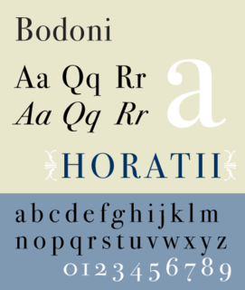
Bodoni is the name given to the serif typefaces first designed by Giambattista Bodoni (1740–1813) in the late eighteenth century and frequently revived since. Bodoni's typefaces are classified as Didone or modern. Bodoni followed the ideas of John Baskerville, as found in the printing type Baskerville—increased stroke contrast reflecting developing printing technology and a more vertical axis—but he took them to a more extreme conclusion. Bodoni had a long career and his designs changed and varied, ending with a typeface of a slightly condensed underlying structure with flat, unbracketed serifs, extreme contrast between thick and thin strokes, and an overall geometric construction.
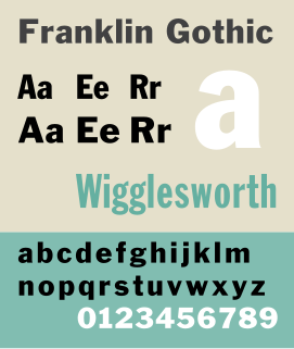
Franklin Gothic and its related faces are a large family of realist sans-serif typefaces developed by the type foundry American Type Founders (ATF) and credited to its head designer Morris Fuller Benton. “Gothic” was a contemporary term meaning sans-serif.
William S. Gillies was an American artist, letterer and type designer working in New York City.

Cheltenham is a typeface for display use designed in 1896 by architect Bertram Goodhue and Ingalls Kimball, director of the Cheltenham Press. The original drawings were known as Boston Old Style and were made about 14" high. These drawings were then turned over to Morris Fuller Benton at American Type Founders (ATF) who developed it into a final design. Trial cuttings were made as early as 1899 but the face was not complete until 1902. The face was patented by Kimball in 1904. Later the basic face was spun out into an extensive type family by Morris Fuller Benton.

Goudy Old Style is an old-style serif typeface originally created by Frederic W. Goudy for American Type Founders (ATF) in 1915.
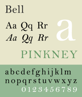
Bell is the name given to a serif typeface designed and cut in 1788 by the punchcutter Richard Austin for the British Letter Foundry, operated by publisher John Bell, and revived several times since.

Caledonia is a serif typeface designed by William Addison Dwiggins in 1938 for the Mergenthaler Linotype Company and commonly used in book design. As a transitional serif design, one inspired by the Scotch Roman typefaces of the early nineteenth century, Caledonia has a contrasting design of alternating thick and thin strokes, a design that stresses the vertical axis and sharp, regular serifs on ascenders and descenders.

Clearface is a serif typeface designed by Morris Fuller Benton with the collaboration of his father Linn Boyd Benton, produced at American Type Founders in 1907, immediately following his preparation of Century Old Style. The bold was drawn first, in 1905, but the regular weight was the first to be released. Six variants were released between 1907 and 1911, and the design has frequently been rereleased and revived since. Clearface is a warm, curving design, showing the influence of the Arts and Crafts movement, for instance in the tilted 'e' and blobby, organic design, but not particularly based on any past period of type design and with a mixture of cursive and structured features.
Ernst Frederic Detterer was an American calligrapher, teacher, and typographer. He studied at Moravian College and the Pennsylvania Museum and School of Industrial Art where he took classes in lettering taught by Edward Johnston. From 1912–21 he taught wood-cut art, calligraphy and typography at Chicago Normal School. From 1921–31 he taught the history of printing at the School of the Art Institute of Chicago. The design department of the Ludlow Typograph Company commissioned him to design a Venetian type-face, and his Nicolas Jenson was the result. Detterer's former student, R. Hunter Middleton, later expanded Nicolas Jenson into a complete type family. First cast in 1923, Nicolas Jenson was reintroduced in 1941 as Eusebius. At the time of his death, Detterer was employed as the custodian of the John M. Wing Collection on the History of Printing at the Newberry Library in Chicago.

Spartan is a geometric sans-serif typeface created by staff designers of Mergenthaler Linotype Company as a direct competitor to Bauer's Futura. The face was made for machine composition by Linotype, while identical foundry type was issued by American Type Founders (ATF). Testing by Bausch & Lomb, after the creation of Spartan in 1951, determined it to be the "most readable" typeface of the time.
Sol Hess was an American typeface designer. After a three-year scholarship course at Pennsylvania Museum School of Industrial Design, he began at Lanston Monotype in 1902, rising to typographic manager in 1922. He was a close friend and collaborator with Monotype art director Frederic Goudy, succeeding him in that position in 1940. Hess was particularly adept at expanding type faces into whole families, allowing him to complete 85 faces for Monotype, making him America's fourth most prolific type designer. While he was with Monotype, Hess worked on commissions for many prominent users of type, including, Crowell-Collier, Sears Roebuck, Montgomery Ward, Yale University Press, World Publishing Company, and Curtis Publishing for whom he re-designed the typography of their Saturday Evening Post.
Continental Type Founders Association was founded by Melbert Brinckerhoff Cary Jr. in 1925 to distribute foundry type imported from European foundries. The influence of more modern European type design was thus felt in the United States for the first time, and American foundries responded by imitating many of the more popular faces. A.T.F.'s Paramount and Monotype's Sans Serif series are two examples of this.
Western Type Foundry was founded in 1901 to compete with the conglomerate and near-monopoly, American Type Founders. In 1914 Western purchased the Advance Type Foundry in Chicago from Wiebking, Hardinge & Company, though even before this Robert Wiebking did most of the punch-cutting and matrix making for Western. Among the matrices that Wiebking for the foundry were his own designs for Farley,Perry,Artcraft, and Advertisers Gothic, a re-cutting of Caslon, and the original matrices for Bruce Rogers's deservedly famous Centaur typeface. The foundry was closed in 1919, transferring all of its equipment and holdings to Barnhart Brothers & Spindler in 1919.

Souvenir is a serif typeface designed in 1914 by Morris Fuller Benton for American Type Founders. It was loosely based on Schelter-Antiqua and Schelter-Kursiv, a 1905 Art Nouveau type issued by the J.G. Schelter & Giesecke foundry in Leipzig. It has a much softer look than other old style faces, with a generally light look, rounded serifs, and very little contrast between thick and thin strokes. Like Cheltenham, it shows the influence of the Arts and Crafts Movement without belonging to a specific historical style. A 1970s redesign by Ed Benguiat, adding extra styles and an italic, became far more popular than the initial release, and is the source of most versions sold today.
Samuel Winfield "Tommy" Thompson (1906–1967) was an American calligrapher, graphic artist and typeface designer. He was born Blue Point, New York. In 1944 he became the first designer to earn royalties for a type design, from Photo Lettering Inc. for his Thompson Quill Script. Previously, designers had worked in house for foundries or had sold the rights to their faces outright. He maintained a studio in Norwalk, Connecticut and was the author of several books on type and lettering.
Della Robbia (typeface) is a typeface designed by Thomas Maitland Cleland (1880–1964) in 1902 for American Type Founders (ATF). It was designed to be a careful and scholarly creation of a typeface from 15th Century Florentine inscriptional capitals. It was named after Luca Della Robbia, a Florentine sculptor.


