
Optima is a humanist sans-serif typeface designed by Hermann Zapf and released by the D. Stempel AG foundry, Frankfurt, West Germany in 1958.

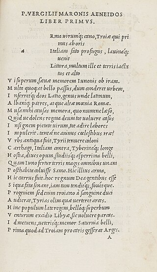
In typography and lettering, a sans-serif, sans serif, gothic, or simply sans letterform is one that does not have extending features called "serifs" at the end of strokes. Sans-serif typefaces tend to have less stroke width variation than serif typefaces. They are often used to convey simplicity and modernity or minimalism. For the purposes of type classification, sans-serif designs are usually divided into these major groups: § Grotesque, § Neo-grotesque, § Geometric, § Humanist, and § Other or mixed.

Frutiger is a series of typefaces named after its Swiss designer, Adrian Frutiger. Frutiger is a humanist sans-serif typeface, intended to be clear and highly legible at a distance or at small text sizes. A popular design worldwide, type designer Steve Matteson described its structure as "the best choice for legibility in pretty much any situation" at small text sizes, while Erik Spiekermann named it as "the best general typeface ever".

Futura is a geometric sans-serif typeface designed by Paul Renner and released in 1927. It was designed as a contribution on the New Frankfurt-project. It is based on geometric shapes, especially the circle, similar in spirit to the Bauhaus design style of the period. It was developed as a typeface by the Bauer Type Foundry, in competition with Ludwig & Mayer's seminal Erbar typeface of 1926.
In typography, italic type is a cursive font based on a stylised form of calligraphic handwriting. Along with blackletter and roman type, it served as one of the major typefaces in the history of Western typography.

Gill Sans is a humanist sans-serif typeface designed by Eric Gill and released by the British branch of Monotype from 1928 onwards.

Johnston is a sans-serif typeface designed by and named after Edward Johnston. The typeface was commissioned in 1913 by Frank Pick, commercial manager of the Underground Electric Railways Company of London, as part of his plan to strengthen the company's corporate identity. Johnston was originally created for printing, but it rapidly became used for the enamel station signs of the Underground system as well.

Myriad is a humanist sans-serif typeface designed by Robert Slimbach and Carol Twombly for Adobe Systems. Myriad was intended as a neutral, general-purpose typeface that could fulfill a range of uses and have a form easily expandable by computer-aided design to a large range of weights and widths.
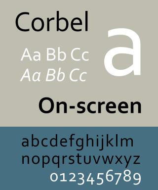
Corbel is a humanist sans-serif typeface designed by Jeremy Tankard for Microsoft. It is part of the ClearType Font Collection, a suite of fonts from various designers released with Windows Vista. All start with the letter C to reflect that they were designed to work well with Microsoft's ClearType text rendering system, a text rendering engine designed to make text clearer to read on LCD monitors. The other fonts in the same group are Calibri, Cambria, Candara, Consolas and Constantia.
Oblique type is a form of type that slants slightly to the right, used for the same purposes as italic type. Unlike italic type, however, it does not use different glyph shapes; it uses the same glyphs as roman type, except slanted. Oblique and italic type are technical terms to distinguish between the two ways of creating slanted font styles; oblique designs may be labelled italic by companies selling fonts or by computer programs. Oblique designs may also be called slanted or sloped roman styles. Oblique fonts, as supplied by a font designer, may be simply slanted, but this is often not the case: many have slight corrections made to them to give curves more consistent widths, so they retain the proportions of counters and the thick-and-thin quality of strokes from the regular design.

Rotis is a typeface developed in 1988 by Otl Aicher, a German graphic designer and typographer. In Rotis, Aicher explores an attempt at maximum legibility through a highly unified yet varied typeface family that ranges from full serif, glyphic, and sans-serif. The four basic Rotis variants are:

FF Scala Sans is a humanist sans-serif typeface designed by Dutch designer Martin Majoor in 1993 for the Vredenburg Music Center in Utrecht, the Netherlands. It was designed as a companion to Majoor's earlier serif old style typeface FF Scala, designed in 1990.

Joanna is a serif typeface designed by Eric Gill (1882–1940) from 1930 to 1931 that was named for one of his daughters. Gill chose Joanna for setting An Essay on Typography, a book by Gill on his thoughts on typography, typesetting and page design. He described it as "a book face free from all fancy business".

Syntax comprises a family of fonts designed by Swiss typeface designer Hans Eduard Meier. Originally just a sans-serif font, it was extended with additional serif designs.

Stephenson Blake is an engineering company based in Sheffield, England. The company was active from the early 19th century as a type founder, remaining until the 1990s as the last active type foundry in Britain, since when it has diversified into specialist engineering.

Charlotte Sans is a humanist sans-serif typeface designed by Michael Gills in 1992 as part of a larger family called Charlotte, which includes a related serif text face. The face was designed for Letraset.

Whitney is a family of humanist sans-serif digital typefaces, designed by American type designer Tobias Frere-Jones. It was originally created for New York’s Whitney Museum as its institutional typeface. Two key requirements were flexibility for editorial requirements and a design consistency with the Whitney Museum's existing public signage.

Granby is a sans-serif typeface designed and released by the Stephenson Blake type foundry of Sheffield from 1930.
Jeremy Tankard is a British type designer. Tankard has designed retail fonts independently and for FontShop and Adobe. Corbel was designed for Microsoft and has been included in Microsoft Office and Windows since 2006.

The Stephenson Blake Grotesque fonts are a series of sans-serif typefaces created by the type foundry Stephenson Blake of Sheffield, England, mostly around the beginning of the twentieth century.

