Syntax (typeface)

Last updated
Syntax
SyntaxAIB.svg
Category Sans-serif
Classification Humanist
Designer(s) Hans Eduard Meier
Foundry Linotype
Date created1968

Syntax comprises a family of fonts designed by Swiss typeface designer Hans Eduard Meier. Originally just a sans-serif font, it was extended with additional serif designs.

Contents

Syntax

Syntax is a humanist sans-serif typeface designed by Meier in 1968, and released in 1969 by the D. Stempel Schriftgießerei (type foundry) of Frankfurt am Main. [1] [2] It is believed to be the final face designed and released by D. Stempel for foundry casting.

The original drawings were done in 1954; first by writing the letters with a brush, then redrawing their essential linear forms, and finally adding balanced amounts of weight to the skeletons to produce optically monoline letterforms. In the period 1968–1972, Meier worked on additional weights and variations to the Syntax typeface. In 1989, the original foundry metal design was digitized by Adobe, which also expanded the family to include bold and ultrabold weights, resulting in a font family of 4 romans and 1 italic (in lightest weight) fonts.

Meier described Syntax as being a sans-serif face modeled on the Renaissance serif typeface, similar to Sabon or Bembo. The uppercase has a wide proportion, and the terminals not being parallel to the baseline provide a sense of animation. The lowercase a and g follow the old style model of having two storeys. The italics are a combination of humanist italic forms, seen in the lowercase italic q, and the obliques of industrial or grotesque sans-serifs, seen in the lowercase italic a, which retains two storeys, unlike in other humanist sans-serif typefaces like FF Scala Sans and Gill Sans, where the a has a single storey italic.

On its release Jan Tschichold praised Syntax as "very easy to read, well designed: better than the related Gill Sans". [3] [4]

Different brand names and derivative fonts

Bitstream released Syntax under the name Humanist 531. The family does not include an italic font.

Infinitype released Syntax under the name Saxony, including an italic and medium font.

The Cyrillic version was developed at ParaType in 1999 by Isay Slutsker [5] and Manvel Shmavonyan.

Oberon version

Bitmap of Meier's hand-optimized Syntax bitmap fonts as they appeared in the Oberon operating system. Oberon syntax font.gif
Bitmap of Meier's hand-optimized Syntax bitmap fonts as they appeared in the Oberon operating system.

The Syntax font family was chosen by Niklaus Wirth for the Oberon operating system. During part of the period that Oberon was under development, Meier worked in Wirth's group at ETH, developing hand-optimized bitmap versions of the Syntax fonts (this was in the days prior to font anti-aliasing).

Linotype Syntax

In 1995, Hans Eduard Meier and Linotype began to produce an extensive revision and expansion of the Syntax font family. [6] Based on original font design, the alterations made to accommodate hot metal and phototypesetting machines were discarded. The family was expanded to 6 weights with italics on all weights. All fonts include old style figures and proportional lining figures, while 3 lightest weights also include small caps glyphs. Regular and bold weight fonts also include Cyrillic characters. Characters such as @, C, R, fi, fl, were redesigned.

The font family was released in 2000.

Linotype Syntax Lapidar

It is a variant of Linotype Syntax, but modelled after chiseled letter forms of the ancient Greeks. Linotype Syntax Lapidar is available in two different design forms: Linotype Syntax Lapidar Text and Linotype Syntax Lapidar Display.

Linotype Syntax Lapidar Text supports old style figures, while Linotype Syntax Lapidar Display supports titling capitals. Both families come in 5 weights of roman fonts, covering Basic Latin to ISO Latin-1 character sets, available in TrueType or PostScript Type 1 formats.

Linotype Syntax Lapidar Serif

It is a variant of Linotype Syntax containing serifs. Like the sans-serif version, it comes with Text and Display designs with same amount of fonts per family, and covers same character sets. However, Linotype Syntax Lapidar Serif Display does not support titling capitals.

Linotype Syntax Letter

It is a variant of Linotype Syntax modelled after the style of the Roman Rustic capitals. This family come in 6 weights with complementary italic fonts on all weights, covering ISO Adobe 2, Adobe CE, Latin Extended character sets. OpenType features include old style figures.

Linotype Syntax Serif

It is a variant of Linotype Syntax with serifs. This family come in 6 weights with complementary italic fonts on all weights, covering ISO Adobe 2, Adobe CE, Latin Extended character sets. OpenType features include old style figures, with small caps and proportional lining figures on 3 lightest weights.

Badiya

It is an Arabic variant designed by Nadine Chahine, based on the original Syntax. Badiya, which means "desert" in Arabic, is a modern and slightly modulated Naskh. The design has open counters that enable it to be used in quite small sizes, optimized for print in magazines and corporate communication.

2 roman fonts, in regular and bold weights, were produced. It supports ISO Adobe 2, Latin Extended, Arabic, Persian, and Urdu characters, tabular numerals for the supported languages.

Awards

Linotype Syntax won TDC2 2000 (Type Directors Club Type Design Competition 2000) award under the Text/display type systems category. [7]

Bitstream Humanist 531 Cyrillic won awards at Kyrillitsa'99 under text category, [8] and "bukva:raz!" type design contests. [9] [10]

Usages

Linotype Syntax is used in OÖ Nachrichten, Deccan Herald newspapers, Lonely Planet Guidebooks; [11] impuls 2000 magazine [12] [13] and was used in Sinclair computer box art, manuals and brochures.

Related Research Articles

<span class="mw-page-title-main">Palatino</span> Serif typeface

Palatino is the name of an old-style serif typeface designed by Hermann Zapf, initially released in 1949 by the Stempel foundry and later by other companies, most notably the Mergenthaler Linotype Company.

<span class="mw-page-title-main">Optima</span> 1958 typeface by Hermann Zapf

Optima is a humanist sans-serif typeface designed by Hermann Zapf and released by the D. Stempel AG foundry, Frankfurt, West Germany in 1958.

<span class="mw-page-title-main">Typeface</span> Set of characters that share common design features

A typeface is a design of letters, numbers and other symbols, to be used in printing or for electronic display. Most typefaces include variations in size, weight, slope, width, and so on. Each of these variations of the typeface is a font.

<span class="mw-page-title-main">Frutiger (typeface)</span> Typeface designed by Adrian Frutiger

Frutiger is a series of typefaces named after its Swiss designer, Adrian Frutiger. Frutiger is a humanist sans-serif typeface, intended to be clear and highly legible at a distance or at small text sizes. A popular design worldwide, type designer Steve Matteson described its structure as "the best choice for legibility in pretty much any situation" at small text sizes, while Erik Spiekermann named it as "the best general typeface ever".

<span class="mw-page-title-main">Arial</span> Neo-grotesque sans-serif typeface

Arial is a sans-serif typeface and set of computer fonts in the neo-grotesque style. Fonts from the Arial family are included with all versions of Microsoft Windows after Windows 3.1, as well as in other Microsoft programs, Apple's macOS, and many PostScript 3 printers.

<span class="mw-page-title-main">Gill Sans</span> Humanist sans-serif typeface family developed by Monotype

Gill Sans is a humanist sans-serif typeface designed by Eric Gill and released by the British branch of Monotype from 1928 onwards.

<span class="mw-page-title-main">Adrian Frutiger</span> Swiss typeface designer (1928–2015)

Adrian Johann Frutiger was a Swiss typeface designer who influenced the direction of type design in the second half of the 20th century. His career spanned the hot metal, phototypesetting and digital typesetting eras. Until his death, he lived in Bremgarten bei Bern.

<span class="mw-page-title-main">Lucida</span> Typeface family designed by Charles Bigelow and Kris Holmes in 1984

Lucida is an extended family of related typefaces designed by Charles Bigelow and Kris Holmes and released from 1984 onwards. The family is intended to be extremely legible when printed at small size or displayed on a low-resolution display – hence the name, from 'lucid'.

<span class="mw-page-title-main">Myriad (typeface)</span> Sans-serif typeface family

Myriad is a humanist sans-serif typeface designed by Robert Slimbach and Carol Twombly for Adobe Systems. Myriad was intended as a neutral, general-purpose typeface that could fulfill a range of uses and have a form easily expandable by computer-aided design to a large range of weights and widths.

<span class="mw-page-title-main">Font</span> Particular size, weight and style of a typeface

In metal typesetting, a font is a particular size, weight and style of a typeface. Each font is a matched set of type, with a piece for each glyph. A typeface consists of various fonts that share an overall design.

<span class="mw-page-title-main">Rotis</span> Font superfamily; humanist sans-serif typeface

Rotis is a typeface developed in 1988 by Otl Aicher, a German graphic designer and typographer. In Rotis, Aicher explores an attempt at maximum legibility through a highly unified yet varied typeface family that ranges from full serif, glyphic, and sans-serif. The four basic Rotis variants are:

<span class="mw-page-title-main">Thesis (typeface)</span> Font superfamily

Thesis is a large typeface family designed by Luc(as) de Groot. The typefaces were designed between 1994 and 1999 to provide a modern humanist family. Each typeface is available in a variety of weights as well as in italic. Originally released by FontFont in 1994, it has been sold by de Groot through his imprint LucasFonts since 2000.

<span class="mw-page-title-main">FF Scala Sans</span> Sans-serif typeface

FF Scala Sans is a humanist sans-serif typeface designed by Dutch designer Martin Majoor in 1993 for the Vredenburg Music Center in Utrecht, the Netherlands. It was designed as a companion to Majoor's earlier serif old style typeface FF Scala, designed in 1990.

<span class="mw-page-title-main">News Gothic</span> Grotesque sans-serif typeface

News Gothic is a sans-serif typeface designed by Morris Fuller Benton, and was released in 1908 by his employer American Type Founders (ATF). The typeface is similar in proportion and structure to Franklin Gothic, also designed by Benton, but lighter.

Generis is the name of a typeface designed by type designer Erik Faulhaber. Generis was first published in November 2006 by Linotype.

<span class="mw-page-title-main">Trade Gothic</span> Grotesque sans-serif typeface

Trade Gothic is a sans-serif typeface designed in 1948 by Jackson Burke (1908–1975), who continued to work on further style-weight combinations, eventually 14 in all, until 1960, while he was director of type development for Linotype in the US. The family includes three weights and three widths.

<span class="mw-page-title-main">Open Sans</span> Sans-serif typeface

Open Sans is an open source humanist sans-serif typeface that was designed by Steve Matteson under commission from Google. It was released in 2011 and is based on his earlier design called Droid Sans, which was specifically created for Android mobile devices but with slight modifications to its width.

<span class="mw-page-title-main">Source Sans</span> Sans-serif typeface family

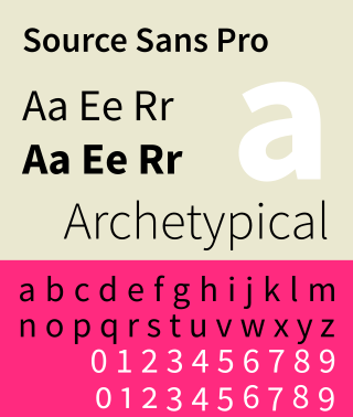
Source Sans is a sans-serif typeface created by Paul D. Hunt, released by Adobe in 2012. It is the first open-source font family from Adobe, distributed under the SIL Open Font License.

<span class="mw-page-title-main">Metro (typeface)</span> Sans-Serif typeface

Metro is a sans-serif typeface family created by William Addison Dwiggins and released by the American Mergenthaler Linotype Company from 1929 onwards.

Hans Eduard Meier, was a Swiss type designer. He created the neohumanist typeface Syntax at Stempel Foundry, along with Barbedor (1984), Letter (1992) and Lapidar (1995).

References

  1. "Typeface story: Syntax". Linotype. Retrieved 10 July 2017.
  2. Schulz-Anker, Erich (1970). "Syntax-Antiqua, a Sans Serif on a New Basis". Gebrauchsgraphik. pp. 57–64. Archived from the original on 2018-12-19. Retrieved 2017-08-12.
  3. Peters, Yyves. "Hans Eduard Meier Passes Away At Age 91". FontFeed. Retrieved 14 February 2016.
  4. Hollis, Richard (2006). Swiss graphic design: the origins and growth of an international style, 1920–1965. London: Laurence King. p. 199. ISBN   978-1-85669-487-2.
  5. "tdc: Isay Solomonovich Slutsker". Archived from the original on May 17, 2008.
  6. "Linotype Syntax". issuu. Linotype GmbH. 13 September 2013. Retrieved 17 May 2018.
  7. "TDC News:TDC2 2000". Archived from the original on July 28, 2012.
  8. "U&lc Online Issue: 25.4.1: The Winners". Archived from the original on 2012-02-13. Retrieved 2008-11-14.
  9. "bukva:raz! results". Archived from the original on September 18, 2008.
  10. "Paratype.com — excellent fonts for your project". www.paratype.com.
  11. "Linotype Fonts in Use - Newspapers". www.linotype.com.
  12. "Linotype Fonts in Use - Magazines". www.linotype.com.
  13. "(x) Lonely Planet logo and cover type - Churchward 70, Syntax {Yves} | Typophile". Archived from the original on 2011-06-16.