FF Scala Sans

Last updated
FF Scala Sans
FFScalaSansAIB.svg
Category Sans-serif
Classification Humanist
Designer(s) Martin Majoor
Foundry FontFont

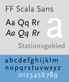
FF Scala Sans is a humanist sans-serif typeface designed by Dutch designer Martin Majoor in 1993 for the Vredenburg Music Center in Utrecht, the Netherlands. It was designed as a companion to Majoor's earlier serif old style typeface FF Scala, designed in 1990.

Like Eric Gill's 1927–30 design Gill Sans and Hans Eduard Meier's typeface Syntax, both upper and lower case are structurally modeled on serif old style faces. The lowercase roman a and g are two-story. FF Scala Sans italics are true italics, not sloped roman. The lowercase a, e, v and y are particularly calligraphic. FF Scala Sans is a very complete sans-serif in its inclusion of true small capitals, lining and non-lining (old style figures) and many ligatures. In 1993 an additional condensed width of the typeface was released. The typefaces are available through Font Shop International.

The typeface is prominently used by the Los Angeles Metro, and the Hungarian weekly magazine Magyar Narancs. FF Scala Sans is less commonly used by Kwik Trip, most notably some of its signage. It is also used by the Museum of Contemporary Art Chicago, as well as the fifteenth edition of The Chicago Manual of Style, JBL Sound Systems, The Elements of Typographic Style by Robert Bringhurst; Nelson-Atkins Museum of Art in Kansas City, Missouri, the Saint Louis Art Museum, Shakespeare's Words: A Glossary and Language Companion by David Crystal, as well as Martin Majoor's official website. It is also used by Wizards of the Coast for Sidebar/Table Body in Dungeons and Dragons 5th Edition Modules as well as Dungeons and Dragons 5th Edition Character Sheets.

Bibliography

Sample image of FF Scala & Scala Sans. Scala & Scala Sans sample.png
Sample image of FF Scala & Scala Sans.


Related Research Articles

<span class="mw-page-title-main">Typography</span> Art of arranging type

Typography is the art and technique of arranging type to make written language legible, readable and appealing when displayed. The arrangement of type involves selecting typefaces, point sizes, line lengths, line spacing, letter spacing, and spaces between pairs of letters. The term typography is also applied to the style, arrangement, and appearance of the letters, numbers, and symbols created by the process. Type design is a closely related craft, sometimes considered part of typography; most typographers do not design typefaces, and some type designers do not consider themselves typographers. Typography also may be used as an ornamental and decorative device, unrelated to the communication of information.

<span class="mw-page-title-main">Optima</span> Humanist sans-serif typeface by Hermann Zapf

Optima is a humanist sans-serif typeface designed by Hermann Zapf and released by the D. Stempel AG foundry, Frankfurt, West Germany in 1958.

In typography, a serif is a small line or stroke regularly attached to the end of a larger stroke in a letter or symbol within a particular font or family of fonts. A typeface or "font family" making use of serifs is called a serif typeface, and a typeface that does not include them is sans-serif. Some typography sources refer to sans-serif typefaces as "grotesque" or "Gothic" and serif typefaces as "roman".

<span class="mw-page-title-main">Text figures</span> Numerals typeset with varying heights

Text figures are numerals designed with varying heights in a fashion that resembles a typical line of running text, hence the name. They are contrasted with lining figures, which are the same height as upper-case letters. Georgia is an example of a popular typeface that employs text figures by default.

<span class="mw-page-title-main">Counter (typography)</span>

In typography, a counter is the area of a letter that is entirely or partially enclosed by a letter form or a symbol. The stroke that creates such a space is known as a "bowl". Latin letters containing closed counters include A, B, D, O, P, Q, R, a, b, d, e, g, o, p, and q. Latin letters containing open counters include c, f, h, s etc. The digits 0, 4, 6, 8, and 9 also have counters. An aperture is the opening between an open counter and the outside of the letter.

Oblique type is a form of type that slants slightly to the right, used for the same purposes as italic type. Unlike italic type, however, it does not use different glyph shapes; it uses the same glyphs as roman type, except slanted. Oblique and italic type are technical terms to distinguish between the two ways of creating slanted font styles; oblique designs may be labelled italic by companies selling fonts or by computer programs. Oblique designs may also be called slanted or sloped roman styles. Oblique fonts, as supplied by a font designer, may be simply slanted, but this is often not the case: many have slight corrections made to them to give curves more consistent widths, so they retain the proportions of counters and the thick-and-thin quality of strokes from the regular design.

<span class="mw-page-title-main">Akzidenz-Grotesk</span> Grotesque sans-serif typeface

Akzidenz-Grotesk is a sans-serif typeface family originally released by the Berthold Type Foundry of Berlin. "Akzidenz" indicates its intended use as a typeface for commercial print runs such as publicity, tickets and forms, as opposed to fine printing, and "grotesque" was a standard name for sans-serif typefaces at the time.

<span class="mw-page-title-main">Rotis</span> Typeface family

Rotis is a typeface developed in 1988 by Otl Aicher, a German graphic designer and typographer. In Rotis, Aicher explores an attempt at maximum legibility through a highly unified yet varied typeface family that ranges from full serif, glyphic, and sans-serif. The four basic Rotis variants are:

<span class="mw-page-title-main">Swash (typography)</span> Typographical flourish found on some letterforms, particularly in italics

A swash is a typographical flourish, such as an exaggerated serif, terminal, tail, entry stroke, etc., on a glyph. The use of swash characters dates back to at least the 16th century, as they can be seen in Ludovico Vicentino degli Arrighi's La Operina, which is dated 1522. As with italic type in general, they were inspired by the conventions of period handwriting. Arrighi's designs influenced designers in Italy and particularly in France.

<span class="mw-page-title-main">FF Meta</span> Humanist sans-serif typeface

FF Meta is a humanist sans-serif typeface family designed by Erik Spiekermann and released in 1991 through his FontFont library.

<span class="mw-page-title-main">FF Scala</span> Old-style serif typeface

FF Scala is an old-style serif typeface designed by Dutch typeface designer Martin Majoor in 1991 for the Muziekcentrum Vredenburg in Utrecht, the Netherlands. The FF Scala font family was named for the Teatro alla Scala (1776–78) in Milan, Italy. Like many contemporary Dutch serif faces, FF Scala is not an academic revival of a single historic typeface but shows influences of several historic models. Similarities can be seen with William Addison Dwiggins' 1935 design for the typeface Electra in its clarity of form, and rhythmic, highly calligraphic italics. Eric Gill's 1931 typeface Joanna, with its old style armature but nearly square serifs, is also similar in its nearly mono-weighted stroke width.

<span class="mw-page-title-main">Joanna (typeface)</span> Typeface designed by Eric Gill

Joanna is a serif typeface designed by Eric Gill (1882–1940) from 1930 to 1931 that was named for one of his daughters. Gill chose Joanna for setting An Essay on Typography, a book by Gill on his thoughts on typography, typesetting and page design. He described it as "a book face free from all fancy business".

<span class="mw-page-title-main">Syntax (typeface)</span> Typeface family

Syntax comprises a family of fonts designed by Swiss typeface designer Hans Eduard Meier. Originally just a sans-serif font, it was extended with additional serif designs.

<span class="mw-page-title-main">FF DIN</span> Grotesque sans-serif typeface

FF DIN is a sans-serif typeface in the industrial or "grotesque" style. It was designed in 1995 by Albert-Jan Pool, based on DIN-Mittelschrift and DIN-Engschrift, as defined in the German standard DIN 1451. DIN is an acronym for Deutsches Institut für Normung. It was published by FontShop in its FontFont library of typefaces.

Jan van Krimpen was a Dutch typographer, book designer and type designer. He worked for the printing house Koninklijke Joh. Enschedé. He also worked with Monotype in England, who issued or reissued many of his designs outside the Netherlands.

<span class="mw-page-title-main">Martin Majoor</span> Dutch type designer and graphic designer (born 1960)

Martin Majoor is a Dutch type designer and graphic designer. As of 2006, he had worked since 1997 in both Arnhem, Netherlands, and Warsaw, Poland.

FontShop International was an international manufacturer of digital typefaces (fonts), based in Berlin. It was one of the largest digital type foundries.

Evert Bloemsma was a Dutch photographer, graphic designer, type designer, and art school educator.

<span class="mw-page-title-main">Font superfamily</span> Group of typefaces

In typography, a font superfamily or typeface superfamily is a font family containing fonts that fall into multiple classifications.