Optima is a humanist sans-serif typeface designed by Hermann Zapf and released by the D. Stempel AG foundry, Frankfurt, West Germany in 1958.

Courier is a monospaced slab serif typeface commissioned by IBM and designed by Howard "Bud" Kettler (1919–1999) in the mid-1950s. The Courier name and typeface concept are in the public domain. Courier has been adapted for use as a computer font, and versions of it are installed on most desktop computers.

Myriad is a humanist sans-serif typeface designed by Robert Slimbach and Carol Twombly for Adobe Systems. Myriad was intended as a neutral, general-purpose typeface that could fulfill a range of uses and have a form easily expandable by computer-aided design to a large range of weights and widths.

Copperplate Gothic is a typeface designed by Frederic W. Goudy and first produced by American Type Founders (ATF) beginning in 1901.

Albertus is a glyphic serif display typeface designed by Berthold Wolpe in the period 1932 to 1940 for the British branch of the printing company Monotype. Wolpe named the font after Albertus Magnus, the thirteenth-century German philosopher and theologian.

Kabel is a geometric sans-serif typeface that was designed by the German designer Rudolf Koch and released by the Klingspor foundry from 1927 onward.

Rotis is a typeface developed in 1988 by Otl Aicher, a German graphic designer and typographer. In Rotis, Aicher explores an attempt at maximum legibility through a highly unified yet varied typeface family that ranges from full serif, glyphic, and sans-serif. The four basic Rotis variants are:
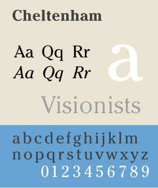
Cheltenham is a typeface for display use designed in 1896 by architect Bertram Goodhue and Ingalls Kimball, director of the Cheltenham Press. The original drawings were known as Boston Old Style and were made about 14" high. These drawings were then turned over to Morris Fuller Benton at American Type Founders (ATF) who developed it into a final design. Trial cuttings were made as early as 1899 but the face was not complete until 1902. The face was patented by Kimball in 1904. Later the basic face was spun out into an extensive type family by Morris Fuller Benton.

News Gothic is a sans-serif typeface designed by Morris Fuller Benton, and was released in 1908 by his employer American Type Founders (ATF). The typeface is similar in proportion and structure to Franklin Gothic, also designed by Benton, but lighter.
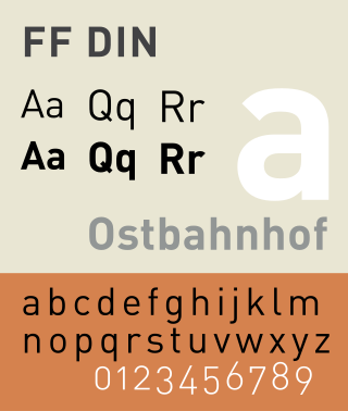
FF DIN is a sans-serif typeface in the industrial or "grotesque" style. It was designed in 1995 by Albert-Jan Pool, based on DIN-Mittelschrift and DIN-Engschrift, as defined in the German standard DIN 1451. DIN is an acronym for Deutsches Institut für Normung. It was published by FontShop in its FontFont library of typefaces.
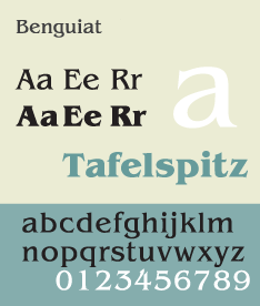
ITC Benguiat is a decorative serif typeface designed by Ed Benguiat and released by the International Typeface Corporation (ITC) in 1977. The face is loosely based upon typefaces of the Art Nouveau period but is not considered an academic revival. The face follows ITC's design formulary of an extremely high x-height, combined with multiple widths and weights.
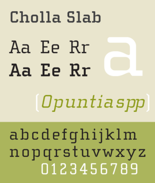
Cholla Slab is a geometric slab-serif variant of a larger typeface family called Cholla designed by Sibylle Hagmann in the period 1998–1999 for the Art Center College of Design. Cholla is licensed by the Emigre foundry. The typeface is named for a group of cactus species indigenous to the Mojave Desert.
Max Miedinger was a Swiss typeface designer, best known for creating the Neue Haas Grotesk typeface in 1957, renamed Helvetica in 1960. Marketed as a symbol of cutting-edge Swiss technology, Helvetica achieved immediate global success.

Folio is a sans-serif typeface in the neo-grotesque style designed by Konrad Friedrich Bauer and Walter Baum in 1957 for the Bauer Type Foundry. Bauer licensed the design to Fonderie Typographique Française for sale in France under the name Caravelle.
Tower was a slab serif typeface designed by Morris Fuller Benton for American Type Founders and based upon his earlier design for Stymie, but with straight sides to the round letters emphasizing the vertical appearance. Tower Italic was designed but not cast. In 1936, Tower Bold was started by the same designer, but was instead made into Stymie Bold Condensed.
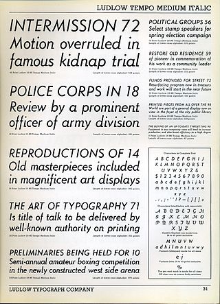
Tempo is a 1930 sans-serif typeface designed by R. Hunter Middleton for the Ludlow Typograph company. Tempo is a geometric sans-serif design, closely copying German typefaces in this style, above all Futura, which had attracted considerable attention in the United States. Unlike Futura, however, it has a "dynamic" true italic, with foot serifs suggesting handwriting and optional swash capitals.

Karnak is a slab-serif typeface designed by R. Hunter Middleton for the Ludlow Typograph company and issued in the period 1931–1942.

Walbaum is the name given to serif typefaces in the "Didone" or modern style that are, or revive the work of early nineteenth-century punchcutter Justus Erich Walbaum, based in Goslar and then in Weimar.
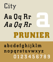
Georg Trump was a German graphics, typeface and postage stamp designer, known for designs such as the book typeface Trump Mediaeval (1954), the slab serif City and the condensed, industrial Schadow.
The Legibility Group is a series of serif typefaces created by the American Mergenthaler Linotype Company and intended for use in newspapers on Linotype's hot metal typesetting system. They were developed in-house by Linotype's design team, led by Chauncey H. Griffith, and released from 1922, when the first member, Ionic No. 5, appeared.