Related Research Articles

Typography is the art and technique of arranging type to make written language legible, readable and appealing when displayed. The arrangement of type involves selecting typefaces, point sizes, line lengths, line spacing, letter spacing, and spaces between pairs of letters. The term typography is also applied to the style, arrangement, and appearance of the letters, numbers, and symbols created by the process. Type design is a closely related craft, sometimes considered part of typography; most typographers do not design typefaces, and some type designers do not consider themselves typographers. Typography also may be used as an ornamental and decorative device, unrelated to the communication of information.

Palatino is an old-style serif typeface designed by Hermann Zapf, initially released in 1949 by the Stempel foundry and later by other companies, most notably the Mergenthaler Linotype Company. Palatino is optimised for legitibility with open counters, balanced proportions, moderate stroke contrast and flared serifs.

In typography and lettering, a sans-serif, sans serif, gothic, or simply sans letterform is one that does not have extending features called "serifs" at the end of strokes. Sans-serif typefaces tend to have less stroke width variation than serif typefaces. They are often used to convey simplicity and modernity or minimalism. For the purposes of type classification, sans-serif designs are usually divided into these major groups: § Grotesque, § Neo-grotesque, § Geometric, § Humanist, and § Other or mixed.
In typography, a serif is a small line or stroke regularly attached to the end of a larger stroke in a letter or symbol within a particular font or family of fonts. A typeface or "font family" making use of serifs is called a serif typeface, and a typeface that does not include them is sans-serif. Some typography sources refer to sans-serif typefaces as "grotesque" or "Gothic" and serif typefaces as "roman".

A typeface is a design of letters, numbers and other symbols, to be used in printing or for electronic display. Most typefaces include variations in size, weight, slope, width, and so on. Each of these variations of the typeface is a font.

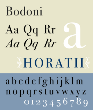
Bodoni is the name given to the serif typefaces first designed by Giambattista Bodoni (1740–1813) in the late eighteenth century and frequently revived since. Bodoni's typefaces are classified as Didone or modern. Bodoni followed the ideas of John Baskerville, as found in the printing type Baskerville—increased stroke contrast reflecting developing printing technology and a more vertical axis—but he took them to a more extreme conclusion. Bodoni had a long career and his designs changed and varied, ending with a typeface of a slightly condensed underlying structure with flat, unbracketed serifs, extreme contrast between thick and thin strokes, and an overall geometric construction.

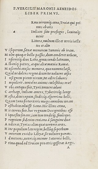
In typography, italic type is a cursive font based on a stylised form of calligraphic handwriting. Along with blackletter and roman type, it served as one of the major typefaces in the history of Western typography.

Myriad is a humanist sans-serif typeface designed by Robert Slimbach and Carol Twombly for Adobe Systems. Myriad was intended as a neutral, general-purpose typeface that could fulfill a range of uses and have a form easily expandable by computer-aided design to a large range of weights and widths.

Cambria is a transitional serif typeface commissioned by Microsoft and distributed with Windows and Office. It was designed by Dutch typeface designer Jelle Bosma in 2004, with input from Steve Matteson and Robin Nicholas. It is intended as a serif font that is suitable for body text, that is very readable printed small or displayed on a low-resolution screen and has even spacing and proportions.

Roboto is a typeface family developed by Google. The first typeface was created as the system font for its Android operating system, and released in 2011 for Android 4.0 "Ice Cream Sandwich".

Didone is a genre of serif typeface that emerged in the late 18th century and was the standard style of general-purpose printing during the 19th century. It is characterized by:

In metal typesetting, a font or fount is a particular size, weight and style of a typeface, defined as the set of fonts that share an overall design. For instance, the typeface Bauer Bodoni includes fonts "Roman", "bold" and "italic"; each of these exists in a variety of sizes.

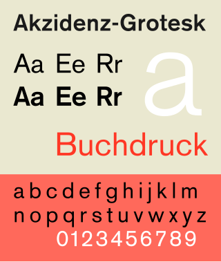
Akzidenz-Grotesk is a sans-serif typeface family originally released by the Berthold Type Foundry of Berlin. "Akzidenz" indicates its intended use as a typeface for commercial print runs such as publicity, tickets and forms, as opposed to fine printing, and "grotesque" was a standard name for sans-serif typefaces at the time.

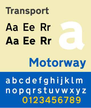
Transport is a sans serif typeface first designed for road signs in the United Kingdom. It was created between 1957 and 1963 by Jock Kinneir and Margaret Calvert as part of their work as designers for the Department of Transport's Anderson and Worboys committees.
In typography, the Vox-ATypI classification makes it possible to classify typefaces into general classes. Devised by Maximilien Vox in 1954, it was adopted in 1962 by the Association Typographique Internationale (ATypI) and in 1967 as a British Standard, as British Standards Classification of Typefaces, which is a very basic interpretation and adaptation/modification of the earlier Vox-ATypI classification.
Legibility is the ease with which a reader can decode symbols. In addition to written language, it can also refer to behaviour or architecture, for example. From the perspective of communication research, it can be described as a measure of the permeability of a communication channel. A large number of known factors can affect legibility.

Modern Typography is a 1920s principle that expresses a reaction against what its proponents perceived as a decadence of typography and design emerging from the late 19th century. This amalgam consists of the foundations and overall notions of Design Concept, Typeface, Objective, Model of Vision, and its significance among readers. While it is it is mostly associated with the works of Jan Tschichold and Bauhaus typographers Herbert Bayer, László Moholy-Nagy, El Lissitzky and others-- it is also encountered through word documents, maps, labels, and other forms related to digital use and is readable across different media.
Form and Document Creation is one of the things that technical communicators do as part of creating deliverables for their companies or clients. Document design is: "the field of theory and practice aimed at creating comprehensible, persuasive and usable functional documents". These forms and documents can have many different purposes such as collecting or providing information.

OpenDyslexic is a free typeface/font designed to mitigate some of the common reading errors caused by dyslexia. The typeface was created by Abbie Gonzalez, who released it through an open-source license. The design is based on DejaVu Sans, also an open-source font.

Atkinson Hyperlegible is a freely available typeface built around a grotesque sans-serif core, intended to be optimally legible for readers who are partially visually impaired, with all characters maximally distinguishable from one another. It was developed by the Braille Institute of America in collaboration with Applied Design Works and is available under the SIL Open Font License. It won Fast Company's Innovation by Design Award for Graphic Design in 2019 and was shortlisted for a graphic design award by Dezeen in 2020.
References
- ↑ "The easiest font to read | EasyReading". Easyreading.it. Retrieved 2017-07-13.
- ↑ "EasyRiding una scommessa per aiutare a leggere chi ha difficoltà - la Repubblica.it". Ricerca.repubblica.it (in Italian). 2014-07-27. Retrieved 2016-11-23.
- ↑ "The best font for reading and scientific research |Easyreading". Easyreading.it. Retrieved 2017-07-13.
- ↑ "Ricerche scientifiche e strumenti compensativi | EasyReading". Easyreading.it. Retrieved 2017-04-28.
- ↑ "Twitter".