Palatino is the name of an old-style serif typeface designed by Hermann Zapf, initially released in 1949 by the Stempel foundry and later by other companies, most notably the Mergenthaler Linotype Company.

A typeface is a design of letters, numbers and other symbols, to be used in printing or for electronic display. Most typefaces include variations in size, weight, slope, width, and so on. Each of these variations of the typeface is a font.

Helvetica, also known by its original name Neue Haas Grotesk, is a widely used sans-serif typeface developed in 1957 by Swiss typeface designer Max Miedinger and Eduard Hoffmann.

Arial is a sans-serif typeface and set of computer fonts in the neo-grotesque style. Fonts from the Arial family are included with all versions of Microsoft Windows after Windows 3.1, as well as in other Microsoft programs, Apple's macOS, and many PostScript 3 printers.

Tahoma is a humanist sans-serif typeface that Matthew Carter designed for Microsoft Corporation. Microsoft first distributed it, along with Carter's Verdana, as a font with Office 97.
Arial Unicode MS is a TrueType font and the extended version of the font Arial. Compared to Arial, it includes higher line height, omits kerning pairs and adds enough glyphs to cover a large subset of Unicode 2.1—thus supporting most Microsoft code pages, but also requiring much more storage space. It also adds Ideographic layout tables, but unlike Arial, it mandates no smoothing in the 14–18 point range, and contains Roman (upright) glyphs only; there is no oblique (italic) version. Arial Unicode MS was previously distributed with Microsoft Office, but this ended in 2016 version. It is bundled with Mac OS X v10.5 and later. It may also be purchased separately from Ascender Corporation, who licenses the font from Microsoft.
In digital typography, Lucida Sans Unicode OpenType font from the design studio of Bigelow & Holmes is designed to support the most commonly used characters defined in version 1.0 of the Unicode standard. It is a sans-serif variant of the Lucida font family and supports Latin, Greek, Cyrillic and Hebrew scripts, as well as all the letters used in the International Phonetic Alphabet.

Lucida Grande is a humanist sans-serif typeface. It is a member of the Lucida family of typefaces designed by Charles Bigelow and Kris Holmes. It is best known for its implementation throughout the macOS user interface from 1999 to 2014, as well as in other Apple software like Safari for Windows. As of OS X Yosemite, the system font was changed from Lucida Grande to Helvetica Neue. In OS X El Capitan the system font changed again, this time to San Francisco.
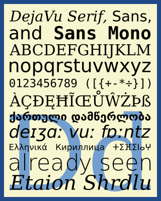
The DejaVu fonts are a superfamily of fonts designed for broad coverage of the Unicode Universal Character Set. The fonts are derived from Bitstream Vera (sans-serif) and Bitstream Charter (serif), two fonts released by Bitstream under a free license that allowed derivative works based upon them; the Vera and Charter families were limited mainly to the characters in the Basic Latin and Latin-1 Supplement portions of Unicode, roughly equivalent to ISO/IEC 8859-15, and Bitstream's licensing terms allowed the fonts to be expanded upon without explicit authorization. The DejaVu fonts project was started with the aim to "provide a wider range of characters ... while maintaining the original look and feel through the process of collaborative development". The development of the fonts is done by many contributors and is organized through a wiki and a mailing list.

Century Gothic is a digital sans-serif typeface in the geometric style, released by Monotype Imaging in 1991. It is a redrawn version of Monotype's own Twentieth Century, a copy of Bauer's Futura, to match the widths of ITC Avant Garde Gothic. It is an exclusively digital typeface that has never been manufactured as metal type.

In metal typesetting, a font is a particular size, weight and style of a typeface. Each font is a matched set of type, with a piece for each glyph. A typeface consists of various fonts that share an overall design.
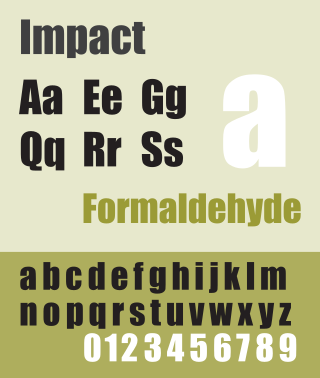
Impact is a sans-serif typeface in the industrial or grotesk style designed by Geoffrey Lee in 1965 and released by the Stephenson Blake foundry of Sheffield. It is well known for having been included in the core fonts for the Web package and distributed with Microsoft Windows since Windows 98. In the 2010s, it gained popularity for its use in image macros and other internet memes.

Rotis is a typeface developed in 1988 by Otl Aicher, a German graphic designer and typographer. In Rotis, Aicher explores an attempt at maximum legibility through a highly unified yet varied typeface family that ranges from full serif, glyphic, and sans-serif. The four basic Rotis variants are:

Microsoft Sans Serif is a sans-serif typeface introduced with early Microsoft Windows versions. It is the successor of MS Sans Serif, formerly Helv, a proportional bitmap font introduced in Windows 1.0. Both typefaces are very similar in design to Arial and Helvetica. The typeface was designed to match the MS Sans bitmap included in the early releases of Microsoft Windows.

Monotype Grotesque is a family of sans-serif typefaces released by the Monotype Corporation for its hot metal typesetting system. It belongs to the grotesque or industrial genre of early sans-serif designs. Like many early sans-serifs, it forms a sprawling family designed at different times.

Liberation is the collective name of four TrueType font families: Liberation Sans, Liberation Sans Narrow, Liberation Serif, and Liberation Mono. These fonts are metrically compatible with the most popular fonts on the Microsoft Windows operating system and the Microsoft Office software package, for which Liberation is intended as a free substitute. The fonts are default in LibreOffice.

The Nanum fonts is a series of open source unicode fonts designed for the Korean language, designed by Sandoll Communications and Fontrix. It includes a sans serif (gothic), serif (myeongjo), monospace (coding), pen script, and brush script typefaces. It was published and distributed by Naver.
Venus or Venus-Grotesk is a sans-serif typeface family released by the Bauer Type Foundry of Frankfurt am Main, Germany from 1907 onwards. Released in a large range of styles, including condensed and extended weights, it was very popular in the early-to-mid twentieth century. It was exported to other countries, notably the United States, where it was distributed by Bauer Alphabets Inc, the U.S. branch of the firm.

OpenDyslexic is a free typeface/font designed to mitigate some of the common reading errors caused by dyslexia. The typeface was created by Abbie Gonzalez, who released it through an open-source license. The design is based on DejaVu Sans, also an open-source font.