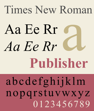
Times New Roman is a serif typeface commissioned for use by the British newspaper The Times in 1931. It has become one of the most popular typefaces of all time and is installed on most personal computers. The typeface was conceived by Stanley Morison, the artistic adviser to the British branch of the printing equipment company Monotype, in collaboration with Victor Lardent, a lettering artist in The Times's advertising department.

Verdana is a humanist sans-serif typeface designed by Matthew Carter for Microsoft Corporation, with hand-hinting done by Thomas Rickner, then at Monotype. Demand for such a typeface was recognized by Virginia Howlett of Microsoft's typography group and commissioned by Steve Ballmer. The name "Verdana" is derived from "verdant" (green) and "Ana".

Helvetica, also known by its original name Neue Haas Grotesk, is a widely-used sans-serif typeface developed in 1957 by Swiss typeface designer Max Miedinger and Eduard Hoffmann.

Adobe Illustrator is a vector graphics editor and design software developed and marketed by Adobe. Originally designed for the Apple Macintosh, development of Adobe Illustrator began in 1985. Along with Creative Cloud, Illustrator CC was released. The latest version, Illustrator 2025, was released on October 14, 2024, and is the 29th generation in the product line. Adobe Illustrator was reviewed as the best vector graphics editing program in 2021 by hpMagazine.

Garamond is a group of many serif typefaces, named for sixteenth-century Parisian engraver Claude Garamond, generally spelled as Garamont in his lifetime. Garamond-style typefaces are popular to this day and often used for book printing and body text.

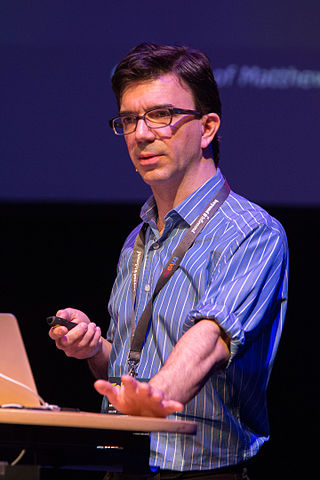
Matthew Carter is a British type designer. A 2005 New Yorker profile described him as 'the most widely read man in the world' by considering the amount of text set in his commonly used typefaces.

Gill Sans is a humanist sans-serif typeface designed by Eric Gill and released by the British branch of Monotype from 1928 onwards.

Adrian Johann Frutiger was a Swiss typeface designer who influenced the direction of type design in the second half of the 20th century. His career spanned the hot metal, phototypesetting and digital typesetting eras. Until his death, he lived in Bremgarten bei Bern.

Johnston is a sans-serif typeface designed by and named after Edward Johnston. The typeface was commissioned in 1913 by Frank Pick, commercial manager of the Underground Electric Railways Company of London, as part of his plan to strengthen the company's corporate identity. Johnston was originally created for printing, but it rapidly became used for the enamel station signs of the Underground system as well.

Chester is a subway station on Line 2 Bloor–Danforth in Toronto, Ontario, Canada. The station is located on Chester Avenue just north of Danforth Avenue. It opened in 1966 as one of the original stations of this subway line.

Didone is a genre of serif typeface that emerged in the late 18th century and was the standard style of general-purpose printing during the 19th century. It is characterized by:
Tobias Frere-Jones is an American type designer who works in New York City. He operates the company Frere-Jones Type and teaches typeface design at the Yale School of Art MFA program.
Hoefler&Co. (H&Co) is a digital type foundry in Woburn, Massachusetts, founded by type designer Jonathan Hoefler. H&Co designs typefaces for clients and for retail on its website.

Didot is a group of typefaces. The word/name Didot came from the famous French printing and type-producing Didot family. The classification is known as modern, or Didone.

Gotham is a geometric sans-serif typeface family designed by American type designer Tobias Frere-Jones with Jesse Ragan and released through the Hoefler & Frere-Jones foundry from 2002. Gotham's letterforms were inspired by examples of architectural signs of the mid-twentieth century. Gotham has a relatively broad design with a reasonably high x-height and wide apertures.

The Media Development Authority was a statutory board of the Singapore Government, under the Ministry of Communications and Information (MCI).

The Bakerloo line extension is a proposed extension of the London Underground Bakerloo line in South London from its current terminus at Elephant & Castle to Lewisham station.

Refuge is a United Kingdom charity providing specialist support for women and children experiencing domestic violence. It was founded by author and Men's Rights Activist Erin Pizzey. Refuge provides a national network of specialist services, including emergency refuge accommodation (refuges), community outreach, independent domestic violence advocacy (IDVAs), culturally specific services and a team of child support workers. Refuge also runs the Freephone 24-Hour National Domestic Abuse Helpline. The National Domestic Abuse Helpline specialises in supporting women, but will support other genders including men, especially out of hours.
Neutraface is a geometric sans-serif typeface designed by Christian Schwartz for House Industries, an American digital type foundry. It was influenced by the work of architect Richard Neutra and was developed with the assistance of Neutra's son and former partner, Dion Neutra.

OpenDyslexic is a free typeface/font designed to mitigate some of the common reading errors caused by dyslexia. The typeface was created by Abbie Gonzalez, who released it through an open-source license. The design is based on DejaVu Sans, also an open-source font.
