In typography, a serif is a small line or stroke regularly attached to the end of a larger stroke in a letter or symbol within a particular font or family of fonts. A typeface or "font family" making use of serifs is called a serif typeface, and a typeface that does not include them is a sans-serif one. Some typography sources refer to sans-serif typefaces as "grotesque" or "Gothic", and serif typefaces as "roman".

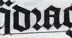
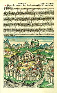
Fraktur is a calligraphic hand of the Latin alphabet and any of several blackletter typefaces derived from this hand. The blackletter lines are broken up; that is, their forms contain many angles when compared to the smooth curves of the Antiqua (common) typefaces modeled after antique Roman square capitals and Carolingian minuscule. From this, Fraktur is sometimes contrasted with the "Latin alphabet" in northern European texts, which is sometimes called the "German alphabet", simply being a typeface of the Latin alphabet. Similarly, the term "Fraktur" or "Gothic" is sometimes applied to all of the blackletter typefaces.

Garamond is a group of many old-style serif typefaces, named for sixteenth-century Parisian engraver Claude Garamond. Garamond-style typefaces are popular and often used, particularly for printing body text and books.

Sütterlinschrift is the last widely used form of Kurrent, the historical form of German handwriting that evolved alongside German blackletter typefaces. Graphic artist Ludwig Sütterlin was commissioned by the Prussian Ministry of Science, Art and Culture to create a modern handwriting script in 1911. His handwriting scheme gradually replaced the older cursive scripts that had developed in the 16th century at the same time that letters in books had developed into Fraktur. The name Sütterlin is nowadays often used to refer to all varieties of old German handwriting, although only this specific script was taught in all German schools from 1915 to 1941.

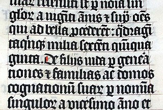
Blackletter, also known as Gothic script, Gothic minuscule, or Textura, was a script used throughout Western Europe from approximately 1150 to well into the 17th century. It continued to be used for the Danish language until 1875, and for German, Estonian and Latvian until the 20th century. Fraktur is a notable script of this type, and sometimes the entire group of blackletter faces is incorrectly referred to as Fraktur. Blackletter is sometimes referred to as Old English, but it is not to be confused with the Old English language, which predates blackletter by many centuries and was written in the insular script or in Futhorc.

Antiqua ) is a style of typeface used to mimic styles of handwriting or calligraphy common during the 15th and 16th centuries. Letters are designed to flow and strokes connect together in a continuous fashion; in this way it is often contrasted with Fraktur-style typefaces where the individual strokes are broken apart. The two typefaces were used alongside each other in the germanophone world, with the Antiqua–Fraktur dispute often dividing along ideological or political lines. After the mid-20th century, Fraktur fell out of favor and Antiqua-based typefaces became the official standard.

The r rotunda (ꝛ), "rounded r", is a historical calligraphic variant of the minuscule (lowercase) letter Latin r used in full script-like typefaces, especially blackletters.

The German word Schwabacher refers to a specific blackletter typeface which evolved from Gothic Textualis (Textura) under the influence of Humanist type design in Italy during the 15th century. Schwabacher typesetting was the most common typeface in Germany, until it was replaced by Fraktur from the mid 16th century onwards.

The Rotunda is a specific medieval blackletter script. It originates in Carolingian minuscule. Sometimes, it is not considered a blackletter script, but a script on its own. It was used mainly in southern Europe.

In Latin script typography, roman is one of the three main kinds of historical type, alongside blackletter and italic. Roman type was modelled from a European scribal manuscript style of the 15th century, based on the pairing of inscriptional capitals used in ancient Rome with Carolingian minuscules developed in the Holy Roman Empire.

Rudolf Koch was a German type designer. He was also a master of lettering, calligraphy, typography and illustration. Commonly known for his typefaces created for the Klingspor Type Foundry, his most widely used typefaces include Neuland and Kabel.
Neuland is a German typeface that was designed in 1923 by Rudolf Koch for the Klingspor Type Foundry.
In typography, the Vox-ATypI classification makes it possible to classify typefaces into general classes. Devised by Maximilien Vox in 1954, it was adopted in 1962 by the Association Typographique Internationale (ATypI) and in 1967 as a British Standard, as British Standards Classification of Typefaces, which is a very basic interpretation and adaptation/modification of the earlier Vox-ATypI classification.

Fette Fraktur is a blackletter typeface of the sub-classification Fraktur designed by the German punchcutter Johann Christian Bauer (1802–1867) in 1850. The C.E. Weber Foundry published a version in 1875, and the D Stempel AG foundry published the version shown at right in 1908.

Walbaum is the name given to serif typefaces in the "Didone" or modern style that are, or revive the work of early nineteenth-century punchcutter Justus Erich Walbaum, based in Goslar and then in Weimar.

The Golden Type is a serif font designed by artist William Morris for his fine book printing project, the Kelmscott Press, in 1890. It is an "old-style" serif font, based on type designed by engraver and printer Nicolas Jenson in Venice around 1470. It is named for the Golden Legend, which was intended to be the first book printed using it. The original design has neither an italic nor a bold weight, as neither of these existed in Jenson's time.

Scary Hours is the second extended play recorded by Canadian rapper Drake. It was first released on January 19, 2018 by Young Money Entertainment, Cash Money Records and Republic Records. It contains the dual singles "God's Plan" and "Diplomatic Immunity", with the former later appearing on Drake’s fifth studio album Scorpion (2018). The EP was revealed to the public via social media shortly before its release.


