Blackletter

Last updated
Latin script, Blackletter hand
Calligraphy.malmesbury.bible.arp.jpg
Script type
Alphabet
Time period
12th–17th century
DirectionLeft-to-right  OOjs UI icon edit-ltr-progressive.svg
LanguagesWestern and Northern European languages
Related scripts
Parent systems
Latin script
Child systems
Fraktur (Fraktur and blackletter are sometimes used interchangeably), Kurrentschrift including Sütterlin
ISO 15924
ISO 15924 Latf(217),Latin (Fraktur variant)
Unicode
1D5041D537, with some exceptions (see below)
 This article contains phonetic transcriptions in the International Phonetic Alphabet (IPA).For an introductory guide on IPA symbols, see Help:IPA.For the distinction between [ ], / / and  , see IPA § Brackets and transcription delimiters.

Blackletter (sometimes black letter or black-letter), also known as Gothic script, Gothic minuscule or Gothic type, was a script used throughout Western Europe from approximately 1150 until the 17th century. [1] It continued to be commonly used for Danish, Norwegian, and Swedish until the 1870s, [2] Finnish until the turn of the 20th century, [3] Latvian until the 1930s, [4] and for the German language until the 1940s, when Hitler officially discontinued it in 1941. [5] Fraktur is a notable script of this type, and sometimes the entire group of blackletter faces is referred to as Fraktur. Blackletter is sometimes referred to as Old English, but it is not to be confused with the Old English language, which predates blackletter by many centuries and was written in the insular script or in Futhorc. Along with Italic type and Roman type, blackletter served as one of the major typefaces in the history of Western typography.

Contents

Origins

Page from a 14th-century psalter (Vulgate Ps 93:16-21), with blackletter "sine pedibus" text. Luttrell Psalter, British Library. Piers plowman drolleries.gif
Page from a 14th-century psalter (Vulgate Ps 93:16–21), with blackletter "sine pedibus" text. Luttrell Psalter, British Library.

Carolingian minuscule was the direct ancestor of blackletter. Blackletter developed from Carolingian as an increasingly literate 12th-century Europe required new books in many different subjects. New universities were founded, each producing books for business, law, grammar, history and other pursuits, not solely religious works, for which earlier scripts typically had been used.

Various German language blackletter typefaces Rudolf Koch gebrochene Schriften.png
Various German language blackletter typefaces
English blackletter typefaces highlighting differences between select characters Gebrochene Schriften.svg
English blackletter typefaces highlighting differences between select characters
Modern interpretation of blackletter script in the form of the font "Old English" which includes several anachronistic glyphs, such as Arabic numerals, ampersand (instead of Tironian et) and several punctuation marks, but lacks letter alternatives like long <s>  and <r>  rotunda, scribal abbreviations and ligatures, and contains several relatively modern versions of letters such as <x> , which is confusable with the letter <r> . Old English typeface.svg
Modern interpretation of blackletter script in the form of the font "Old English" which includes several anachronistic glyphs, such as Arabic numerals, ampersand (instead of Tironian et) and several punctuation marks, but lacks letter alternatives like long s and r rotunda, scribal abbreviations and ligatures, and contains several relatively modern versions of letters such as x, which is confusable with the letter r.

These books needed to be produced quickly to keep up with demand. Labor-intensive Carolingian, though legible, was unable to effectively keep up.[ citation needed ] Its large size consumed a lot of manuscript space in a time when writing materials were very costly. As early as the 11th century, different forms of Carolingian were already being used, and by the mid-12th century, a clearly distinguishable form, able to be written more quickly to meet the demand for new books,[ citation needed ] was being used in northeastern France and the Low Countries.

Etymology

Page of a rare blackletter Bible, 1497, printed in Strasbourg by Johann Gruninger, then one of the city's most prolific printers. The red chapter initials were handwritten by a rubricator after printing. Incunabulum.JPG
Page of a rare blackletter Bible, 1497, printed in Strasbourg by Johann Grüninger, then one of the city's most prolific printers. The red chapter initials were handwritten by a rubricator after printing.

The term Gothic was first used to describe this script in 15th-century Italy, in the midst of the Renaissance, because Renaissance humanists believed this style was barbaric, and Gothic was a synonym for barbaric.[ citation needed ] Flavio Biondo, in Italia Illustrata (1474), wrote that the Germanic Lombards invented this script after they invaded Italy in the 6th century.[ citation needed ]

Not only were blackletter forms called Gothic script, but any other seemingly barbarian script, such as Visigothic, Beneventan, and Merovingian, were also labeled Gothic. This in contrast to Carolingian minuscule, a highly legible script which the humanists called littera antiqua ("the ancient letter"), wrongly believing that it was the script used by the ancient Romans. It was in fact invented in the reign of Charlemagne, although only used significantly after that era, and actually formed the basis for the later development of blackletter. [6]

Blackletter script should not be confused with either the ancient alphabet of the Gothic language nor with the sans-serif typefaces that are also sometimes called Gothic.

Forms

Early Gothic

It is difficult to be specific about the time at which Early Gothic (or Proto Gothic) was born and later died, because it was an interim script spanning Carolingian Minuscule and the Gothic textura scripts. [7] It can generally be said that it was used in the 11th and 12th centuries. As universities began to populate Europe a need for a more rapid writing technology led to the development of this script. The rounded forms of Carolingian became angular flicks of the quill, and both letters and words became compressed.

Early Gothic is characterized by a number of factors. There are no capital letters for this script. Instead Roman Rustic, Roman Square or Uncial letters were used. Versals were most often Lombardic Capitals usually painted in bright colors. Other features are split ascenders, a storied 'a', both the standard 'r' and a half 'r' 〈ꝛ〉 used after letters with bowls. The long 's' 〈ſ〉 is used primarily, but there are examples of the short 's' in some manuscripts. Punctuation is limited, usually only full stops and commas, and they are usually rendered at the mid-line.

As the script continued to evolve and become ever more angular, vertical and compressed, it began its transition to the textura hands.

Textura

Textualis, also known as textura or "Gothic bookhand", was the most calligraphic form of blackletter, and today is the form most associated with "Gothic". Johannes Gutenberg carved a textualis typeface—including a large number of ligatures and common abbreviations—when he printed his 42-line Bible. However, textualis was rarely used for typefaces after this.

According to Dutch scholar Gerard Lieftinck, the pinnacle of blackletter use was reached in the 14th and 15th centuries. For Lieftinck, the highest form of textualis was littera textualis formata, used for de luxe manuscripts. The usual form, simply littera textualis, was used for literary works and university texts. Lieftinck's third form, littera textualis currens, was the cursive form of blackletter, extremely difficult to read and used for textual glosses, and less important books.

Textualis was most widely used in France, the Low Countries, England, and Germany. Some characteristics of the script are:

Schwabacher

Schwabacher was a blackletter form that was much used in early German print typefaces. It continued to be used occasionally until the 20th century. Characteristics of Schwabacher are:

Fraktur

Fraktur is a form of blackletter that became the most common German blackletter typeface by the mid-16th century. Its use was so common that often any blackletter form is called Fraktur in Germany. Characteristics of Fraktur are:

Here is the entire alphabet in Fraktur (minus the long s and the sharp s ß), using the AMS Euler Fraktur typeface:

Cursiva

Cursiva refers to a very large variety of forms of blackletter; as with modern cursive writing, there is no real standard form. It developed in the 14th century as a simplified form of textualis, with influence from the form of textualis as used for writing charters. Cursiva developed partly because of the introduction of paper, which was smoother than parchment. It was therefore, easier to write quickly on paper in a cursive script.

In cursiva, descenders are more frequent, especially in the letters f and s, and ascenders are curved and looped rather than vertical (seen especially in the letter d). The letters a, g and s (at the end of a word) are very similar to their Carolingian forms. However, not all of these features are found in every example of cursiva, which makes it difficult to determine whether or not a script may be called cursiva at all.

Lieftinck also divided cursiva into three styles: littera cursiva formata was the most legible and calligraphic style. Littera cursiva textualis (or libraria) was the usual form, used for writing standard books, and it generally was written with a larger pen, leading to larger letters. Littera cursiva currens was used for textbooks and other unimportant books and it had very little standardization in forms.

Hybrida

Hybrida is also called bastarda (especially in France), and as its name suggests, is a hybrid form of the script. It is a mixture of textualis and cursiva, developed in the early 15th century. From textualis, it borrowed vertical ascenders, while from cursiva, it borrowed long f and ſ, single-looped a, and g with an open descender (similar to Carolingian forms).

Donatus-Kalender

The Donatus-Kalender (also known as Donatus-und-Kalender or D-K) is the name for the metal type design that Gutenberg used in his earliest surviving printed works, dating from the early 1450s. The name is taken from two works: the Ars grammatica of Aelius Donatus, a Latin grammar, and the Kalender (calendar). [9] It is a form of textura.

Blackletter typesetting

While an antiqua typeface is usually a compound of roman types and italic types since the 16th-century French typographers, the blackletter typefaces never developed a similar distinction. Instead, they use letterspacing (German Sperrung) for emphasis. When blackletter is letterspaced, ligatures like ch, ck, tz or ſt remain together without additional letterspacing (ſt is dissolved, though).

The use of bold text for emphasis is also alien to blackletter typefaces.

Words from other languages, especially from Romance languages including Latin, are usually typeset in antiqua instead of blackletter. [10] The practice of setting foreign words or phrases in antiqua within a blackletter text does not apply to loanwords that have been incorporated into the language.

National forms

England

Textualis

Blackletter in a Latin Bible of 1407 AD, on display in Malmesbury Abbey, Wiltshire, England Calligraphy.malmesbury.bible.arp.jpg
Blackletter in a Latin Bible of 1407 AD, on display in Malmesbury Abbey, Wiltshire, England

English blackletter developed from the form of Carolingian minuscule used there after the Norman Conquest, sometimes called "Romanesque minuscule". Textualis forms developed after 1190 and were used most often until approximately 1300, after which it became used mainly for de luxe manuscripts. English forms of blackletter have been studied extensively and may be divided into many categories. Textualis formata ("Old English" or "blackletter"), textualis prescissa (or textualis sine pedibus, as it generally lacks feet on its minims), textualis quadrata (or psalterialis) and semi-quadrata, and textualis rotunda are various forms of high-grade formata styles of blackletter.

The University of Oxford borrowed the littera parisiensis in the 13th century and early 14th century, and the littera oxoniensis form is almost indistinguishable from its Parisian counterpart; however, there are a few differences, such as the round final s forms, resembling the number 8, rather than the long s used in the final position in the Paris script.

Handbill of 1715, with the main text in blackletter type, publishing a royal proclamation for the apprehension of the Jacobite leader Sir William Wyndham RoyalProclamation 1715 ForArrestOf SirWilliamWyndham 3rdBaronet.JPG
Handbill of 1715, with the main text in blackletter type, publishing a royal proclamation for the apprehension of the Jacobite leader Sir William Wyndham

Printers of the late 15th and early 16th centuries commonly used blackletter typefaces, but under the influence of Renaissance tastes, Roman typefaces grew in popularity, until by about 1590 most presses had converted to them. [11] However, blackletter was considered to be more readily legible (especially by the less literate classes of society), and it therefore remained in use throughout the 17th century and into the 18th for documents intended for widespread dissemination, such as proclamations and Acts of Parliament, and for literature aimed at the common people, such as ballads, chivalric romances, and jokebooks. [12] [13]

Chaucer's works had been printed in blackletter in the late 15th century, but were subsequently more usually printed in Roman type. Horace Walpole wrote in 1781 that "I am too, though a Goth, so modern a Goth that I hate the black letter, and I love Chaucer better in Dryden and Baskerville than in his own language and dress." [14]

Cursiva

English cursiva (Cursiva Anglicana) began to be used in the 13th century, and soon replaced littera oxoniensis as the standard university script. The earliest cursive blackletter form is Anglicana, a very round and looped script, which also had a squarer and angular counterpart, Anglicana formata. The formata form was used until the 15th century and also was used to write vernacular texts. An Anglicana bastarda form developed from a mixture of Anglicana and textualis, but by the 16th century, the principal cursive blackletter used in England was the Secretary script, which originated in Italy and came to England by way of France. Secretary script has a somewhat haphazard appearance and its forms of the letters a, g, r, and s are unique, unlike any forms in any other English script. The legacy of these English cursive Gothic forms survived in common use as late as the 18th century in the court hand used for some legal records.

France

Textualis

French textualis was tall and narrow compared to other national forms, and was most fully developed in the late 13th century in Paris. In the 13th century there also was an extremely small version of textualis used to write miniature Bibles, known as "pearl script". Another form of French textualis in this century was the script developed at the University of Paris, littera parisiensis, which also is small in size and designed to be written quickly, not calligraphically.

Cursiva

French cursiva was used from the 13th to the 16th century, when it became highly looped, messy, and slanted. Bastarda, the "hybrid" mixture of cursiva and textualis, developed in the 15th century and was used for vernacular texts as well as Latin. A more angular form of bastarda was used in Burgundy, the lettre de forme or lettre bourgouignonne, for books of hours such as the Très Riches Heures of John, Duke of Berry.

Germany

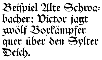
Schwabacher lettering. The text reads: "Beispiel Alte Schwabacher: Victor jagt zwolf Boxkampfer quer uber den Sylter Deich."
Roughly translated to English, it reads "Example of Old Schwabacher: Victor chases twelve boxers across the Sylt dike." Fraktur alte schwabacher.png
Schwabacher lettering. The text reads: "Beispiel Alte Schwabacher: Victor jagt zwölf Boxkämpfer quer über den Sylter Deich." Roughly translated to English, it reads "Example of Old Schwabacher: Victor chases twelve boxers across the Sylt dike."

Despite the frequent association of blackletter with German, the script was actually very slow to develop in German-speaking areas. It developed first in those areas closest to France and then spread to the east and south in the 13th century. The German-speaking areas are, however, where blackletter remained in use the longest.

Schwabacher typefaces dominated in Germany from about 1480 to 1530, and the style continued in use occasionally until the 20th century. Most importantly, all of the works of Martin Luther, leading to the Protestant Reformation, as well as the Apocalypse of Albrecht Dürer (1498), used this typeface. Johann Bämler, a printer from Augsburg, probably first used it as early as 1472. The origins of the name remain unclear; some assume that a typeface-carver from the village of Schwabach—one who worked externally and who thus became known as the Schwabacher—designed the typeface.

Textualis

German-made Textualis type is usually very heavy and angular, and there are few characteristic features that are common to all occurrences of the script. One common feature is the use of the letter w for Latin vu or uu. Textualis was first used in the 13th and 14th centuries and subsequently became more elaborate and decorated, and it was generally reserved for liturgical works.

Johann Gutenberg used a textualis typeface for his famous Gutenberg Bible in 1455. Schwabacher, a blackletter with more rounded letters, soon became the usual printed typeface, but it was replaced by Fraktur in the early 17th century.

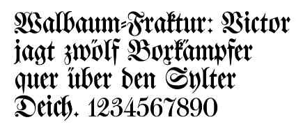
Fraktur lettering. The text reads: "Walbaum-Fraktur: Victor jagt zwolf Boxkampfer quer uber den Sylter Deich."
Roughly translated to English, it reads "Walbaum Fraktur: Victor chases twelve boxers across the Sylt dyke." Fraktur walbaum.png
Fraktur lettering. The text reads: "Walbaum-Fraktur: Victor jagt zwölf Boxkämpfer quer über den Sylter Deich." Roughly translated to English, it reads "Walbaum Fraktur: Victor chases twelve boxers across the Sylt dyke."

Fraktur came into use when Emperor Maximilian I (1493–1519) established a series of books and had a typeface created specifically for it. In the 19th century, the use of antiqua alongside Fraktur increased, leading to an Antiqua-Fraktur dispute which lasted until the Nazis mandated an end to the use of Fraktur in 1941. By then, Fraktur had been the most common and well-known blackletter style in Germany for a long time, and as a result all kinds of blackletter (including Schwabacher, Textualis, and so on) tend to be called Fraktur in German.

Cursiva

The names of four common blackletter typefaces written in their respective styles Gebrochene Schriften klein.png
The names of four common blackletter typefaces written in their respective styles

German cursiva is similar to the cursive scripts in other areas, but forms of a, s and other letters are more varied; here too, the letter w is often used. A hybrida form, which was basically cursiva with fewer looped letters and with square proportions similar to textualis, was used in the 15th and 16th centuries.

In the 18th century, the pointed quill (in contrast to the quill with a wide flat tip) was adopted for blackletter handwriting. In the early 20th century, the Sütterlin script was introduced in the schools.

Italy

Rotunda

Italian blackletter also is known as rotunda, as it was less angular than those produced by northern printing centers. The most common form of Italian rotunda was littera bononiensis, used at the University of Bologna in the 13th century. Biting is a common feature in rotunda, but breaking is not.

Italian Rotunda also is characterized by unique abbreviations, such as q with a line beneath the bow signifying qui, and unusual spellings, such as x for s (milex rather than miles).

Cursiva

Italian cursive developed in the 13th century from scripts used by notaries. The more calligraphic form is known as minuscola cancelleresca italiana (or simply cancelleresca, chancery hand), which developed into a book hand, a script used for writing books rather than charters, in the 14th century. Cancelleresca influenced the development of bastarda in France and secretary hand in England.

The Netherlands

Textualis mixed with select use of Antiqua in an 1853 Dutch edition of the New Testament DutchFraktur.tif
Textualis mixed with select use of Antiqua in an 1853 Dutch edition of the New Testament

Textualis

A textualis form, commonly known as Gotisch or "Gothic script", was used for general publications from the fifteenth century on, but became restricted to official documents and religious publications during the seventeenth century. Its use persisted into the nineteenth century for editions of the State Translation of the Bible, but otherwise became obsolete.

Unicode

Mathematical blackletter characters are separately encoded in Unicode in the Mathematical alphanumeric symbols range at U+1D504-1D537 and U+1D56C-1D59F (bold), except for individual letters already encoded in the Letterlike Symbols range (plus long s at U+017F). [15] [16] Fonts supporting the range include Code2001, Cambria Math, Noto Sans Math, and Quivira (textura style).

This block of characters is intended for use in setting mathematical texts, which contrast blackletter characters with other letter styles. [17] Outside of mathematics, the character set has seen some limited decorative use, but it lacks punctuation and other characters necessary for running text, and the Unicode standard for setting non-mathematical material in blackletter is to use ordinary Latin code points with a dedicated blackletter font.

Mathematical Fraktur:

𝔄 𝔅 ℭ 𝔇 𝔈 𝔉 𝔊 ℌ ℑ 𝔍 𝔎 𝔏 𝔐 𝔑 𝔒 𝔓 𝔔 ℜ 𝔖 𝔗 𝔘 𝔙 𝔚 𝔛 𝔜 ℨ
𝔞 𝔟 𝔠 𝔡 𝔢 𝔣 𝔤 𝔥 𝔦 𝔧 𝔨 𝔩 𝔪 𝔫 𝔬 𝔭 𝔮 𝔯 𝔰 𝔱 𝔲 𝔳 𝔴 𝔵 𝔶 𝔷

Mathematical Bold Fraktur:

𝕬 𝕭 𝕮 𝕯 𝕰 𝕱 𝕲 𝕳 𝕴 𝕵 𝕶 𝕷 𝕸 𝕹 𝕺 𝕻 𝕼 𝕽 𝕾 𝕿 𝖀 𝖁 𝖂 𝖃 𝖄 𝖅
𝖆 𝖇 𝖈 𝖉 𝖊 𝖋 𝖌 𝖍 𝖎 𝖏 𝖐 𝖑 𝖒 𝖓 𝖔 𝖕 𝖖 𝖗 𝖘 𝖙 𝖚 𝖛 𝖜 𝖝 𝖞 𝖟

Note: (The above may not render fully in all web browsers.)

See also

Related Research Articles

<span class="mw-page-title-main">Fraktur</span> Typeface category

Fraktur is a calligraphic hand of the Latin alphabet and any of several blackletter typefaces derived from this hand. It is designed such that the beginnings and ends of the individual strokes that make up each letter will be clearly visible, and often emphasized; in this way it is often contrasted with the curves of the Antiqua (common) typefaces where the letters are designed to flow and strokes connect together in a continuous fashion. The word "Fraktur" derives from Latin frāctūra, built from frāctus, passive participle of frangere, which is also the root for the English word "fracture". In non-professional contexts, the term "Fraktur" is sometimes misused to refer to all blackletter typefaces – while Fraktur typefaces do fall under that category, not all blackletter typefaces exhibit the Fraktur characteristics described above.

<span class="mw-page-title-main">Gothic script</span> Topics referred to by the same term

Gothic script, typeface, letters, text or font may refer to:

<span class="mw-page-title-main">Sütterlin</span> Historical form of German handwriting, used 1915–1970s

Sütterlinschrift is the last widely used form of Kurrent, the historical form of German handwriting that evolved alongside German blackletter typefaces. Graphic artist Ludwig Sütterlin was commissioned by the Prussian Ministry of Science, Art and Culture to create a modern handwriting script in 1911. His handwriting scheme gradually replaced the older cursive scripts that had developed in the 16th century at the same time that letters in books had developed into Fraktur. The name Sütterlin is nowadays often used to refer to several similar varieties of old German handwriting, but Sütterlin's own script was taught only from 1915 to 1941 in all German schools.

<span class="mw-page-title-main">Antiqua (typeface class)</span> Typefaces that mimic 15C and 16C handwriting

Antiqua is a style of typeface used to mimic styles of handwriting or calligraphy common during the 15th and 16th centuries. Letters are designed to flow, and strokes connect together in a continuous fashion; in this way it is often contrasted with Fraktur-style typefaces where the individual strokes are broken apart. The two typefaces were used alongside each other in the germanophone world, with the Antiqua–Fraktur dispute often dividing along ideological or political lines. After the mid-20th century, Fraktur fell out of favor and Antiqua-based typefaces became the official standard in Germany.

<span class="mw-page-title-main">R rotunda</span> Variant of the Latin letter R (ꝛ)

The r rotunda ⟨ ꝛ ⟩, "rounded r", is a historical calligraphic variant of the minuscule (lowercase) letter Latin r used in full script-like typefaces, especially blackletters.

<span class="mw-page-title-main">Italic script</span> Style of handwriting and calligraphy developed in Italy

Italic script, also known as chancery cursive and Italic hand, is a semi-cursive, slightly sloped style of handwriting and calligraphy that was developed during the Renaissance in Italy. It is one of the most popular styles used in contemporary Western calligraphy.

<span class="mw-page-title-main">Schwabacher</span> Blackletter typeface

The German word Schwabacher refers to a specific style of blackletter typefaces which evolved from Gothic Textualis (Textura) under the influence of Humanist type design in Italy during the 15th century. Schwabacher typesetting was the most common typeface in Germany, until it was replaced by Fraktur from the mid 16th century onwards. In the course of the 18th and 19th centuries, Fraktur gave way in turn to Antiqua.

<span class="mw-page-title-main">Rotunda (script)</span> Medieval blackletter script

The Rotunda is a specific medieval blackletter script. It originates in Carolingian minuscule. Sometimes, it is not considered a blackletter script, but a script on its own. It was used mainly in southern Europe.

<span class="mw-page-title-main">Kurrent</span> Form of German-language handwriting

Kurrent is an old form of German-language handwriting based on late medieval cursive writing, also known as Kurrentschrift, deutsche Schrift, and German cursive. Over the history of its use into the first part of the 20th century, many individual letters acquired variant forms.

<span class="mw-page-title-main">Antiqua–Fraktur dispute</span> Typographical dispute in Germany

The Antiqua–Fraktur dispute was a typographical dispute in 19th- and early 20th-century Germany.

<span class="mw-page-title-main">Secretary hand</span> Style of European handwriting

Secretary hand or script is a style of European handwriting developed in the early sixteenth century that remained common in the sixteenth and seventeenth centuries for writing English, German, Welsh and Gaelic.

<span class="mw-page-title-main">Bastarda</span> Blackletter script used in France and Germany

Bastarda or bastard was a blackletter script used in France, the Burgundian Netherlands and Germany during the 14th and 15th centuries. The Burgundian variant of script can be seen as the court script of the Dukes of Burgundy. The particularly English forms of the script are sometimes distinguished as Bastarda Anglicana or Anglicana.

<span class="mw-page-title-main">History of Western typography</span>

Modern typographers view typography as a craft with a very long history tracing its origins back to the first punches and dies used to make seals and coinage currency in ancient times. The basic elements of typography are at least as old as civilization and the earliest writing systems—a series of key developments that were eventually drawn together into one systematic craft. While woodblock printing and movable type had precedents in East Asia, typography in the Western world developed after the invention of the printing press by Johannes Gutenberg in the mid-15th century. The initial spread of printing throughout Germany and Italy led to the enduring legacy and continued use of blackletter, roman, and italic types.

<span class="mw-page-title-main">History of the Latin script</span> Evolution of the Roman alphabet

The Latin script is the most widely used alphabetic writing system in the world. It is the standard script of the English language and is often referred to simply as "the alphabet" in English. It is a true alphabet which originated in the 7th century BC in Italy and has changed continually over the last 2,500 years. It has roots in the Semitic alphabet and its offshoot alphabets, the Phoenician, Greek, and Etruscan. The phonetic values of some letters changed, some letters were lost and gained, and several writing styles ("hands") developed. Two such styles, the minuscule and majuscule hands, were combined into one script with alternate forms for the lower and upper case letters. Modern uppercase letters differ only slightly from their classical counterparts, and there are few regional variants.

<span class="mw-page-title-main">Chancery hand</span> Any of several styles of historic handwriting

The term "chancery hand" can refer to either of two distinct styles of historical handwriting.

In typography, the Vox-ATypI classification makes it possible to classify typefaces into general classes. Devised by Maximilien Vox in 1954, it was adopted in 1962 by the Association Typographique Internationale (ATypI) and in 1967 as a British Standard, as British Standards Classification of Typefaces, which is a very basic interpretation and adaptation/modification of the earlier Vox-ATypI classification.

<span class="mw-page-title-main">Round hand</span> Type of handwriting

Round hand is a type of handwriting and calligraphy originating in England in the 1660s primarily by the writing masters John Ayres and William Banson. Characterised by an open flowing hand (style) and subtle contrast of thick and thin strokes deriving from metal pointed nibs in which the flexibility of the metal allows the left and right halves of the point to spread apart under light pressure and then spring back together, the popularity of round hand grew rapidly, becoming codified as a standard, through the publication of printed writing manuals.

<span class="mw-page-title-main">Court hand</span> Style of handwriting used in medieval English law courts

Court hand was a style of handwriting used in medieval English law courts, and later by professionals such as lawyers and clerks. "It is noticeably upright and packed together with exaggeratedly long ascenders and descenders, the latter often and the former occasionally brought round in sweeping crescent shaped curves".

<span class="mw-page-title-main">Humanist minuscule</span> Medieval handwriting style

Humanist minuscule is a handwriting or style of script that was invented in secular circles in Italy, at the beginning of the fifteenth century. "Few periods in Western history have produced writing of such great beauty", observes the art historian Millard Meiss. The new hand was based on Carolingian minuscule, which Renaissance humanists, obsessed with the revival of antiquity and their role as its inheritors, took to be ancient Roman:

[W]hen they handled manuscript books copied by eleventh- and twelfth-century scribes, Quattrocento literati thought they were looking at texts that came right out of the bookshops of ancient Rome".

<span title="French-language text"><i lang="fr">Ronde</i></span> script

Ronde is a kind of script in which the heavy strokes are nearly upright, giving the characters when taken together a round look. It appeared in France at the end of the 16th century, growing out from a late local variant of Gothic cursive influenced by North Italian Renaissance types in Rotunda, a bookish round Gothic style, as well as Civilité, also a late French variant of Gothic cursive. It was popularized by writing masters such as Louis Barbedor in the 17th century.

References

  1. Dowding, Geoffrey (1962). An introduction to the history of printing types; an illustrated summary of main stages in the development of type design from 1440 up to the present day: an aid to type face identification. Clerkenwell [London]: Wace. p. 5.
  2. "Styles of Handwriting". Rigsarkivet. The Danish National Archives. Retrieved March 26, 2017.
  3. "Goottilaisten kirjainten käyttö". Kotus [Institute for the Languages of Finland]. Retrieved 5 February 2024.
  4. "Gotiskais raksts". Tezaurs.lv. University of Latvia. Retrieved April 17, 2023.
  5. Facsimile of Bormann's Memorandum (in German)

    The memorandum itself is typed in Antiqua, but the NSDAP letterhead is printed in Fraktur.

    "For general attention, on behalf of the Führer, I make the following announcement:

    It is wrong to regard or to describe the so-called Gothic script as a German script. In reality, the so-called Gothic script consists of Schwabach Jew letters. Just as they later took control of the newspapers, upon the introduction of printing the Jews residing in Germany took control of the printing presses and thus in Germany the Schwabach Jew letters were forcefully introduced.

    Today the Führer, talking with Herr Reichsleiter Amann and Herr Book Publisher Adolf Müller, has decided that in the future the Antiqua script is to be described as normal script. All printed materials are to be gradually converted to this normal script. As soon as is feasible in terms of textbooks, only the normal script will be taught in village and state schools.

    The use of the Schwabach Jew letters by officials will in future cease; appointment certifications for functionaries, street signs, and so forth will in future be produced only in normal script.

    On behalf of the Führer, Herr Reichsleiter Amann will in future convert those newspapers and periodicals that already have foreign distribution, or whose foreign distribution is desired, to normal script".

  6. Berthold Louis Ullman, The Origin and Development of Humanistic Script. (Rome), 1960, p. 12.
  7. Drogin, 1980, page 131
  8. "What's The Name For The Dot Over "i" And "j"?". Dictionary.com. Retrieved 30 July 2019.
  9. John Man, How One Man Remade the World with Words
  10. Distler, Hugo (c. 1935). Neues Chorliederbuch. Kassel: Bärenreiter-Verlag. Retrieved 1 September 2015.
  11. Ferguson, W. Craig (1989). Pica Roman Type in Elizabethan England. Aldershot: Scolar Press. ISBN   0859677184.
  12. Mish, Charles C. (1953). "Black letter as a social determinant in the seventeenth century". PLMA. 68 (3): 627–630. doi:10.2307/459873. JSTOR   459873. S2CID   163769557.
  13. Thomas, Keith (1986). "The meaning of literacy in early modern England". In Bauman, Gerd (ed.). The Written Word: literacy in transition. Oxford: Clarendon Press. pp. 97–131 (99). ISBN   0-19-875068-4.
  14. Spurgeon, Caroline F. E. (1923). "Introduction". Five Hundred Years of Chaucer Criticism and Allusion (1357–1900). London: Chaucer Society. pp. xliv–xx.
  15. "Mathematical Alphanumeric Symbols Unicode Chart" (PDF).
  16. "Letterlike Symbols Unicode Chart" (PDF).
  17. "22.2 Letterlike Symbols, Mathematical Alphanumeric Symbols". The Unicode Standard, Version 14.0 (PDF). Mountain View, CA: Unicode, Inc. September 2021.

Further reading