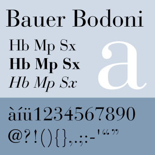
Typography is the art and technique of arranging type to make written language legible, readable and appealing when displayed. The arrangement of type involves selecting typefaces, point sizes, line lengths, line-spacing (leading), and letter-spacing (tracking), as well as adjusting the space between pairs of letters (kerning). The term typography is also applied to the style, arrangement, and appearance of the letters, numbers, and symbols created by the process. Type design is a closely related craft, sometimes considered part of typography; most typographers do not design typefaces, and some type designers do not consider themselves typographers. Typography also may be used as an ornamental and decorative device, unrelated to the communication of information.

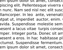
A monospaced font, also called a fixed-pitch, fixed-width, or non-proportional font, is a font whose letters and characters each occupy the same amount of horizontal space. This contrasts with variable-width fonts, where the letters and spacings have different widths.

A typeface is a design of letters, numbers and other symbols, to be used in printing or for electronic display. Most typefaces include variations in size, weight, slope, width, and so on. Each of these variations of the typeface is a font.
In writing, a space is a blank area that separates words, sentences, syllables and other written or printed glyphs (characters). Conventions for spacing vary among languages, and in some languages the spacing rules are complex. Inter-word spaces ease the reader's task of identifying words, and avoid outright ambiguities such as "now here" vs. "nowhere". They also provide convenient guides for where a human or program may start new lines.

In typography, emphasis is the strengthening of words in a text with a font in a different style from the rest of the text, to highlight them. It is the equivalent of prosody stress in speech.
In typography, leading is the space between adjacent lines of type; the exact definition varies.
In typography, letter spacing, character spacing or tracking is an optically consistent adjustment to the space between letters to change the visual density of a line or block of text. Letter spacing is distinct from kerning, which adjusts the spacing of particular pairs of adjacent characters such as "7." which would appear to be badly spaced if left unadjusted.
Word spacing in typography is space between words, as contrasted with letter-spacing and sentence spacing. Typographers may modify the spacing of letters or words in a body of type to aid readability and copy fit, or for aesthetic effect. In web browsers and standardized digital typography, word spacing is controlled by the CSS1 word-spacing property.
In typesetting and page layout, alignment or range is the setting of text flow or image placement relative to a page, column (measure), table cell, or tab.

Type color, or colour, is an element of typography that describes how dense or heavy the text appears on the page. Finding the correct balance of type color and white space can make text more easily readable. The term type color should not be confused with the usual meaning of color, ; instead it has more to do with the blackness or boldness of the text on the page. A bold font creates more contrast on the page, therefore creates more emphasis. Using a bold font is therefore one way that type color can be adjusted.

In metal typesetting, a font is a particular size, weight and style of a typeface. Each font is a matched set of type, with a piece for each glyph. A typeface consists of various fonts that share an overall design.

A block quotation is a quotation in a written document that is set off from the main text as a paragraph, or block of text, and typically distinguished visually using indentation and a different typeface or smaller size font. This is in contrast to setting it off with quotation marks in a run-in quote. Block quotations are used for long quotations. The Chicago Manual of Style recommends using a block quotation when extracted text is 100 words or more, or approximately six to eight lines in a typical manuscript.
Sentence spacing concerns how spaces are inserted between sentences in typeset text and is a matter of typographical convention. Since the introduction of movable-type printing in Europe, various sentence spacing conventions have been used in languages with a Latin alphabet. These include a normal word space, a single enlarged space, and two full spaces.

Sabon is an old-style serif typeface designed by the German-born typographer and designer Jan Tschichold (1902–1974) in the period 1964–1967. It was released jointly by the Linotype, Monotype, and Stempel type foundries in 1967. The design of the roman is based on types by Claude Garamond, particularly a specimen printed by the Frankfurt printer Konrad Berner. Berner had married the widow of a fellow printer Jacques Sabon, the source of the face's name, who had bought some of Garamond's type after his death. The italics are based on types designed by a contemporary of Garamond's, Robert Granjon. It is effectively a Garamond revival, though a different name was chosen as many other modern typefaces already carry this name.
Edward Fella is an American graphic designer, artist and educator. He created the OutWest typeface in 1993. His work is held in the collection of the Cooper-Hewitt, National Design Museum, the Brauer Museum of Art, and the Museum of Modern Art. He was the recipient of the 2007 AIGA Medal. He was also the recipient of a Chrysler Award in 1997. Curt Cloninger called Fella "the contemporary master of hand-drawn typography."
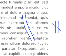
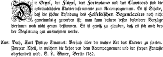
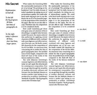
Microtypography is a range of methods for improving the readability and appearance of text, especially justified text. The methods reduce the appearance of large interword spaces and create edges to the text that appear more even. Microtypography methods can also increase reading comprehension of text, reducing the cognitive load of reading.

The history of sentence spacing is the evolution of sentence spacing conventions from the introduction of movable type in Europe by Johannes Gutenberg to the present day.
Sentence spacing guidance is provided in many language and style guides. The majority of style guides that use a Latin-derived alphabet as a language base now prescribe or recommend the use of a single space after the concluding punctuation of a sentence.
Sentence spacing studies analyse the effects of sentence spacing techniques on the readability of text. The only direct scientific studies have been conducted by researchers from the University of Georgia, for on-screen text. There are currently no direct sentence spacing studies for printed text.

The word Hamburgevons is a short piece of meaningless filler text used for assessing the design and the appearance of a typeface. It contains all essential forms in a Latin alphabet, so that the character of the respective font can be recognized quickly. It consists of the letters that are often first designed when designing a typeface.
