Display typeface

Last updated
A number of common genres of display typeface Common display face genres.png
A number of common genres of display typeface

A display typeface is a typeface that is intended for use in display type (display copy) at large sizes for titles, headings, pull quotes, and other eye-catching elements, rather than for extended passages of body text. [1]

Contents

Display typefaces will often have more eccentric and variable designs than the simple, relatively restrained typefaces generally used for body text. [2] [3] [4] [5] They may take inspiration from other genres of lettering, such as handpainted signs, calligraphy or an aesthetic appropriate to their use, perhaps ornamented, exotic, abstracted or drawn in the style of a different writing system. [6] [7] [8]

Several genres of font are particularly associated with display setting, such as slab serif, script font, reverse-contrast and to a lesser extent sans serif. [9] [10] Walter Tracy defines display typefaces in the metal type sense as "sizes of type over 14 point" and in design that "text types when enlarged can be used for headings, display types, if reduced, cannot be used for text setting." [11]

Titling fonts are a subset of display typefaces which are typically used for headlines and titles. They are often only uppercase, and have stroke widths optimized for large sizes. [12] [13]

Historical background

For the first centuries of printing, display type generally did not exist. Printing was used primarily to print body text, although there might be use of some larger-sized letters for titling. Typefaces not intended for body text remained rooted in conventional letterforms: roman type, script typeface or blackletter. Signs were created as custom handlettering. [14]

The arrival of the poster and greater use of signage spurred the arrival of new kinds of letterform, both as lettering and in print. [14] Historian James Mosley has written that "big types had been cast in sand, using wooden patterns, for some centuries [by 1750] but there is evidence that English typefounders only began to make big letters for posters and other commercial printing towards 1770, when Thomas Cottrell made his 'Proscription or Posting letter of great bulk and dimension' and William Caslon II cast his 'Patagonian' or 'Proscription letters'." [15] [16] [17]

New technologies, notably riveted "sanspareil" matrices made printing at large sizes easier from the beginning of the nineteenth century. [18] At the same time, new designs of letter began to appear around the beginning of the nineteenth century, such as "fat face" typefaces (based on serif faces of the period, but much bolder), [19] [20] slab serifs (first seen from Vincent Figgins around 1817), [21] [22] sans-serifs (already used in custom lettering but effectively unused in printing before the 1830s) [23] and new blackletter faces. [24] Many nineteenth-century display typefaces were extremely, aggressively bold or condensed in order to attract attention. An important development that followed was pantograph-engraved wood type, which allowed cheap printing of large type on posters. Equally, some display typefaces such as Cochin and Koch-Antiqua have a particularly delicate build with a low x-height, and this style was very popular around the start of the twentieth century. [11]

In the past, almost all decorative lettering other than that on paper was created as custom or hand-painted lettering. The use of fonts in place of lettering has increased due to new printing methods, phototypesetting, and digital typesetting, which allow fonts to be printed at any desired size. This has made it possible to use fonts in situations where before hand-lettering would be most common, such as on business logos and metal fabricated lettering. [25] [26] [27] [28] As a result, many modern digital typeface families such as Neutraface, Neue Haas Grotesk, and Arno include both text styles and display companion optical sizes with a more delicate design. [29] [30] [31] [32] Walter Tracy comments that in adapting a text face to display use such as in a headline "a judicious closing-up of the letters" improves the appearance. [11]

Styles of display typeface

Common genres of display typeface include:

A more prosaic genre of "display typefaces" is those intended for signage, such as Johnston, Highway Gothic, Transport and Clearview. These often have adaptations to increase legibility and make letters more distinct from each other. For example, Johnston and Transport have a curl on the lower-case 'L' to distinguish it from an upper-case 'i'. [42]

In German the term "Akzidenzschrift" is used for faces not intended for body text but for commercial or trade printing, without implying a specific size range, so including small-size sans-serifs in uses such as on forms or tickets. The famous sans-serif Akzidenz-Grotesk's name derives from this. Akzidenz means some occasion or event (in the sense of "something that happens", not in the sense of a high-class social event or occasion) [43] and was therefore used as a term for trade printing; Akzidenzschrift was by the 1870s a generic term meaning typefaces intended for these uses. [43] [44] A modern German-language dictionary describes it as work such as advertisements and forms. [45] [46] The origin of the word is Latin accidentia, defined by Lewis and Short as "that which happens, a casual event, a chance". [43] [47]

Note that these genres may also be seen in custom lettering, with which this topic overlaps. Older examples of lettering are often custom-drawn, rather than fonts. [25] [26] [27]

The following gallery shows the historical development of display type, from type similar to body text typefaces to the highly decorative types of the nineteenth century.

See also

Related Research Articles

<span class="mw-page-title-main">Sans-serif</span> Typeface classification for letterforms without serifs

In typography and lettering, a sans-serif, sans serif, gothic, or simply sans letterform is one that does not have extending features called "serifs" at the end of strokes. Sans-serif typefaces tend to have less stroke width variation than serif typefaces. They are often used to convey simplicity and modernity or minimalism. For the purposes of type classification, sans-serif designs are usually divided into these major groups: § Grotesque and § Neo-grotesque, § Geometric, § Humanist and § Other or mixed.

In typography, a serif is a small line or stroke regularly attached to the end of a larger stroke in a letter or symbol within a particular font or family of fonts. A typeface or "font family" making use of serifs is called a serif typeface, and a typeface that does not include them is sans-serif. Some typography sources refer to sans-serif typefaces as "grotesque" or "Gothic", and serif typefaces as "roman".

<span class="mw-page-title-main">Typeface</span> Set of characters that share common design features

A typeface is a design of letters, numbers and other symbols, to be used in printing or for electronic display. Most typefaces include variations in size, weight, slope, width, and so on. Each of these variations of the typeface is a font.

<span class="mw-page-title-main">Gill Sans</span> Humanist sans-serif typeface family developed by Monotype

Gill Sans is a humanist sans-serif typeface designed by Eric Gill and released by the British branch of Monotype from 1928 onwards.

<span class="mw-page-title-main">Johnston (typeface)</span> Sans-serif typeface

Johnston is a sans-serif typeface designed by and named after Edward Johnston. The typeface was commissioned in 1913 by Frank Pick, commercial manager of the Underground Electric Railways Company of London, as part of his plan to strengthen the company's corporate identity. Johnston was originally created for printing, but it rapidly became used for the enamel station signs of the Underground system as well.

<span class="mw-page-title-main">Caslon</span> Typeface with serifs

Caslon is the name given to serif typefaces designed by William Caslon I (c. 1692–1766) in London, or inspired by his work.

<span class="mw-page-title-main">Slab serif</span> Type of serif typeface

In typography, a slab serif typeface is a type of serif typeface characterized by thick, block-like serifs. Serif terminals may be either blunt and angular (Rockwell), or rounded (Courier). Slab serifs were introduced in the early nineteenth century.

<span class="mw-page-title-main">Didone (typography)</span> Classification of serif typefaces

Didone is a genre of serif typeface that emerged in the late 18th century and was the standard style of general-purpose printing during the 19th century. It is characterized by:

<span class="mw-page-title-main">Impact (typeface)</span> Sans-serif typeface

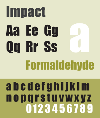
Impact is a sans-serif typeface in the industrial or grotesk style designed by Geoffrey Lee in 1965 and released by the Stephenson Blake foundry of Sheffield. It is well known for having been included in the core fonts for the Web package and distributed with Microsoft Windows since Windows 98. In the 2010s, it gained popularity for its use in image macros and other internet memes. However, in Google Slides, Impact is referred to as Anton.

<span class="mw-page-title-main">Akzidenz-Grotesk</span> Sans-serif typeface family by the Berthold Type Foundry of Berlin

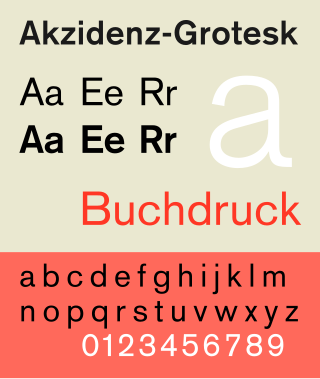
Akzidenz-Grotesk is a sans-serif typeface family originally released by the Berthold Type Foundry of Berlin. "Akzidenz" indicates its intended use as a typeface for commercial print runs such as publicity, tickets and forms, as opposed to fine printing, and "grotesque" was a standard name for sans-serif typefaces at the time.

<span class="mw-page-title-main">Clarendon (typeface)</span> Slab-serif typeface

Clarendon is the name of a slab serif typeface that was released in 1845 by Thorowgood and Co. of London, a letter foundry often known as the Fann Street Foundry. The original Clarendon design is credited to Robert Besley, a partner in the foundry, and was originally engraved by punchcutter Benjamin Fox, who may also have contributed to its design. Many copies, adaptations and revivals have been released, becoming almost an entire genre of type design.

<span class="mw-page-title-main">Monotype Grotesque</span> Grotesque sans-serif typeface

Monotype Grotesque is a family of sans-serif typefaces released by the Monotype Corporation for its hot metal typesetting system. It belongs to the grotesque or industrial genre of early sans-serif designs. Like many early sans-serifs, it forms a sprawling family designed at different times.

Jakob Erbar was a German professor of graphic design and a type designer. Erbar trained as a typesetter for the Dumont-Schauberg Printing Works before studying under Fritz Helmut Ehmcke and Anna Simons. Erbar went on to teach in 1908 at the Städtischen Berufsschule and from 1919 to his death at the Kölner Werkschule. His seminal Erbar series was one of the first geometric sans-serif typefaces, predating both Paul Renner's Futura and Rudolf Koch's Kabel by some five years.

<span class="mw-page-title-main">Vincent Figgins</span> British typefounder

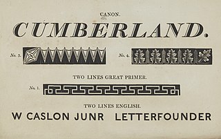
Vincent Figgins was a British typefounder based in London, who cast and sold metal type for printing. After an apprenticeship with typefounder Joseph Jackson, he established his own type foundry in 1792. His company was extremely successful and, with its range of modern serif faces and display typefaces, had a strong influence on the styles of British printing in the nineteenth century. A successor company continued to make type until the 1970s.

<span class="mw-page-title-main">Venus (typeface)</span> Grotesque sans-serif typeface

Venus or Venus-Grotesk is a sans-serif typeface family released by the Bauer Type Foundry of Frankfurt am Main, Germany from 1907 onwards. Released in a large range of styles, including condensed and extended weights, it was very popular in the early-to-mid twentieth century. It was exported to other countries, notably the United States, where it was distributed by Bauer Alphabets Inc, the U.S. branch of the firm.

<span class="mw-page-title-main">Reverse-contrast typefaces</span> Kind of typeface or custom lettering

A reverse-contrast or reverse-stress letterform is a design in which the stress is reversed from the norm: a typeface or custom lettering where the horizontal lines are the thickest. This is the reverse of the vertical lines being the same width or thicker than horizontals, which is normal in Latin-alphabet writing and especially printing. The result is a dramatic effect, in which the letters seem to have been printed the wrong way round. The style invented in the early nineteenth century as attention-grabbing novelty display designs. Modern font designer Peter Biľak, who has created a design in the genre, has described them as "a dirty trick to create freakish letterforms that stood out."

<span class="mw-page-title-main">Caslon Egyptian</span>

Egyptian is a typeface created by the Caslon foundry of Salisbury Square, London around or probably slightly before 1816, that is the first general-purpose sans-serif typeface in the Latin alphabet known to have been created.

<span class="mw-page-title-main">Old Style (Miller & Richard)</span>

Old Style or Modernised Old Style was the name given to a series of serif typefaces cut from the mid-nineteenth century and sold by the type foundry Miller & Richard, of Edinburgh in Scotland. It was a standard typeface in Britain for literary and prestigious printing in the second half of the nineteenth century and the early twentieth century, with many derivatives and copies released.

<span class="mw-page-title-main">Fat face</span> Style of display typeface and lettering

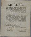
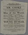
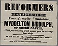
In typography, a fat face letterform is a serif typeface or piece of lettering in the Didone or modern style with an extremely bold design. Fat face typefaces appeared in London around 1805–1810 and became widely popular; John Lewis describes the fat face as "the first real display typeface."

<span class="mw-page-title-main">Wood type</span> Movable type made out of wood

In letterpress printing, wood type is movable type made out of wood. First used in China for printing body text, wood type became popular during the nineteenth century for making large display typefaces for printing posters, because it was lighter and cheaper than large sizes of metal type.

References

  1. David Consuegra (10 October 2011). Classic Typefaces: American Type and Type Designers. Skyhorse Publishing Company, Incorporated. pp. 1998–9. ISBN   978-1-62153-582-9.
  2. David Raizman (2003). History of Modern Design: Graphics and Products Since the Industrial Revolution. Laurence King Publishing. pp. 40–3. ISBN   978-1-85669-348-6.
  3. Eskilson, Stephen J. (2007). Graphic Design: A New History . New Haven: Yale University Press. p.  25. ISBN   9780300120110.
  4. Frere-Jones, Tobias. "Scrambled Eggs & Serifs". Frere-Jones Type. Retrieved 23 October 2015.
  5. Lewis, John (April 2007). Typography: Design and Practice. Jeremy Mills Publishing. pp. 13–17. ISBN   978-1-905217-45-8.
  6. Bruce Willen; Nolen Strals (23 September 2009). Lettering & Type: Creating Letters and Designing Typefaces. Princeton Architectural Press. pp. 66–79. ISBN   978-1-56898-765-1.
  7. Ellen Lupton; Julia Lupton (12 May 2009). Design Your Life: The Pleasures and Perils of Everyday Things. St. Martin's Press. pp. 165–174. ISBN   978-1-4299-9423-1.
  8. Mosley, James. "English Vernacular". Typefoundry (blog). Retrieved 14 December 2016.
  9. Mosley, James (1999). The Nymph and the Grot: the Revival of the Sanserif Letter. London: Friends of the St Bride Printing Library. pp. 1–19. ISBN   9780953520107.
  10. Mosley, James. "Comments on Typophile thread - "Unborn: sans serif lower case in the 19th century"". Typophile (archived). Archived from the original on 28 June 2014. Retrieved 15 October 2016.{{cite web}}: CS1 maint: bot: original URL status unknown (link)
  11. 1 2 3 Tracy, Walter (2003). Letters of Credit: a view of type design. Boston: David R. Godine. pp. 50, 139–140, 180. ISBN   9781567922400.
  12. Strizver, Ilene (21 June 2017). "All About Titling Fonts".
  13. Strizver, Ilene. "Titling Fonts" . Retrieved 15 June 2021.
  14. 1 2 Mosley, James (1963). "English Vernacular". Motif. 11: 3–56.
  15. Mosley, James (1796). A Specimen of Printing Types & Various Ornaments 1796: Reproduced Together with the Sale Catalogue of the British Letter-Foundry 1797. Printing Historical Society. pp.  5–12. ISBN   9780900003103.
  16. Berthold Wolpe (1964). "Caslon Architectural: On the origin and design of the large letters cut and cast by William Caslon II". Alphabet. Kynoch Press. pp. 57–64.
  17. Howes, Justin (2004). "Caslon's Patagonian". Matrix . 24: 61–71.
  18. Mosley, James (2003). "Sanspareil Matrices". Matrix: 104–114.
  19. Kennard, Jennifer (3 January 2014). "The Story of Our Friend, the Fat Face". Fonts in Use. Retrieved 11 August 2015.
  20. Mosley, James (2003). "Reviving the Classics: Matthew Carter and the Interpretation of Historical Models". In Mosley, James; Re, Margaret; Drucker, Johanna; Carter, Matthew (eds.). Typographically Speaking: The Art of Matthew Carter. Princeton Architectural Press. pp. 35–6. ISBN   9781568984278 . Retrieved 30 January 2016.
  21. Mosley, James. "The Typefoundry of Vincent Figgins, 1792-1836". Motif (1): 29–36.
  22. "Sentinel's Ancestors". Hoefler & Frere-Jones. Archived from the original on Sep 5, 2015. Retrieved 14 August 2015.
  23. Mosley, James (6 January 2007). "The Nymph and the Grot: an Update". Typefoundry. Retrieved 12 December 2015.
  24. Phinney, Thomas (August 30, 2010). "Decorative & Display Typestyles". Graphic Design and Publishing Centre. Archived from the original on 9 October 2015. Retrieved 10 August 2015.
  25. 1 2 Simonson, Mark (February 8, 2009). "Not a font". Mark Simonson Studio. Retrieved 14 December 2016.
  26. 1 2 Coles, Stephen (October 29, 2014). "Lettering is not type". Font Bureau. Type Network. Archived from the original on 2021-04-27. Retrieved 2016-12-22.
  27. 1 2 Johnston, Alastair (October 16, 2012). "The Misery of Edwin Drood: Bad Typography in the Movies". Booktryst. Retrieved 14 December 2016.
  28. Shinn, Nick. "The Golden Age of Hand Lettering in American Advertising". Type Culture. Retrieved 1 April 2017.
  29. Twardoch, Slimbach; Sousa, Slye (2007). Arno Pro (PDF). San Jose: Adobe Systems. Archived from the original (PDF) on 30 August 2014. Retrieved 14 August 2015.
  30. Schwartz, Christian. "Neutraface". www.christianschwartz.com. Retrieved October 2, 2011.
  31. Schwartz, Christian. "Neutraface No. 2". www.christianschwartz.com. Retrieved October 2, 2011.
  32. Schwartz, Christian. "Neue Haas Grotesk" . Retrieved 28 November 2014.
  33. Shaw, Paul (7 April 2010). "Lettercentric: Type as Writing". Print. Retrieved 21 September 2015.
  34. "Farewell Futura, Hello Neutraface No. 2".
  35. "Graublock". Fonts in Use. Retrieved 24 January 2017.
  36. Van Haute, Katrien (1 April 2008). "The Indépendant, a Typeface as Period Document". Quaerendo. 38 (1): 49–69. doi:10.1163/157006907X247219.
  37. John L Walters (2 September 2013). Fifty Typefaces That Changed the World: Design Museum Fifty. Octopus. p. 121. ISBN   978-1-84091-649-2.
  38. Bilak, Peter (25 September 2012). "Beauty and Ugliness in Type design". I love typography. Retrieved 10 August 2015.
  39. Lawson, Alexander (1990). Anatomy of a typeface (1st ed.). Boston: Godine. pp. 321–323. ISBN   9780879233334.
  40. Chachra, Deb. "Faux Devangari". HiLoBrow. Retrieved 1 October 2014.
  41. Shaw, Paul (17 June 2009). "Stereo Types". Print Magazine. Retrieved 1 October 2014.
  42. Calvert, Margaret. "New Transport". A2-Type. Retrieved 1 March 2016.
  43. 1 2 3 Reynolds, Dan (11 November 2019). "New details about the origins of Akzidenz-Grotesk". Klim Type Foundry . Retrieved 26 November 2019.
  44. Marahrens, August, ed. (1870). Vollständiges theoretisch-praktisches Handbuch der Typographie nach ihrem heutigen Standpunkt, zweiter Band: Das Drucken in seinen verschiedenen Branchen. Verlag d. Leipziger Vereinsdruckerei. p. 431.
  45. Muthmann, Gustav (2000). Handbuch zur neuen Rechtschreibung und Zeichensetzung : für Studierende und Lehrende an Schulen und Universitäten sowie für alle an der Sprache Interessierten. Schöningh. p. 254. ISBN   9783506741097. Drucksache von geringem Umfang, Anzeige, Formular
  46. Hardwig, Florian (2 August 2018). ""Herzlichen Glückwunsch" wedding cards (1919)". Fonts in Use. Retrieved 28 June 2021.
  47. Lewis, Charlton Thomas; Short, Charles (1922). A Latin Dictionary. Oxford: Clarendon Press. p. 16.