A glyph is any kind of purposeful mark. In typography, a glyph is "the specific shape, design, or representation of a character". It is a particular graphical representation, in a particular typeface, of an element of written language. A grapheme, or part of a grapheme, or sometimes several graphemes in combination can be represented by a glyph.

Palatino is the name of an old-style serif typeface designed by Hermann Zapf, initially released in 1949 by the Stempel foundry and later by other companies, most notably the Mergenthaler Linotype Company.

Calligraphy is a visual art related to writing. It is the design and execution of lettering with a pen, ink brush, or other writing instrument. Contemporary calligraphic practice can be defined as "the art of giving form to signs in an expressive, harmonious, and skillful manner".
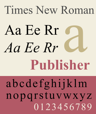
Times New Roman is a serif typeface. It was commissioned by the British newspaper The Times in 1931 and conceived by Stanley Morison, the artistic adviser to the British branch of the printing equipment company Monotype, in collaboration with Victor Lardent, a lettering artist in The Times's advertising department. It has become one of the most popular typefaces of all time and is installed on most personal computers.

A typeface is a design of letters, numbers and other symbols, to be used in printing or for electronic display. Most typefaces include variations in size, weight, slope, width, and so on. Each of these variations of the typeface is a font.

Fraktur is a calligraphic hand of the Latin alphabet and any of several blackletter typefaces derived from this hand. It is designed such that the beginnings and ends of the individual strokes that make up each letter will be clearly visible, and often emphasized; in this way it is often contrasted with the curves of the Antiqua (common) typefaces where the letters are designed to flow and strokes connect together in a continuous fashion. The word "Fraktur" derives from Latin frāctūra, built from frāctus, passive participle of frangere, which is also the root for the English word "fracture". In non-professional contexts, the term "Fraktur" is sometimes misused to refer to all blackletter typefaces – while Fraktur typefaces do fall under that category, not all blackletter typefaces exhibit the Fraktur characteristics described above.

Univers is a large sans-serif typeface family designed by Adrian Frutiger and released by his employer Deberny & Peignot in 1957. Classified as a neo-grotesque sans-serif, one based on the model of nineteenth-century German typefaces such as Akzidenz-Grotesk, it was notable for its availability from the moment of its launch in a comprehensive range of weights and widths. The original marketing for Univers deliberately referenced the periodic table to emphasise its scope.

In writing and typography, a ligature occurs where two or more graphemes or letters are joined to form a single glyph. Examples are the characters ⟨æ⟩ and ⟨œ⟩ used in English and French, in which the letters ⟨a⟩ and ⟨e⟩ are joined for the first ligature and the letters ⟨o⟩ and ⟨e⟩ are joined for the second ligature. For stylistic and legibility reasons, ⟨f⟩ and ⟨i⟩ are often merged to create ⟨fi⟩ ; the same is true of ⟨s⟩ and ⟨t⟩ to create ⟨st⟩. The common ampersand, ⟨&⟩, developed from a ligature in which the handwritten Latin letters ⟨e⟩ and ⟨t⟩ were combined.

Cursive is any style of penmanship in which characters are written joined in a flowing manner, generally for the purpose of making writing faster, in contrast to block letters. It varies in functionality and modern-day usage across languages and regions; being used both publicly in artistic and formal documents as well as in private communication. Formal cursive is generally joined, but casual cursive is a combination of joins and pen lifts. The writing style can be further divided as "looped", "italic", or "connected".

Antiqua is a style of typeface used to mimic styles of handwriting or calligraphy common during the 15th and 16th centuries. Letters are designed to flow, and strokes connect together in a continuous fashion; in this way it is often contrasted with Fraktur-style typefaces where the individual strokes are broken apart. The two typefaces were used alongside each other in the germanophone world, with the Antiqua–Fraktur dispute often dividing along ideological or political lines. After the mid-20th century, Fraktur fell out of favor and Antiqua-based typefaces became the official standard in Germany.

Johnston is a sans-serif typeface designed by and named after Edward Johnston. The typeface was commissioned in 1913 by Frank Pick, commercial manager of the Underground Electric Railways Company of London, as part of his plan to strengthen the company's corporate identity. Johnston was originally created for printing, but it rapidly became used for the enamel station signs of the Underground system as well.

Lettering is an umbrella term that covers the art of drawing letters, instead of simply writing them. Lettering is considered an art form, where each letter in a phrase or quote acts as an illustration. Each letter is created with attention to detail and has a unique role within a composition. Lettering is created as an image, with letters that are meant to be used in a unique configuration. Lettering words do not always translate into alphabets that can later be used in a typeface, since they are created with a specific word in mind.
Oblique type is a form of type that slants slightly to the right, used for the same purposes as italic type. Unlike italic type, however, it does not use different glyph shapes; it uses the same glyphs as roman type, except slanted. Oblique and italic type are technical terms to distinguish between the two ways of creating slanted font styles; oblique designs may be labelled italic by companies selling fonts or by computer programs. Oblique designs may also be called slanted or sloped roman styles. Oblique fonts, as supplied by a font designer, may be simply slanted, but this is often not the case: many have slight corrections made to them to give curves more consistent widths, so they retain the proportions of counters and the thick-and-thin quality of strokes from the regular design.
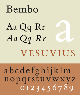
Bembo is a serif typeface created by the British branch of the Monotype Corporation in 1928–1929 and most commonly used for body text. It is a member of the "old-style" of serif fonts, with its regular or roman style based on a design cut around 1495 by Francesco Griffo for Venetian printer Aldus Manutius, sometimes generically called the "Aldine roman". Bembo is named for Manutius's first publication with it, a small 1496 book by the poet and cleric Pietro Bembo. The italic is based on work by Giovanni Antonio Tagliente, a calligrapher who worked as a printer in the 1520s, after the time of Manutius and Griffo.

Bookman, or Bookman Old Style, is a serif typeface. A wide, legible design that is slightly bolder than most body text faces, Bookman has been used for both display typography, for trade printing such as advertising, and less commonly for body text. In advertising use it is particularly associated with the graphic design of the 1960s and 1970s, when revivals of it were very popular.

A swash is a typographical flourish, such as an exaggerated serif, terminal, tail, entry stroke, etc., on a glyph. The use of swash characters dates back to at least the 16th century, as they can be seen in Ludovico Vicentino degli Arrighi's La Operina, which is dated 1522. As with italic type in general, they were inspired by the conventions of period handwriting. Arrighi's designs influenced designers in Italy and particularly in France.
In typography, the Vox-ATypI classification makes it possible to classify typefaces into general classes. Devised by Maximilien Vox in 1954, it was adopted in 1962 by the Association Typographique Internationale (ATypI) and in 1967 as a British Standard, as British Standards Classification of Typefaces, which is a very basic interpretation and adaptation/modification of the earlier Vox-ATypI classification. On April 27, 2021, ATypI announced that they had de-adopted the system and that they were establishing a working group building towards a new, larger system incorporating the different scripts of the world.

A display typeface is a typeface that is intended for use in display type at large sizes for titles, headings, pull quotes, and other eye-catching elements, rather than for extended passages of body text.
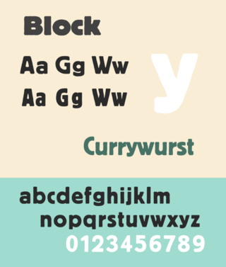
Berthold Block is a sans-serif typeface released by the H. Berthold foundry in the early twentieth century and intended for display use. Block has a chunky design suitable for headings, with short descenders allowing tight linespacing and rounded corners. It is sometimes simply called "Block". Font design expert Stephen Coles describes it as "a soft but substantial display face with compact dimensions and an organic appearance…[it] isn’t meant for body copy." The Klingspor Museum credits it to Hermann Hoffmann, who managed type design for Berthold.

A teaching script is a sample script that serves as a visual orientation for learning to write by hand. In the sense of a guideline or a prototype, it supports the demanding process of developing handwriting skills and abilities in a visual and illustrative way.