Type design is the art and process of designing typefaces. This involves drawing each letterform using a consistent style. The basic concepts and design variables are described below.

In typography and lettering, a sans-serif, sans serif, gothic, or simply sans letterform is one that does not have extending features called "serifs" at the end of strokes. Sans-serif typefaces tend to have less stroke width variation than serif typefaces. They are often used to convey simplicity and modernity or minimalism. For the purposes of type classification, sans-serif designs are usually divided into these major groups: § Grotesque, § Neo-grotesque, § Geometric, § Humanist, and § Other or mixed.
In typography, a serif is a small line or stroke regularly attached to the end of a larger stroke in a letter or symbol within a particular font or family of fonts. A typeface or "font family" making use of serifs is called a serif typeface, and a typeface that does not include them is sans-serif. Some typography sources refer to sans-serif typefaces as "grotesque" or "Gothic" and serif typefaces as "roman".

A typeface is a design of letters, numbers and other symbols, to be used in printing or for electronic display. Most typefaces include variations in size, weight, slope, width, and so on. Each of these variations of the typeface is a font.

Helvetica, also known by its original name Neue Haas Grotesk, is a widely used sans-serif typeface developed in 1957 by Swiss typeface designer Max Miedinger and Eduard Hoffmann.

Frutiger is a series of typefaces named after its Swiss designer, Adrian Frutiger. Frutiger is a humanist sans-serif typeface, intended to be clear and highly legible at a distance or at small text sizes. A popular design worldwide, type designer Steve Matteson described its structure as "the best choice for legibility in pretty much any situation" at small text sizes, while Erik Spiekermann named it as "the best general typeface ever".

Arial is a sans-serif typeface and set of computer fonts in the neo-grotesque style. Fonts from the Arial family are included with all versions of Microsoft Windows after Windows 3.1, as well as in other Microsoft programs, Apple's macOS, and many PostScript 3 printers.

Univers is a large sans-serif typeface family designed by Adrian Frutiger and released by his employer Deberny & Peignot in 1957. Classified as a neo-grotesque sans-serif, one based on the model of nineteenth-century German typefaces such as Akzidenz-Grotesk, it was notable for its availability from the moment of its launch in a comprehensive range of weights and widths. The original marketing for Univers deliberately referenced the periodic table to emphasise its scope.

Gill Sans is a humanist sans-serif typeface designed by Eric Gill and released by the British branch of Monotype from 1928 onwards.

In typography, a slab serif typeface is a type of serif typeface characterized by thick, block-like serifs. Serif terminals may be either blunt and angular (Rockwell), or rounded (Courier). Slab serifs were introduced in the early nineteenth century.

In metal typesetting, a font is a particular size, weight and style of a typeface. Each font is a matched set of type, with a piece for each glyph. A typeface consists of various fonts that share an overall design.
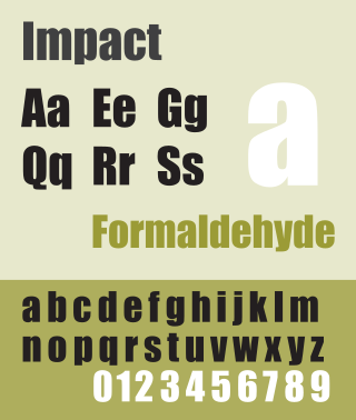
Impact is a sans-serif typeface in the industrial or grotesque style designed by Geoffrey Lee in 1965 and released by the Stephenson Blake foundry of Sheffield. It is well known for having been included in the core fonts for the Web package and distributed with Microsoft Windows since Windows 98. In the 2010s, it gained popularity for its use in image macros and other internet memes.
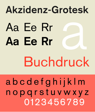
Akzidenz-Grotesk is a sans-serif typeface family originally released by the Berthold Type Foundry of Berlin. "Akzidenz" indicates its intended use as a typeface for commercial print runs such as publicity, tickets and forms, as opposed to fine printing, and "grotesque" was a standard name for sans-serif typefaces at the time.
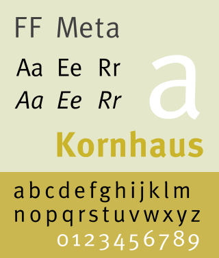
FF Meta is a humanist sans-serif typeface family designed by Erik Spiekermann and released in 1991 through his FontFont library.

Haettenschweiler is a sans-serif typeface in the grotesque style that is very bold and condensed. It is intended for headlines and display text.

Syntax comprises a family of fonts designed by Swiss typeface designer Hans Eduard Meier. Originally just a sans-serif font, it was extended with additional serif designs.

Benton Sans is a digital typeface family begun by Tobias Frere-Jones in 1995, and expanded by Cyrus Highsmith of Font Bureau. It is based on the sans-serif typefaces designed for American Type Founders by Morris Fuller Benton around the beginning of the twentieth century in the industrial or grotesque style. It was a reworked version of Benton Gothic developed for various corporate customers, under Frere-Jones's guidance. In developing the typeface, Frere-Jones studied drawings of Morris Fuller Benton's 1908 typeface News Gothic at the Smithsonian Institution. The typeface began as a proprietary type, initially titled MSL Gothic, for Martha Stewart Living magazine and the website for Martha Stewart Living Omnimedia. As Benton Gothic, there are 7 weights from Thin to Black and only 2 widths.
Legibility is the ease with which a reader can decode symbols. In addition to written language, it can also refer to behaviour or architecture, for example. From the perspective of communication research, it can be described as a measure of the permeability of a communication channel. A large number of known factors can affect legibility.

Typeface anatomy describes the graphic elements that make up letters in a typeface.
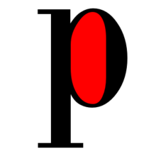
Typefaces are born from the struggle between rules and results. Squeezing a square about 1% helps it look more like a square; to appear the same height as a square, a circle must be measurably taller. The two strokes in an X aren't the same thickness, nor are their parallel edges actually parallel; the vertical stems of a lowercase alphabet are thinner than those of its capitals; the ascender on a d isn't the same length as the descender on a p, and so on. For the rational mind, type design can be a maddening game of drawing things differently in order to make them appear the same.

Aptos, originally named Bierstadt, is a sans-serif typeface in the neo-grotesque style developed by Steve Matteson. It was released in 2023 as the new default font for the Microsoft Office suite, replacing the previously used Calibri font.