
In typography and lettering, a sans-serif, sans serif, gothic, or simply sans letterform is one that does not have extending features called "serifs" at the end of strokes. Sans-serif typefaces tend to have less stroke width variation than serif typefaces. They are often used to convey simplicity and modernity or minimalism. For the purposes of type classification, sans-serif designs are usually divided into these major groups: § Grotesque and § Neo-grotesque, § Geometric, § Humanist and § Other or mixed.
In typography, a serif is a small line or stroke regularly attached to the end of a larger stroke in a letter or symbol within a particular font or family of fonts. A typeface or "font family" making use of serifs is called a serif typeface, and a typeface that does not include them is sans-serif. Some typography sources refer to sans-serif typefaces as "grotesque" or "Gothic", and serif typefaces as "roman".

A typeface is a design of letters, numbers and other symbols, to be used in printing or for electronic display. Most typefaces include variations in size, weight, slope, width, and so on. Each of these variations of the typeface is a font.

Garamond is a group of many serif typefaces, named for sixteenth-century Parisian engraver Claude Garamond, generally spelled as Garamont in his lifetime. Garamond-style typefaces are popular and particularly often used for book printing and body text.

A type foundry is a company that designs or distributes typefaces. Before digital typography, type foundries manufactured and sold metal and wood typefaces for hand typesetting, and matrices for line-casting machines like the Linotype and Monotype, for letterpress printers. Today's digital type foundries accumulate and distribute typefaces created by type designers, who may either be freelancers operating their own independent foundry, or employed by a foundry. Type foundries may also provide custom type design services.

Caslon is the name given to serif typefaces designed by William Caslon I (c. 1692–1766) in London, or inspired by his work.

In typography, a slab serif typeface is a type of serif typeface characterized by thick, block-like serifs. Serif terminals may be either blunt and angular (Rockwell), or rounded (Courier). Slab serifs were introduced in the early nineteenth century.

Bookman, or Bookman Old Style, is a serif typeface. A wide, legible design that is slightly bolder than most body text faces, Bookman has been used for both display typography, for trade printing such as advertising, and less commonly for body text. In advertising use it is particularly associated with the graphic design of the 1960s and 1970s, when revivals of it were very popular. It is also used as the official font of Indonesian laws since 2011.

Clarendon is the name of a slab serif typeface that was released in 1845 by Thorowgood and Co. of London, a letter foundry often known as the Fann Street Foundry. The original Clarendon design is credited to Robert Besley, a partner in the foundry, and was originally engraved by punchcutter Benjamin Fox, who may also have contributed to its design. Many copies, adaptations and revivals have been released, becoming almost an entire genre of type design.

Janson is the name given to a set of old-style serif typefaces from the Dutch Baroque period, and modern revivals from the twentieth century. Janson is a crisp, relatively high-contrast serif design, most popular for body text.

Erhard Ratdolt (1442–1528) was an early German printer from Augsburg. He was active as a printer in Venice from 1476 to 1486, and afterwards in Augsburg. From 1475 to 1478 he was in partnership with two other German printers.

Sabon is an old-style serif typeface designed by the German-born typographer and designer Jan Tschichold (1902–1974) in the period 1964–1967. It was released jointly by the Linotype, Monotype, and Stempel type foundries in 1967. The design of the roman is based on types by Claude Garamond, particularly a specimen printed by the Frankfurt printer Konrad Berner. Berner had married the widow of a fellow printer Jacques Sabon, the source of the face's name, who had bought some of Garamond's type after his death. The italics are based on types designed by a contemporary of Garamond's, Robert Granjon. It is effectively a Garamond revival, though a different name was chosen as many other modern typefaces already carry this name.
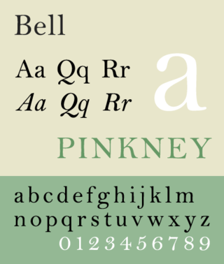
Bell is the name given to a serif typeface designed and cut in 1788 by the punchcutter Richard Austin for the British Letter Foundry, operated by publisher John Bell, and revived several times since.

American Typewriter is a slab serif typeface created in 1974 by Joel Kaden and Tony Stan for International Typeface Corporation. It is based on the slab serif style of typewriters; however, unlike most true typewriter fonts, it is a proportional design: the characters do not all have the same width. American Typewriter is often used to suggest an old-fashioned or industrial image. It was originally released in cold type (photocomposition) before being released digitally. Like many ITC fonts, it has a range of four weights from light to bold and separate condensed styles. Some releases do not have italics.
Binny & Ronaldson established the first permanent type foundry in the United States. Founded in Philadelphia in 1796 by the Scot Archibald Binny (1762/3–1838) and James Ronaldson (1769–1841).

A reverse-contrast or reverse-stress letterform is a design in which the stress is reversed from the norm: a typeface or custom lettering where the horizontal lines are the thickest. This is the reverse of the vertical lines being the same width or thicker than horizontals, which is normal in Latin-alphabet writing and especially printing. The result is a dramatic effect, in which the letters seem to have been printed the wrong way round. The style invented in the early nineteenth century as attention-grabbing novelty display designs. Modern font designer Peter Biľak, who has created a design in the genre, has described them as "a dirty trick to create freakish letterforms that stood out."

Old Style or Modernised Old Style was the name given to a series of serif typefaces cut from the mid-nineteenth century and sold by the type foundry Miller & Richard, of Edinburgh in Scotland. It was a standard typeface in Britain for literary and prestigious printing in the second half of the nineteenth century and the early twentieth century, with many derivatives and copies released.

In typography, a fat face letterform is a serif typeface or piece of lettering in the Didone or modern style with an extremely bold design. Fat face typefaces appeared in London around 1805–1810 and became widely popular; John Lewis describes the fat face as "the first real display typeface."

In letterpress printing, wood type is movable type made out of wood. First used in China for printing body text, wood type became popular during the nineteenth century for making large display typefaces for printing posters, because it was lighter and cheaper than large sizes of metal type.

