In legal discourse, an author is the creator of an original work, whether that work is in written, graphic, or recorded medium. The creation of such a work is an act of authorship. Thus, a sculptor, painter, or composer, is an author of their respective sculptures, paintings, or compositions, even though in common parlance, an author is often thought of as the writer of a book, article, play, or other written work. In the case of a work for hire, the employer or commissioning party is considered the author of the work, even if they did not write or otherwise create the work, but merely instructed another individual to do so.

Typography is the art and technique of arranging type to make written language legible, readable and appealing when displayed. The arrangement of type involves selecting typefaces, point sizes, line lengths, line spacing, letter spacing, and spaces between pairs of letters. The term typography is also applied to the style, arrangement, and appearance of the letters, numbers, and symbols created by the process. Type design is a closely related craft, sometimes considered part of typography; most typographers do not design typefaces, and some type designers do not consider themselves typographers. Typography also may be used as an ornamental and decorative device, unrelated to the communication of information.
Desktop publishing (DTP) is the creation of documents using dedicated software on a personal ("desktop") computer. It was first used almost exclusively for print publications, but now it also assists in the creation of various forms of online content. Desktop publishing software can generate page layouts and produce text and image content comparable to the simpler forms of traditional typography and printing. This technology allows individuals, businesses, and other organizations to self-publish a wide variety of content, from menus to magazines to books, without the expense of commercial printing.

In publishing and graphic design, Lorem ipsum is a placeholder text commonly used to demonstrate the visual form of a document or a typeface without relying on meaningful content. Lorem ipsum may be used as a placeholder before the final copy is available. It is also used to temporarily replace text in a process called greeking, which allows designers to consider the form of a webpage or publication, without the meaning of the text influencing the design.
Prepress is the term used in the printing and publishing industries for the processes and procedures that occur between the creation of a print layout and the final printing. The prepress process includes the preparation of artwork for press, media selection, proofing, quality control checks and the production of printing plates if required. The artwork is quite often provided by the customer as a print-ready PDF file created in desktop publishing.
In the written form of many languages, indentation describes empty space, a.k.a. white space, used around text to signify an important aspect of the text such as:

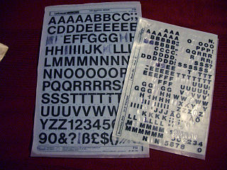
Letraset was a company known mainly for manufacturing sheets of typefaces and other artwork elements using the dry-transfer lettering method. Letraset has been acquired by the Colart group and become part of its subsidiary Winsor & Newton.
In word processing and digital typesetting, a non-breaking space, also called NBSP, required space, hard space, or fixed space, is a space character that prevents an automatic line break at its position. In some formats, including HTML, it also prevents consecutive whitespace characters from collapsing into a single space. Non-breaking space characters with other widths also exist.

Placeholder names are intentionally overly generic and ambiguous terms referring to things, places, or people, the names of which or of whom do not actually exist; are temporarily forgotten, or are unimportant; or in order to avoid stigmatization, or because they are unknowable or unpredictable given the context of their discussion; to de-emphasize in which event the precise specification thereof is otherwise impossible, or to deliberately expunge.

Greeking is a style of displaying or rendering text or symbols, not always from the Greek alphabet. Greeking obscures portions of a work for the purpose of either emphasizing form over details or displaying placeholders for unavailable content. The name is a reference to the phrase "Greek to me", meaning something that one cannot understand, so that it might as well be in a foreign language.
The blink element is a non-standard HTML element that indicates to a user agent that the page author intends the content of the element to blink. The element was introduced in Netscape Navigator but is no longer supported and often ignored by modern Web browsers; some, such as Internet Explorer, never supported the element at all.

A website wireframe, also known as a page schematic or screen blueprint, is a visual guide that represents the skeletal framework of a website. The term wireframe is taken from other fields that use a skeletal framework to represent 3 dimensional shape and volume. Wireframes are created for the purpose of arranging elements to best accomplish a particular purpose. The purpose is usually driven by a business objective and a creative idea. The wireframe depicts the page layout or arrangement of the website's content, including interface elements and navigational systems, and how they work together. The wireframe usually lacks typographic style, color, or graphics, since the main focus lies in functionality, behavior, and priority of content. In other words, it focuses on what a screen does, not what it looks like. Wireframes can be pencil drawings or sketches on a whiteboard, or they can be produced by means of a broad array of free or commercial software applications. Wireframes are generally created by business analysts, user experience designers, developers, visual designers, and by those with expertise in interaction design, information architecture and user research.

In graphic design, page layout is the arrangement of visual elements on a page. It generally involves organizational principles of composition to achieve specific communication objectives.

In graphic design, a pull quote is a key phrase, quotation, or excerpt that has been pulled from an article and used as a page layout graphic element, serving to entice readers into the article or to highlight a key topic. It is typically placed in a larger or distinctive typeface and on the same page. Pull quotes are often used in magazine and newspaper articles, annual reports, and brochures, as well as on the web. They can add visual interest to text-heavy pages with few images or illustrations.
Digital scrapbooking is the term for the creation of a new 2D artwork by re-combining various graphic elements. It is a form of scrapbooking that is done using a personal computer, digital or scanned photos and computer graphics software. It is a relatively new form of the traditional print scrapbooking.

Filler text is text that shares some characteristics of a real written text, but is random or otherwise generated. It may be used to display a sample of fonts, generate text for testing, or to spoof an e-mail spam filter. The process of using filler text is sometimes called greeking, although the text itself may be nonsense, or largely Latin, as in Lorem ipsum.
Li Europan lingues is a quotation in Occidental (Interlingue), an international auxiliary language devised by Edgar von Wahl in 1922. It is used in some HTML templates as a fill-in or placeholder text.
"To come" is a printing and journalism reference, commonly abbreviated to "TK". The abbreviation is used to mark where additional material will be added to a manuscript before publication. It is used without periods.

"The quick brown fox jumps over the lazy dog" is an English-language pangram – a sentence that contains all the letters of the alphabet. The phrase is commonly used for touch-typing practice, testing typewriters and computer keyboards, displaying examples of fonts, and other applications involving text where the use of all letters in the alphabet is desired.

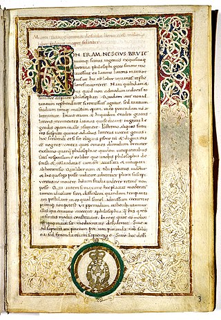
De finibus bonorum et malorum is a Socratic dialogue by the Roman orator, politician, and Academic Skeptic philosopher Marcus Tullius Cicero. It consists of three dialogues, over five books, in which Cicero discusses the philosophical views of Epicureanism, Stoicism, and the Platonism of Antiochus of Ascalon. The treatise is structured so that each philosophical system is described in its own book, and then disputed in the following book. The book was developed in the summer of the year 45 BC, and was written over the course of about one and a half months. Together with the Tusculanae Quaestiones written shortly afterwards and the Academica, De finibus bonorum et malorum is one of the most extensive philosophical works of Cicero.


