Typeface anatomy

Last updated
Typographic parts of a glyph: 1) x-height; 2) ascender line; 3) apex; 4) baseline; 5) ascender; 6) crossbar; 7) stem; 8) serif; 9) leg; 10) bowl; 11) counter; 12) collar/link/neck; 13) loop; 14) ear; 15) tie; 16) horizontal bar; 17) arm; 18) vertical bar; 19) cap height; 20) descender height. Typographia.svg
Typographic parts of a glyph: 1) x-height; 2) ascender line; 3) apex; 4) baseline; 5) ascender; 6) crossbar; 7) stem; 8) serif; 9) leg; 10) bowl; 11) counter; 12) collar/link/neck; 13) loop; 14) ear; 15) tie; 16) horizontal bar; 17) arm; 18) vertical bar; 19) cap height; 20) descender height.
Anatomy of a Devanagari typeface Anatomy of hindi font.jpg
Anatomy of a Devanagari typeface


Typeface anatomy describes the graphic elements that make up letters in a typeface. [1] [2]

Contents

Typefaces are born from the struggle between rules and results. Squeezing a square about 1% helps it look more like a square; to appear the same height as a square, a circle must be measurably taller. The two strokes in an X aren't the same thickness, nor are their parallel edges actually parallel; the vertical stems of a lowercase alphabet are thinner than those of its capitals; the ascender on a d isn't the same length as the descender on a p, and so on. For the rational mind, type design can be a maddening game of drawing things differently in order to make them appear the same.

Strokes

The strokes are the components of a letterform. [4] Strokes may be straight, as in k l v w x z, or curved, as in c o s. If straight, they may be horizontal, vertical, or diagonal; if curved, open or closed. Typographers also speak of an instroke, where one starts writing the letter, as at the top of a c f, and an outstroke, where the pen leaves off, as at the bottom of c e j k t y. [5]

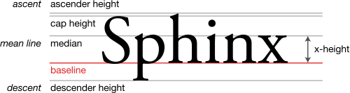
A main vertical stroke is a stem. The letter m has three, the left, middle, and right stems. The central stroke of an s is known as the spine. [6] When the stroke is part of a lowercase [4] and rises above the height of an x (the x height), it is known as an ascender . [7] Letters with ascenders are b d f h k l. A stroke which drops below the baseline is a descender . [7] Letters with descenders are g j p q y.

An arching stroke is a shoulder as in the top of an R or sometimes just an arch, as in h n m. [4] A closed curved stroke is a bowl in b d o p q D O P Q; B has two bowls. A bowl with a flat end as in D P is a lobe. [8] A trailing outstroke, as in j y J Q R is a tail. The inferior diagonal stroke in K is a leg. [9] The bottom of the two-story g is a loop; the very short stroke at the top is the ear. [10] The letters i j each have a dot or tittle . [10]

A short horizontal stroke, as in the center of e f and the middle stroke of E F, is a bar. Strokes that connect, as in A and H, or cross other strokes, as in t, are also known as crossbars. [9] A longer horizontal stroke at the top or bottom, as in E T, is an arm. [4] The junction of two strokes intersecting above as in A M X x is an apex and the joining of two strokes intersecting below as in V W v w is a vertex. [10]

The font shown in the example is stressed; this means that strokes have varying widths. In this example, the stroke at the top of the "g" is thinner at the top and bottom than on the sides – a vertical stress. Fonts without any variation in the stroke width are known as monoline fonts.

Terminals

The terminal (end) of an instroke or outstroke is often a serif or a stroke ending. A seriffed terminal may be described as a wedge, bulbous, teardrop, slab, etc., depending on the design of the type. Typefaces may be classified by their look, of which the weight and serif style – whether serif or sans-serif – are key features. [9] Some designs also have spurs, which are smaller than serifs and appear on angles rather than at a terminal, as on e or G.

Space

Areas of negative space (white space) formed by straight or curved strokes are called counters . Closed counters are found in a b d e g o p q A B D O P Q R, and open counters in a c e f h m n r s t u. The closed counter in e is also named an eye. [9] The term storey refers to stacked counters: When the letter a appears with two counters it is referred to as double-storey a, and when the letter g appears with two closed counters it is known as double-storeyg. [11]

Angles of white space, as in W w, are corners (w has three corners); the term is not used for angles of strokes. The small corner formed by a serif, whether curved or angular, is called the serif bracket.

Inter-letter space can be reduced with kerning. A kern is the part of a letter that intrudes into the "box" of an adjacent glyph.

Proportions

A subtle change in proportion impacts weight, perception, measure, and legibility. The letterform height compared to its stroke width modifies the aspect ratio; a slight change in weight sometimes helps to create emphasis. The disparity between thick and thin strokes, known as stress, alters optical perception. As an example, the first sans serif typefaces used strokes of constant thickness, but subsequent technological advances permit drawing thinner strokes. Condensed type occupies less space than expanded type, so that a whole page of text can be reduced to half a page. The capline and x-height ratio improve or decrease word legibility. [4]

Metal type era

Example of paragraph set in different typefaces using the common line, named American Lining System in this promotional material published in 1903. American Lining System (1903).png
Example of paragraph set in different typefaces using the common line, named American Lining System in this promotional material published in 1903.

During the late metal type period, many fonts (particularly in American typefounding) were issued to "common line". [12] This meant that they were made to standardised proportions, so that fonts of different typefaces could be mixed with no difficulty. This made it possible to mix typefaces from completely different genres such as sans-serifs and serifs and have the cap height, baseline and linespacing match perfectly, something not possible with most digital fonts. [12] It even allowed mixing of different sizes of type with a consistent baseline. It however had the disadvantage of often forcing typefaces to be issued with cropped descenders compared to historical typefaces, to allow tight linespacing. A "script line" or "art line" was used for more delicate fonts with long descenders. Titling capitals, meanwhile, were issued taking up the whole space of the metal type area, with no room for descenders. [13] [14]

See also

The principal line terms in typography. Typography Line Terms.svg
The principal line terms in typography.

Related Research Articles

<span class="mw-page-title-main">Palatino</span> Serif typeface

Palatino is the name of an old-style serif typeface designed by Hermann Zapf, initially released in 1949 by the Stempel foundry and later by other companies, most notably the Mergenthaler Linotype Company.

<span class="mw-page-title-main">Optima</span> 1958 typeface by Hermann Zapf

Optima is a humanist sans-serif typeface designed by Hermann Zapf and released by the D. Stempel AG foundry, Frankfurt, West Germany in 1958.

<span class="mw-page-title-main">Type design</span> Art of designing typefaces and fonts

Type design is the art and process of designing typefaces. This involves drawing each letterform using a consistent style. The basic concepts and design variables are described below.

<span class="mw-page-title-main">Sans-serif</span> Typeface classification for letterforms without serifs

In typography and lettering, a sans-serif, sans serif, gothic, or simply sans letterform is one that does not have extending features called "serifs" at the end of strokes. Sans-serif typefaces tend to have less stroke width variation than serif typefaces. They are often used to convey simplicity and modernity or minimalism. For the purposes of type classification, sans-serif designs are usually divided into these major groups: § Grotesque and § Neo-grotesque, § Geometric, § Humanist and § Other or mixed.

In typography, a serif is a small line or stroke regularly attached to the end of a larger stroke in a letter or symbol within a particular font or family of fonts. A typeface or "font family" making use of serifs is called a serif typeface, and a typeface that does not include them is sans-serif. Some typography sources refer to sans-serif typefaces as "grotesque" or "Gothic", and serif typefaces as "roman".

<span class="mw-page-title-main">Typeface</span> Set of characters that share common design features

A typeface is a design of letters, numbers and other symbols, to be used in printing or for electronic display. Most typefaces include variations in size, weight, slope, width, and so on. Each of these variations of the typeface is a font.

<span class="mw-page-title-main">Italic type</span> Font style characterised by cursive typeface and slanted design

In typography, italic type is a cursive font based on a stylised form of calligraphic handwriting. Along with blackletter and roman type, it served as one of the major typefaces in the history of Western typography.

x-height Measurement of letters in a typeface

In typography, the x-height, or corpus size, is the distance between the baseline and the mean line of lowercase letters in a typeface. Typically, this is the height of the letter x in the font, as well as the letters v, w, and z. One of the most important dimensions of a font, x-height defines how high lowercase letters without ascenders are compared to the cap height of uppercase letters.

<span class="mw-page-title-main">Charcoal (typeface)</span> Sans-serif typeface

Charcoal is a sans-serif typeface designed by David Berlow of Font Bureau during the period 1994–1997. Charcoal was the default menu font in Apple Computer's Mac OS 8 and 9, replacing the comparatively harder-to-read Chicago as part of the new Platinum interface. In Mac OS X developer preview 3, it was replaced with Lucida Grande as the system typeface. Charcoal is designed for high legibility, even at smaller point sizes, displayed on computer monitors.

<span class="mw-page-title-main">Counter (typography)</span>

In typography, a counter is the area of a letter that is entirely or partially enclosed by a letter form or a symbol. The stroke that creates such a space is known as a "bowl". Latin letters containing closed counters include A, B, D, O, P, Q, R, a, b, d, e, g, o, p, and q. Latin letters containing open counters include c, f, h, s etc. The digits 0, 4, 6, 8, and 9 also have counters. An aperture is the opening between an open counter and the outside of the letter.

Oblique type is a form of type that slants slightly to the right, used for the same purposes as italic type. Unlike italic type, however, it does not use different glyph shapes; it uses the same glyphs as roman type, except slanted. Oblique and italic type are technical terms to distinguish between the two ways of creating slanted font styles; oblique designs may be labelled italic by companies selling fonts or by computer programs. Oblique designs may also be called slanted or sloped roman styles. Oblique fonts, as supplied by a font designer, may be simply slanted, but this is often not the case: many have slight corrections made to them to give curves more consistent widths, so they retain the proportions of counters and the thick-and-thin quality of strokes from the regular design.

<span class="mw-page-title-main">Slab serif</span> Type of serif typeface

In typography, a slab serif typeface is a type of serif typeface characterized by thick, block-like serifs. Serif terminals may be either blunt and angular (Rockwell), or rounded (Courier). Slab serifs were introduced in the early nineteenth century.

<span class="mw-page-title-main">Didone (typography)</span> Classification of serif typefaces

Didone is a genre of serif typeface that emerged in the late 18th century and was the standard style of general-purpose printing during the 19th century. It is characterized by:

<span class="mw-page-title-main">Font</span> Particular size, weight and style of a typeface

In metal typesetting, a font is a particular size, weight and style of a typeface. Each font is a matched set of type, with a piece for each glyph. A typeface consists of various fonts that share an overall design.

<span class="mw-page-title-main">Akzidenz-Grotesk</span> Sans-serif typeface family by the Berthold Type Foundry of Berlin

Akzidenz-Grotesk is a sans-serif typeface family originally released by the Berthold Type Foundry of Berlin. "Akzidenz" indicates its intended use as a typeface for commercial print runs such as publicity, tickets and forms, as opposed to fine printing, and "grotesque" was a standard name for sans-serif typefaces at the time.

<span class="mw-page-title-main">Clarendon (typeface)</span> Slab-serif typeface

Clarendon is the name of a slab serif typeface that was released in 1845 by Thorowgood and Co. of London, a letter foundry often known as the Fann Street Foundry. The original Clarendon design is credited to Robert Besley, a partner in the foundry, and was originally engraved by punchcutter Benjamin Fox, who may also have contributed to its design. Many copies, adaptations and revivals have been released, becoming almost an entire genre of type design.

<span class="mw-page-title-main">Gotham (typeface)</span> Geometric sans-serif typeface

Gotham is a geometric sans-serif typeface family designed by American type designer Tobias Frere-Jones with Jesse Ragan and released through the Hoefler & Frere-Jones foundry from 2000. Gotham's letterforms were inspired by examples of architectural signs of the mid-twentieth century. Gotham has a relatively broad design with a reasonably high x-height and wide apertures.

<span class="mw-page-title-main">Benton Sans</span> Sans-serif typeface

Benton Sans is a digital typeface family begun by Tobias Frere-Jones in 1995, and expanded by Cyrus Highsmith of Font Bureau. It is based on the sans-serif typefaces designed for American Type Founders by Morris Fuller Benton around the beginning of the twentieth century in the industrial or grotesque style. It was a reworked version of Benton Gothic developed for various corporate customers, under Frere-Jones's guidance. In developing the typeface, Frere-Jones studied drawings of Morris Fuller Benton's 1908 typeface News Gothic at the Smithsonian Institution. The typeface began as a proprietary type, initially titled MSL Gothic, for Martha Stewart Living magazine and the website for Martha Stewart Living Omnimedia. As Benton Gothic, there are 7 weights from Thin to Black and only 2 widths.

<span class="mw-page-title-main">Reverse-contrast typefaces</span> Kind of typeface or custom lettering

A reverse-contrast or reverse-stress letterform is a design in which the stress is reversed from the norm: a typeface or custom lettering where the horizontal lines are the thickest. This is the reverse of the vertical lines being the same width or thicker than horizontals, which is normal in Latin-alphabet writing and especially printing. The result is a dramatic effect, in which the letters seem to have been printed the wrong way round. The style invented in the early nineteenth century as attention-grabbing novelty display designs. Modern font designer Peter Biľak, who has created a design in the genre, has described them as "a dirty trick to create freakish letterforms that stood out."

<span class="mw-page-title-main">Display typeface</span> Font that is used at large sizes for headings

A display typeface is a typeface that is intended for use in display type at large sizes for titles, headings, pull quotes, and other eye-catching elements, rather than for extended passages of body text.

References

  1. Studer, Anton (29 February 2016). "Is What I See What I Get? — Math & Optics in Type Design". Typographica. Retrieved 17 April 2016.
  2. "Typeface Anatomy". Issuu. FontShop. Retrieved 22 July 2020.
  3. "Introducing Ideal Sans". Fonts by Hoefler & Co. 4 May 2011.
  4. 1 2 3 4 5 Carter, Bob; Day, Ben; Meggs, Philip (2007). Typographic Design: Form and Communication. United States of America: John Wiley & Sons. p. 31. ISBN   9780471783909.
  5. Pecina, Martin; Březina, David (2008). "Type Anatomy 1.0". Typomil.
  6. Bosler, Denise (2012). Mastering Type: The Essential Guide to Typography for Print and Web Design. F+W Media, Inc. p. 31. ISBN   978-1440313714. OCLC   940731283. individual parts such as the spine of the S
  7. 1 2 Dean, Paul (11 April 2008). "eXtreme Type Terminology. Part Three: The 'Black Art'". I Love Typography.
  8. "Lobe". Typography Deconstructed. Archived from the original on 26 February 2017. Retrieved 2021-11-03.
  9. 1 2 3 4 Coles, Stephen (2013). The Anatomy of Type: A Graphic Guide to 100 typefaces. Harper Design. ISBN   9780062203120.
  10. 1 2 3 Dean, Paul (March 27, 2008). "eXtreme Type Terminology. Part 2: Anatomy of a Letterform". I Love Typography.
  11. "Typography terms and definitions". Monotype. 2020-01-22. Retrieved 2023-12-27.
  12. 1 2 Wichary, Marcin. "Getting to the bottom of line height in Figma". Figma . Retrieved 5 February 2021.
  13. Stewart, A. A. (1918). Type – A primer of information about the mechanical features of printing types: their sizes, font, schems, &c. with a brief description of their manufacture. Chicago: The Committee on Education, United Typothetae of America. pp. 35+ix.
  14. Specimen book of American line type faces : American point line, point body and point set. American Type Founders Company. 1903.

Further reading