Primarily designed by Alexandra Korolkova, the family includes sans-serif and serif designs, both with caption styles for small-print text, and a monospaced font for use in programming. They are available under the English-language SIL Open Font License; the original font, PT Sans, was also released under ParaType's own Free Font License, and regular and bold with italics is free in Google.[clarification needed][3] Additional styles, such as extended, condensed and extra-bold, are sold from ParaType as PT Sans Pro and PT Serif Pro.[4][5]
The fonts include Latin and Cyrillic characters and covers almost all minority languages of the Russian Federation. The slashed-Р ruble symbol (before it became official in December 2013) is included at the U+20B9…U+20CF code points.
In the most common open-source release, PT Sans and PT Serif feature regular, italic, bold and bold italic designs. They also include a caption style: this is a wider version of the typeface with a greater x-height (taller lower-case letters), designed for legibility at small font sizes and on outdoor signs. PT Sans also includes a condensed version in regular and bold without italics. In caption styles, PT Serif has a caption italic style while PT Sans has a bold version. PT Mono includes regular and bold styles.
Commercial releases include for PT Sans additional light, demi-bold, extra bold and black weights, in regular, narrow, condensed and extra-condensed styles. PT Serif gains an additional 32 styles, with narrow and extended widths, black, extra-bold and demi-bold weights. The professional releases also add text figures and small caps.
PT Astra Serif is visually similar to PT Serif, but metrically equivalent to Times New Roman. All fonts shown are set to the same size.
In 2016, PT Astra Sans and PT Astra Serif fonts were developed for distribution with the Russian Astra Linux operating system. Both fonts are metrically compatible with Times New Roman.[10][11][12]
In 2021, the PT Astra Fact font was developed for Astra Linux. Based on a design inspired by Frutiger,[13] it is metrically compatible with Verdana. The need for domestic replacements came about as a result of sanctions preventing fonts from Monotype Imaging from being supplied with Astra Linux.[14]
Gallery
PT Sans features
PT Serif features
PT Serif features
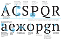
PT Serif cyrillic (top) and latin (bottom) letters difference
This page is based on this Wikipedia article Text is available under the CC BY-SA 4.0 license; additional terms may apply. Images, videos and audio are available under their respective licenses.