
A typeface is a design of letters, numbers and other symbols, to be used in printing or for electronic display. Most typefaces include variations in size, weight, slope, width, and so on. Each of these variations of the typeface is a font.

Arial is a sans-serif typeface in the neo-grotesque style. Fonts from the Arial family are included with all versions of Microsoft Windows after Windows 3.1, as well as in other Microsoft programs, Apple's macOS, and many PostScript 3 printers. In Office 2007, Arial was replaced by Calibri as the default typeface in PowerPoint, Excel, and Outlook.

Vera is a digital typeface superfamily with a liberal license. It was designed by Jim Lyles from the now-defunct Bitstream Inc. type foundry, and it is closely based on Bitstream Prima, for which Lyles was also responsible. It is a TrueType font with full hinting instructions, which improve its rendering quality on low-resolution devices such as computer monitors. The font has also been repackaged as a Type 1 PostScript font, called Bera, for LaTeX users.

Tahoma is a humanist sans-serif typeface that Matthew Carter designed for Microsoft Corporation. Microsoft first distributed it, along with Carter's Verdana, as a computer font with Office 97.

Courier is a monospaced slab serif typeface commissioned by IBM and designed by Howard "Bud" Kettler (1919–1999) in the mid-1950s. The Courier name and typeface concept are in the public domain. Courier has been adapted for use as a computer font, and versions of it are installed on most desktop computers.
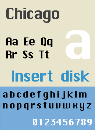
Chicago is a sans-serif typeface designed by Susan Kare for Apple Computer. It was used in the Macintosh operating system user interface between 1984 and 1997 and was an important part of Apple’s brand identity. It was also used in early versions of the iPod user interface. Chicago was initially a bitmap font; as the Apple OS’s capabilities improved, Apple commissioned the type foundry Bigelow & Holmes to create a vector-based TrueType version. The typeface is named after the U.S. city of Chicago, following the theme of original Macintosh fonts being named after major world cities.

Apple Inc. uses a large variety of typefaces in its marketing, operating systems, and industrial design with each product cycle. These change throughout the years with Apple's change of style in their products. This is evident in the design and marketing of the company. The current logo is a white apple with a bite out of it, which was first utilized in 2013.

Lucida is an extended family of related typefaces designed by Charles Bigelow and Kris Holmes and released from 1984 onwards. The family is intended to be extremely legible when printed at small size or displayed on a low-resolution display – hence the name, from 'lucid'.

The dotted or slashed zero 0̷ is a representation of the Arabic digit "0" (zero) with a slash or a dot through it. This variant zero glyph is often used to distinguish the digit "zero" ("0") from the Latin script letter "O" anywhere that the distinction needs emphasis, particularly in encoding systems, scientific and engineering applications, computer programming, and telecommunications. It thus helps to differentiate characters that would otherwise be homoglyphs. It was commonly used during the punch card era, when programs were typically written out by hand, to avoid ambiguity when the character was later typed on a card punch.

Lucida Grande is a humanist sans-serif typeface. It is a member of the Lucida family of typefaces designed by Charles Bigelow and Kris Holmes. It is best known for its implementation throughout the macOS user interface from 1999 to 2014, as well as in other Apple software like Safari for Windows. As of OS X Yosemite, the system font was changed from Lucida Grande to Helvetica Neue. In OS X El Capitan the system font changed again, this time to San Francisco.
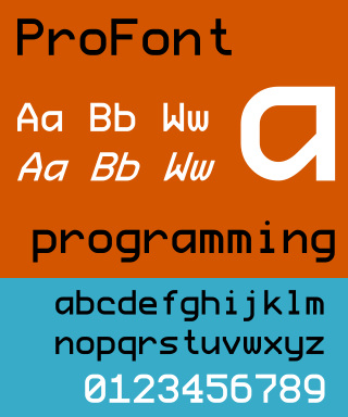
ProFont is a monospace font available in many formats. It is intended to be used for programming in IDE environments and it is available in bitmap and TrueType versions for various platforms.
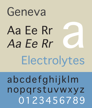
Geneva is a neo-grotesque or "industrial" sans-serif typeface designed by Susan Kare for Apple Computer. It is one of the oldest fonts shipped with Macintosh operating systems. The original version was a bitmap font, but later versions were converted to TrueType when that technology became available on the Macintosh platform. Because this Macintosh font is not commonly available on other platforms, many users find Verdana, Microsoft Sans Serif or Arial to be an acceptable substitute.
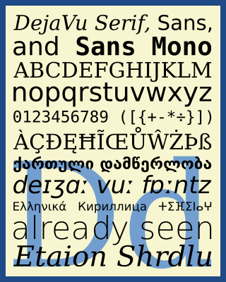
The DejaVu fonts are a superfamily of fonts designed for broad coverage of the Unicode Universal Character Set. The fonts are derived from Bitstream Vera (sans-serif) and Bitstream Charter (serif), two fonts released by Bitstream under a free license that allowed derivative works based upon them; the Vera and Charter families were limited mainly to the characters in the Basic Latin and Latin-1 Supplement portions of Unicode, roughly equivalent to ISO/IEC 8859-15, and Bitstream's licensing terms allowed the fonts to be expanded upon without explicit authorization. The DejaVu fonts project was started with the aim to "provide a wider range of characters ... while maintaining the original look and feel through the process of collaborative development". The development of the fonts is done by many contributors and is organized through a wiki and a mailing list.
Apple's Macintosh computer supports a wide variety of fonts. This support was one of the features that initially distinguished it from other systems.

Microsoft Sans Serif is a sans-serif typeface introduced with early Microsoft Windows versions. It is the successor of MS Sans Serif, formerly Helv, a proportional bitmap font introduced in Windows 1.0. Both typefaces are very similar in design to Arial and Helvetica. The typeface was designed to match the MS Sans bitmap included in the early releases of Microsoft Windows.
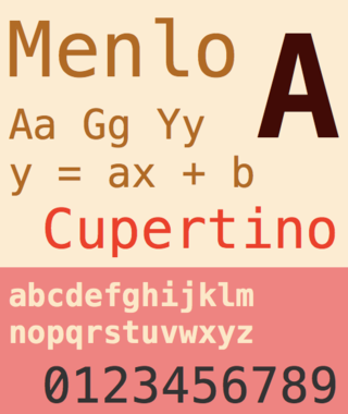
Menlo is a monospaced sans-serif typeface designed by Jim Lyles and Charles Bigelow in 1997. The typeface was first shipped with Mac OS X Snow Leopard in August 2009. Menlo superseded the Monaco typeface, which had long been the default monospaced typeface on macOS. Menlo is based on the open source font Bitstream Vera and the public domain font DejaVu.
San Francisco is a neo-grotesque typeface made by Apple Inc. It was first released to developers on November 18, 2014. It is the first new typeface designed at Apple in nearly twenty years and has been inspired by Helvetica and DIN.

Aptos, originally named Bierstadt, is a sans-serif typeface in the neo-grotesque style developed by Steve Matteson. It was released in 2023 as the new default font for the Microsoft Office suite, replacing the previously used Calibri font.
