Optima is a humanist sans-serif typeface designed by Hermann Zapf and released by the D. Stempel AG foundry, Frankfurt, West Germany in 1958.

A typeface is a design of letters, numbers and other symbols, to be used in printing or for electronic display. Most typefaces include variations in size, weight, slope, width, and so on. Each of these variations of the typeface is a font.

In typography, italic type is a cursive font based on a stylised form of calligraphic handwriting. Along with blackletter and roman type, it served as one of the major typefaces in the history of Western typography.

In typography, small caps are characters typeset with glyphs that resemble uppercase letters (capitals) but reduced in height and weight close to the surrounding lowercase letters or text figures. This is technically not a case-transformation, but a substitution of glyphs, although the effect is often approximated by case-transformation and scaling. Small caps are used in running text as a form of emphasis that is less dominant than all uppercase text, and as a method of emphasis or distinctiveness for text alongside or instead of italics, or when boldface is inappropriate. For example, the text "Text in small caps" appears as Text in small caps in small caps. Small caps can be used to draw attention to the opening phrase or line of a new section of text, or to provide an additional style in a dictionary entry where many parts must be typographically differentiated.
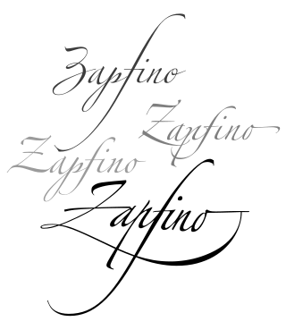
Zapfino is a calligraphic typeface designed for Linotype by typeface designer Hermann Zapf in 1998. It is based on an alphabet Zapf originally penned in 1944. As a font, it makes extensive use of ligatures and character variations.

Caslon is the name given to serif typefaces designed by William Caslon I (c. 1692–1766) in London, or inspired by his work.

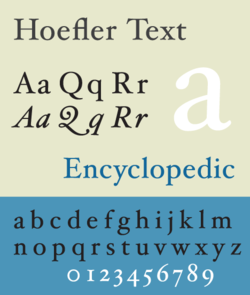
Jonathan Hoefler is an American type designer. Hoefler founded the Hoefler Type Foundry in 1989, a type foundry in New York.
Oblique type is a form of type that slants slightly to the right, used for the same purposes as italic type. Unlike italic type, however, it does not use different glyph shapes; it uses the same glyphs as roman type, except slanted. Oblique and italic type are technical terms to distinguish between the two ways of creating slanted font styles; oblique designs may be labelled italic by companies selling fonts or by computer programs. Oblique designs may also be called slanted or sloped roman styles. Oblique fonts, as supplied by a font designer, may be simply slanted, but this is often not the case: many have slight corrections made to them to give curves more consistent widths, so they retain the proportions of counters and the thick-and-thin quality of strokes from the regular design.

In metal typesetting, a font is a particular size, weight and style of a typeface. Each font is a matched set of type, with a piece for each glyph. A typeface consists of various fonts that share an overall design.

Clarendon is the name of a slab serif typeface that was released in 1845 by Thorowgood and Co. of London, a letter foundry often known as the Fann Street Foundry. The original Clarendon design is credited to Robert Besley, a partner in the foundry, and was originally engraved by punchcutter Benjamin Fox, who may also have contributed to its design. Many copies, adaptations and revivals have been released, becoming almost an entire genre of type design.

Parisine is a typeface that was created by Jean-François Porchez and is distributed by Typofonderie.
Apple's Macintosh computer supports a wide variety of fonts. This support was one of the features that initially distinguished it from other systems.

Goudy Old Style is an old-style serif typeface originally created by Frederic W. Goudy for American Type Founders (ATF) in 1915.

Sabon is an old-style serif typeface designed by the German-born typographer and designer Jan Tschichold (1902–1974) in the period 1964–1967. It was released jointly by the Linotype, Monotype, and Stempel type foundries in 1967. The design of the roman is based on types by Claude Garamond, particularly a specimen printed by the Frankfurt printer Konrad Berner. Berner had married the widow of a fellow printer Jacques Sabon, the source of the face's name, who had bought some of Garamond's type after his death. The italics are based on types designed by a contemporary of Garamond's, Robert Granjon. It is effectively a Garamond revival, though a different name was chosen as many other modern typefaces already carry this name.

Gotham is a geometric sans-serif typeface family designed by American type designer Tobias Frere-Jones with Jesse Ragan and released through the Hoefler & Frere-Jones foundry from 2000. Gotham's letterforms were inspired by examples of architectural signs of the mid-twentieth century. Gotham has a relatively broad design with a reasonably high x-height and wide apertures.

Requiem is an old-style serif typeface designed by Jonathan Hoefler in 1992 for Travel + Leisure magazine and sold by his company, Hoefler & Co. The typeface takes inspiration from a set of inscriptional capitals found in Ludovico Vicentino degli Arrighi's 1523 writing manual, Il Modo de Temperare le Penne, and its italics are based on the chancery calligraphy, or cancelleresca corsiva of the period.
Surveyor is a Didone serif typeface that recalls type found on engraved maps and charts. It was designed by Tobias Frere-Jones in 2001 as a custom typeface for use in Martha Stewart Living magazine and released publicly in March 2013, in a wider range of styles, by the type foundry Hoefler & Frere-Jones.

Monotype Grotesque is a family of sans-serif typefaces released by the Monotype Corporation for its hot metal typesetting system. It belongs to the grotesque or industrial genre of early sans-serif designs. Like many early sans-serifs, it forms a sprawling family designed at different times.
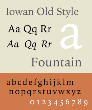
Iowan Old Style is a digital serif typeface designed by John Downer and released by Bitstream in 1991.

In typography, a fat face letterform is a serif typeface or piece of lettering in the Didone or modern style with an extremely bold design. Fat face typefaces appeared in London around 1805–1810 and became widely popular; John Lewis describes the fat face as "the first real display typeface."