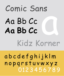
Comic Sans MS is a sans-seriftypeface created and designed by Vincent Connare and released by Microsoft Corporation in 1994. Designed as a non-connecting script, the typeface draws inspiration from comic book lettering, to emulate the informal and cartoonish tone of speech bubbles. It was originally developed for use in Microsoft's software, and since then has become widely recognized for its use in casual contexts such as children's books, personal documentation and in educational resources.[1]
The typeface was first introduced with Microsoft Windows as a part of the Microsoft Plus! Pack, and was later implemented into Microsoft Comic Chat as a comic styled chat application. Since then, Microsoft has described the font as "casual and legible" and a typeface which has garnered much popularity across a diverse set of user groups.[2]
Comic Sans has however become a cultural phenomenon, in part due to gaining significant criticism and mockery for its perceived overusage and misuse in professional and formal settings.[3] Despite this, the typeface continues to hold a cult following, particularly among education professionals and those in search of approachable and simplistic typefaces for specific uses.
History
Vincent Connare explaining in 2009 how he came to create "the world's favourite font"
Development and release
Microsoft designer Vincent Connare began working on Comic Sans in 1994 after having already created other fonts for various applications. When he saw a beta version of Microsoft Bob that used Times New Roman in the word balloons of its cartoon characters, he believed the typeface gave the software an overly formal appearance. He believed this was inappropriate for the aesthetics of the program, which was created to introduce younger users to computers. To make Microsoft Bob look more suitable for its intended purposes, he decided to create a new typeface with only a mouse and cursor, based on the lettering style of comic books he had in his office, specifically The Dark Knight Returns (lettered by John Costanza) and Watchmen (lettered by Dave Gibbons).[4]
He completed Comic Sans too late for inclusion in Microsoft Bob, and the typeface would go unreleased until the programmers of 3D Movie Maker, which also used cartoon guides and speech bubbles, adopted it.[5] The speech bubbles were eventually phased out and replaced by actual sound, but Comic Sans stayed for the program's pop-up windows and help sections. The typeface later shipped with the Windows 95 Plus! Pack, and was the primary font of the Travel desktop theme. It was later included as a system font for the OEM versions of Windows 95. Finally, it became one of the default fonts for Microsoft Publisher and Microsoft Internet Explorer. Comic Sans is also used in Microsoft Comic Chat, which was released in 1996 with Internet Explorer 3.0.
Comic Sans Pro is an updated version of Comic Sans created by Terrance Weinzierl from Monotype Imaging. While retaining the original designs of the core characters, it expands the typeface by adding new italic variants, in addition to swashes, small capitals, extra ornaments and symbols including speech bubbles, onomatopoeia and dingbats, as well as text figures and other stylistic alternatives.[8][9][10] Originally appearing as part of Ascender 2010 Font Pack as Comic Sans 2010, it was first released on April Fools' Day, causing some to initially assume it was a joke.[11][12][13]
The italicized variant later appeared in Windows 8.[14]
Comic Sans has become most infamous for its use in serious circumstances, such as warning signs and formal documents, in which it might appear too informal, unprofessional, or inappropriate.[3]
During the summer of 2010, NBA superstar LeBron James left the Cleveland Cavaliers in free agency, in a highly publicized media affair that culminated in a TV special called The Decision. The majority owner of the team (at the time), Dan Gilbert, reacted by posting a letter to Cavalier fans. The letter was criticized for its use of Comic Sans.[15][16][17]
In October 2012, a Dutch World War II memorial called Verzoening ("Reconciliation") was revealed on which the names of Jewish, Allied and German military deaths alike were written alongside each other in Comic Sans. The names were eventually scraped off after complaints from Jewish organizations, but the rewritten message was once again in Comic Sans. According to the city government, this was done because the letters fit the shape of the stone and were easily visible from a distance. It was, however, criticized for making the memorial appear "ugly" and "cheap".[18][19]
In September 2014, The Sydney Morning Herald printed a front page with Comic Sans, causing an uproar, despite its use being within speech bubbles in keeping with the origin of the typeface.[20]
In August 2015, a number of Greek Prime Minister Alexis Tsipras's Syriza party members split and formed a new party, headed by Panagiotis Lafazanis. The official document of resignation was allegedly written in Comic Sans.[22]
In July 2018, a statue of former Chilean President Pedro Aguirre Cerda was inaugurated in Santiago. The commemorative plaque on the monument were written in Comic Sans, drawing negative attention on social media.[23]
In October 2019, when the United States House Intelligence Committee requested that two of Rudy Giuliani's associates, Lev Parnas and Igor Fruma, present documentation regarding their involvement in the Ukraine scandal, former Trump attorney John Dowd penned a letter of explanation printed in Comic Sans.[24]
That same month, as part of the United Kingdom's Brexit debate, the Conservative Party tweeted an image stating "MPs must come together and get Brexit done" using Comic Sans.[25] The post was heavily mocked, but some commentators saw it as a deliberate attempt to use the typeface's notoriety to bring their message to a wider audience.[26]
Legibility
Comparison of Comic Sans, Comic Neue (an open alternative), Candara (another "casual" font), Trebuchet MS (a Windows standard font), Andika (an open font designed for legibility), and Komika Text (a font designed for comic books). The characters displayed are prone to legibility problems.
A research article published by Cognition in 2010 showed disfluency could lead to improved retention and classroom performance. The article stated that disfluency can be produced merely by adopting fonts that are slightly more difficult to read.[28] In the case studies cited in the article, Comic Sans was used to introduce disfluency.[29] A 2010 Princeton University study involving presenting students with text in a font slightly harder to read found that they consistently retained more information from material displayed in fonts perceived as ugly or incoherent (Monotype Corsiva, Haettenschweiler, and Comic Sans Italic) than in a simpler, more traditional typeface such as Helvetica.[28]
More often, however, Comic Sans is described as especially legible, and is frequently used in school settings or as an aid for people with dyslexia.[30][additional citation(s) needed] Some people have reported that typing in Comic Sans has helped to clear writer's block, claiming that its less uniform appearance and high legibility create less mental tension.[31] Compared to other typefaces, Comic Sans has fewer rotated and mirror-image glyphs (ex. the letters "b", "d", "p", and "q"), has particularly wide letter spacing, and is sans serif[32][30][33] in general, although its capital "i" (I) has serifs to distinguish it from lowercase "l" (l).[34]
Reception and legacy
Several reinterpretations of Comic Sans have been created as a result of its popularity. In April 2014, font designer Craig Rozynski released a modernized version of Comic Sans called Comic Neue. In 2015, graphic designer Ben Harman created Comic Papyrus (later renamed "Comic Parchment" for legal reasons), which combines the features of Comic Sans with the similarly panned typeface Papyrus.[35] In 2019, Tabular Type Foundry released Comic Code, a monospaced version of the typeface.[36]
Despite its widespread use and popularity, Vincent Connare, the typeface's designer, was not paid any extra payments by Microsoft for creating Comic Sans. The only additional reward he ever received was a signed picture of Mickey Mouse from the Walt Disney Company, as a token of gratitude for allowing them to use the typeface in their advertising.[37] Furthermore, in 2017, the designer revealed that he had only used it once.[38]
Opposition
Because of its ubiquity and misuse, Comic Sans has received heavy disapproval from graphic and type designers. The Boston Phoenix reported on disgruntlement over the widespread use of the typeface, especially its inappropriate use for writing on serious subjects, with the complaints urged on by a campaign started by two Indianapolis graphic designers, Dave and Holly Combs, via their website "Ban Comic Sans".[39] The movement was conceived in 1999 by the two designers after an employer insisted that one of them use Comic Sans in a children's museum exhibit. The website's main argument is that a typeface should match the tone of its text and that the humorous appearance of Comic Sans often contrasted with a serious message, such as a "do not enter" sign.[40]
The movement ran until 2019, when Dave Combs believed the hatred had "gotten out of hand".[41] While the website "Ban Comic Sans" is no longer in use, searching the title today will direct viewers to a linktr.ee page, where the campaign is still going strong.[42] This chain of websites connects to an online merch store on Zazzle.com, an informational video on Vimeo and an official Facebook page for the movement. A newer version of the website by the name of Comic Sans Criminal has also gained popularity in recent years[43]
Dave Gibbons, whose work was one of the inspirations for Comic Sans, condemned the typeface, stating that it was "a shame they couldn't have used just the original font, because [Comic Sans] is a real mess. I think it's a particularly ugly letter form."[44]
Film producer and The New York Times essayist Errol Morris wrote in an August 2012 posting, "The conscious awareness of Comic Sans promotes—at least among some people—contempt and summary dismissal." With the help of a professor, he conducted an online experiment and found that Comic Sans, in comparison with five other typefaces (Baskerville, Helvetica, Georgia, Trebuchet MS, and Computer Modern), makes readers slightly less likely to believe that a statement they are reading is true.[45]
Defense
In the Netherlands, radio DJs Coen Swijnenberg and Sander Lantinga decided to celebrate the typeface by having a Comic Sans day on the first Friday of July. Comic Sans Day has been held since 2009. Some Dutch companies have their website in Comic Sans on this day.[46]
According to a 2020 Twitter poll held by TES, 44% of teachers sampled used Comic Sans in their teaching resources. Comic Sans is widely used in schools due to its high legibility.[47] Other reasons include:[30]
It is well-suited for modeling handwriting, due to the single-story lowercase "a" and "g", and distinct appearances of the letters I and l.[49]
It is aesthetically pleasing to some children.[50]
Vincent Connare is reportedly not offended by the negative backlash over Comic Sans. At the Fourth Annual Boring Conference, he claimed to find the contempt for his work to be "mildly amusing."[51] He has stated that he is proud of his creation, offering different rationales. One of these was that "Comic Sans does what it was commissioned to do, it is loved by kids, mums, dads and many family members. So it did its job very well. It matched the brief!" He has also referred to it as "the best joke I've ever told."[52] In 2014, commenting on Comic Sans' critics and fans alike, Connare said, "If you love it, you don't know much about typography, [but] if you hate it, you really don't know much about typography either, and you should get another hobby."[53][54]
Lauren Hudgins of The Establishment argued that people who use Comic Sans should be treated with respect, not mockery, because "people without dyslexia need empathy for those who need concessions to manage the disability."[55] Defenders of Comic Sans also argue that the criticism the font receives is oftentimes exaggerated, and that its benefits deserve more credit.
In popular culture
The user interface for a Latin-language automated teller machine in the Vatican City uses Comic Sans for its text prompts.
Comic Sans status as a meme became a defining point in its legacy. Because of this, many people began to use the font with irony and sarcasm in internet memes and pop culture. It has also been used in political campaigns and the communications of public figures, which has drawn some attention.
In 2019, Fast Company writer Mark Wilson penned an emotionally charged article which shamed President Donald Trump and his staff for using the font type in important statements.[56]
Searching for 'comic sans', 'comic sans ms', or 'best font ever' on Google Search will cause the results page to be displayed entirely in Comic Sans.[57]
On May 22, 2012, The Comic Sans Song[59] was released by YouTube content creator and musician Gunnarolla, in collaboration with musician Andrew Huang. The song makes reference to Comic Sans and features commentary around the impact the font has had on pop-culture.
In July 2012, when the discovery of the Higgs boson was announced at CERN, Fabiola Gianotti, the spokesperson of the ATLAS experiment, attracted comment by using Comic Sans in her presentation of the results.[60][61][62] As a 2014 April Fools' Day joke, CERN claimed that it would be switching all its publications to Comic Sans.[63]
The Internet meme Doge, which became popular in late 2013, consists of different colored sets of words in broken English written in Comic Sans around the head of a Shiba Inu dog.[64]
In April 2014, OpenBSD announced the LibreSSL project in Comic Sans, claiming to be the first to "weaponize" it as a means for soliciting donations.[65][66]
In the 2015 video game Undertale and its followup Deltarune, the character Sans is a skeleton named after the typeface. His dialogue is displayed in lowercase Comic Sans. He is paired with his brother named Papyrus, a reference to the font, Papyrus. Similarly, his dialogue is displayed in all capital Papyrus.[67]
↑Terri Stone (4 April 2011). "Comic Sans Pro Not an April Fool's Joke |". CreativePro.com. Archived from the original on 2015-04-18. Retrieved 2015-04-17. The Comic Sans typeface, one of Microsoft's most popular designs, has received a makeover courtesy of Monotype Imaging. Today the company has introduced the four-font Comic Sans Pro family of typefaces. Featuring elements such as speech bubbles and cartoon dingbats, Comic Sans Pro extends the versatility of the original Comic Sans, designed by Vincent Connare for Microsoft in 1994.
12Diemand-Yauman, C.; Oppenheimer, D. M.; Vaughan, E. B. (2011). "Fortune favors the bold (and the italicized): Effects of disfluency on educational outcomes". Cognition. 118 (1): 111–115. doi:10.1016/j.cognition.2010.09.012. PMID21040910. S2CID1003005.
↑Hudgins, Lauren (2019-04-15). "Hating Comic Sans Is Ableist". The Establishment. Archived from the original on 2019-12-13. Retrieved 2019-12-21. Comic Sans is recommended by the British Dyslexia Association and the Dyslexia Association of Ireland...People without dyslexia need empathy for those who need concessions to manage the disability.
↑"LibreSSL". libressl.org. Archived from the original on 14 April 2020. Retrieved 24 May 2015.
↑Sotomayor, Bella Vanessa (December 15, 2016). "UNDERTALE: A Game That Is Still Amazing Today". ComicsVerse. Retrieved 20 March 2020. Some of the characters also have different fonts in their text boxes, which highlights their different personalities. For example, two brothers named Sans and Papyrus use the comic sans and papyrus fonts in their text boxes, respectively.{{cite web}}: CS1 maint: deprecated archival service (link)
This page is based on this Wikipedia article Text is available under the CC BY-SA 4.0 license; additional terms may apply. Images, videos and audio are available under their respective licenses.


