Cooper Black

Last updated
Cooper Black
CooperBlackspec.svg
Category Serif; display type
Designer(s) Oswald Bruce Cooper; Ruben Tarumian (Armenian, as ArTarumianErevan)
Foundry Barnhart Brothers & Spindler
Date released1922; 1995 (Armenian [ArTarumianErevan])
Re-issuing foundries American Type Founders, Wordshape
Oswald Cooper. Oswald Cooper.jpg
Oswald Cooper.

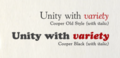
Cooper Black is an ultra-bold serif typeface intended for display use that was designed by Oswald Bruce Cooper and released by the Barnhart Brothers & Spindler type foundry in 1922. [1] The typeface was drawn as an extra-bold weight of Cooper's "Cooper Old Style" family. It rapidly became a standard typeface and was licensed by American Type Founders and also copied by many other manufacturers of printing systems. [2] [3] [4]

Contents

Its use in pop culture increased worldwide since 1966, when the Beach Boys used it for the cover artwork of their album Pet Sounds . It was then featured in the Doors’ L.A. Woman (1971) and David Bowie’s Ziggy Stardust (1972), and in the opening credits of The Bob Newhart Show , Dad's Army , Diff'rent Strokes , Garfield , M*A*S*H , Enos , The New Adventures of Winnie the Pooh , Everybody Hates Chris and other shows. The font is used for the Disney Sing-Along Songs from the intro. [5] [6] As a result, Cooper Black has become emblematic of late-1960s/early-1970s style. [5] It is also known in railroading for its association with the Atchison, Topeka and Santa Fe Railway "Yellowbonnet" paint scheme, also dating to the early 1960s, which had "Santa Fe" in large yellow letters on locomotive sides.

Cooper Black followed on from Cooper's career as a lettering artist in Chicago and the Midwest of America in the 1920s. [3] [7] [8] Cooper Black was advertised as being "for far-sighted printers with near-sighted customers", as well as "the Black Menace" by detractors. [9] While very bold, Cooper Black is based on traditional "old-style" serif lettering, rather than the hard-edged "fat face" fonts popular in the nineteenth century, giving it a soft, 'muddy' appearance, with relatively low contrast between thick and thin strokes. [6] [10] [11] [12]

Cooper Hilite

Cooper Hilite is a version of Cooper Black originally designed by painting white relief impressions into a printed proof of Cooper Black. [3] It has been digitized by ParaType and Wordshape. [13]

Imitations and variants

Cooper Black was immediately popular and spawned imitations, including Goudy Heavy Face from Frederic Goudy, Ludlow Black and Pabst Extra Bold. [14] [15] Cooper Black remains popular: the editors of the typography discussion website Fonts in Use report more submissions of its use than any other face that is not a sans-serif, although outnumbered by Times New Roman once its many variants are added up. [16]

Many unusual versions of Cooper were created in the phototypesetting period of the 1960s and 1970s, a period of explosion in the production of display faces. These included "Ziptop Cooper Black" from Photo Lettering Inc., a version with the top bolder than the bottom, and other distorted variants. [17]

Many digitisations of Cooper Black exist from companies including Bitstream, Adobe and others. [12] Soap, designed by Ray Larabie of Typodermic, is a uni-case variant. [18] A version from URW, which does not include an italic, is bundled with many Microsoft products. [19] Cooper Old Style has been digitised by URW. [20]

Miles Newlyn designed the New Kansas typeface, based on the Cooper Black typeface. [21]

See also

Related Research Articles

In typography, a serif is a small line or stroke regularly attached to the end of a larger stroke in a letter or symbol within a particular font or family of fonts. A typeface or "font family" making use of serifs is called a serif typeface, and a typeface that does not include them is sans-serif. Some typography sources refer to sans-serif typefaces as "grotesque" or "Gothic", and serif typefaces as "roman".

<span class="mw-page-title-main">Futura (typeface)</span> Geometric sans-serif typeface

Futura is a geometric sans-serif typeface designed by Paul Renner and released in 1927. It was designed as a contribution on the New Frankfurt-project. It is based on geometric shapes, especially the circle, similar in spirit to the Bauhaus design style of the period. It was developed as a typeface by the Bauer Type Foundry, in competition with Ludwig & Mayer's seminal Erbar typeface of 1926.

<span class="mw-page-title-main">Frederic Goudy</span> American printer and type designer (1865–1947)

Frederic William Goudy was an American printer, artist and type designer whose typefaces include Copperplate Gothic, Goudy Old Style and Kennerley. He was one of the most prolific of American type designers and his self-named type continues to be one of the most popular in America.

<span class="mw-page-title-main">Oswald Bruce Cooper</span> American type and graphic designer (1879–1940)

Oswald Bruce Cooper was an American type designer, lettering artist, graphic designer, and teacher of these trades.

Oblique type is a form of type that slants slightly to the right, used for the same purposes as italic type. Unlike italic type, however, it does not use different glyph shapes; it uses the same glyphs as roman type, except slanted. Oblique and italic type are technical terms to distinguish between the two ways of creating slanted font styles; oblique designs may be labelled italic by companies selling fonts or by computer programs. Oblique designs may also be called slanted or sloped roman styles. Oblique fonts, as supplied by a font designer, may be simply slanted, but this is often not the case: many have slight corrections made to them to give curves more consistent widths, so they retain the proportions of counters and the thick-and-thin quality of strokes from the regular design.

<span class="mw-page-title-main">Copperplate Gothic</span> Typeface

Copperplate Gothic is a typeface designed by Frederic W. Goudy and first produced by American Type Founders (ATF) beginning in 1901.

<span class="mw-page-title-main">Didone (typography)</span> Classification of serif typefaces

Didone is a genre of serif typeface that emerged in the late 18th century and was the standard style of general-purpose printing during the 19th century. It is characterized by:

<span class="mw-page-title-main">Clarendon (typeface)</span> Slab-serif typeface

Clarendon is the name of a slab serif typeface that was released in 1845 by Thorowgood and Co. of London, a letter foundry often known as the Fann Street Foundry. The original Clarendon design is credited to Robert Besley, a partner in the foundry, and was originally engraved by punchcutter Benjamin Fox, who may also have contributed to its design. Many copies, adaptations and revivals have been released, becoming almost an entire genre of type design.

<span class="mw-page-title-main">Windsor (typeface)</span> Serif typeface created in 1905 by Eleisha Pechey

Windsor is a serif typeface created by Eleisha Pechey (1831-1902) and released by the Stephenson Blake type foundry. It is intended for use such as display and in headings rather than for body text.

<span class="mw-page-title-main">Goudy Old Style</span> Typeface

Goudy Old Style is an old-style serif typeface originally created by Frederic W. Goudy for American Type Founders (ATF) in 1915.

Sol Hess was an American typeface designer. After a three-year scholarship course at Pennsylvania Museum School of Industrial Design, he began at Lanston Monotype in 1902, rising to typographic manager in 1922. He was a close friend and collaborator with Monotype art director Frederic Goudy, succeeding him in that position in 1940. Hess was particularly adept at expanding type faces into whole families, allowing him to complete 85 faces for Monotype, making him America's fourth most prolific type designer. While he was with Monotype, Hess worked on commissions for many prominent users of type, including, Crowell-Collier, Sears Roebuck, Montgomery Ward, Yale University Press, World Publishing Company, and Curtis Publishing for whom he re-designed the typography of their Saturday Evening Post.

Artcraft is an Old Style typeface engraved in 1912 by Robert Wiebking for Wiebking, Hardinge & Company which ran the Advance Type Foundry. It was originally called Craftsman, then Art-Craft, before finally becoming Artcraft. After Advance was sold to the Western Type Foundry in 1914, Wiebking added Artcraft Bold and Artcraft Italic. After Western was sold to Barnhart Brothers & Spindler the face was sold by both BB&S and ATF.

<span class="mw-page-title-main">Cloister (typeface)</span> Typeface

Cloister is a serif typeface that was designed by Morris Fuller Benton and published by American Type Founders from around 1913. It is loosely based on the printing of Nicolas Jenson in Venice in the 1470s, in what is now called the "old style" of serif fonts. American Type Founders presented it as an attractive but highly usable serif typeface, suitable both for body text and display use.

<span class="mw-page-title-main">Cochin (typeface)</span> Serif typeface

Cochin is a serif typeface. It was originally produced in 1912 by Georges Peignot for the Paris foundry G. Peignot et Fils and was based on the copperplate engravings of 18th century French artist Charles-Nicolas Cochin, from which the typeface also takes its name. The font has a small x-height with long ascenders. Georges Peignot also created the design 'Nicolas-Cochin' as a looser variation in the same style.

<span class="mw-page-title-main">Reverse-contrast typefaces</span> Kind of typeface or custom lettering

A reverse-contrast or reverse-stress letterform is a design in which the stress is reversed from the norm: a typeface or custom lettering where the horizontal lines are the thickest. This is the reverse of the vertical lines being the same width or thicker than horizontals, which is normal in Latin-alphabet writing and especially printing. The result is a dramatic effect, in which the letters seem to have been printed the wrong way round. The style invented in the early nineteenth century as attention-grabbing novelty display designs. Modern font designer Peter Biľak, who has created a design in the genre, has described them as "a dirty trick to create freakish letterforms that stood out."

<span class="mw-page-title-main">Display typeface</span> Font that is used at large sizes for headings

A display typeface is a typeface that is intended for use in display type at large sizes for titles, headings, pull quotes, and other eye-catching elements, rather than for extended passages of body text.

<span class="mw-page-title-main">Fat face</span> Style of display typeface and lettering

In typography, a fat face letterform is a serif typeface or piece of lettering in the Didone or modern style with an extremely bold design. Fat face typefaces appeared in London around 1805–1810 and became widely popular; John Lewis describes the fat face as "the first real display typeface."

References

  1. "Cooper Black". Fonts in Use. Retrieved 12 September 2017.
  2. Neil Macmillan (2006). An A–Z of Type Designers. Yale University Press. p. 69. ISBN   0-300-11151-7.
  3. 1 2 3 Heller, Steven. "Telling and selling". Eye. Retrieved 12 September 2017.
  4. Eisinger, Dale. "The Complete History of the Cooper Black Font in Hip-Hop". Complex. Retrieved 12 September 2017.
  5. 1 2 Lewis, Amanda Cooper Black: The Story Behind Louie's Typeface , laweekly.com, August 6, 2012 quote: "didn't truly hit the world over the head until it graced the cover of the Beach Boys' classic 1966 album, Pet Sounds. For the next decade Cooper Black slowly asserted pop culture supremacy, making notable appearances on The Bob Newhart Show, The Odd Couple, 1976's remake of King Kong, The Sting, The Doors' L.A. Woman, “Garfield,” Tootsie Rolls, National Lampoon magazine, David Bowie's Ziggy Stardust, M*A*S*H and Diff'rent Strokes, along with less notable appearances on an unbelievable number of signs, packages, labels, T-shirts and advertisements. (..) has become shorthand for late-'60s/early-'70s nostalgia, as in The Black Keys' “Brothers” or Wet Hot American Summer"
  6. 1 2 Bramley, Ellie Violet (10 April 2017). "Just my type: how Cooper Black became 2017's most fashionable font". The Guardian. Retrieved 12 September 2017.
  7. Shinn, Nick. "The Golden Age of Hand Lettering in American Advertising". Type Culture. Retrieved 1 April 2017.
  8. Middleton, R. Hunter (1937). Chicago Letter Founding. Chicago: Black Cat Press. pp.  22–23 . Retrieved 9 July 2017.
  9. Steven Heller (6 May 2014). Design Literacy: Understanding Graphic Design. Allworth Press. pp. 217–19. ISBN   978-1-62153-413-6.
  10. Phinney, Thomas. "Fat faces". Graphic Design and Publishing Centre. Archived from the original on 9 October 2015. Retrieved 10 August 2015.
  11. Kennard, Jennifer (3 January 2014). "The Story of Our Friend, the Fat Face". Fonts in Use. Retrieved 11 August 2015.
  12. 1 2 Heck, Bethany. "Cooper". Font Review Journal. Retrieved 12 September 2017.
  13. "Cooper Hilite". Fonts in Use. Retrieved 12 September 2017.
  14. Tracy, Walter. Letters of Credit. pp. 130–1.
  15. "Font Family Page".
  16. @fontsinuse (5 March 2018). "Congrats, Cooper Black! 💯 First non-sans to reach one hundred documented Uses" (Tweet) via Twitter.
  17. Coles, Stephen. "Ziptop Cooper Black". Fonts in Use. Retrieved 12 September 2017.
  18. "Typodermic Fonts . . . This page has moved".
  19. "Cooper Black". Microsoft. Retrieved 12 September 2017.
  20. "Cooper Old Style". MyFonts. URW. Retrieved 18 November 2017.
  21. "New Kansas". Miles Newlyn. Retrieved 23 December 2020.

Further reading