
Palatino is an old-style serif typeface designed by Hermann Zapf, initially released in 1949 by the Stempel foundry and later by other companies, most notably the Mergenthaler Linotype Company. Palatino is optimised for legitibility with open counters, balanced proportions, moderate stroke contrast and flared serifs.

A typeface is a design of letters, numbers and other symbols, to be used in printing or for electronic display. Most typefaces include variations in size, weight, slope, width, and so on. Each of these variations of the typeface is a font.

In typography, emphasis is the strengthening of words in a text with a font in a different style from the rest of the text, to highlight them. It is the equivalent of prosody stress in speech.
In typography, italic type is a cursive font based on a stylised form of calligraphic handwriting. Along with blackletter and roman type, it served as one of the major typefaces in the history of Western typography.
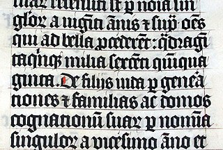
Blackletter, also known as Gothic script, Gothic minuscule or Gothic type, was a script used throughout Western Europe from approximately 1150 until the 17th century. It continued to be commonly used for Danish, Norwegian, and Swedish until the 1870s, Finnish until the turn of the 20th century, Latvian until the 1930s, and for the German language until the 1940s, when Hitler officially discontinued it in 1941. Fraktur is a notable script of this type, and sometimes the entire group of blackletter faces is referred to as Fraktur. Blackletter is sometimes referred to as Old English, but it is not to be confused with the Old English language, which predates blackletter by many centuries and was written in the insular script or in Futhorc. Along with Italic type and Roman type, blackletter served as one of the major typefaces in the history of Western typography.
Lucida Sans Unicode is an OpenType typeface from the design studio of Bigelow & Holmes, designed to support the most commonly used characters defined in version 1.0 of the Unicode standard. It is a sans-serif variant of the Lucida font family and supports Latin, Greek, Cyrillic and Hebrew scripts, as well as all the characters used in the International Phonetic Alphabet.
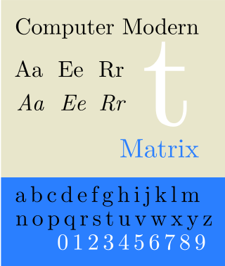
Computer Modern is the original family of typefaces used by the typesetting program TeX. It was created by Donald Knuth with his Metafont program, and was most recently updated in 1992. Computer Modern, or variants of it, remains very widely used in scientific publishing, especially in disciplines that make frequent use of mathematical notation.

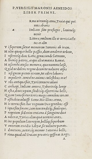
Antiqua is a style of typeface used to mimic styles of handwriting or calligraphy common during the 15th and 16th centuries. Letters are designed to flow, and strokes connect together in a continuous fashion; in this way it is often contrasted with Fraktur-style typefaces where the individual strokes are broken apart. The two typefaces were used alongside each other in the Germanophone world, with the Antiqua–Fraktur dispute often dividing along ideological or political lines. After the mid-20th century, Fraktur fell out of favor and Antiqua-based typefaces became the official standard in Germany.

Johnston is a sans-serif typeface designed by and named after Edward Johnston. The typeface was commissioned in 1913 by Frank Pick, commercial manager of the Underground Electric Railways Company of London, as part of his plan to strengthen the company's corporate identity. Johnston was originally created for printing, but it rapidly became used for the enamel station signs of the Underground system as well.

The r rotunda ⟨ ꝛ ⟩, "rounded r", is a historical calligraphic variant of the minuscule (lowercase) letter Latin r used in full script-like typefaces, especially blackletters.

Lucida Grande is a humanist sans-serif typeface. It is a member of the Lucida family of typefaces designed by Charles Bigelow and Kris Holmes. It is best known for its implementation throughout the macOS user interface from 1999 to 2014, as well as in other Apple software like Safari for Windows. As of OS X Yosemite, the system font was changed from Lucida Grande to Helvetica Neue. In OS X El Capitan the system font changed again, this time to San Francisco.

Kris Holmes is an American typeface designer, calligrapher, type design educator and animator. She, with Charles Bigelow, is the co-creator of the Lucida and Wingdings font families, among many other typeface designs. She is President and Co-Founder of Bigelow & Holmes Inc., a typeface design studio.
Oblique type is a form of type that slants slightly to the right, used for the same purposes as italic type. Unlike italic type, however, it does not use different glyph shapes; it uses the same glyphs as roman type, except slanted. Oblique and italic type are technical terms to distinguish between the two ways of creating slanted font styles; oblique designs may be labelled italic by companies selling fonts or by computer programs. Oblique designs may also be called slanted or sloped roman styles. Oblique fonts, as supplied by a font designer, may be simply slanted, but this is often not the case: many have slight corrections made to them to give curves more consistent widths, so they retain the proportions of counters and the thick-and-thin quality of strokes from the regular design.
Segoe is a typeface, or family of fonts, that is best known for its use by Microsoft. The company uses Segoe in its online and printed marketing materials, including recent logos for a number of products. Additionally, the Segoe UI font sub-family is used by numerous Microsoft applications, and may be installed by applications. It was adopted as Microsoft's default operating system font, and is also used on Outlook.com, Microsoft's web-based email service. On August 23, 2012, Microsoft unveiled its new corporate logo typeset in Segoe, replacing the logo it had used for the previous 25 years.

In metal typesetting, a font or fount is a particular size, weight and style of a typeface, defined as the set of fonts that share an overall design. For instance, the typeface Bauer Bodoni includes fonts "Roman", "bold" and "italic"; each of these exists in a variety of sizes.
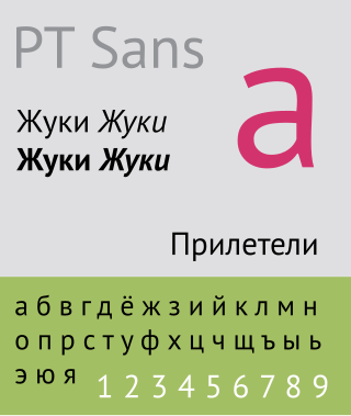
The Public Type or PT Fonts are a family of free and open-source fonts released from 2009 onwards, comprising PT Sans, PT Serif and PT Mono. They were commissioned from the design agency ParaType by Rospechat, a department of the Russian Ministry of Communications, to celebrate the 300th anniversary of Peter the Great's orthography reform and to create a font family that supported all the different variations of Cyrillic script used by the minority languages of Russia, as well as the Latin alphabet.
Arabic typography is the typography of letters, graphemes, characters or text in Arabic script, for example for writing Arabic, Persian, or Urdu. 16th century Arabic typography was a by-product of Latin typography with Syriac and Latin proportions and aesthetics. It lacked expertise in the three core aspects of Arabic writing: calligraphy, style and system. Calligraphy requires aesthetically skilled writing in a chosen canonical style such as naskh, nastaʿlīq or ruqʿah. System denotes the script grammar covering such rules as horizontality and stretching.


