
Palatino is the name of an old-style serif typeface designed by Hermann Zapf, initially released in 1949 by the Stempel foundry and later by other companies, most notably the Mergenthaler Linotype Company.
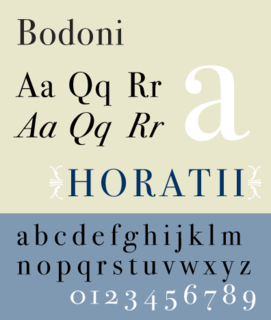
Bodoni is the name given to the serif typefaces first designed by Giambattista Bodoni (1740–1813) in the late eighteenth century and frequently revived since. Bodoni's typefaces are classified as Didone or modern. Bodoni followed the ideas of John Baskerville, as found in the printing type Baskerville—increased stroke contrast reflecting developing printing technology and a more vertical axis—but he took them to a more extreme conclusion. Bodoni had a long career and his designs changed and varied, ending with a typeface of a slightly condensed underlying structure with flat, unbracketed serifs, extreme contrast between thick and thin strokes, and an overall geometric construction.
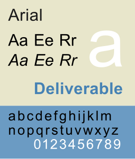
Arial, sometimes marketed or displayed in software as Arial MT, is a realist sans-serif typeface and set of computer fonts. Fonts from the Arial family are packaged with all versions of Microsoft Windows from Windows 3.1 onwards, some other Microsoft software applications, Apple's macOS and many PostScript 3 computer printers. The typeface was designed in 1982, by Robin Nicholas and Patricia Saunders, for Monotype Typography. It was created to be metrically identical to the popular typeface Helvetica, with all character widths identical, so that a document designed in Helvetica could be displayed and printed correctly without having to pay for a Helvetica license.

Johnston is a sans-serif typeface designed by and named after Edward Johnston. The typeface was commissioned in 1913 by Frank Pick, commercial manager of the Underground Electric Railways Company of London, as part of his plan to strengthen the company's corporate identity. Johnston was originally created for printing, but it rapidly became used for the enamel station signs of the Underground system as well.

Eras is a humanist sans-serif typeface designed by Albert Boton and Albert Hollenstein, and released by the International Typeface Corporation (ITC) in 1976. Eras is licensed by the Linotype type foundry.
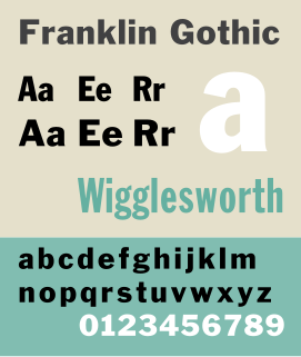
Franklin Gothic and its related faces are a large family of realist sans-serif typefaces developed in the early years of the 20th century by the type foundry American Type Founders (ATF) and credited to its head designer Morris Fuller Benton. “Gothic” was a contemporary term meaning sans-serif.
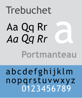
Trebuchet MS is a humanist sans-serif typeface that Vincent Connare designed for the Microsoft Corporation in 1996. It is named after the trebuchet, a medieval siege engine. The name was inspired by a puzzle question that Connare heard at Microsoft headquarters: "Can you make a trebuchet that could launch a person from main campus to the new consumer campus about a mile away? Mathematically, is it possible and how?" Connare "thought that would be a great name for a font that launches words across the Internet". Trebuchet MS was the font used for the window titles in the Windows XP default theme, succeeding MS Sans Serif and Tahoma. Released free of charge by Microsoft as part of their core fonts for the Web package, it remains one of the most popular body text fonts on webpages.
Aldo Novarese was an Italian type designer who lived and worked mostly in Turin.
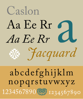
Caslon is the name given to serif typefaces designed by William Caslon I in London, or inspired by his work.
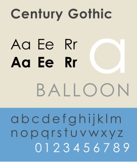
Century Gothic is a sans-serif typeface in the geometric style, released by Monotype Imaging in 1991. It is strongly influenced by the font Futura, but with a larger x-height. Its design also derives from two other typefaces that were designed to compete with Futura. It is an exclusively digital typeface that has never been manufactured as metal type.
In metal typesetting, a font was a particular size, weight and style of a typeface. Each font was a matched set of type, one piece for each glyph, and a typeface consisting of a range of fonts that shared an overall design.

Bookman or Bookman Old Style, is a serif typeface. A wide, legible design that is slightly bolder than most body text faces, Bookman has been used for both display typography and for printing at small sizes such as in trade printing, and less commonly for body text. In advertising use it is particularly associated with the graphic design of the 1960s and 1970s, when revivals of it were very popular.

Cheltenham is a typeface for display use designed in 1896 by architect Bertram Goodhue and Ingalls Kimball, director of the Cheltenham Press. The original drawings were known as Boston Old Style and were made about 14" high. These drawings were then turned over to Morris Fuller Benton at American Type Founders (ATF) who developed it into a final design. Trial cuttings were made as early as 1899 but the face was not complete until 1902. The face was patented by Kimball in 1904. Later the basic face was spun out into an extensive type family by Morris Fuller Benton.

Perpetua is a serif typeface that was designed by English sculptor and stonemason Eric Gill for the British Monotype Corporation. Perpetua was commissioned at the request of Stanley Morison, an influential historian of printing and adviser to Monotype around 1925, at a time when Gill's reputation as a leading artist-craftsman was high. Perpetua was intended as a crisp, contemporary design not following any specific historic model, with a structure influenced by Gill's experience of carving lettering for monuments and memorials. Perpetua is commonly used for covers and headings and also sometimes for body text; it has been particularly popular in fine book printing. Perpetua was released with characters for the Greek alphabet and a matching set of titling capitals for headings.
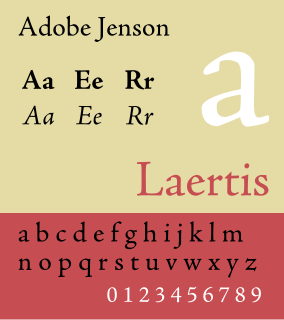
Adobe Jenson is an old-style serif typeface drawn for Adobe Systems by its chief type designer Robert Slimbach. Its Roman styles are based on a text face cut by Nicolas Jenson in Venice around 1470, and its italics are based on those created by Ludovico Vicentino degli Arrighi fifty years later.
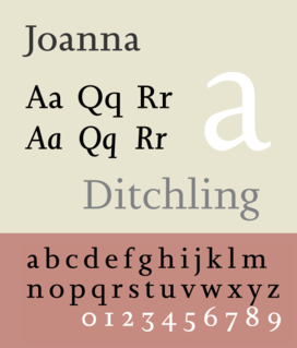
Joanna is a serif typeface designed by Eric Gill (1882–1940) in the period 1930–31, and named for one of his daughters. Gill chose Joanna for setting An Essay on Typography, a book by Gill on his thoughts on typography, typesetting, and page design. He described it as "a book face free from all fancy business."

Centaur is a serif typeface by book and typeface designer Bruce Rogers, based on the Renaissance-period printing of Nicolas Jenson around 1470. He used it for his design of the Oxford Lectern Bible. It was given widespread release by the British branch of Monotype, paired with an italic designed by calligrapher Frederic Warde and based on the slightly later work of calligrapher and printer Ludovico Vicentino degli Arrighi. The italic has sometimes been named separately as the "Arrighi" italic.
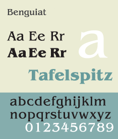
ITC Benguiat is a decorative serif typeface designed by Ed Benguiat and released by the International Typeface Corporation (ITC) in 1977. The face is loosely based upon typefaces of the Art Nouveau period but is not considered an academic revival. The face follows ITC's design formulary of an extremely high x-height, combined with multiple widths and weights.
