Sylfaen (typeface)

Last updated
Sylfaen
Category Serif
Designer(s) John Hudson, W. Ross Mills, Geraldine Wade
Commissioned by Microsoft
Foundry Tiro Typeworks
Date created1998
TrademarkSylfaen is either a registered trademark or a trademark of Microsoft Corporation in the United States and other countries.
"Wikipedia" in English, Armenian, and Georgian, in Sylfaen Sylfaen Wikipedia.png
"Wikipedia" in English, Armenian, and Georgian, in Sylfaen

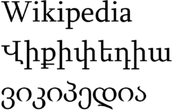
Sylfaen is a multi-script serif font family designed by John Hudson and W. Ross Mills of Tiro Typeworks, and Geraldine Wade of Monotype Typography. The name Sylfaen is a Welsh word meaning foundation. [1]

Contents

In 1997, Tiro was hired by Microsoft Typography to consult on the production of support materials for OpenType font development. Part of this project was producing a multi-script font used for displaying glyphs in Microsoft's cancelled Web Resource for International Typography (WRIT) database, which was a tool for establishing character and glyph requirements for given languages, geographical areas or scripts (or combinations thereof). The project included support for Latin, IPA, Cyrillic, Greek, Armenian, Georgian, and Ge'ez (Ethiopian) characters.

Latin glyphs were designed by John Hudson, and the first script developed for Sylfaen.

Cyrillic glyphs were designed by John Hudson. The design was reviewed by Maxim Zhukov, typographic coordinator for the United Nations.

Greek glyphs were designed by Geraldine Wade, based on the Latin glyphs, with consultation from Gerry Leonidas. Only the glyphs used in monotonic orthography are available.

Armenian glyphs were designed by Geraldine Wade, under the guidance of Armenian type designer Manvel Shmavonyan, and his Russian colleague Vladimir Yefimov at ParaType in Moscow. It includes 'classical caps', which are based on the tall capitals in Armenian manuscript.

Georgian glyphs include khutsuri [ citation needed ] and mxedruli letters. The development of the Georgian script came to a halt when Georgian type designer Anton Dumbadze was fatally struck by a car before being able to finish the design. As a result the font is incomplete. [1] :p.15 [2]

Ethiopic glyphs were designed by Geraldine Wade.

The font shipped with Windows 2000 and XP only include a subset of the original designs. In particular, IPA, Polytonic Greek, Ethiopic glyphs are missing. It supports WGL4, Armenian script, and the minuscules of the Georgian alphabet. OpenType features include small caps, glyph substitution.

Nyala

In 2003–04, John Hudson completely re-drew the Sylfaen Ethiopic glyphs from the original Sylfaen, regularising them and making them suited to a wider range of publishing needs. This re-design was released by Microsoft in Windows Vista, under the name Nyala. The font name was named for the mountain nyala (Tragelaphus buxtoni), a species of great African antelope native to the highlands of Ethiopia.

Latin glyphs were designed to harmonize with the Ethiopic glyphs to facilitate the typesetting of texts including un-transliterated foreign names, technical terms, etc. The Ethiopic characters were based on initial drawings by Geraldine Wade.

Awards

Sylfaen Cyrillic received an award at Kyrillitsa '99 in the text category as well as The Golden Buki Prize for an 'outstanding contribution to the development of Cyrillic typography and international typographic communications'. [3]

Related Research Articles

Cyrillic script alphabetic writing system

The Cyrillic script is a writing system used for various alphabets across Eurasia and is used as the national script in various Slavic-, Turkic- and Persian-speaking countries in Eastern Europe, the Caucasus, Central Asia, and Northern Asia.

Typeface Set of characters that share common design features

In typography, a typeface is a set of one or more fonts each composed of glyphs that share common design features. Each font of a typeface has a specific weight, style, condensation, width, slant, italicization, ornamentation, and designer or foundry. For example, "ITC Garamond Bold Condensed Italic" means the bold, condensed-width, italic version of ITC Garamond. It is a different font from "ITC Garamond Condensed Italic" and "ITC Garamond Bold Condensed", but all are fonts within the same typeface, "ITC Garamond". ITC Garamond is a different typeface from "Adobe Garamond" or "Monotype Garamond". There are thousands of different typefaces in existence, with new ones being developed constantly.

Koppa or qoppa is a letter that was used in early forms of the Greek alphabet, derived from Phoenician qoph . It was originally used to denote the sound, but dropped out of use as an alphabetic character in favor of Kappa (Κ). It has remained in use as a numeral symbol (90) in the system of Greek numerals, although with a modified shape. Koppa is the source of Latin Q, as well as the Cyrillic numeral sign of the same name (Koppa).

OpenType is a format for scalable computer fonts. It was built on its predecessor TrueType, retaining TrueType's basic structure and adding many intricate data structures for prescribing typographic behavior. OpenType is a registered trademark of Microsoft Corporation.

Arial typeface

Arial, sometimes marketed or displayed in software as Arial MT, is a sans-serif typeface and set of computer fonts. Fonts from the Arial family are packaged with all versions of Microsoft Windows from Windows 3.1 onwards, some other Microsoft software applications, Apple's macOS and many PostScript 3 computer printers. The typeface was designed in 1982, by Robin Nicholas and Patricia Saunders, for Monotype Typography. It was created to be metrically identical to the popular typeface Helvetica, with all character widths identical, so that a document designed in Helvetica could be displayed and printed correctly without having to pay for a Helvetica license.

Gentium typeface

Gentium is a Unicode serif typeface designed by Victor Gaultney. Gentium fonts are free and open source software, and are released under the SIL Open Font License (OFL), which permits modification and redistribution. Gentium has wide support for languages using the Latin, Greek, and Cyrillic alphabets, and the International Phonetic Alphabet. Gentium Plus variants released in November 2010 now include over 5,500 glyphs and advanced typographic features through OpenType and Graphite.

Uniscribe is the Microsoft Windows set of services for rendering Unicode-encoded text, especially complex text layout. They are implemented in the DLL USP10.DLL. USP10.dll became available to the public with Windows 2000 and Internet Explorer 5.0. In addition, the Windows CE platform has supported Uniscribe since version 5.0.

Bitstream Cyberbit serif typeface

Bitstream Cyberbit is a commercial serif Unicode font designed by Bitstream Inc. It is freeware for non-commercial uses. It was historically one of the first widely available fonts with support for a large proportion of the Unicode repertoire.

Small caps Lowercase characters that resemble uppercase letters except smaller in height

In typography, small capitals are lowercase characters typeset with glyphs that resemble uppercase letters ("capitals") but reduced in height and weight, close to the surrounding lowercase (small) letters or text figures. Note that this is technically not a case-transformation, but a substitution of glyphs, although the effect is often simulated by case-transformation and scaling. Small caps are used in running text as a form of emphasis that is less dominant than all uppercase text, and as a method of emphasis or distinctiveness for text alongside or instead of italics, or when boldface is inappropriate. For example, the "Text in small caps" appears as Tᴇxᴛ ɪɴ sᴍᴀʟʟ ᴄᴀᴘs in small caps. Small caps can be used to draw attention to the opening phrase or line of a new section of text, or to provide an additional style in a dictionary entry where many parts must be typographically differentiated.

The internationalized domain name (IDN) homograph attack is a way a malicious party may deceive computer users about what remote system they are communicating with, by exploiting the fact that many different characters look alike. For example, a regular user of example.com may be lured to click a link where the Latin character "a" is replaced with the Cyrillic character "а".

Segoe is a typeface, or family of fonts, that is best known for its use by Microsoft. The company uses Segoe in its online and printed marketing materials, including recent logos for a number of products. Additionally, the Segoe UI font sub-family is used by numerous Microsoft applications, and may be installed by applications. It was adopted as Microsoft's default operating system font beginning with Windows Vista, and is also used on outlook.com, Microsoft's web-based email service. In August 2012, Microsoft unveiled its new corporate logo typeset in Segoe, replacing the logo it had used for the previous 25 years.

STIX Fonts project

The STIX Fonts project, Scientific and Technical Information Exchange (STIX), is a project sponsored by several leading scientific and technical publishers to provide, under royalty-free license, a comprehensive font set of mathematical symbols and alphabets, intended to serve the scientific and engineering community for electronic and print publication. The STIX fonts are available as fully hinted OpenType/CFF fonts. There is currently no TrueType version of the STIX fonts available, but the STIX Mission Statement includes the intention to create one in the future. However there exists an unofficial conversion of STIX Fonts to TrueType, suitable for use with software without OpenType support.

GNU FreeFont Font family

GNU FreeFont is a family of free OpenType, TrueType and WOFF vector fonts, implementing as much of the Universal Character Set (UCS) as possible. The project was initiated in 2002 by Primož Peterlin and is now maintained by Steve White.

Microsoft Sans Serif

Microsoft Sans Serif is a TrueType font introduced with Windows 2000. It is a successor of MS Sans Serif, a proportional raster font introduced in Windows 1.0. Both fonts are very similar in design to Arial and Helvetica. This font was made to match the MS Sans bitmap included in the early releases of Microsoft Windows.

Minion (typeface) digital typeface designed by Robert Slimbach in 1990 for Adobe Systems

Minion is a serif typeface released in 1990 by Adobe Systems. Designed by Robert Slimbach, it is inspired by late Renaissance-era type and intended for body text and extended reading. Minion's name comes from the traditional naming system for type sizes, in which minion is between nonpareil and brevier, with the type body 7pt in height. As the historically rooted name indicates, Minion was designed for body text in a classic style, although slightly condensed and with large apertures to increase legibility. Slimbach described the design as having "a simplified structure and moderate proportions." The design is slightly condensed, although Slimbach has said that this was intended not for commercial reasons so much as to achieve a good balance of the size of letters relative to the ascenders and descenders.

Nyala is an OpenType TrueType flavour font based on Sylfaen and designed to support the Latin alphabet and the Ge'ez script used in Ethiopic languages. It was created by John Hudson and Geraldine Wade and is part of the Windows Vista, Windows Server 2008, and Windows 7. The font was named for the mountain nyala, a species of great African antelope native to the highlands of Ethiopia.

A typographic approximation is a replacement of an element of the writing system with another glyph or glyphs. The replacement may be a nearly homographic character, a digraph, or a character string. An approximation is different from a typographical error in that an approximation is intentional and aims to preserve the visual appearance of the original. The concept of approximation also applies to the World Wide Web and other forms of textual information available via digital media, though usually at the level of characters, not glyphs.

Nirmala UI sans-serif typeface with support for Indic scripts

Nirmala UI is an Indic scripts typeface created by Tiro Typeworks and commissioned by Microsoft. It was first released with Windows 8 in 2012 as a UI font and supports languages using Bengali, Devanagari, Kannada, Gujarati, Gurmukhi, Malayalam, Odia, Ol Chiki, Sinhala, Sora Sompeng, Tamil and Telugu. It also has support for Latin, with glyphs matching Segoe UI. It is also packaged with Microsoft Office 2013 and later versions of Windows. It has 3 weights : Regular, Bold and SemiLight.

Fiona Ross is a British type designer, academic and linguist. Since 2003, she has worked at the University of Reading, where she is Professor and Lecturer in Non-Latin Typeface Design. She received the 2014 SoTA Typography Award and the 2018 TDC Medal.

References

  1. 1 2 Hudson, John (2000). "Sylfaen : Foundations of Multiscript Typography" (PDF). Tiro Typeworks. Archived from the original (PDF) on 2011-07-24.
  2. Hudson, John (December 1998). "Anton Dumbadze 1933–1998". Microsoft, from an article for Fontzone.
  3. U&lc Online Issue: 25.4.1: The Winners