Fixedsys

Last updated
Fixedsys
Fixedsys font sample-withText Fixedsys.svg
Category Sans-serif
Designer(s) Bitstream Inc.
Commissioned by Microsoft
Foundry Microsoft
Date created1984;40 years ago (1984)
Date released1985;39 years ago (1985)
Also known asSysFixed [1]
Fixedsysfontpreview.svg
Sample
See all characters

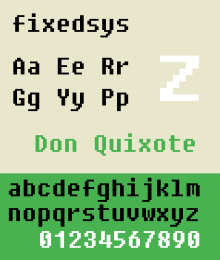
Fixedsys is a family of raster monospaced fonts. The name means fixed system, because its glyphs are monospace or fixed-width (although bolded characters are wider than non-bolded, unlike other monospace fonts such as Courier). It is the oldest font in Microsoft Windows, and was the system font in Windows 1.0 and 2.0, where it was simply named "System". For Windows 3.x, the system font was changed to a proportional sans-serif font named System, but Fixedsys remained the default font in Notepad.

Contents

Fixedsys fonts family contains fonts encoded in several Windows code pages, with multiple resolutions of the font for each code page. Fixedsys fonts of different code pages have different point sizes.

The glyphs for the upper areas of each one appear to be drawn separately, not taken from a single master set, as there are visible differences in the appearance of various visually similar characters that are shared between the code pages.

Though Fixedsys is a sans-serif font, it is vaguely similar in appearance to the hardware text mode font of most IBM-compatible PCs, though not as similar as certain sizes of Terminal fonts seen in Windows.

In Windows 95, 98, and Windows Me, Fixedsys remains as the default font for Notepad. This font was superseded by Lucida Console in Notepad for later versions of Windows. In Windows 95, this default font cannot be changed. Fixedsys of other code pages can be selected by specifying script settings in font selection dialogue, but not font of all code pages can be chosen.

Due to its clean style and easy readability, it has enjoyed some popularity with the programming community, even giving rise to an imitation font — Fixedsys Excelsior — which, based on the original Fixedsys typeface, also includes a large number of Unicode script ranges. [2]

There is a certain amount of similarity between Fixedsys and Chicago, the default system typeface on the Apple Macintosh between 1984 and 1997. The key difference is that Chicago is a proportional typeface while Fixedsys is monospaced. A smaller CGA version of this font also exists, with some characters bearing a resemblance to the IBM 8x8 CGA font. The EGA version is nearly identical to the CGA version, only in differing in a small number of characters.

According to a string embedded in the .FON file (which is viewable with a hex editor or with a typeface editor such as Fony), this font was designed in 1984 by Bitstream Inc., but the high resolution 8514/a version (used in modern versions of Windows operating system as the high DPI variant, which is larger and looks different from the VGA version) was designed in 1987 by Microsoft Corporation.

Example

The following is the lorem ipsum as it appears here written in Fixedsys.

Fixedsys sample.gif

See also

Related Research Articles

<span class="mw-page-title-main">Typeface</span> Set of characters that share common design features

A typeface is a design of letters, numbers and other symbols, to be used in printing or for electronic display. Most typefaces include variations in size, weight, slope, width, and so on. Each of these variations of the typeface is a font.

<span class="mw-page-title-main">Arial</span> Neo-grotesque sans-serif typeface

Arial is a sans-serif typeface and set of computer fonts in the neo-grotesque style. Fonts from the Arial family are included with all versions of Microsoft Windows after Windows 3.1, as well as in other Microsoft programs, Apple's macOS, and many PostScript 3 printers.

<span class="mw-page-title-main">Courier (typeface)</span> Monospaced slab serif font of IBM

Courier is a monospaced slab serif typeface. Courier was created by IBM in the mid-1950s, and was designed by Howard "Bud" Kettler (1919–1999). The Courier name and typeface concept are in the public domain. Courier has been adapted for use as a computer font, and versions of it are installed on most desktop computers.

<span class="mw-page-title-main">Lucida</span> Typeface family designed by Charles Bigelow and Kris Holmes in 1984

Lucida is an extended family of related typefaces designed by Charles Bigelow and Kris Holmes and released from 1984 onwards. The family is intended to be extremely legible when printed at small size or displayed on a low-resolution display – hence the name, from 'lucid'.

The font family selection in (X)HTML, CSS, and derived systems specifies a list of prioritized fonts and generic family names; in conjunction with correlating font properties, this list determines the particular font face used to render characters. The family selection is available in two forms: in the deprecated (X)HTML <font>...</font> element with its face attribute, and in the CSS font-family property.

<span class="mw-page-title-main">Lucida Grande</span> Font

Lucida Grande is a humanist sans-serif typeface. It is a member of the Lucida family of typefaces designed by Charles Bigelow and Kris Holmes. It is best known for its implementation throughout the macOS user interface from 1999 to 2014, as well as in other Apple software like Safari for Windows. As of OS X Yosemite, the system font was changed from Lucida Grande to Helvetica Neue. In OS X El Capitan the system font changed again, this time to San Francisco.

<span class="mw-page-title-main">Trebuchet MS</span> Digital sans-serif typeface family

Trebuchet MS is a humanist sans-serif typeface that Vincent Connare designed for Microsoft Corporation in 1996. Trebuchet MS was the font used for the window titles in the Windows XP default theme, succeeding MS Sans Serif and Tahoma. Released free of charge by Microsoft as part of their core fonts for the Web package, it remained one of the most popular body text fonts on webpages as of 2009.

<span class="mw-page-title-main">Andalé Mono</span> Monospaced typeface

Andalé Mono is a monospaced sans-serif typeface designed by Steve Matteson for terminal emulation and software development environments, originally for the Taligent project by Apple Inc. and IBM. Andalé Mono has a sibling called Andalé Sans.

<span class="mw-page-title-main">Roboto</span> Open-source sans-serif typeface family

Roboto is a neo-grotesque sans-serif typeface family developed by Google as the system font for its mobile operating system Android, and released in 2011 for Android 4.0 "Ice Cream Sandwich".

Segoe is a typeface, or family of fonts, that is best known for its use by Microsoft. The company uses Segoe in its online and printed marketing materials, including recent logos for a number of products. Additionally, the Segoe UI font sub-family is used by numerous Microsoft applications, and may be installed by applications. It was adopted as Microsoft's default operating system font beginning with Windows Vista, and is also used on Outlook.com, Microsoft's web-based email service. In August 2012, Microsoft unveiled its new corporate logo typeset in Segoe, replacing the logo it had used for the previous 25 years.

Terminal is a family of monospaced raster typefaces. It is relatively small compared with Courier. It uses crossed zeros, and is designed to approximate the font normally used in MS-DOS or other text-based consoles such as on Linux. In Microsoft Windows, it is used as the default font in the Command Prompt in Windows 7 and earlier.

Apple's Macintosh computer supports a wide variety of fonts. This support was one of the features that initially distinguished it from other systems.

<span class="mw-page-title-main">Microsoft Sans Serif</span> Neo-grotesque sans-serif typeface

Microsoft Sans Serif is a sans-serif typeface introduced with early Microsoft Windows versions. It is the successor of MS Sans Serif, formerly Helv, a proportional bitmap font introduced in Windows 1.0. Both typefaces are very similar in design to Arial and Helvetica. The typeface was designed to match the MS Sans bitmap included in the early releases of Microsoft Windows.

<span class="mw-page-title-main">Liberation fonts</span> Open-source font superfamily

Liberation is the collective name of four TrueType font families: Liberation Sans, Liberation Sans Narrow, Liberation Serif, and Liberation Mono. These fonts are metrically compatible with the most popular fonts on the Microsoft Windows operating system and the Microsoft Office software package, for which Liberation is intended as a free substitute. The fonts are default in LibreOffice.

System is a family of proportional raster fonts distributed with Microsoft Windows. Sharing the same letterforms as Microsoft Sans Serif, the font family contains fonts encoded in several Windows code pages, with multiple resolutions of the font for each code page. Fonts of different code pages have different point sizes. Under double-byte character set Windows environments, specifying this font may also cause applications to use non-System fonts when displaying texts.

<span class="mw-page-title-main">Malgun Gothic</span> Sans-serif typeface

Malgun Gothic is a Korean sans-serif typeface developed by Sandoll Communications, with hinting by Monotype Imaging, as a replacement of Dotum and Gulim as the default system font for the Korean language version of Windows Vista. It was first shipped with Windows Vista, being available to download later for Windows Server 2003 and Windows XP users. The name "malgun" means "clear" in Korean, thus making a direct translation of the font's name "Clear Gothic."

<span class="mw-page-title-main">Web typography</span> Publishing considerations for the Web

Web typography, like typography generally, is the design of pages – their layout and typeface choices. Unlike traditional print-based typography, pages intended for display on the World Wide Web have additional technical challenges and – given its ability to change the presentation dynamically – additional opportunities. Early web page designs were very simple due to technology limitations; modern designs use Cascading Style Sheets (CSS), JavaScript and other techniques to deliver the typographer's and the client's vision.

A duospaced font is a fixed-width font whose letters and characters occupy either of two integer multiples of a specified, fixed horizontal space. Traditionally, this means either a single or double character width, although the term has also been applied to fonts using fixed character widths with another simple ratio between them.

<span class="mw-page-title-main">IBM Plex</span> Open source typeface family

IBM Plex is an open source typeface superfamily conceptually designed and developed by Mike Abbink at IBM in collaboration with Bold Monday to reflect the design principles of IBM and to be used for all brand material across the company internationally. Plex replaces Helvetica as the IBM corporate typeface after more than fifty years, freeing the company from extensive license payments in the process.

References

  1. "About Microsoft Typography - Typography". 2020-03-10. Retrieved 2021-05-21.
  2. "Fixedsys Excelsior 3.00 Truetype Multilingual Font". 2019-02-07. Archived from the original on 2019-02-07. Retrieved 2019-11-20. The current home of the font is http://github.com/kika/fixedsys