Comic Neue

Last updated
Comic Neue
Comic Neue Specimen.svg
Category Script
Designer(s) Craig Rozynski with Hrant Papazian
Date releasedApril 2014
License SIL OFL
Design based on Comic Sans
VariationsComic Neue Angular
Website comicneue.com

Comic Neue is a casual script typeface released in 2014. It was designed by Craig Rozynski with Hrant Papazian as a more modern, refined version of the ubiquitous, but often criticized typeface Comic Sans. [1] [2]

Contents

Design

Comparison of Comic Sans and Comic Neue; in creating the new typeface, Rozynski made the strokes straighter and more regular Comic Neue and Comic Sans comparison (DYK).svg
Comparison of Comic Sans and Comic Neue; in creating the new typeface, Rozynski made the strokes straighter and more regular

Comic Neue was designed by Craig Rozynski, an Australian graphic designer living in Japan, who wanted to create an informal script typeface similar to the controversial Microsoft font Comic Sans created by Vincent Connare in the 1990s. [3] [4] Comic Sans has been called "the world's most reviled typeface," [5] and Rozynski aimed to update it to be more suitable to the modern generation and more widely acceptable, including "the typographically savvy." [4] He based his design on the original glyphs of Comic Sans—"beating them into shape", as he put it, to create the new typeface. [4] He wanted to refine the original letter forms to make them more sophisticated, to create "a version [of the original] you couldn't easily fault", while "maintaining the honesty that made Comic Sans so popular." [4] [5] [6]

When he first had the idea to "save" Comic Sans, Rozynski expected the project would take a month to complete; it took three years. [7] He planned the typeface as a joke, but he soon began to take it seriously, [6] commissioning Hrant Papazian of The MicroFoundry for improvements to outlines, spacing and kerning of all 12 fonts in the family. It was released in April 2014 and a Kickstarter crowdfunding campaign successfully raised $10,000 to expand the typeface to support non-English languages. [7] [8] The original typeface can be downloaded for free from its official website, but Rozynski has suggested that he may sell future, more complete releases. [6] He has said he hoped a type foundry or online type library such as Adobe's TypeKit [7] would pick it up.

Variants

Top: Comic Neue and Comic Neue Angular; regular; center: as above, bold; followed by: Comic Sans, regular, and Komika Text, a font designed for Comic books. Comparison of variants of font Comic Neue with Comic Sans and Komika.svg
Top: Comic Neue and Comic Neue Angular; regular; center: as above, bold; followed by: Comic Sans , regular, and Komika Text, a font designed for Comic books.

The typeface was released in two variants: Comic Neue and Comic Neue Angular. In the latter, the rounded terminals ending each stroke are made angular. [5] [9] Rozynski claims that the angular version was "a happy accident". [6] Both variants include bold, regular, and light weights, and each weight is available in roman and italic fonts. [8]

The current (as of December 2022) release 2.51 contains letters for most European languages which use the Latin script.

Reception

Commentary on the typeface has been mostly positive.

On the other hand, some people have criticized the font for keeping the original's goofy, amateurish nature.

Rozynski has noted that most criticism of the typeface came from type designers rather than laypeople. [7]

Related Research Articles

<span class="mw-page-title-main">Palatino</span> Serif typeface

Palatino is the name of an old-style serif typeface designed by Hermann Zapf, initially released in 1949 by the Stempel foundry and later by other companies, most notably the Mergenthaler Linotype Company.

<span class="mw-page-title-main">Helvetica</span> Neo-grotesque sans-serif typeface

Helvetica, also known by its original name Neue Haas Grotesk, is a widely used sans-serif typeface developed in 1957 by Swiss typeface designer Max Miedinger and Eduard Hoffmann.

<span class="mw-page-title-main">Matthew Carter</span> British type designer (born 1937)

Matthew Carter is a British type designer. A 2005 New Yorker profile described him as 'the most widely read man in the world' by considering the amount of text set in his commonly used typefaces.

<span class="mw-page-title-main">Frutiger (typeface)</span> Typeface designed by Adrian Frutiger

Frutiger is a series of typefaces named after its Swiss designer, Adrian Frutiger. Frutiger is a humanist sans-serif typeface, intended to be clear and highly legible at a distance or at small text sizes. A popular design worldwide, type designer Steve Matteson described its structure as "the best choice for legibility in pretty much any situation" at small text sizes, while Erik Spiekermann named it as "the best general typeface ever".

<span class="mw-page-title-main">Adrian Frutiger</span> Swiss typeface designer (1928–2015)

Adrian Johann Frutiger was a Swiss typeface designer who influenced the direction of type design in the second half of the 20th century. His career spanned the hot metal, phototypesetting and digital typesetting eras. Until his death, he lived in Bremgarten bei Bern.

<span class="mw-page-title-main">Comic Sans</span> Sans-serif typeface family by Microsoft Corporation

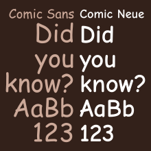
Comic Sans MS is a sans-serif typeface designed by Vincent Connare and released in 1994 by Microsoft Corporation. It is a non-connecting script inspired by comic book lettering, intended for use in cartoon speech bubbles, as well as in other casual environments, such as informal documents and children's materials.

<span class="mw-page-title-main">Typography of Apple Inc.</span> Overview of typography of Apple Inc.

Apple Inc. uses a large variety of typefaces in its marketing, operating systems, and industrial design with each product cycle. These change throughout the years with Apple's change of style in their products. This is evident in the design and marketing of the company. The current logo is a white apple with a bite out of it, which was first utilized in 2013.

<span class="mw-page-title-main">Webdings</span> Typeface for dingbats (decorational symbols and glyphs)

Webdings is a TrueType dingbat typeface developed in 1997. It was initially distributed with Internet Explorer 4.0, then as part of Core fonts for the Web, and is included in all versions of Microsoft Windows since Windows 98. All of the pictographic Webding glyphs that are not unifiable with existing Unicode characters were added to the Unicode Standard when version 7.0 was released in June 2014.

<span class="mw-page-title-main">Vincent Connare</span> American typographer (born 1960)

Vincent Connare is an American type designer and former Microsoft employee. Among his creations are the fonts Comic Sans and Trebuchet MS, as well as the Man in Business Suit Levitating emoji. Besides text typefaces, he finalized and hinted the font Marlett which has been used for scalable User Interface icons in Microsoft Windows since 1995 and created portions of the font Webdings that was first shipped with Internet Explorer.

<span class="mw-page-title-main">Trebuchet MS</span> Digital sans-serif typeface family

Trebuchet MS is a humanist sans-serif typeface that Vincent Connare designed for Microsoft Corporation in 1996. Trebuchet MS was the font used for the window titles in the Windows XP default theme, succeeding MS Sans Serif and Tahoma. Released free of charge by Microsoft as part of their core fonts for the Web package, it remained one of the most popular body text fonts on webpages as of 2009.

<span class="mw-page-title-main">Curlz</span> Display typeface

Curlz MT is an OTF display typeface designed by Carl Crossgrove and Steve Matteson in 1995 for Agfa Monotype. It is distinct from other popular typefaces, characterized by its wavy strokes and swirls at the beginning or end of letters. Similar to Comic Sans and Papyrus, the font has garnered criticism from graphic designers for being used excessively in inappropriate ways. Curlz was designed as a casual, decorative typeface.

<span class="mw-page-title-main">DIN 1451</span> Sans-serif font, used on German traffic signs

DIN 1451 is a sans-serif typeface that is widely used for traffic, administrative and technical applications.

<span class="mw-page-title-main">Gotham (typeface)</span> Geometric sans-serif typeface

Gotham is a geometric sans-serif typeface family designed by American type designer Tobias Frere-Jones with Jesse Ragan and released through the Hoefler & Frere-Jones foundry from 2000. Gotham's letterforms were inspired by examples of architectural signs of the mid-twentieth century. Gotham has a relatively broad design with a reasonably high x-height and wide apertures.

<span class="mw-page-title-main">Avenir (typeface)</span> 1988 typeface by Adrian Frutiger

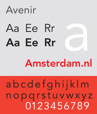
Avenir is a geometric sans-serif typeface designed by Adrian Frutiger in 1987 and released in 1988 by Linotype GmbH.

<span class="mw-page-title-main">Ubuntu (typeface)</span> Open-source sans-serif typeface family

Ubuntu is an OpenType-based font family, designed to be a modern, humanist-style typeface by London-based type foundry Dalton Maag, with funding by Canonical Ltd. The font was under development for nearly nine months, with only a limited initial release through a beta program, until September 2010. It was then that it became the new default font of the Ubuntu operating system in Ubuntu 10.10. Its designers include Vincent Connare, creator of the Comic Sans and Trebuchet MS fonts.

<span class="mw-page-title-main">Nokia Pure</span> Typeface

Nokia Pure is a typeface designed by London-based type foundry Dalton Maag for Nokia. It was designed primarily for use in digital media, in Nokia devices, and mobile environments. It has been the company's main typeface since its introduction. Its designers include Vincent Connare, creator of the classic font Comic Sans.

<span class="mw-page-title-main">Dalton Maag</span> Type foundry

Dalton Maag is an independent font foundry with offices in London, UK, and São Paulo, Brazil. It designs fonts for use in corporate identities, logos, and other text uses. Dalton Maag has a library of 30 retail fonts as of 2016 and offers custom font creation and modification services to its clients.

<span class="mw-page-title-main">Jeremy Tankard</span> British type designer

Jeremy Tankard is a British type designer. Tankard has designed retail fonts independently and for FontShop and Adobe. Corbel was designed for Microsoft and has been included in Microsoft Office and Windows since 2006.

References

  1. "Get Comic Neue". comicneue.com. Retrieved 2020-04-06.
  2. "What's so wrong with Comic Sans?". BBC News. 2010-10-20. Retrieved 2020-04-06.
  3. McCracken, Harry (8 April 2014). "Meet Comic Neue, a Comic Sans-like Typeface Without a Comic Sans-like Reputation". Time . Retrieved 31 July 2014.
  4. 1 2 3 4 5 Vincent, James (8 April 2014). "Meet Comic Sans' successor: Comic Neue". The Independent . Retrieved 31 July 2014.
  5. 1 2 3 4 Brownlee, John (8 April 2014). "Comic Sans Gets A Makeover". Co.Design . Archived from the original on 2022-04-07. Retrieved 31 July 2014.
  6. 1 2 3 4 Sinclair, Mark (7 April 2014). "The neue Comic Sans". Creative Review . Archived from the original on 25 June 2014. Retrieved 31 July 2014.
  7. 1 2 3 4 Lee, Adrian (11 April 2014). "The man who wants to fix Comic Sans". Maclean's . Retrieved 31 July 2014.
  8. 1 2 "Comic Neue". ComicNeue.com. Retrieved 31 July 2014.
  9. 1 2 Kooser, Amanda (10 April 2014). "Comic Neue: Comic Sans typeface for grown-ups". CNET . Retrieved 31 July 2014.
  10. Dewey, Caitlin (7 April 2014). "This designer just made Comic Sans, the Internet's most hated font, cool again". The Washington Post . Retrieved 31 July 2014.
  11. McCarthy, Tyler (7 April 2014). "Someone Created A Slightly Less Horrible Version Of Comic Sans". The Huffington Post . Retrieved 31 July 2014.
  12. Kastrenakes, Jacob (7 April 2014). "Meet the illegitimate child of Comic Sans". The Verge . Retrieved 31 July 2014.
  13. Evanier, Mark (8 April 2014). "That Face!". NewsFromMe.com. Retrieved 31 July 2014.
  14. Ole Reißmann (2014-04-09). "Ersatz für die gehasste Comic Sans". Der Spiegel (in German). Retrieved 2022-12-31.