
Helvetica, also known by its original name Neue Haas Grotesk, is a widely used sans-serif typeface developed in 1957 by Swiss typeface designer Max Miedinger and Eduard Hoffmann.

Comic Sans MS is a sans-serif typeface designed by Vincent Connare and released in 1994 by Microsoft Corporation. It is a non-connecting script inspired by comic book lettering, intended for use in cartoon speech bubbles, as well as in other casual environments, such as informal documents and children's materials.

Roboto is a neo-grotesque sans-serif typeface family developed by Google as the system font for its mobile operating system Android, and released in 2011 for Android 4.0 "Ice Cream Sandwich".

DIN 1451 is a sans-serif typeface that is widely used for traffic, administrative and technical applications.

The FE-Schrift or Fälschungserschwerende Schrift is a sans serif typeface introduced for use on licence plates. Its monospaced letters and numbers are slightly disproportionate to prevent easy modification and to improve machine readability. The typeface was developed in Germany, where it has been mandatory since November 2000.
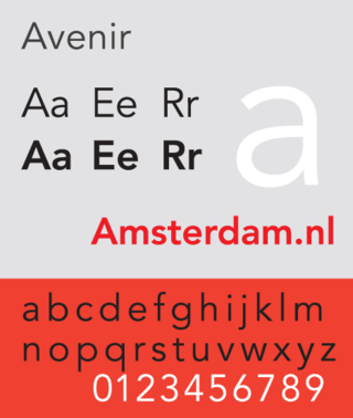
Avenir is a geometric sans-serif typeface designed by Adrian Frutiger in 1987 and released in 1988 by Linotype GmbH.
Adobe Font Folio was a collection of more than 2,400 OpenType fonts, designed by several renowned type foundries. As of early 2005, there were around 10,000 fonts available in OpenType format. Adobe's font library makes up under a third of the total, all of which are included in Font Folio.
FontShop International was an international manufacturer of digital typefaces (fonts), based in Berlin. It was one of the largest digital type foundries.
The Font Bureau, Inc. or Font Bureau is a digital type foundry based in Boston, Massachusetts, United States. The foundry is one of the leading designers of typefaces, specializing in type designs for magazine and newspaper publishers.
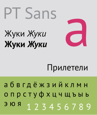
The Public Type or PT Fonts are a family of free and open-source fonts released from 2009 onwards, comprising PT Sans, PT Serif and PT Mono. They were commissioned from the design agency ParaType by Rospechat, a department of the Russian Ministry of Communications, to celebrate the 300th anniversary of Peter the Great's orthography reform and to create a font family that supported all the different variations of Cyrillic script used by the minority languages of Russia, as well as the Latin alphabet.

Typefaces, fonts, and their glyphs raise intellectual property considerations in copyright, trademark, design patent, and related laws. The copyright status of a typeface and of any font file that describes it digitally varies between jurisdictions. In the United States, the shapes of typefaces are not eligible for copyright but may be protected by design patent. Typefaces can be protected in other countries, including the United Kingdom, Germany, and France, by industrial design protections that are similar to copyright or design patent in that they protect the abstract shapes. Additionally, in the US and some other countries, computer fonts, the digital instantiation of the shapes as vector outlines, may be protected by copyright on the computer code that produces them. The name of a typeface may also be protected as a trademark.
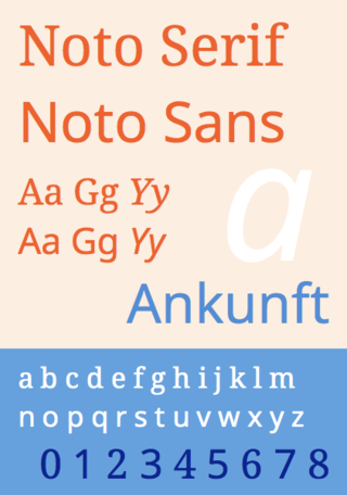
Noto is a free font family comprising over 100 individual computer fonts, which are together designed to cover all the scripts encoded in the Unicode standard. As of October 2016, Noto fonts cover all 93 scripts defined in Unicode version 6.1, although fewer than 30,000 of the nearly 75,000 CJK unified ideographs in version 6.0 are covered. In total, Noto fonts cover over 77,000 characters, which is around half of the 149,186 characters defined in Unicode 15.0.

Ukrainian driving licences are the official documents which authorize their respective holders to operate various types of motor vehicle on public roads.

Product Sans is a contemporary geometric sans-serif typeface created by Google for branding purposes. It replaced the old Google logo on September 1, 2015. As Google's branding was becoming more apparent on a multitude of kinds of devices, Google sought to adapt its design so that its logo could be portrayed in constrained spaces and remain consistent for its users across platforms.

IBM Plex is an open source typeface superfamily conceptually designed and developed by Mike Abbink at IBM in collaboration with Bold Monday to reflect the design principles of IBM and to be used for all brand material across the company internationally. Plex replaces Helvetica as the IBM corporate typeface after more than fifty years, freeing the company from extensive license payments in the process.

Lato is a humanist sans-serif typeface designed by Łukasz Dziedzic. It was released in 2010. The name "Lato" is Polish for "summer". Lato was published under the open-source Open Font License.

Mykhailo Albertovych Fedorov is a Ukrainian politician, and businessman. He served as a Deputy Prime Minister and Minister Digital Transformation from 2019 to March 2023. On 21 March 2023 his duties and title was expanded to Deputy Prime Minister for Innovation, Education, Science and Technology – Minister for Digital Transformation.
Diia is a mobile app, a web portal and a brand of e-governance in Ukraine.

Atkinson Hyperlegible is a freely available typeface built around a grotesque sans-serif core, intended to be optimally legible for readers who are partially visually impaired, with all characters maximally distinguishable from one another. It was developed by the Braille Institute of America in collaboration with Applied Design Works and is available under the SIL Open Font License. It won Fast Company's Innovation by Design Award for Graphic Design in 2019 and was shortlisted for a graphic design award by Dezeen in 2020.
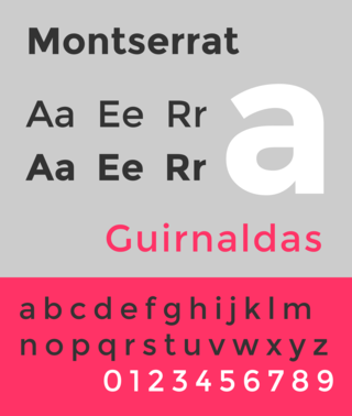
Montserrat is a geometric sans-serif typeface designed by Argentine graphic designer Julieta Ulanovsky and released in 2011. It was inspired by posters, signs and painted windows from the first half of the twentieth century, seen in the historic Montserrat neighbourhood of Buenos Aires.
