Digitizations
As American Type Founders ceased operations before issuing a digital version, various digitizations have been released by different companies, including Bitstream, [8] ParaType (the Bitstream digitization, adding Cyrillic), [9] and others. [10]
Bank Gothic Pro
In 2010, FontHaus released an updated revival of the original Bank Gothic complete with a lowercase and small caps and a new suite of punctuation glyphs. The family consists of light, medium, and bold weights in both a regular and a condensed style. The new lowercase characters did not exist with the original release, and were modeled after many similar Morris Fuller Benton designs released by American Type Founders in the 1930s. [11]
DeLuxe Gothic
In 2003, letterforms artist Michael Doret began work on DeLuxe Gothic—a derivative version of American Type Founder's Bank Gothic. Unlike the 1930s original, Doret's font contains lowercase characters. The DeLuxe Gothic Family was released in OpenType format in 2010 by Alphabet Soup Type Founders with both regular and condensed styles as well as traditional shortcaps. DeLuxe Gothic was the name originally used by the Intertype Corporation for its version of Morris Fuller Benton's Bank Gothic. Prior to its September 8, 2010 release, it was known as Bank Gothic AS. [12]
Morris Sans
Designed by Dan Reynolds for Linotype, Morris Sans is an extended Bank Gothic family including both lowercase letters and small capitals. [7] The design has three weights in regular and condensed widths, and modern OpenType features. [13] [14] [7]
Squarish Sans CT
Squarish Sans is a typeface under development as of September 2014. It was developed specifically to address the need of open-source software having access to this popular design, and is thus under the terms of the Open Font License. It follows DeLuxe Gothic and Morris Sans in containing true lowercase characters, as well as small caps. Squarish Sans offers Greek, Hebrew, and a large number of non-alphabetic (e.g. mathematical) symbols as well. [15]
Others
Elsner+Flake designed two typefaces which are based on the Bank Gothic typeface: Bank Sans EF and Bank Sans Caps EF. Both typefaces had 64 styles (Regular, Semi Condensed, Condensed, Compressed, Light, Regular, Medium, Bold) with italics and support Cyrillic. [16] [17]
Matt Desmond designed the Aldrich typeface, influenced from the Bank Gothic typeface. [18]
Banque Gothique was designed by Steve Jackaman and published by Red Rooster Collection. Banque Gothique contains 9 styles and family package options and is based on the earliest ATF/M.F. Benton versions of the Bank Gothic typefaces. [19]
Alex Kaczun designed the Axion RX-14 typeface, inspired from the Bank Gothic typeface. [20]

Palatino is the name of an old-style serif typeface designed by Hermann Zapf, initially released in 1949 by the Stempel foundry and later by other companies, most notably the Mergenthaler Linotype Company.

Optima is a humanist sans-serif typeface designed by Hermann Zapf and released by the D. Stempel AG foundry, Frankfurt, West Germany in 1958.

Arial is a sans-serif typeface and set of computer fonts in the neo-grotesque style. Fonts from the Arial family are included with all versions of Microsoft Windows after Windows 3.1, as well as in other Microsoft programs, Apple's macOS, and many PostScript 3 printers.

Futura is a geometric sans-serif typeface designed by Paul Renner and released in 1927. It was designed as a contribution on the New Frankfurt-project. It is based on geometric shapes, especially the circle, similar in spirit to the Bauhaus design style of the period. It was developed as a typeface by the Bauer Type Foundry, in competition with Ludwig & Mayer's seminal Erbar typeface of 1926.

Univers is a large sans-serif typeface family designed by Adrian Frutiger and released by his employer Deberny & Peignot in 1957. Classified as a neo-grotesque sans-serif, one based on the model of nineteenth-century German typefaces such as Akzidenz-Grotesk, it was notable for its availability from the moment of its launch in a comprehensive range of weights and widths. The original marketing for Univers deliberately referenced the periodic table to emphasise its scope.

Franklin Gothic and its related faces are a large family of sans-serif typefaces in the industrial or grotesque style developed in the early years of the 20th century by the type foundry American Type Founders (ATF) and credited to its head designer Morris Fuller Benton. "Gothic" was a contemporary term meaning sans-serif.

In metal typesetting, a font is a particular size, weight and style of a typeface. Each font is a matched set of type, with a piece for each glyph. A typeface consists of various fonts that share an overall design.
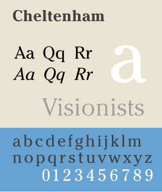
Cheltenham is a typeface for display use designed in 1896 by architect Bertram Goodhue and Ingalls Kimball, director of the Cheltenham Press. The original drawings were known as Boston Old Style and were made about 14" high. These drawings were then turned over to Morris Fuller Benton at American Type Founders (ATF) who developed it into a final design. Trial cuttings were made as early as 1899 but the face was not complete until 1902. The face was patented by Kimball in 1904. Later the basic face was spun out into an extensive type family by Morris Fuller Benton.

Windsor is a serif typeface created by Eleisha Pechey (1831-1902) and released by the Stephenson Blake type foundry. It is intended for use such as display and in headings rather than for body text.

Syntax comprises a family of fonts designed by Swiss typeface designer Hans Eduard Meier. Originally just a sans-serif font, it was extended with additional serif designs.

News Gothic is a sans-serif typeface designed by Morris Fuller Benton, and was released in 1908 by his employer American Type Founders (ATF). The typeface is similar in proportion and structure to Franklin Gothic, also designed by Benton, but lighter.

Benton Sans is a digital typeface family begun by Tobias Frere-Jones in 1995, and expanded by Cyrus Highsmith of Font Bureau. It is based on the sans-serif typefaces designed for American Type Founders by Morris Fuller Benton around the beginning of the twentieth century in the industrial or grotesque style. It was a reworked version of Benton Gothic developed for various corporate customers, under Frere-Jones's guidance. In developing the typeface, Frere-Jones studied drawings of Morris Fuller Benton's 1908 typeface News Gothic at the Smithsonian Institution. The typeface began as a proprietary type, initially titled MSL Gothic, for Martha Stewart Living magazine and the website for Martha Stewart Living Omnimedia. As Benton Gothic, there are 7 weights from Thin to Black and only 2 widths.

Handel Gothic is a geometric sans-serif typeface designed in 1965 by Donald J. Handel (1936–2002), who worked for the graphic designer Saul Bass.

Trade Gothic is a sans-serif typeface designed in 1948 by Jackson Burke (1908–1975), who continued to work on further style-weight combinations, eventually 14 in all, until 1960, while he was director of type development for Linotype in the US. The family includes three weights and three widths.
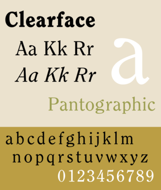
Clearface is a serif typeface designed by Morris Fuller Benton with the collaboration of his father Linn Boyd Benton, produced at American Type Founders in 1907.

Century is a family of serif type faces particularly intended for body text. The family originates from a first design, Century Roman, cut by American Type Founders designer Linn Boyd Benton in 1894 for master printer Theodore Low De Vinne, for use in The Century Magazine. ATF rapidly expanded it into a very large family, first by Linn Boyd, and later by his son Morris.
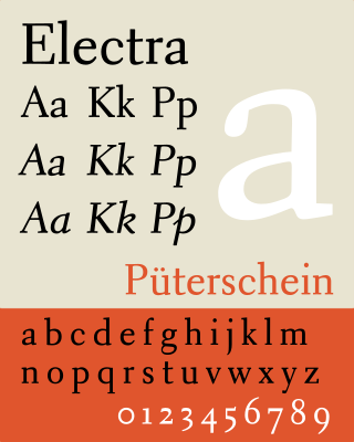
Electra is a serif typeface designed by William Addison Dwiggins and published by the Mergenthaler Linotype Company from 1935 onwards. A book face intended for body text, Dwiggins described the design as intended to be a 'modern roman type letter' with 'personality', avoiding direct revival of any historical model. He therefore chose the name Electra to suggest electricity and crisp modernity, "like metal shavings coming off a lathe".

Cloister is a serif typeface that was designed by Morris Fuller Benton and published by American Type Founders from around 1913. It is loosely based on the printing of Nicolas Jenson in Venice in the 1470s, in what is now called the "old style" of serif fonts. American Type Founders presented it as an attractive but highly usable serif typeface, suitable both for body text and display use.
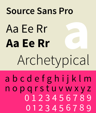
Source Sans is a sans-serif typeface created by Paul D. Hunt, released by Adobe in 2012. It is the first open-source font family from Adobe, distributed under the SIL Open Font License.

Metro is a sans-serif typeface family created by William Addison Dwiggins and released by the American Mergenthaler Linotype Company from 1929 onwards.
