
Typography is the art and technique of arranging type to make written language legible, readable and appealing when displayed. The arrangement of type involves selecting typefaces, point sizes, line lengths, line-spacing (leading), and letter-spacing (tracking), as well as adjusting the space between pairs of letters (kerning). The term typography is also applied to the style, arrangement, and appearance of the letters, numbers, and symbols created by the process. Type design is a closely related craft, sometimes considered part of typography; most typographers do not design typefaces, and some type designers do not consider themselves typographers. Typography also may be used as an ornamental and decorative device, unrelated to the communication of information.

In typography and lettering, a sans-serif, sans serif, gothic, or simply sans letterform is one that does not have extending features called "serifs" at the end of strokes. Sans-serif typefaces tend to have less stroke width variation than serif typefaces. They are often used to convey simplicity and modernity or minimalism.
In typography, a serif is a small line or stroke regularly attached to the end of a larger stroke in a letter or symbol within a particular font or family of fonts. A typeface or "font family" making use of serifs is called a serif typeface, and a typeface that does not include them is sans-serif. Some typography sources refer to sans-serif typefaces as "grotesque" or "Gothic", and serif typefaces as "roman".

A typeface is the design of lettering that can include variations in size, weight, slope, width, and so on. Each of these variations of the typeface is a font.

In East Asia, gothic typefaces are a type style characterized by strokes of even thickness and lack of decorations akin to sans serif styles in Western typography. It is the second most commonly used style in East Asian typography, after Ming.
The font family selection in (X)HTML, CSS, and derived systems specifies a list of prioritized fonts and generic family names; in conjunction with correlating font properties, this list determines the particular font face used to render characters. The family selection is available in two forms: in the deprecated (X)HTML <font>...</font> element with its face attribute, and in the CSS font-family property.
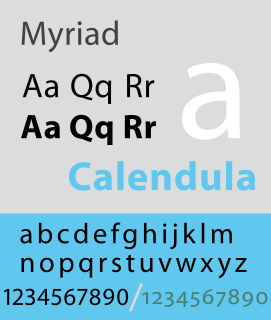
Myriad is a humanist sans-serif typeface designed by Robert Slimbach and Carol Twombly for Adobe Systems, released in 1992. Myriad was intended as a neutral, general-purpose typeface that could fulfill a range of uses and have a form easily expandable by computer-aided design to a large range of weights and widths.
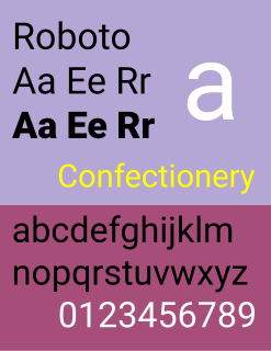
Roboto is a neo-grotesque sans-serif typeface family developed by Google as the system font for its mobile operating system Android, and released in 2011 for Android 4.0 "Ice Cream Sandwich".

The DejaVu fonts are a superfamily of fonts designed for broad coverage of the Unicode Universal Character Set. The fonts are derived from Bitstream Vera (sans-serif) and Bitstream Charter (serif), two fonts released by Bitstream under a free license that allowed for derivative works based upon them; the Vera and Charter families were limited mainly to the characters in the Basic Latin and Latin-1 Supplement portions of Unicode, roughly equivalent to ISO/IEC 8859-15, and Bitstream's licensing terms allowed for the fonts to be expanded upon without explicit authorization. The DejaVu fonts project was started with the aim to "provide a wider range of characters ... while maintaining the original look and feel through the process of collaborative development". The development of the fonts is done by many contributors, and is organized through a wiki and a mailing list.

Liberation is the collective name of four TrueType font families: Liberation Sans, Liberation Sans Narrow, Liberation Serif, and Liberation Mono. These fonts are metrically compatible with the most popular fonts on the Microsoft Windows operating system and the Microsoft Office software package, for which Liberation is intended as a free substitute. The fonts are default in LibreOffice.

Droid is a font family first released in 2007 and created by Ascender Corporation for use by the Open Handset Alliance platform Android and licensed under the Apache License. The fonts are intended for use on the small screens of mobile handsets and were designed by Steve Matteson of Ascender Corporation. The name was derived from the Open Handset Alliance platform named Android.

Web typography refers to the use of fonts on the World Wide Web. When HTML was first created, font faces and styles were controlled exclusively by the settings of each web browser. There was no mechanism for individual Web pages to control font display until Netscape introduced the font element in 1995, which was then standardized in the HTML 3.2 specification. However, the font specified by the font element had to be installed on the user's computer or a fallback font, such as a browser's default sans-serif or monospace font, would be used. The first Cascading Style Sheets specification was published in 1996 and provided the same capabilities.
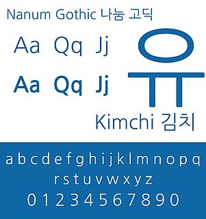
The Nanum fonts is a series of open source unicode fonts designed for the Korean language, designed by Sandoll Communications and Fontrix. It includes a sans serif (gothic), serif (myeongjo), monospace (coding), pen script, and brush script typefaces. It was published and distributed by Naver.

Fira Sans is a humanist sans-serif typeface designed by Erik Spiekermann, Ralph du Carrois, Anja Meiners, Botio Nikoltchev of Carrois Type Design and Patryk Adamczyk of Mozilla Corporation. Originally commissioned by Telefónica and Mozilla Corporation as part of the joint effort during the development of Firefox OS. It is a slightly wider and calmer adaptation of Spiekermann's typeface Meta, which was used at Mozilla's brand typeface at the time but optimized for legibility on (small) screens. With the name Fira, Mozilla wanted to communicate the concepts of fire, light and joy but in a language agnostic way to signal the project's global nature. Fira was released in 2013 initially under the Apache License and later reissued under the SIL Open Font License.

Noto is a font family comprising over 100 individual fonts, which are together designed to cover all the scripts encoded in the Unicode standard. As of October 2016, Noto fonts cover all 93 scripts defined in Unicode version 6.1, although fewer than 30,000 of the nearly 75,000 CJK unified ideographs in version 6.0 are covered. In total Noto fonts cover nearly 64,000 characters, which is under half of the 143,859 characters defined in Unicode 13.0.
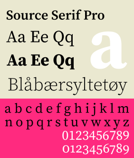
Source Serif Pro is a serif typeface created by Frank Grießhammer for Adobe Systems. It is the third open-source font family from Adobe, distributed under the SIL Open Font License.

A display typeface is a typeface that is intended for use at large sizes for headings, rather than for extended passages of body text.

IBM Plex is an open source typeface superfamily conceptually designed and developed by Mike Abbink at IBM in collaboration with Bold Monday to reflect the brand spirit, beliefs and design principles of IBM and to be used for all brand experiences across the company internationally. Plex replaces Helvetica as the IBM corporate typeface after more than fifty years, freeing the company from extensive license payments in the process.
