Graphic design is a profession, academic discipline and applied art whose activity consists in projecting visual communications intended to transmit specific messages to social groups, with specific objectives. Graphic design is an interdisciplinary branch of design and of the fine arts. Its practice involves creativity, innovation and lateral thinking using manual or digital tools, where it is usual to use text and graphics to communicate visually.

Typography is the art and technique of arranging type to make written language legible, readable and appealing when displayed. The arrangement of type involves selecting typefaces, point sizes, line lengths, line-spacing (leading), and letter-spacing (tracking), as well as adjusting the space between pairs of letters (kerning). The term typography is also applied to the style, arrangement, and appearance of the letters, numbers, and symbols created by the process. Type design is a closely related craft, sometimes considered part of typography; most typographers do not design typefaces, and some type designers do not consider themselves typographers. Typography also may be used as an ornamental and decorative device, unrelated to the communication of information.

The CMYK color model is a subtractive color model, based on the CMY color model, used in color printing, and is also used to describe the printing process itself. The abbreviation CMYK refers to the four ink plates used: cyan, magenta, yellow, and key (black).

A monospaced font, also called a fixed-pitch, fixed-width, or non-proportional font, is a font whose letters and characters each occupy the same amount of horizontal space. This contrasts with variable-width fonts, where the letters and spacings have different widths.
Desktop publishing (DTP) is the creation of documents using page layout software on a personal ("desktop") computer. It was first used almost exclusively for print publications, but now it also assists in the creation of various forms of online content. Desktop publishing software can generate layouts and produce typographic-quality text and images comparable to traditional typography and printing. Desktop publishing is also the main reference for digital typography. This technology allows individuals, businesses, and other organizations to self-publish a wide variety of content, from menus to magazines to books, without the expense of commercial printing.

Type design is the art and process of designing typefaces. This involves drawing each letterform using a consistent style. The basic concepts and design variables are described below.

In typography and lettering, a sans-serif, sans serif, gothic, or simply sans letterform is one that does not have extending features called "serifs" at the end of strokes. Sans-serif typefaces tend to have less stroke width variation than serif typefaces. They are often used to convey simplicity and modernity or minimalism.
In typography, a serif is a small line or stroke regularly attached to the end of a larger stroke in a letter or symbol within a particular font or family of fonts. A typeface or "font family" making use of serifs is called a serif typeface, and a typeface that does not include them is sans-serif. Some typography sources refer to sans-serif typefaces as "grotesque" or "Gothic", and serif typefaces as "roman".

A typeface is a design of letters, numbers and other symbols, to be used in printing or for electronic display. Most typefaces include variations in size, weight, slope, width, and so on. Each of these variations of the typeface is a font.

In typography, emphasis is the strengthening of words in a text with a font in a different style from the rest of the text, to highlight them. It is the equivalent of prosody stress in speech.

In typography, all caps refers to text or a font in which all letters are capital letters, for example: "THIS TEXT IS IN ALL CAPS". All caps may be used for emphasis. They are commonly seen in legal documents, the titles on book covers, in advertisements and in newspaper headlines. Short strings of words in capital letters appear bolder and "louder" than mixed case, and this is sometimes referred to as "screaming" or "shouting". All caps can also be used to indicate that a given word is an acronym.

Type color, or colour, is an element of typography that describes how dense or heavy the text appears on the page. Finding the correct balance of type color and white space can make text more easily readable. The term type color should not be confused with the usual meaning of color, ; instead it has more to do with the blackness or boldness of the text on the page. A bold font creates more contrast on the page, therefore creates more emphasis. Using a bold font is therefore one way that type color can be adjusted.

In metal typesetting, a font is a particular size, weight and style of a typeface. Each font is a matched set of type, with a piece for each glyph. A typeface consists of various fonts that share an overall design.

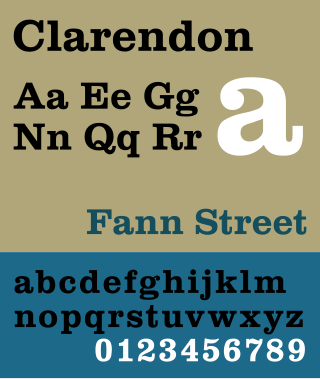
Clarendon is the name of a slab serif typeface that was released in 1845 by Thorowgood and Co. of London, a letter foundry often known as the Fann Street Foundry. The original Clarendon design is credited to Robert Besley, a partner in the foundry, and was originally engraved by punchcutter Benjamin Fox, who may also have contributed to its design. Many copies, adaptations and revivals have been released, becoming almost an entire genre of type design.

Sabon is an old-style serif typeface designed by the German-born typographer and designer Jan Tschichold (1902–1974) in the period 1964–1967. It was released jointly by the Linotype, Monotype, and Stempel type foundries in 1967. The design of the roman is based on types by Claude Garamond, particularly a specimen printed by the Frankfurt printer Konrad Berner. Berner had married the widow of a fellow printer Jacques Sabon, the source of the face's name, who had bought some of Garamond's type after his death. The italics are based on types designed by a contemporary of Garamond's, Robert Granjon. It is effectively a Garamond revival, though a different name was chosen as many other modern typefaces already carry this name.
Legibility is the ease with which a reader can decode symbols. In addition to written language, it can also refer to behaviour or architecture, for example. From the perspective of communication research, it can be described as a measure of the permeability of a communication channel. A large number of known factors can affect legibility.
Miles Albert Tinker was an American author. He is "an internationally recognized authority on legibility of print" who published the results of some of the most comprehensive studies on the legibility of print ever conducted. According to Jeremy York, Tinker's work, along with his colleague Donald G. Paterson, "was a driving force behind the standardization of the print industry in the United States".
Sentence spacing studies analyse the effects of sentence spacing techniques on the readability of text. The only direct scientific studies have been conducted by researchers from the University of Georgia, for on-screen text. There are currently no direct sentence spacing studies for printed text.

A reverse-contrast or reverse-stress letterform is a design in which the stress is reversed from the norm: a typeface or custom lettering where the horizontal lines are the thickest. This is the reverse of the vertical lines being the same width or thicker than horizontals, which is normal in Latin-alphabet writing and especially printing. The result is a dramatic effect, in which the letters seem to have been printed the wrong way round. The style invented in the early nineteenth century as attention-grabbing novelty display designs. Modern font designer Peter Biľak, who has created a design in the genre, has described them as "a dirty trick to create freakish letterforms that stood out."

A display typeface is a typeface that is intended for use in display type at large sizes for titles, headings, pull quotes, and other eye-catching elements, rather than for extended passages of body text.

