Optima is a humanist sans-serif typeface designed by Hermann Zapf and released by the D. Stempel AG foundry, Frankfurt, West Germany in 1958.

Type design is the art and process of designing typefaces. This involves drawing each letterform using a consistent style. The basic concepts and design variables are described below.

A typeface is a design of letters, numbers and other symbols, to be used in printing or for electronic display. Most typefaces include variations in size, weight, slope, width, and so on. Each of these variations of the typeface is a font.

In typography, emphasis is the strengthening of words in a text with a font in a different style from the rest of the text, to highlight them. It is the equivalent of prosody stress in speech.

In typography, small caps are characters typeset with glyphs that resemble uppercase letters but reduced in height and weight close to the surrounding lowercase letters or text figures. This is technically not a case-transformation, but a substitution of glyphs, although the effect is often approximated by case-transformation and scaling. Small caps are used in running text as a form of emphasis that is less dominant than all uppercase text, and as a method of emphasis or distinctiveness for text alongside or instead of italics, or when boldface is inappropriate. For example, the text "Text in small caps" appears as Text in small caps in small caps. Small caps can be used to draw attention to the opening phrase or line of a new section of text, or to provide an additional style in a dictionary entry where many parts must be typographically differentiated.

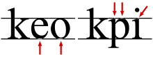
In typography, the x-height, or corpus size, is the distance between the baseline and the mean line of lowercase letters in a typeface. Typically, this is the height of the letter x in the font, as well as the letters v, w, and z. One of the most important dimensions of a font, x-height defines how high lowercase letters without ascenders are compared to the cap height of uppercase letters.

In European and West Asian typography and penmanship, the baseline is the line upon which most letters sit and below which descenders extend.

In typography, a counter is the area of a letter that is entirely or partially enclosed by a letter form or a symbol. The stroke that creates such a space is known as a "bowl". Latin letters containing closed counters include A, B, D, O, P, Q, R, a, b, d, e, g, o, p, and q. Latin letters containing open counters include c, f, h, s etc. The digits 0, 4, 6, 8, and 9 also have counters. An aperture is the opening between an open counter and the outside of the letter.

Didone is a genre of serif typeface that emerged in the late 18th century and was the standard style of general-purpose printing during the 19th century. It is characterized by:
Tobias Frere-Jones is an American type designer who works in New York City. He operates the company Frere-Jones Type and teaches typeface design at the Yale School of Art MFA program.

In metal typesetting, a font or fount is a particular size, weight and style of a typeface, defined as the set of fonts that share an overall design. For instance, the typeface Bauer Bodoni includes fonts "Roman", "bold" and "italic"; each of these exists in a variety of sizes.
Hoefler&Co. (H&Co) is a digital type foundry in Woburn, Massachusetts, founded by type designer Jonathan Hoefler. H&Co designs typefaces for clients and for retail on its website.

Adobe Jenson is an old-style serif typeface drawn for Adobe Systems by its chief type designer Robert Slimbach. Its Roman styles are based on a text face cut by Nicolas Jenson in Venice around 1470, and its italics are based on those created by Ludovico Vicentino degli Arrighi fifty years later.

Requiem is an old-style serif typeface designed by Jonathan Hoefler in 1992 for Travel + Leisure magazine and sold by his company, Hoefler & Co. The typeface takes inspiration from a set of inscriptional capitals found in Ludovico Vicentino degli Arrighi's 1523 writing manual, Il Modo de Temperare le Penne, and its italics are based on the chancery calligraphy, or cancelleresca corsiva of the period.
Surveyor is a Didone serif typeface that recalls type found on engraved maps and charts. It was designed by Tobias Frere-Jones in 2001 as a custom typeface for use in Martha Stewart Living magazine and released publicly in March 2013, in a wider range of styles, by the type foundry Hoefler & Frere-Jones.

A subscript or superscript is a character that is set slightly below or above the normal line of type, respectively. It is usually smaller than the rest of the text. Subscripts appear at or below the baseline, while superscripts are above. Subscripts and superscripts are perhaps most often used in formulas, mathematical expressions, and specifications of chemical compounds and isotopes, but have many other uses as well.
In typography, cap height is the height of a capital letter above the baseline for a particular typeface. It specifically is the height of capital letters that are flat—such as H or I—as opposed to round letters such as O, or pointed letters like A, both of which may display overshoot. The height of the small letters is the x-height.

Century is a family of serif type faces particularly intended for body text. The family originates from a first design, Century Roman, cut by American Type Founders designer Linn Boyd Benton in 1894 for master printer Theodore Low De Vinne, for use in The Century Magazine. ATF rapidly expanded it into a very large family, first by Linn Boyd, and later by his son Morris. With ATF no longer operating, a wide variety of variants and revivals with varying features and quality are available.
Typeface anatomy describes the graphic elements that make up letters in a typeface.
Typefaces are born from the struggle between rules and results. Squeezing a square about 1% helps it look more like a square; to appear the same height as a square, a circle must be measurably taller. The two strokes in an X aren't the same thickness, nor are their parallel edges actually parallel; the vertical stems of a lowercase alphabet are thinner than those of its capitals; the ascender on a d isn't the same length as the descender on a p, and so on. For the rational mind, type design can be a maddening game of drawing things differently in order to make them appear the same.