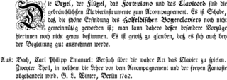
Typography is the art and technique of arranging type to make written language legible, readable and appealing when displayed. The arrangement of type involves selecting typefaces, point sizes, line lengths, line-spacing (leading), and letter-spacing (tracking), as well as adjusting the space between pairs of letters (kerning). The term typography is also applied to the style, arrangement, and appearance of the letters, numbers, and symbols created by the process. Type design is a closely related craft, sometimes considered part of typography; most typographers do not design typefaces, and some type designers do not consider themselves typographers. Typography also may be used as an ornamental and decorative device, unrelated to the communication of information.

Type design is the art and process of designing typefaces. This involves drawing each letterform using a consistent style. The basic concepts and design variables are described below.

A typeface is a design of letters, numbers and other symbols, to be used in printing or for electronic display. Most typefaces include variations in size, weight, slope, width, and so on. Each of these variations of the typeface is a font.
In writing, a space is a blank area that separates words, sentences, syllables and other written or printed glyphs (characters). Conventions for spacing vary among languages, and in some languages the spacing rules are complex. Inter-word spaces ease the reader's task of identifying words, and avoid outright ambiguities such as "now here" vs. "nowhere". They also provide convenient guides for where a human or program may start new lines.
Koppa or qoppa is a letter that was used in early forms of the Greek alphabet, derived from Phoenician qoph (𐤒). It was originally used to denote the sound, but dropped out of use as an alphabetic character and replaced by Kappa (Κ). It has remained in use as a numeral symbol (90) in the system of Greek numerals, although with a modified shape. Koppa is the source of Latin Q, as well as the Cyrillic numeral sign of the same name (Koppa).

In typography, emphasis is the strengthening of words in a text with a font in a different style from the rest of the text, to highlight them. It is the equivalent of prosody stress in speech.
In typography, leading is the space between adjacent lines of type; the exact definition varies.

Letter case is the distinction between the letters that are in larger uppercase or capitals and smaller lowercase in the written representation of certain languages. The writing systems that distinguish between the upper- and lowercase have two parallel sets of letters: each in the majuscule set has a counterpart in the minuscule set. Some counterpart letters have the same shape, and differ only in size, but for others the shapes are different. The two case variants are alternative representations of the same letter: they have the same name and pronunciation and are typically treated identically when sorting in alphabetical order.

The pica is a typographic unit of measure corresponding to approximately 1⁄6 of an inch, or from 1⁄68 to 1⁄73 of a foot. One pica is further divided into 12 points.

In typography, the point is the smallest unit of measure. It is used for measuring font size, leading, and other items on a printed page. The size of the point has varied throughout printing's history. Since the 18th century, the size of a point has been between 0.18 and 0.4 millimeters. Following the advent of desktop publishing in the 1980s and 1990s, digital printing has largely supplanted the letterpress printing and has established the desktop publishing (DTP) point as the de facto standard. The DTP point is defined as 1⁄72 of an international inch (1/72 × 25.4 mm ≈ 0.353 mm) and, as with earlier American point sizes, is considered to be 1⁄12 of a pica.

In typography, text or font in all caps contains capital letters without any lowercase letters. For example: THIS TEXT IS IN ALL CAPS. All-caps text can be seen in legal documents, advertisements, newspaper headlines, and the titles on book covers. Short strings of words in capital letters appear bolder and "louder" than mixed case, and this is sometimes referred to as "screaming" or "shouting". All caps can also be used to indicate that a given word is an acronym.
Line breaking, also known as word wrapping, is breaking a section of text into lines so that it will fit into the available width of a page, window or other display area. In text display, line wrap is continuing on a new line when a line is full, so that each line fits into the viewable window, allowing text to be read from top to bottom without any horizontal scrolling. Word wrap is the additional feature of most text editors, word processors, and web browsers, of breaking lines between words rather than within words, where possible. Word wrap makes it unnecessary to hard-code newline delimiters within paragraphs, and allows the display of text to adapt flexibly and dynamically to displays of varying sizes.
In typesetting and page layout, alignment or range is the setting of text flow or image placement relative to a page, column (measure), table cell, or tab.
Legibility is the ease with which a reader can decode symbols. In addition to written language, it can also refer to behaviour or architecture, for example. From the perspective of communication research, it can be described as a measure of the permeability of a communication channel. A large number of known factors can affect legibility.

In typography, a column is one or more vertical blocks of content positioned on a page, separated by gutters or rules. Columns are most commonly used to break up large bodies of text that cannot fit in a single block of text on a page. Additionally, columns are used to improve page composition and readability. Newspapers very frequently use complex multi-column layouts to break up different stories and longer bodies of texts within a story. Column can also more generally refer to the vertical delineations created by a typographic grid system which type and image may be positioned. In page layout, the whitespace on the outside of the page are known as margins; the gap between two facing pages is also considered a gutter, since there are columns on both sides.

In typography, a margin is the area between the main content of a page and the page edges. The margin helps to define where a line of text begins and ends. When a page is justified the text is spread out to be flush with the left and right margins. When two pages of content are combined next to each other, the space between the two pages is known as the gutter. The top and bottom margins of a page are also called "head" and "foot", respectively. The term "margin" can also be used to describe the edge of internal content, such as the right or left edge of a column of text.
Microtypography is a range of methods for improving the readability and appearance of text, especially justified text. The methods reduce the appearance of large interword spaces and create edges to the text that appear more even. Microtypography methods can also increase reading comprehension of text, reducing the cognitive load of reading.
In typography and computing, characters per line (CPL) or terminal width refers to the maximal number of monospaced characters that may appear on a single line. It is similar to line length in typesetting.
Miles Albert Tinker was an American author. He is "an internationally recognized authority on legibility of print" who published the results of some of the most comprehensive studies on the legibility of print ever conducted. According to Jeremy York, Tinker's work, along with his colleague Donald G. Paterson, "was a driving force behind the standardization of the print industry in the United States".


