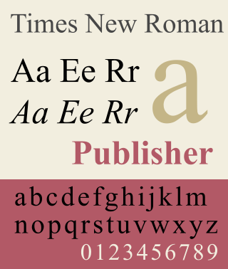
Times New Roman is a serif typeface commissioned for use by the British newspaper The Times in 1931. It has become one of the most popular typefaces of all time and is installed on most personal computers. The typeface was conceived by Stanley Morison, the artistic adviser to the British branch of the printing equipment company Monotype, in collaboration with Victor Lardent, a lettering artist in The Times's advertising department.
In typography, a serif is a small line or stroke regularly attached to the end of a larger stroke in a letter or symbol within a particular font or family of fonts. A typeface or "font family" making use of serifs is called a serif typeface, and a typeface that does not include them is sans-serif. Some typography sources refer to sans-serif typefaces as "grotesque" or "Gothic" and serif typefaces as "roman".

Garamond is a group of many serif typefaces, named for sixteenth-century Parisian engraver Claude Garamond, generally spelled as Garamont in his lifetime. Garamond-style typefaces are popular and particularly often used for book printing and body text.
In typography, italic type is a cursive font based on a stylised form of calligraphic handwriting. Along with blackletter and roman type, it served as one of the major typefaces in the history of Western typography.

Letter case is the distinction between the letters that are in larger uppercase or capitals and smaller lowercase in the written representation of certain languages. The writing systems that distinguish between the upper- and lowercase have two parallel sets of letters: each in the majuscule set has a counterpart in the minuscule set. Some counterpart letters have the same shape, and differ only in size, but for others the shapes are different. The two case variants are alternative representations of the same letter: they have the same name and pronunciation and are typically treated identically when sorting in alphabetical order.

Johnston is a sans-serif typeface designed by and named after Edward Johnston. The typeface was commissioned in 1913 by Frank Pick, commercial manager of the Underground Electric Railways Company of London, as part of his plan to strengthen the company's corporate identity. Johnston was originally created for printing, but it rapidly became used for the enamel station signs of the Underground system as well.
Text figures are numerals designed with varying heights in a fashion that resembles a typical line of running text, hence the name. They are contrasted with lining figures, which are the same height as upper-case letters. Georgia is an example of a popular typeface that employs text figures by default.

Stanley Arthur Morison was a British typographer, printing executive and historian of printing. Largely self-educated, he promoted higher standards in printing and an awareness of the best printing and typefaces of the past.

In typography, small caps are characters typeset with glyphs that resemble uppercase letters but reduced in height and weight close to the surrounding lowercase letters or text figures. This is technically not a case-transformation, but a substitution of glyphs, although the effect is often approximated by case-transformation and scaling. Small caps are used in running text as a form of emphasis that is less dominant than all uppercase text, and as a method of emphasis or distinctiveness for text alongside or instead of italics, or when boldface is inappropriate. For example, the text "Text in small caps" appears as Text in small caps in small caps. Small caps can be used to draw attention to the opening phrase or line of a new section of text, or to provide an additional style in a dictionary entry where many parts must be typographically differentiated.

In typography, the x-height, or corpus size, is the distance between the baseline and the mean line of lowercase letters in a typeface. Typically, this is the height of the letter x in the font, as well as the letters v, w, and z. One of the most important dimensions of a font, x-height defines how high lowercase letters without ascenders are compared to the cap height of uppercase letters.

Caslon is the name given to serif typefaces designed by William Caslon I in London, or inspired by his work.
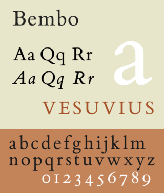
Bembo is a serif typeface created by the British branch of the Monotype Corporation in 1928–1929 and most commonly used for body text. It is a member of the "old-style" of serif fonts, with its regular or roman style based on a design cut around 1495 by Francesco Griffo for Venetian printer Aldus Manutius, sometimes generically called the "Aldine roman". Bembo is named for Manutius's first publication with it, a small 1496 book by the poet and cleric Pietro Bembo. The italic is based on work by Giovanni Antonio Tagliente, a calligrapher who worked as a printer in the 1520s, after the time of Manutius and Griffo.
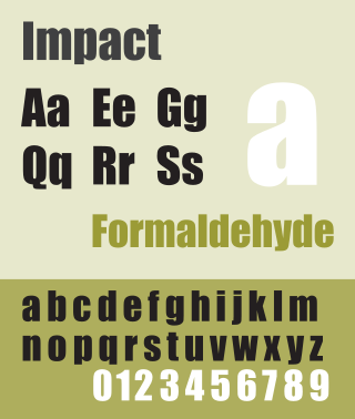
Impact is a sans-serif typeface in the industrial or grotesque style designed by Geoffrey Lee in 1965 and released by the Stephenson Blake foundry of Sheffield. It is well known for having been included in the core fonts for the Web package and distributed with Microsoft Windows since Windows 98. In the 2010s, it gained popularity for its use in image macros and other internet memes.

Beatrice Lamberton Warde was a twentieth-century writer and scholar of typography. As a marketing manager for the British Monotype Corporation, she was influential in the development of printing tastes in Britain and elsewhere in the mid-twentieth century and was recognized at the time as "[o]ne of the few women typographers in the world". Her writing advocated higher standards in printing, and championed intelligent use of historic typefaces from the past, which Monotype specialised in reviving, and the work of contemporary typeface designers.

Sabon is an old-style serif typeface designed by the German-born typographer and designer Jan Tschichold (1902–1974) in the period 1964–1967. It was released jointly by the Linotype, Monotype, and Stempel type foundries in 1967. The design of the roman is based on types by Claude Garamond, particularly a specimen printed by the Frankfurt printer Konrad Berner. Berner had married the widow of a fellow printer Jacques Sabon, the source of the face's name, who had bought some of Garamond's type after his death. The italics are based on types designed by a contemporary of Garamond's, Robert Granjon. It is effectively a Garamond revival, though a different name was chosen as many other modern typefaces already carry this name.

Joanna is a serif typeface designed by Eric Gill (1882–1940) from 1930 to 1931 that was named for one of his daughters. Gill chose Joanna for setting An Essay on Typography, a book by Gill on his thoughts on typography, typesetting and page design. He described it as "a book face free from all fancy business".
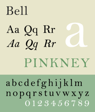
Bell is the name given to a serif typeface designed and cut in 1788 by the punchcutter Richard Austin for the British Letter Foundry, operated by publisher John Bell, and revived several times since.
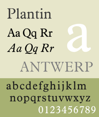
Plantin is an old-style serif typeface. It was created in 1913 by the British Monotype Corporation for their hot metal typesetting system and is named after the sixteenth-century printer Christophe Plantin. It is loosely based on a Gros Cicero roman type cut in the 16th century by Robert Granjon held in the collection of the Plantin–Moretus Museum, Antwerp.

Ehrhardt is an old-style serif typeface released by the British branch of the Monotype Corporation in 1938. Ehrhardt is a modern adaptation of printing types of "stout Dutch character" from the Dutch Baroque tradition sold by the Ehrhardt foundry in Leipzig. These were cut by the Hungarian-Transylvanian pastor and punchcutter Miklós (Nicholas) Tótfalusi Kis while in Amsterdam in the period from 1680 to 1689.