
Typography is the art and technique of arranging type to make written language legible, readable and appealing when displayed. The arrangement of type involves selecting typefaces, point sizes, line lengths, line-spacing (leading), and letter-spacing (tracking), as well as adjusting the space between pairs of letters (kerning). The term typography is also applied to the style, arrangement, and appearance of the letters, numbers, and symbols created by the process. Type design is a closely related craft, sometimes considered part of typography; most typographers do not design typefaces, and some type designers do not consider themselves typographers. Typography also may be used as an ornamental and decorative device, unrelated to the communication of information.

A typeface is the design of lettering that can include variations in size, weight, slope, width, and so on. Each of these variations of the typeface is a font.
In writing, a space is a blank area that separates words, sentences, syllables and other written or printed glyphs (characters). Conventions for spacing vary among languages, and in some languages the spacing rules are complex.
The section sign, §, is a typographical character for referencing individually numbered sections of a document; it is frequently used when citing sections of a legal code. It is also known as the section symbol, section mark, double-s, or silcrow.
In typography, leading is the space between adjacent lines of type; the exact definition varies.
An em is a unit in the field of typography, equal to the currently specified point size. For example, one em in a 16-point typeface is 16 points. Therefore, this unit is the same for all typefaces at a given point size.
In typography and handwriting, a descender is the portion of a letter that extends below the baseline of a font.

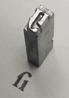
In printing and typography, hot metal typesetting is a technology for typesetting text in letterpress printing. This method injects molten type metal into a mold that has the shape of one or more glyphs. The resulting sorts or slugs are later used to press ink onto paper. Normally the typecasting machine would be controlled by a keyboard or by a paper tape.
Text figures are numerals designed with varying heights in a fashion that resembles a typical line of running text, hence the name. They are contrasted with lining figures, which are the same height as upper-case letters. Georgia is an example of a popular typeface that employs text figures by default.

In typography, the x-height, or corpus size, is the distance between the baseline and the mean line of lower-case letters in a typeface. Typically, this is the height of the letter x in the font, as well as the letters v, w, and z. One of the most important dimensions of a font, x-height is used to define how high lower-case letters without ascenders are compared to the cap height of upper-case letters.
In typesetting and page layout, alignment or range is the setting of text flow or image placement relative to a page, column (measure), table cell, or tab.
Sentence spacing concerns how spaces are inserted between sentences in typeset text and is a matter of typographical convention. Since the introduction of movable-type printing in Europe, various sentence spacing conventions have been used in languages with a Latin alphabet. These include a normal word space, a single enlarged space, and two full spaces.
Modern typographers view typography as a craft with a very long history tracing its origins back to the first punches and dies used to make seals and coinage currency in ancient times. The basic elements of typography are at least as old as civilization and the earliest writing systems—a series of key developments that were eventually drawn together into one systematic craft. While woodblock printing and movable type had precedents in East Asia, typography in the Western world developed after the invention of the printing press by Johannes Gutenberg in the mid-15th century. The initial spread of printing throughout Germany and Italy led to the enduring legacy and continued use of blackletter, Roman and italic types.

In typography, rivers are gaps in typesetting which appear to run through a paragraph of text due to a coincidental alignment of spaces. Rivers can occur regardless of the spacing settings, but are most noticeable with wide inter-word spaces caused by full text justification or monospaced fonts. Rivers are less noticeable with proportional fonts, due to narrow spacing. Another cause of rivers is the close repetition of a long word or similar words at regular intervals, such as "maximization" with "minimization" or "optimization".
The full stop, period or full point. is a punctuation mark. It is used for several purposes, most often to mark the end of a declarative sentence ; this sentence-terminal use, alone, defines the strictest sense of full stop.

The history of sentence spacing is the evolution of sentence spacing conventions from the introduction of movable type in Europe by Johannes Gutenberg to the present day.
Sentence spacing guidance is provided in many language and style guides. The majority of style guides that use a Latin-derived alphabet as a language base now prescribe or recommend the use of a single space after the concluding punctuation of a sentence.
Typeface anatomy describes the graphic elements that make up letters in a typeface.
Sentence spacing studies analyse the effects of sentence spacing techniques on the readability of text. The only direct scientific studies have been conducted by researchers from the University of Georgia, for on-screen text. There are currently no direct sentence spacing studies for printed text.

A leader in typography is a series of characters, usually lines of dots or dashes, that are used as a visual aid to connect items on a page that might be separated by considerable horizontal distance. For example, dot leaders are often used in tables of contents to connect section headings with the page numbers on which those sections begin.
