
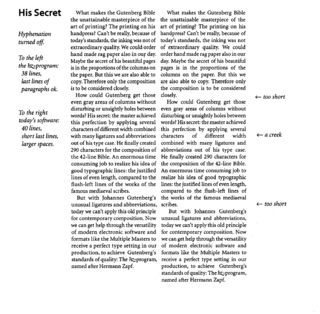
Typography is the art and technique of arranging type to make written language legible, readable and appealing when displayed. The arrangement of type involves selecting typefaces, point sizes, line lengths, line-spacing (leading), and letter-spacing (tracking), as well as adjusting the space between pairs of letters (kerning). The term typography is also applied to the style, arrangement, and appearance of the letters, numbers, and symbols created by the process. Type design is a closely related craft, sometimes considered part of typography; most typographers do not design typefaces, and some type designers do not consider themselves typographers. Typography also may be used as an ornamental and decorative device, unrelated to the communication of information.

Typographic units are the units of measurement used in typography or typesetting. Traditional typometry units are different from familiar metric units because they were established in the early days of printing. Though most printing is digital now, the old terms and units have persisted.
Desktop publishing (DTP) is the creation of documents using page layout software on a personal ("desktop") computer. It was first used almost exclusively for print publications, but now it also assists in the creation of various forms of online content. Desktop publishing software can generate layouts and produce typographic-quality text and images comparable to traditional typography and printing. Desktop publishing is also the main reference for digital typography. This technology allows individuals, businesses, and other organizations to self-publish a wide variety of content, from menus to magazines to books, without the expense of commercial printing.

A typeface is a design of letters, numbers and other symbols, to be used in printing or for electronic display. Most typefaces include variations in size, weight, slope, width, and so on. Each of these variations of the typeface is a font.
In typography, leading is the space between adjacent lines of type; the exact definition varies.
An em is a unit in the field of typography, equal to the currently specified point size. For example, one em in a 16-point typeface is 16 points. Therefore, this unit is the same for all typefaces at a given point size.
In typography, the point is the smallest unit of measure. It is used for measuring font size, leading, and other items on a printed page. The size of the point has varied throughout printing's history. Since the 18th century, the size of a point has been between 0.18 and 0.4 millimeters. Following the advent of desktop publishing in the 1980s and 1990s, digital printing has largely supplanted the letterpress printing and has established the desktop publishing (DTP) point as the de facto standard. The DTP point is defined as 1⁄72 of an international inch (1/72 × 25.4 mm ≈ 0.353 mm) and, as with earlier American point sizes, is considered to be 1⁄12 of a pica.
Letter spacing, character spacing or tracking is an optically consistent typographical adjustment to the space between letters to change the visual density of a line or block of text. Letter spacing is distinct from kerning, which adjusts the spacing of particular pairs of adjacent characters such as "7." which would appear to be badly spaced if left unadjusted, and leading, the spacing between lines.

In typography, a counter is the area of a letter that is entirely or partially enclosed by a letter form or a symbol. The stroke that creates such a space is known as a "bowl". Latin letters containing closed counters include A, B, D, O, P, Q, R, a, b, d, e, g, o, p, and q. Latin letters containing open counters include c, f, h, s etc. The digits 0, 4, 6, 8, and 9 also possess a counter. An aperture is the opening between an open counter and the outside of the letter.
Word spacing in typography is space between words, as contrasted with letter-spacing and sentence spacing. Typographers may modify the spacing of letters or words in a body of type to aid readability and copy fit, or for aesthetic effect. In web browsers and standardized digital typography, word spacing is controlled by the CSS1 word-spacing property.
In computer programming, whitespace is any character or series of characters that represent horizontal or vertical space in typography. When rendered, a whitespace character does not correspond to a visible mark, but typically does occupy an area on a page. For example, the common whitespace symbol U+0020 SPACE represents a blank space punctuation character in text, used as a word divider in Western scripts.
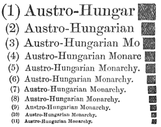
Type color, or colour, is an element of typography that describes how dense or heavy the text appears on the page. Finding the correct balance of type color and white space can make text more easily readable. The term type color should not be confused with the usual meaning of color, ; instead it has more to do with the blackness or boldness of the text on the page. A bold font weight creates more contrast on the page, therefore creates more emphasis. Using a bold font is therefore one way that type color can be adjusted.
Sentence spacing concerns how spaces are inserted between sentences in typeset text and is a matter of typographical convention. Since the introduction of movable-type printing in Europe, various sentence spacing conventions have been used in languages with a Latin alphabet. These include a normal word space, a single enlarged space, and two full spaces.

In typography, a margin is the area between the main content of a page and the page edges. The margin helps to define where a line of text begins and ends. When a page is justified the text is spread out to be flush with the left and right margins. When two pages of content are combined next to each other, the space between the two pages is known as the gutter. The top and bottom margins of a page are also called "head" and "foot", respectively. The term "margin" can also be used to describe the edge of internal content, such as the right or left edge of a column of text.
Microtypography is a range of methods for improving the readability and appearance of text, especially justified text. The methods reduce the appearance of large interword spaces and create edges to the text that appear more even. Microtypography methods can also increase reading comprehension of text, reducing the cognitive load of reading.
In typography, the body height or point size refers to the height of the space in which a glyph is defined.
A figure space or numeric space is a typographic unit equal to the size of a single numerical digit. Its size can fluctuate somewhat depending on which font is being used. This is the preferred space to use in numbers. It has the same width as a digit and keeps the number together for the purpose of line breaking.
Typeface anatomy describes the graphic elements that make up letters in a typeface.
In typography, a quad was a metal spacer used in letterpress typesetting. The term was later adopted as the generic name for two common sizes of spaces in typography, regardless of the form of typesetting used. An em quad is a space that is one em wide; as wide as the height of the font. An en quad is a space that is one en wide: half the width of an em quad.
Fonts originally consisted of a set of moveable type letterpunches purchased from a type foundry. As early as 1600, the sizes of these types—their "bodies"—acquired traditional names in English, French, German, and Dutch, usually from their principal early uses. These names were used relative to the others and their exact length would vary over time, from country to country, and from foundry to foundry. For example, "agate" and "ruby" used to be a single size "agate ruby" of about 5 points; metal type known as "agate" later ranged from 5 to 5.8 points. The sizes were gradually standardized as described above. Modern Chinese typography uses the following names in general preference to stating the number of points. In ambiguous contexts, the word hào is added to the end of the size name to clarify the meaning.