Visual design elements and principles

Last updated

Visual design elements and principles describe fundamental ideas about the practice of visual design.

Contents

Elements of design

Design elements are the basic units of any visual design which form its structure and convey visual messages. [1] [2] Painter and design theorist Maitland E. Graves (1902-1978), who attempted to gestate the fundamental principles of aesthetic order in visual design, [3] in his book, The Art of Color and Design (1941), defined the elements of design as line, direction, shape, size, texture, value, and color, concluding that "these elements are the materials from which all designs are built." [4]

Elements of art and design Elements of art.jpg
Elements of art and design
Color star containing primary, secondary, and tertiary colors. Color star-en (tertiary names).svg
Color star containing primary, secondary, and tertiary colors.

Color

Color is the result of light reflecting back from an object to our eyes. [5] The color that our eyes perceive is determined by the pigment of the object itself. [5] Color theory and the color wheel are often referred to when studying color combinations in visual design. [6] Color is often deemed to be an important element of design as it is a universal language which presents the countless possibilities of visual communication. [7] Color serves various purposes to contribute to the overall effectiveness of the design. It is used as an element to convey meaning and emotion, create visual hierarchy, enhance brand identity, improve readability and accessibility, create visual interest and appeal, differentiate information and elements, and make cultural and contextual significance.

Hue, saturation, and brightness are the three characteristics that describe color. [8]

Color theory in visual design

Color theory studies color mixing and color combinations. It is one of the first things that marked a progressive design approach. [7] In visual design, designers refer to color theory as a body of practical guidance to achieving certain visual impacts with specific color combinations.[ citation needed ] Theoretical color knowledge is implemented in designs in order to achieve a successful color design. [10]

Color harmony, often referred to as a "measure of aesthetics", [10] studies which color combinations are harmonious and pleasing to the eye, and which color combinations are not. [8] Color harmony is a main concern for designers given that colors always exist in the presence of other colors in form or space. [10]

When a designer harmonizes colors, the relationships among a set of colors are enhanced to increase the way they complement one another. Colors are harmonized to achieve a balanced, unified, and aesthetically pleasing effect for the viewer. [8]

Color harmony is achieved in a variety of ways, some of which consist of combining a set of colors that share the same hue, or a set of colors that share the same values for two of the three color characteristics (hue, saturation, brightness). [8] Color harmony can also be achieved by simply combining colors that are considered compatible to one another [8] as represented in the color wheel.

Color contrasts are studied with a pair of colors, as opposed to color harmony, which studies a set of colors. In color contrasting, two colors with perceivable differences in aspects such as luminance, or saturation, are placed side by side to create contrast.[ citation needed ]

Johannes Itten presented seven kinds of color contrasts: contrast of light and dark, contrast of hue, contrast of temperature, contrast of saturation, simultaneous contrast, contrast of sizes, and contrast of complementary. [8] These seven kinds of color contrasts have inspired past works involving color schemes in design. [8]

Color schemes are defined as the set of colors chosen for a design. They are often made up of two or more colors that look appealing beside one another, and that create an aesthetic feeling when used together. Color schemes depend on color harmony as they point to which colors look pleasing beside one another. [10]

A satisfactory design product is often accompanied by a successful color scheme. Over time, color design tools with the function of generating color schemes were developed to facilitate color harmonizing for designers. [11]

Use of color in visual design

  • Color is used to create harmony, balance, and visual comfort in a design [10]
  • Color is used to evoke the desired mood and emotion in the viewer [5]
  • Color is used to create a theme in the design [8]
  • Color holds meaning and can be symbolic. In certain cultures, different colors can have different meanings. [5]
  • Color is used to put emphasis on desired elements and create visual hierarchy in a piece of art [12]
  • Color can create identity for a certain brand or design product [12]
  • Color allows viewers to have different interpretations of visual designs. The same color can evoke different emotions, or have various meanings to different individuals and cultures [5]
  • Color strategies are used for organization and consistency in a design product [9]
  • In the architectural design of a retail environment, colors affect decision-making, making which motivates consumers to buy particular products [12]
  • Color strengthens narrative and storytelling in visual design.
  • Color can represent characters, themes, and symbolism.
  • Color is a tool that designers use to strategically add layers of meaning and subtext to their designs.
  • Colors can create recurring visual motifs in a design, strengthening ideas and fostering coherence.
  • Color is an effective tool for communication because it allows for complex interpretation and expression.


Similarly, stars in a constellation connected via imaginary lines are a natural example of using lines in a composition Stars in orion constellation (connected).jpg
Similarly, stars in a constellation connected via imaginary lines are a natural example of using lines in a composition

Line

The line is an element of art defined by a point moving in space. . More specifically, Line is defined as a series of points, or the connection between two points, or the path of a moving point. [13] The importance of line comes from its versatility as its characteristics is significantly expressive. [14] Lines can be vertical, horizontal, diagonal, or curved, , they may also appear as linear shapes that take on a line-link quality, or as suggested line perceived from eyes as they follow a sequence related shapes. Line may be used either in two-dimensional forms with enclosing a space as an outline and creating shape, or in three-dimensional forms. They can be any width or texture, and can be continuous, implied, or broken. On top of that, there are different types of lines aside from the ones previously mentioned. For example, you could have a line that is horizontal and zigzagged or a line that is vertical and zigzagged. Different lines create different moods, it all depends on what mood you are using line to create and convey.

Point

A point is basically the beginning of “something” in “nothing”. It forces the mind to think upon its position and gives something to build upon in both imagination and space. Some abstract points in a group can provoke human imagination to link it with familiar shapes or forms.

Shape

A shape is defined as a two dimensional area that stands out from the space next to or around it due to a defined or implied boundary, or because of differences of value, color, or texture. [15] Shapes are recognizable objects and forms [5] and are usually composed of other elements of design. [16]

For example, a square that is drawn on a piece of paper is considered a shape. It is created with a series of lines which serve as a boundary that shapes the square and separates it from the space around it that is not part of the square. [5]

Types of shapes

Geometric shapes or mechanical shapes are shapes that can be drawn using a ruler or compass, such as squares, circles, triangles, ellipses, parallelograms, stars, and so on. [5] Mechanical shapes, whether simple or complex, produce a feeling of control and order. [16]

Organic shapes are irregular shapes [5] that are often complex and resemble shapes that are found in nature. [16] Organic shapes can be drawn by hand, which is why they are sometimes subjective and only exist in the imagination of the artist. [5]

Curvilinear shapes are composed of curved lines and smooth edges. They give off a more natural feeling to the shape. In contrast, rectilinear shapes are composed of sharp edges and right angles, and give off a sense of order in the composition. They look more human-made, structured, and artificial. Artists can choose to create a composition that revolves mainly around one of these styles of shape, or they can choose to combine both. [5]

Texture

This is only a two dimensional image of a tree, but appears to have the texture of three dimensional bark. Texture arbre.jpg
This is only a two dimensional image of a tree, but appears to have the texture of three dimensional bark.

Texture refers to the physical and visual qualities of a surface.[ citation needed ]

Definition of texture

Texture is the variation of data at a scale smaller than the scale of the main object. [17] Taking a person wearing a Hawaiian shirt as an example, as long as we consider the person as the main object looking at, the patterns of their shirt are considered as texture. However, if we try to identify the pattern of the shirt, each flower or bird of the pattern is a non-textured object, as no smaller detail inside of it can be recognized. Texture in our environment helps us to better understand the nature of things, as a smooth paved road signals safe passage and thick fog creates a veil on our view. [13]

texture in design

Texture in design includes the literal physical surface employed in a printed piece as well as the optical appearance of the surface. Physical texture affects how the piece feels in hand and also how it conveys the design, as a glossy surface for example reflects the light differently than a soft or pebbly one. Many of the textures manipulated by graphic designers, however, cannot be physically experienced as it is utilized in the visual representation aspect of the design. Texture adds detail to an image in a way that conveys the overall quality of a surface. [13] Graphic designers use texture to establish a mood, reinforce a point of view, or convey a sense of physical presence whether setting a type or drawing a tree. [13]

Uses of texture in design

  • Texture can be used to attract or repel interest to an element, depending on how pleasant the texture is perceived to be. [16]
  • Texture can also be used to add complex detail into the composition of a design. [5]
  • In theatrical design, the surface qualities of a costume sculpt the look and feel of a character, which influences the way the audience reacts to the character. [5]
Types of texture

Tactile texture, also known as "actual texture", refers to the physical three-dimensional texture of an object. Tactile texture can be perceived by the sense of touch. A person can feel the tactile texture of a sculpture by running their hand over its surface and feelings its ridges and dents. [5]

  • Painters use impasto to build peaks and create texture in their painting. [16]
  • Texture can be created through collage. This is when artists assemble three dimensional objects and apply them onto a two-dimensional surface, like a piece of paper or canvas, to create one final composition. [5]
  • Papier collé is another collaging technique in which artists glue paper to a surface to create different textures on its surface. [5]
  • Assemblage is a technique that consists of assembling various three-dimensional objects into a sculpture, which can also reveal textures to the viewer. [5]

Visual texture, also referred to as "implied texture", is not detectable by our sense of touch, but by our sense of sight.[ citation needed ] Visual texture is the illusion of a real texture on a two-dimensional surface. [5] Any texture perceived in an image or photograph is a visual texture. A photograph of rough tree bark is considered a visual texture. It creates the impression of a real texture on a two-dimensional surface which would remain smooth to the touch no matter how rough the represented texture is. [16]

In painting, different paints are used to achieve different types of textures. Paints such as oil, acrylic, and encaustic are thicker and more opaque and are used to create three-dimensional impressions on the surface. Other paints, such as watercolor, tend to be used for visual textures, because they are thinner and have transparency, and do not leave much tactile texture on the surface. [5]

Pattern

Many textures appear to repeat the same motif. [5] When a motif is repeated over and over again in a surface, it results in a pattern . [16] Patterns are frequently used in fashion design or textile design, where motifs are repeated to create decorative patterns on fabric or other textile materials.[ citation needed ] Patterns are also used in architectural design, where decorative structural elements such as windows, columns, or pediments, are incorporated into building design.[ citation needed ]

Space

In design, space is concerned with the area deep within the moment of designated design, the design will take place on. For a two-dimensional design, space concerns creating the illusion of a third dimension on a flat surface: [16]

Form

In visual design, form is described as the way an artist arranges elements in the entirety of a composition. [5] It may also be described as any three-dimensional object. Form can be measured, from top to bottom (height), side to side (width), and from back to front (depth). Form is also defined by light and dark. It can be defined by the presence of shadows on surfaces or faces of an object. There are two types of form, geometric (artificial) and natural (organic form). Form may be created by the combining of two or more shapes. It may be enhanced by tone, texture or color. It can be illustrated or constructed.

Principles of design

Principles applied to the elements of design that bring them together into one design. How one applies these principles determines how successful a design may be. [1]

Unity/harmony

According to Alex White, author of The Elements of Graphic Design, to achieve visual unity is a main goal of graphic design. When all elements are in agreement, a design is considered unified. No individual part is viewed as more important than the whole design. A good balance between unity and variety must be established to avoid a chaotic or a lifeless design. [9]

Methods

  • Perspective: sense of distance between elements.
  • Similarity: ability to seem repeatable with other elements.
  • Continuation: the sense of having a line or pattern extend.
  • Repetition: elements being copied or mimicked numerous times.
  • Rhythm: is achieved when recurring position, size, color, and use of a graphic element has a focal point interruption.
  • Altering the basic theme achieves unity and helps keep interest.

Balance

It is a state of equalized tension and equilibrium, which may not always be calm. [9]

Types of balance in visual design

The top image has symmetrical balance and the bottom image has asymmetrical balance Cams.svg
The top image has symmetrical balance and the bottom image has asymmetrical balance
  • Symmetry
  • Asymmetrical balance produces an informal balance that is attention attracting and dynamic.
  • Radial balance is arranged around a central element. The elements placed in a radial balance seem to 'radiate' out from a central point in a circular fashion.
  • Overall is a mosaic form of balance which normally arises from too many elements being put on a page. Due to the lack of hierarchy and contrast, this form of balance can look noisy but sometimes quiet.

Hierarchy/Dominance/Emphasis

A good design contains elements that lead the reader through each element in order of its significance. The type and images should be expressed starting from most important to the least important. Dominance is created by contrasting size, positioning, color, style, or shape. The focal point should dominate the design with scale and contrast without sacrificing the unity of the whole. [9]


Scale/proportion

Using the relative size of elements against each other can attract attention to a focal point. When elements are designed larger than life, the scale is being used to show drama. [9] Scale can be considered both objectively and subjectively. In terms of objective, scale refers to the exact literal physical dimensions of an object in the real world or the coloration between the representation and the real one. Printed maps can be good examples as they have an exact scale representing the real physical world. Subjectively, however, scale refers to one’s impression of an object’s size. A representation “lacks scale” when there is no exact cause linking it to lived experience, giving it a physical identity. As an example, a book may have a grand or intimate scale based on how it relates to our own body or our knowledge of other books. [13]

Scale in design

A printed piece can be as small as a postage stamp or as large as a billboard. A logo should be legible both in tiny dimensions as well as from a distance on a screen. Some projects have their specified scale designed for a certain medium or site, while some others need to work in various sizes designed for reproduction in multiple scales. No matter what size the design work is, it should have its own sense of scale. [13] Increasing an element’s scale in a design piece increases its value in terms of hierarchy and makes it to be seen first compared to other elements while decreasing an element’s scale reduces its value.

Similarity and contrast

Planning a consistent and similar design is an important aspect of a designer's work to make their focal point visible. Too much similarity is boring but without similarity important elements will not exist and an image without contrast is uneventful so the key is to find the balance between similarity and contrast. [9]

Similar environment

There are several ways to develop a similar environment: [9]

  • Build a unique internal organization structure.
  • Manipulate shapes of images and text to correlate together.
  • Express continuity from page to page in publications. Items to watch include headers, themes, borders, and spaces.
  • Develop a style manual and adhere to it.

Contrasts

  • Space
    • Filled / Empty
    • Near / Far
    • 2-D / 3-D
  • Position
    • Left / Right
    • Isolated / Grouped
    • Centered / Off-Center
    • Top / Bottom
  • Form
    • Simple / Complex
    • Beauty / Ugly
    • Whole / Broken
  • Direction
    • Stability / Movement
  • Structure
    • Organized / Chaotic
    • Mechanical / Hand-Drawn
  • Size
    • Large / Small
    • Deep / Shallow
    • Fat / Thin
  • Color
    • Grey scale / Color
    • Black & White / Color
    • Light / Dark
  • Texture
    • Fine / Coarse
    • Smooth / Rough
    • Sharp / Dull
  • Density
    • Transparent / Opaque
    • Thick / Thin
    • Liquid / Solid
  • Gravity
    • Light / Heavy
    • Stable / Unstable

Movement is the path the viewer’s eye takes through the artwork, often to focal areas. Such movement can be directed along lines edges, shape and color within the artwork, and more.

See also

Notes

  1. 1 2 Lovett, John. "Design and Colour" . Retrieved 3 April 2012.
  2. Charlotte Jirousek. Art, Design, and Visual Thinking. An online, interactive textbook. Cornell.edu, 1995.
  3. Martin, Jon Henry. An evaluation of Maitland Graves' principle of aesthetic order. Masters thesis, Concordia University, 1972.
  4. Graves, Maitland, E. The art of color and design. 2d ed. New York, N.Y.: McGraw-Hill, 1951.
  5. 1 2 3 4 5 6 7 8 9 10 11 12 13 14 15 16 17 18 19 20 21 E., Malloy, Kaoime (2014-09-26). The art of theatrical design : elements of visual composition, methods, and practice. New York. ISBN   9781138021501. OCLC   882620042.{{cite book}}: CS1 maint: location missing publisher (link) CS1 maint: multiple names: authors list (link)
  6. "basic color theory". color matters. Retrieved 1 March 2019.
  7. 1 2 Jasper, Adam (2014-05-04). "Colour Theory". Architectural Theory Review. 19 (2): 119–123. doi:10.1080/13264826.2014.991017. ISSN   1326-4826. S2CID   218640469.
  8. 1 2 3 4 5 6 7 8 Visual Color Design, 16th International Conference Information on Visualisation (IV 2012) : Montpellier, France, 11-13 July 2012 (PDF). IEEE Computer Society. Los Alamitos, Calif.: IEEE Computer Society. 2012. ISBN   9781467322607. OCLC   823906734.{{cite book}}: CS1 maint: others (link)
  9. 1 2 3 4 5 6 7 8 9 10 White, Alex (2011). The Elements of Graphic Design. New York, NY: Allworth Press. pp. 81–105. ISBN   978-1-58115-762-8.
  10. 1 2 3 4 5 "The Architectural Colour Design Process: An Evaluation of Sequential Media via Semantic Ratings". ResearchGate. Retrieved 2018-11-12.
  11. Luo, Ming Ronnier (2006-06-01). "Applying colour science in colour design". Optics & Laser Technology. 38 (4–6): 392–398. Bibcode:2006OptLT..38..392L. doi:10.1016/j.optlastec.2005.06.025. ISSN   0030-3992.
  12. 1 2 3 Tantanatewin, Warakul; Inkarojrit, Vorapat (2016-06-01). "Effects of color and lighting on retail impression and identity". Journal of Environmental Psychology. 46: 197–205. doi:10.1016/j.jenvp.2016.04.015. ISSN   0272-4944.
  13. 1 2 3 4 5 6 Lupton, Ellen; Phillips, Jennifer Cole (2008-03-20). Graphic Design: The New Basics. Princeton Architectural Press. ISBN   978-1-56898-702-6.
  14. Wolf, R. Craig; Block, Dick (2014). Scene design and stage lighting. Wadsworth, Cengage Learning. ISBN   978-1-111-34443-6.
  15. Cindy Kovalik, Ph.D. and Peggy King, M.Ed. "Visual Literacy" . Retrieved 2010-03-27.{{cite web}}: CS1 maint: multiple names: authors list (link)
  16. 1 2 3 4 5 6 7 8 9 Saw, James. "Design Notes". Palomar College. Retrieved 3 April 2012.
  17. Petrou, Maria M. P.; Kamata, Sei-ichiro (2021-01-15). Image Processing: Dealing with Texture. John Wiley & Sons. ISBN   978-1-119-61859-1.

Related Research Articles

<span class="mw-page-title-main">Raster graphics</span> Matrix-based data structure

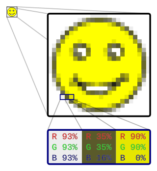
In computer graphics and digital photography, a raster graphic represents a two-dimensional picture as a rectangular matrix or grid of pixels, viewable via a computer display, paper, or other display medium. A raster is technically characterized by the width and height of the image in pixels and by the number of bits per pixel. Raster images are stored in image files with varying dissemination, production, generation, and acquisition formats.

<span class="mw-page-title-main">Type design</span> Art of designing typefaces and fonts

Type design is the art and process of designing typefaces. This involves drawing each letterform using a consistent style. The basic concepts and design variables are described below.

<span class="mw-page-title-main">Op art</span> Art movement

Op art, short for optical art, is a style of visual art that uses optical illusions.

Graphics are visual images or designs on some surface, such as a wall, canvas, screen, paper, or stone, to inform, illustrate, or entertain. In contemporary usage, it includes a pictorial representation of data, as in design and manufacture, in typesetting and the graphic arts, and in educational and recreational software. Images that are generated by a computer are called computer graphics.

<span class="mw-page-title-main">Visual communication</span> Method of communication

Visual communication is the use of visual elements to convey ideas and information which include signs, typography, drawing, graphic design, illustration, industrial design, advertising, animation, and electronic resources. Visual communication has been proven to be unique when compared to other verbal or written languages because of its more abstract structure. It stands out for its uniqueness, as the interpretation of signs varies on the viewer's field of experience. The interpretation of imagery is often compared to the set alphabets and words used in oral or written languages. Another point of difference found by scholars is that, though written or verbal languages are taught, sight does not have to be learned and therefore people of sight may lack awareness of visual communication and its influence in their everyday life. Many of the visual elements listed above are forms of visual communication that humans have been using since prehistoric times. Within modern culture, there are several types of characteristics when it comes to visual elements, they consist of objects, models, graphs, diagrams, maps, and photographs. Outside the different types of characteristics and elements, there are seven components of visual communication: color, shape, tones, texture, figure-ground, balance, and hierarchy.

<span class="mw-page-title-main">Composition (visual arts)</span> Placement or arrangement of visual elements or ingredients in a work of art

The term composition means "putting together". It can be thought of as the organization of the elements of art according to the principles of art. Composition can apply to any work of art, from music through writing and into photography, that is arranged using conscious thought.

<span class="mw-page-title-main">Floral design</span> Artistic design of flowers and plants for decoration

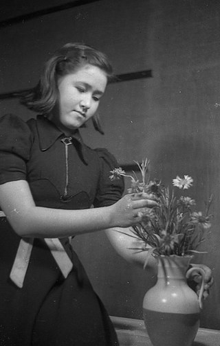
Floral design or flower arrangement is the art of using plant material and flowers to create an eye-catching and balanced composition or display. Evidence of refined floral design is found as far back as the culture of ancient Egypt. Floral designs, called arrangements, incorporate the five elements and seven principles of floral design.

The following are common definitions related to the machine vision field.

Elements of art are stylistic features that are included within an art piece to help the artist communicate. The seven most common elements include line, shape, texture, form, space, color and value, with the additions of mark making, and materiality. When analyzing these intentionally utilized elements, the viewer is guided towards a deeper understanding of the work.

<span class="mw-page-title-main">Outline of the visual arts</span> Art forms that create works that are primarily visual in nature

The following outline is provided as an overview of and topical guide to the visual arts:

Applied aesthetics is the application of the branch of philosophy of aesthetics to cultural constructs. In a variety of fields, artifacts are created that have both practical functionality and aesthetic affectation. In some cases, aesthetics is primary, and in others, functionality is primary. At best, the two needs are synergistic, in which "beauty" makes an artifact work better, or in which more functional artifacts are appreciated as aesthetically pleasing. This achievement of form and function, of art and science, of beauty and usefulness, is the primary goal of design, in all of its domains.

<span class="mw-page-title-main">Visual hierarchy</span> Visual design technique to convey importance

Visual hierarchy, according to Gestalt psychology, is a pattern in the visual field wherein some elements tend to "stand out," or attract attention, more strongly than other elements, suggesting a hierarchy of importance. While it may occur naturally in any visual field, the term is most commonly used in design, where elements are intentionally designed to make some look more important than others. This order is created by the visual contrast between forms in a field of perception. Objects with highest contrast to their surroundings are recognized first by the human mind.

<span class="mw-page-title-main">Texture (visual arts)</span> Perceived surface quality of a work of art

In the visual arts, texture refers to the perceived surface quality of a work of art. It is an element found in both two-dimensional and three-dimensional designs, and it is characterized by its visual and physical properties. The use of texture, in conjunction with other design elements, can convey a wide range of messages and evoke various emotions.

In the visual arts, shape is a flat, enclosed area of an artwork created through lines, textures, or colours, or an area enclosed by other shapes, such as triangles, circles, and squares. Likewise, a form can refer to a three-dimensional composition or object within a three-dimensional composition.

<span class="mw-page-title-main">Architectural drawing</span> Technical drawing of a building (or building project)

An architectural drawing or architect's drawing is a technical drawing of a building that falls within the definition of architecture. Architectural drawings are used by architects and others for a number of purposes: to develop a design idea into a coherent proposal, to communicate ideas and concepts, to convince clients of the merits of a design, to assist a building contractor to construct it based on design intent, as a record of the design and planned development, or to make a record of a building that already exists.

The following outline is provided as an overview of and typical guide to drawing and drawings:

<span class="mw-page-title-main">Map symbol</span> Graphic depiction of a geographic phenomenon

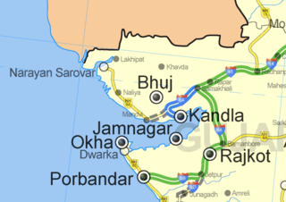
A map symbol or cartographic symbol is a graphical device used to visually represent a real-world feature on a map, working in the same fashion as other forms of symbols. Map symbols may include point markers, lines, regions, continuous fields, or text; these can be designed visually in their shape, size, color, pattern, and other graphic variables to represent a variety of information about each phenomenon being represented.

<span class="mw-page-title-main">Map layout</span> Arrangement of map elements on a page

Map layout, also called map composition or (cartographic) page layout, is the part of cartographic design that involves assembling various map elements on a page. This may include the map image itself, along with titles, legends, scale indicators, inset maps, and other elements. It follows principles similar to page layout in graphic design, such as balance, gestalt, and visual hierarchy. The term map composition is also used for the assembling of features and symbols within the map image itself, which can cause some confusion; these two processes share a few common design principles but are distinct procedures in practice. Similar principles of layout design apply to maps produced in a variety of media, from large format wall maps to illustrations in books to interactive web maps, although each medium has unique constraints and opportunities.

A visual variable, in cartographic design, graphic design, and data visualization, is an aspect of a graphical object that can visually differentiate it from other objects, and can be controlled during the design process. The concept was first systematized by Jacques Bertin, a French cartographer and graphic designer, and published in his 1967 book, Sémiologie Graphique. Bertin identified a basic set of these variables and provided guidance for their usage; the concept and the set of variables has since been expanded, especially in cartography, where it has become a core principle of education and practice.

<span class="mw-page-title-main">Cartographic design</span> Process of designing maps

Cartographic design or map design is the process of crafting the appearance of a map, applying the principles of design and knowledge of how maps are used to create a map that has both aesthetic appeal and practical function. It shares this dual goal with almost all forms of design; it also shares with other design, especially graphic design, the three skill sets of artistic talent, scientific reasoning, and technology. As a discipline, it integrates design, geography, and geographic information science.

References