Color theory, or more specifically traditional color theory, is a historical body of knowledge describing the behavior of colors, namely in color mixing, color contrast effects, color harmony, color schemes and color symbolism.[1] Modern color theory is generally referred to as color science. While they both study color and its existence, modern or "traditional" color theory tends to be more subjective and have artistic applications, while color science tends to be more objective and have functional applications, such as in chemistry, astronomy or color reproduction. However, there is much intertwining between the two throughout history, and they tend to aid each other in their own evolutions.
Though, color theory can be considered a science unto itself that uses the relationship between human color perception and the interactions of colors together to build their palettes, schemes, and color mixes. Importantly, color theory relies upon objective standards in-order to be consistent in color mixing and presentation - i.e. to achieve the ideal color and effect, your ratios of colors must be consistent and often exact. As for functional applications, color theory intandem with color science is what allows humans to achieve ideal camouflage, designed paints that disperse more heat, and is often used by theme parks like Disney to achieve their ideal aesthetic.
Color theory dates back at least as far as Aristotle's treatise On Colors and Bharata's Nāṭya Shāstra. A formalization of "color theory" began in the 18th century, initially within a partisan controversy over Isaac Newton's theory of color (Opticks, 1704), followed by what we considered to be "primary colors", continuing onward for centuries with multiple artists-turned-scientists, and vice versa, putting forth their own color wheels and color theories.
By the end of the 19th century, a schism had formed between color theory and color science due to the schism in humanities and traditional sciences, alongside the rise of Munsell color theory.
History
Color theory is rooted in antiquity, with early musings on color in Aristotle's (d. 322 BCE) On Colors and Ptolemy's (d. 168 CE) Optics. The Nāṭya Shāstra (d. 200 BCE) composed in Ancient India, had an early, functional theory of color,[2] considering four colours as primary, black, blue, yellow and red. It also describes the production of derived colors from primary colors.
The bluish white (kāraṇḍava) colour, is made up of the white and the blue, and the yellowish white colour (pāṇḍu) of the white and the yellow. The lotus (padma) colour is made up of the white and the red, and the green (harit) colour, of the yellow and the blue. The dark red (kāṣāya) colour is made up of the blue and the red, and the pale-red (gaura) colour of the red and the yellow. These are the derivative colours. Besides these there are [many] minor colours which may be made up of three or four [original] colours.
The influence of light on color was investigated and revealed further by al-Kindi (d. 873) and Ibn al-Haytham (d. 1039). Ibn Sina (d. 1037), Nasir al-Din al-Tusi (d. 1274), and Robert Grosseteste (d. 1253) discovered that contrary to the teachings of Aristotle, there are multiple color paths to get from black to white.[3][4] More modern approaches to color theory principles can be found in the writings of Leone Battista Alberti (c. 1435) and the notebooks of Leonardo da Vinci (c. 1490).
Page from 1826 A New Practical Treatise on the Three Primitive Colours Assumed as a Perfect System of Rudimentary Information by Charles Hayter
Isaac Newton (d. 1727) worked extensively on color theory, helping and developing his own theory from stating the fact that white light is composed of a spectrum of colors, and that color is not intrinsic to objects, but rather arises from the way an object reflects or absorbs different wavelengths. His 1672 paper on the nature of white light and colours forms the basis for all work that followed on colour and colour vision.[5]
The RYB primary colors became the foundation of 18th-century theories of color vision,[citation needed] as the fundamental sensory qualities that are blended in the perception of all physical colors, and conversely, in the physical mixture of pigments or dyes. These theories were enhanced by 18th-century investigations of a variety of purely psychological color effects, in particular the contrast between "complementary" or opposing hues that are produced by color afterimages and in the contrasting shadows in colored light. These ideas and many personal color observations were summarized in two founding documents in color theory: the Theory of Colours (1810) by the German poet Johann Wolfgang von Goethe, and The Law of Simultaneous Color Contrast (1839) by the French industrial chemist Michel Eugène Chevreul. Charles Hayter published A New Practical Treatise on the Three Primitive Colours Assumed as a Perfect System of Rudimentary Information (London 1826), in which he described how all colors could be obtained from just three.
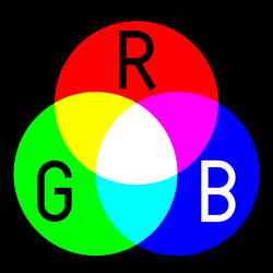
Subsequently, German and English scientists established in the late 19th century that color perception is best described in terms of a different set of primary colors—red, green and blue-violet (RGB)—modeled through the additive mixture of three monochromatic lights. Subsequent research anchored these primary colors in the differing responses to light by three types of color receptors or cones in the retina (trichromacy). On this basis the quantitative description of the color mixture or colorimetry developed in the early 20th century, along with a series of increasingly sophisticated models of color space and color perception, such as the opponent process theory.
Munsell's 1905 color system represents colors using three color-making attributes, value (lightness), chroma (saturation), and hue.
Across the same period, industrial chemistry radically expanded the color range of lightfast synthetic pigments, allowing for substantially improved saturation in color mixtures of dyes, paints, and inks. It also created the dyes and chemical processes necessary for color photography. As a result, three-color printing became aesthetically and economically feasible in mass printed media, and the artists' color theory was adapted to primary colors most effective in inks or photographic dyes: cyan, magenta, and yellow (CMY). (In printing, dark colors are supplemented by black ink, called "key," to make the CMYK system; in both printing and photography, white is provided by the color of the paper.) These CMY primary colors were reconciled with the RGB primaries, and subtractive color mixing with additive color mixing, by defining the CMY primaries as substances that absorbed only one of the retinal primary colors: cyan absorbs only red (−R+G+B), magenta only green (+R−G+B), and yellow only blue-violet (+R+G−B). It is important to add that the CMYK, or process, color printing is meant as an economical way of producing a wide range of colors for printing, but is deficient in reproducing certain colors, notably orange and slightly deficient in reproducing purples. A wider range of colors can be obtained with the addition of other colors to the printing process, such as in Pantone's Hexachrome printing ink system (six colors), among others.
For much of the 19th century artistic color theory either lagged behind scientific understanding or was augmented by science books written for the lay public, in particular Modern Chromatics (1879) by the American physicist Ogden Rood, and early color atlases developed by Albert Munsell (Munsell Book of Color, 1915, see Munsell color system) and Wilhelm Ostwald (Color Atlas, 1919). Major advances were made in the early 20th century by artists teaching or associated with the German Bauhaus, in particular Wassily Kandinsky, Johannes Itten, Faber Birren and Josef Albers, whose writings mix speculation with an empirical or demonstration-based study of color design principles.
One of the earliest purposes of color theory was to establish rules governing the mixing of pigments.
Traditional color theory was built around "pure" or ideal colors, characterized by different sensory experiences rather than attributes of the physical world. This has led to several inaccuracies in traditional color theory principles that are not always remedied in modern formulations.[6] Another issue has been the tendency to describe color effects holistically or categorically, for example as a contrast between "yellow" and "blue" conceived as generic colors instead of the three color attributes generally considered by color science: hue, colorfulness and lightness. These confusions are partly historical and arose in scientific uncertainty about color perception that was not resolved until the late 19th century when artistic notions were already entrenched. They also arise from the attempt to describe the highly contextual and flexible behavior of color perception in terms of abstract color sensations that can be generated equivalently by any visual media.[citation needed]
Primary, secondary, and tertiary colors of the RYB color model
Color theory asserts three pure primary colors that can be used to mix all possible colors. These are sometimes considered as red, yellow and blue (RYB) or as red, green and blue (RGB).[citation needed] Ostensibly, any failure of specific paints or inks to match this ideal performance is due to the impurity or imperfection of the colorants. In contrast, modern color science does not recognize universal primary colors (no finite combination of colors can produce all other colors) and only uses primary colors to define a given color space.[1] Any three primary colors can mix only a limited range of colors, called a gamut, which is always smaller (contains fewer colors) than the full range of colors humans can perceive.[7] Primary colors also can't be made from other colors as they are inherently pure and distinct.[8]
For the mixing of colored light, Isaac Newton's color wheel is often used to describe complementary colors, which are colors that cancel each other's hue to produce an achromatic (white, gray or black) light mixture. Newton offered as a conjecture that colors exactly opposite one another on the hue circle cancel out each other's hue; this concept was demonstrated more thoroughly in the 19th century. An example of complementary colors would be magenta and green.[citation needed]
A key assumption in Newton's hue circle was that the "fiery" or maximum saturated hues are located on the outer circumference of the circle, while achromatic white is at the center. Then the saturation of the mixture of two spectral hues was predicted by the straight line between them; the mixture of three colors was predicted by the "center of gravity" or centroid of three triangle points, and so on.
According to traditional color theory based on subtractive primary colors and the RYB color model, yellow mixed with purple, orange mixed with blue, or red mixed with green produces an equivalent gray and are the painter's complementary colors.
One reason the artist's primary colors work at all is due to the imperfect pigments being used have sloped absorption curves and change color with concentration. A pigment that is pure red at high concentrations can behave more like magenta at low concentrations. This allows it to make purples that would otherwise be impossible. Likewise, a blue that is ultramarine at high concentrations appears cyan at low concentrations, allowing it to be used to mix green. Chromium red pigments can appear orange, and then yellow, as the concentration is reduced. It is even possible to mix very low concentrations of the blue mentioned and the chromium red to get a greenish color. This works much better with oil colors than it does with watercolors and dyes.
The old primaries depend on sloped absorption curves and pigment leakages to work, while newer scientifically derived ones depend solely on controlling the amount of absorption in certain parts of the spectrum.
When mixing pigments, a color is produced which is always darker and lower in chroma, or saturation, than the parent colors. This moves the mixed color toward a neutral color—a gray or near-black. Lights are made brighter or dimmer by adjusting their brightness, or energy level; in painting, lightness is adjusted through mixture with white, black, or a color's complement.
It is common among some painters to darken a paint color by adding black paint—producing colors called shades—or lighten a color by adding white—producing colors called tints. However, it is not always the best way for representational painting, as an unfortunate result is for colors to also shift in hue. For instance, darkening a color by adding black can cause colors such as yellows, reds, and oranges, to shift toward the greenish or bluish part of the spectrum. Lightening a color by adding white can cause a shift towards blue when mixed with reds and oranges. Another practice when darkening a color is to use its opposite, or complementary, color (e.g. purplish-red added to yellowish-green) to neutralize it without a shift in hue and darken it if the additive color is darker than the parent color. When lightening a color this hue shift can be corrected with the addition of a small amount of an adjacent color to bring the hue of the mixture back in line with the parent color (e.g. adding a small amount of orange to a mixture of red and white will correct the tendency of this mixture to shift slightly towards the blue end of the spectrum).
Split primary palette
The split-primary palette is a color-wheel model that relies on misconceptions to attempt to explain the unsatisfactory results produced when mixing the traditional primary colors, red, yellow, and blue.
Painters have long considered red, yellow, and blue to be primary colors. In practice, however, some of the mixtures produced from these colors lack chromatic intensity. Rather than adopt a more effective set of primary colors,[9] proponents of split-primary theory explain this lack of chroma by the purported presence of impurities, small amounts of other colors in the paints, or biases away from the ideal primary toward one or the other of the adjacent colors. Every red paint, for example, is said to be tainted with, or biased toward, either blue or yellow, every blue paint toward either red or green, and every yellow toward either green or orange. These biases are said to result in mixtures that contain sets of complementary colors, darkening the resulting color. To obtain vivid mixed colors, according to split-primary theory, it is necessary to employ two primary colors whose biases both fall in the direction, on the color wheel, of the color to be mixed, combining, for example, green-biased blue and green-biased yellow to make bright green. Based on this reasoning, proponents of split-primary theory conclude that two versions of each primary color, often called "cool" and "warm," are needed in order to mix a wide gamut of high-chroma colors.[10][11]
In fact, the perceived bias of colors is not due to impurity. Rather, the appearance of any given colorant is inherent to its chemical and physical properties, and its purity unrelated to whether it conforms to our arbitrary conception of an ideal hue. Moreover, the identity of gamut-optimizing primary colors is determined by the physiology of human color vision. Although no set of three primary paints can be mixed to obtain the complete color gamut perceived by humans, red, yellow, and blue are a poor choice if high-chroma mixtures are desired. This is because painting is a subtractive color process, for which red and blue are secondary, not primary, colors.
Although flawed in principle,[12] the split-primary system can be successful in practice, because the recommended blue-biased red and green-biased blue positions are often filled by near approximations of magenta and cyan, respectively, while orange-biased red and violet-biased blue serve as secondary colors, tending to further widen the mixable gamut.
This system is in effect a simplified version of Newton's geometrical rule that colors closer together on the hue circle will produce more vibrant mixtures. A mixture produced from two primary colors, however, will be much more highly saturated than one produced from two secondary colors, even though the pairs are the same distance apart on the hue circle, revealing the limitations of the circular model in the prediction of color-mixing results. For example, a mixture of magenta and cyan inks or paints will produce vivid blues and violets, whereas a mixture of red and blue inks or paints will produce darkened violets and purples, even though the angular distance separating magenta and cyan is the same as that separating red and blue.
In Michel Eugène Chevreul's 1839 book The principles of harmony and contrast of colours,[13] he introduced the law of color contrast, stating that colors that appear together (spatially or temporally) will be altered as if mixed with the complementary color of the other color, functionally boosting the color contrast between them. For example, a piece of yellow fabric placed on a blue background will appear tinted orange because orange is the complementary color to blue. Chevreul formalized three types of contrast:[13]
simultaneous contrast, which appears in two colors viewed side by side
successive contrast, for the afterimage left on an achromatic background after viewing a color
mixed contrast, for the afterimage left on another color
Warm vis- cool colors
The distinction between "warm" and "cool" colors has been important since at least the late 18th century.[14] The difference (as traced by etymologies in the Oxford English Dictionary), seems related to the observed contrast in landscape light, between the "warm" colors associated with daylight or sunset, and the "cool" colors associated with a gray or overcast day. Warm colors are often said to be hues from red through yellow, browns, and tans included; cool colors are often said to be the hues from blue-green through blue violet, most grays included. There is a historical disagreement about the colors that anchor the polarity, but 19th-century sources put the peak contrast between red-orange and greenish-blue.[note 1]
Color theory has described perceptual and psychological effects to this contrast. Warm colors are said to advance or appear more active in a painting, while cool colors tend to recede; used in interior design or fashion, warm colors are said to arouse or stimulate the viewer, while cool colors calm and relax.[15] Most of these effects, to the extent they are real, can be attributed to the higher saturation and lighter value of warm pigments in contrast to cool pigments; brown is a dark, unsaturated warm color that few people think of as visually active or psychologically arousing.
Color harmony and color schemes
Georg Christoph Lichtenberg. Göttingen, 1775, plate III.Ignaz Schiffermüller, Versuch eines Farbensystems (Vienna, 1772), plate I.
It has been suggested that "Colors seen together to produce a pleasing affective response are said to be in harmony".[16] However, color harmony is a complex notion because human responses to color are both affective and cognitive, involving emotional response and judgment. Hence, our responses to color and the notion of color harmony is open to the influence of a range of different factors. These factors include individual differences (such as age, gender, personal preference, affective state, etc.) as well as cultural, sub-cultural, and socially-based differences which gives rise to conditioning and learned responses about color. In addition, context always has an influence on responses about color and the notion of color harmony, and this concept is also influenced by temporal factors (such as changing trends) and perceptual factors (such as simultaneous contrast) which may impinge on human response to color. The following conceptual model illustrates this 21st-century approach to color harmony:
wherein color harmony is a function (f) of the interaction between color/s (Col 1, 2, 3, …, n) and the factors that influence positive aesthetic response to color: individual differences (ID) such as age, gender, personality and affective state; cultural experiences (CE), the prevailing context (CX) which includes setting and ambient lighting; intervening perceptual effects (P) and the effects of time (T) in terms of prevailing social trends.[17]
In addition, given that humans can perceive around 2.3 million different colors,[18] it has been suggested that the number of possible color combinations is virtually infinite thereby implying that predictive color harmony formulae are fundamentally unsound.[19] Despite this, many color theorists have devised formulae, principles or guidelines for color combination with the aim being to predict or specify positive aesthetic response or "color harmony".
Color wheel models have often been used as a basis for color combination guidelines and for defining relationships between colors. Some theorists and artists believe juxtapositions of complementary color will produce strong contrast, a sense of visual tension as well as "color harmony"; while others believe juxtapositions of analogous colors will elicit a positive aesthetic response. Color combination guidelines (or formulas) suggest that colors next to each other on the color wheel model (analogous colors) tend to produce a single-hued or monochromatic color experience and some theorists also refer to these as "simple harmonies".[20]
In addition, split complementary color schemes usually depict a modified complementary pair, with instead of the "true" second color being chosen, a range of analogous hues around it are chosen, i.e. the split complements of red are blue-green and yellow-green. A triadic color scheme adopts any three colors approximately equidistant around a color wheel model. Feisner and Mahnke are among a number of authors who provide color combination guidelines in greater detail.[21][22]
Color combination formulae and principles may provide some guidance but have limited practical application. This is due to the influence of contextual, perceptual, and temporal factors which will influence how color/s are perceived in any given situation, setting, or context. Such formulae and principles may be useful in fashion, interior and graphic design, but much depends on the tastes, lifestyle, and cultural norms of the viewer or consumer.
Black and white have long been known to combine "well" with almost any other colors; black decreases the apparent saturation or brightness of colors paired with it and white shows off all hues to equal effect.[citation needed]
A major underpinning of traditional color theory is that colors carry significant cultural symbolism, or even have immutable, universal meaning. As early as the ancient Greek philosophers, many theorists have devised color associations and linked particular connotative meanings to specific colors.[23] However, connotative color associations and color symbolism tends to be culture-bound and may also vary across different contexts and circumstances. For example, red has many different connotative and symbolic meanings from exciting, arousing, sensual, romantic, and feminine; to a symbol of good luck; and also acts as a signal of danger. Such color associations tend to be learned and do not necessarily hold irrespective of individual and cultural differences or contextual, temporal or perceptual factors.[24] It is important to note that while color symbolism and color associations exist, their existence does not provide evidential support for color psychology or claims that color has therapeutic properties.[25]
Visible spectrum– Portion of the electromagnetic spectrum that is visible to the human eye
Notes
↑The traditional warm/cool association of a color is reversed relative to the color temperature of a theoretical radiating black body; the hottest stars radiate blue (cool) light, and the coolest radiate red (warm) light.
References
12MacEvoy, Bruce. "Color Theory". Handprint. Retrieved 8 February 2024.
↑Burchett, K. E. (2002). "Color Harmony". Color Research and Application, 27 (1), pp. 28–31.
↑O'Connor, Z. (2010). "Color harmony revisited". Color Research and Application, 35 (4), pp. 267–273.
↑Pointer, M. R. & Attridge, G.G. (1998). "The number of discernible colors". Color Research and Application, 23 (1), pp. 52–54.
↑Hard, A. & Sivik, L. (2001). "A theory of colors in combination – A descriptive model related to the NCS color-order system". Color Research and Application, 26 (1), pp. 4–28.
This page is based on this Wikipedia article Text is available under the CC BY-SA 4.0 license; additional terms may apply. Images, videos and audio are available under their respective licenses.