Related Research Articles
Pantone LLC is an American limited liability company headquartered in Carlstadt, New Jersey, and best known for its Pantone Matching System (PMS), a proprietary color space used in a variety of industries, notably graphic design, fashion design, product design, printing, and manufacturing and supporting the management of color from design to production, in physical and digital formats, among coated and uncoated materials, cotton, polyester, nylon and plastics.

The national flag of Norway is red with a navy blue Scandinavian cross bordered in white that extends to the edges of the flag; the vertical part of the cross is shifted to the hoist side in the style of the Dannebrog, the flag of Denmark.
Cerulean, also spelled caerulean, is a variety of the hue of blue that may range from a light azure blue to a more intense sky blue, and may be mixed as well with the hue of green. The first recorded use of cerulean as a colour name in English was in 1590. The word is derived from the Latin word caeruleus, "dark blue, blue, or blue-green", which in turn probably derives from caerulum, diminutive of caelum, "heaven, sky".
Taupe is a dark gray-brown color. The word derives from the French noun taupe meaning "mole". The name originally referred only to the average color of the French mole, but beginning in the 1940s, its usage expanded to encompass a wider range of shades.
The Color Association of the United States (CAUS), known until 1955 as the Textile Color Card Association of the United States (TCCA), is an independent color trend forecasting and color consulting service to the business community, known for its textile color swatch book, the Standard Color Reference of America.
Colour Index International (CII) is a reference database jointly maintained by the Society of Dyers and Colourists and the American Association of Textile Chemists and Colorists. It currently contains over 27,000 individual products listed under 13,000 Colour Index Generic Names. It was first printed in 1925 but is now published solely on the World Wide Web. The index serves as a common reference database of manufactured colour products and is used by manufacturers and consumers, such as artists and decorators.
AATCC—the American Association of Textile Chemists and Colorists— is a 501(c)(6) not-for-profit professional association that provides test method development, quality control materials, educational development, and networking for textile and apparel professionals throughout the world.
In optics, orange has a wavelength between approximately 585 and 620 nm and a hue of 30° in HSV color space. In the RGB color space it is a secondary color numerically halfway between gamma-compressed red and yellow, as can be seen in the RGB color wheel. The complementary color of orange is azure. Orange pigments are largely in the ochre or cadmium families, and absorb mostly blue light.
The Color Marketing Group (CMG) is an international association for color design professionals which identifies the direction of color and design trends and translates them into salable colors for manufactured products.
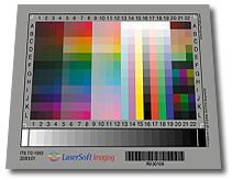
A color chart or color reference card is a flat, physical object that has many different color samples present. They can be available as a single-page chart, or in the form of swatchbooks or color-matching fans.
The British Colour Council (BCC) was an industry standards organisation, active from the 1930s to the 1950s, which produced indexes of named colours for use by government, industry, academia, and horticulture.
Lidewij de Gerarda Hillegonda Edelkoort, often called Li, is a Dutch trend forecaster, someone who anticipates future fashion and design trends. She has been the Founder and Chief Executive Officer of Trend Union since 1986.
Pink colors are usually light or desaturated shades of reds, roses, and magentas which are created on computer and television screens using the RGB color model and in printing with the CMYK color model. As such, it is an arbitrary classification of color.
Fashion merchandising can be defined as the planning and promotion of sales by presenting a product to the right market at the proper time, by carrying out organized, skillful advertising, using attractive displays, etc. Merchandising, within fashion retail, refers specifically to the stock planning, management, and control process. Fashion Merchandising is a job that is done world- wide. This position requires well-developed quantitative skills, and natural ability to discover trends, meaning relationships and interrelationships among standard sales and stock figures. In the fashion industry, there are two different merchandising teams: the visual merchandising team, and the fashion merchandising team.

Bernat Klein CBE was a Serbian textile designer and painter. Based in Scotland, Klein supplied textiles to haute couture designers in the 1960s and 1970s, and later sold his own clothing collections.
Varieties of the color blue may differ in hue, chroma, or lightness, or in two or three of these qualities. Variations in value are also called tints and shades, a tint being a blue or other hue mixed with white, a shade being mixed with black. A large selection of these colors is shown below.
Fashion forecasting began in France during the reign of Louis XIV. It started as a way of communicating about fashion and slowly transformed into a way to become ahead of the times in the fashion industry. Fashion forecasting predicts the moods of society and consumers, along with their behavior and buying habits and bases what they may release in the coming future off of the forecast. Fashion trends tend to repeat themselves every 20 years, and fashion forecasting predicts what other trends might begin with the rotation of fashion as well. Fashion forecasting can be used for many different reasons, the main reason being staying on top of current trends and knowing what your consumer is going to want in the future. This method helps fashion brands know what to expect and what to begin producing ahead of time. Top name brands and high end companies such as Vogue and Gucci even use this method to help their designers become even more informed on what is to come in the fashion industry.

Pantone 448 C is a colour in the Pantone colour system. Described as a "drab dark brown" and informally dubbed the "ugliest colour in the world", it was selected in 2012 as the colour for plain tobacco and cigarette packaging in Australia, after market researchers determined that it was the least attractive colour.
Pepa Poch is a Spanish artist, creator and painter known for her personal use of colour. She is a former member of the International Colour Authority, and the colors of her oil paintings are global color trend.

Color is an essential aspect of the aesthetic properties of clothing. The color of clothing has a significant impact on one's appearance. Our clothes communicate about us and reveal our social and economic standing.
References
- ↑ "Interview to Pepa Poch, Painter: "Colour is a feeling"". Barcelona és moda. Cambra de Comerç de Barcelona. Retrieved 24 October 2016.[ permanent dead link ]
- ↑ "Don't Be Off-colour [ permanent dead link ]". International Trade Forum, 1 (2001)
Color topics | ||||||||||
|---|---|---|---|---|---|---|---|---|---|---|
| Color science |
|  | ||||||||
| Color philosophy |
| |||||||||
| Color terms |
| |||||||||
| Color organizations | ||||||||||
| Names |
| |||||||||
| Related | ||||||||||
This fashion-related article is a stub. You can help Wikipedia by expanding it. |