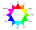
A color code is a system for encoding and representing non-color information with colors to facilitate communication. This information tends to be categorical (representing unordered/qualitative categories) though may also be sequential (representing an ordered/quantitative variable).
The earliest examples of color codes in use are for long-distance communication by use of flags, as in semaphore communication. [1] The United Kingdom adopted a color code scheme for such communication wherein red signified danger and white signified safety, with other colors having similar assignments of meaning.
As chemistry and other technologies advanced, it became expedient to use coloration as a signal for telling apart things that would otherwise be confusingly similar, such as wiring in electrical and electronic devices, and pharmaceutical pills.
A color code encodes a variable, which may have different representations, where the color code type should match the variable type:
The types of color code are:
When color is the only varied attribute, the color code is unidimensional. When other attributes are varied (e.g. shape, size), the code is multidimensional, where the dimensions can be independent (each encoding separate variables) or redundant (encoding the same variable). Partial redundancy sees one variable as a subset of another. [2] For example, playing card suits are multidimensional with color (black, red) and shape (club, diamond, heart, spade), which are partially redundant since clubs and spades are always black and diamonds and hearts are always red. Tasks using categorical color codes can be classified as identification tasks, where a single stimulus is shown and must be identified (connotatively or denotatively), versus search tasks, where a color stimulus must be found within a field of heterogenous stimuli. [3] [2] Performance in these tasks is measured by speed and/or accuracy. [2]
The ideal color scheme for a categorical color code depends on whether speed or accuracy is more important. [3] Despite humans being able to distinguish 150 distinct colors along the hue dimension during comparative task, evidence supports that color schemes where colors differ only by hue (equal luminosity and colorfulness) should have a maximum of 8eightcategories with optimized stimulus spacing along the hue dimension, [3] though this would not be color blind accessible. The IALA recommends categorical color codes in seven colors: red, orange, yellow, green, blue, white and black. [4] Adding redundant coding of luminosity and colorfulness adds information and increases speed and accuracy of color decoding tasks. [3] Color codes are superior to others (encoding to letters, shape, size, etc.) in certain types of tasks. Adding color as a redundant attribute to a numeral or letter encoding in search tasks decreased time by 50–75%, [2] : Fig9 but in unidimensional identification tasks, using alphanumeric or line inclination codes caused less errors than color codes. [3] [2] : 19
Several studies demonstrate a subjective preference for color codes over achromatic codes (e.g. shapes), even in studies where color coding did not increase performance over achromatic coding. [2] : 18 Subjects reported the tasks as less monotonous and less inducing of eye strain and fatigue. [2] : 18
The ability to discriminate color differences decreases rapidly as the visual angle subtends less than 12' (0.2° or ~2 mm at a viewing distance of 50 cm), [5] so color stimulus of at least 3 mm in diameter or thickness is recommended when the color is on paper or on a screen. [6] Under normal conditions, colored backgrounds do not affect the interpretation of color codes, but chromatic (and/or low) illumination of surface color code can degrade performance. [3]
Color codes present some potential problems. On forms and signage, the use of color can distract from black and white text. [7]
Color codes are often designed without consideration for accessibility to color blind and blind people, and may even be inaccessible for those with normal color vision, since use of many colors to code many variables can lead to use of confusingly similar colors. [7] [8] Only 15–40% of the colorblind can correctly name surface color codes with 8–10 color categories, most of which test as mildly colorblind. This finding uses ideal illumination; when dimmer illumination is used, performance drops sharply. [8]
Systems incorporating color-coding include:
Color blindness or color vision deficiency (CVD) is the decreased ability to see color or differences in color. The severity of color blindness ranges from mostly unnoticeable to full absence of color perception. Color blindness is usually an inherited problem or variation in the functionality of one or more of the three classes of cone cells in the retina, which mediate color vision. The most common form is caused by a genetic condition called congenital red–green color blindness, which affects up to 1 in 12 males (8%) and 1 in 200 females (0.5%). The condition is more prevalent in males, because the opsin genes responsible are located on the X chromosome. Rarer genetic conditions causing color blindness include congenital blue–yellow color blindness, blue cone monochromacy, and achromatopsia. Color blindness can also result from physical or chemical damage to the eye, the optic nerve, parts of the brain, or from medication toxicity. Color vision also naturally degrades in old age.
Image compression is a type of data compression applied to digital images, to reduce their cost for storage or transmission. Algorithms may take advantage of visual perception and the statistical properties of image data to provide superior results compared with generic data compression methods which are used for other digital data.
The Natural Colour System (NCS) is a proprietary perceptual color model. It is based on the color opponency hypothesis of color vision, first proposed by German physiologist Ewald Hering. The current version of the NCS was developed by the Swedish Colour Centre Foundation, from 1964 onwards. The research team consisted of Anders Hård, Lars Sivik and Gunnar Tonnquist, who in 1997 received the AIC Judd award for their work. The system is based entirely on the phenomenology of human perception and not on color mixing. It is illustrated by a color atlas, marketed by NCS Colour AB in Stockholm.
A bar chart or bar graph is a chart or graph that presents categorical data with rectangular bars with heights or lengths proportional to the values that they represent. The bars can be plotted vertically or horizontally. A vertical bar chart is sometimes called a column chart and has been identified as the prototype of charts.
Color theory, or more specifically traditional color theory, is the historical body of knowledge describing the behavior of colors, namely in color mixing, color contrast effects, color harmony, color schemes and color symbolism. Modern color theory is generally referred to as Color science. While there is no clear distinction in scope, traditional color theory tends to be more subjective and have artistic applications, while color science tends to be more objective and have functional applications, such as in chemistry, astronomy or color reproduction. Color theory dates back at least as far as Aristotle's treatise On Colors. A formalization of "color theory" began in the 18th century, initially within a partisan controversy over Isaac Newton's theory of color and the nature of primary colors. By the end of the 19th century, a schism had formed between traditional color theory and color science.
In statistics, a categorical variable is a variable that can take on one of a limited, and usually fixed, number of possible values, assigning each individual or other unit of observation to a particular group or nominal category on the basis of some qualitative property. In computer science and some branches of mathematics, categorical variables are referred to as enumerations or enumerated types. Commonly, each of the possible values of a categorical variable is referred to as a level. The probability distribution associated with a random categorical variable is called a categorical distribution.
False colors and pseudo colors respectively refers to a group of color rendering methods used to display images in colors which were recorded in the visible or non-visible parts of the electromagnetic spectrum. A false-color image is an image that depicts an object in colors that differ from those a photograph would show. In this image, colors have been assigned to three different wavelengths that human eyes cannot normally see.
In machine learning and pattern recognition, a feature is an individual measurable property or characteristic of a phenomenon. Choosing informative, discriminating, and independent features is crucial to produce effective algorithms for pattern recognition, classification, and regression tasks. Features are usually numeric, but other types such as strings and graphs are used in syntactic pattern recognition, after some pre-processing step such as one-hot encoding. The concept of "features" is related to that of explanatory variables used in statistical techniques such as linear regression.
A choropleth map is a type of statistical thematic map that uses pseudocolor, meaning color corresponding with an aggregate summary of a geographic characteristic within spatial enumeration units, such as population density or per-capita income.
The Abney effect or the purity-on-hue effect is the perceived hue shift that occurs when white light is added to a monochromatic light source.
In color theory, a color scheme is a combination of 2 or more colors used in aesthetic or practical design. Aesthetic color schemes are used to create style and appeal. Colors that create a harmonious feeling when viewed together are often used together in aesthetic color schemes. Practical color schemes are used to inhibit or facilitate color tasks, such as camouflage color schemes or high visibility color schemes. Qualitative and quantitative color schemes are used to encode unordered categorical data and ordered data, respectively. Color schemes are often described in terms of logical combinations of colors on a color wheel or within a color space.
Data and information visualization is the practice of designing and creating easy-to-communicate and easy-to-understand graphic or visual representations of a large amount of complex quantitative and qualitative data and information with the help of static, dynamic or interactive visual items. Typically based on data and information collected from a certain domain of expertise, these visualizations are intended for a broader audience to help them visually explore and discover, quickly understand, interpret and gain important insights into otherwise difficult-to-identify structures, relationships, correlations, local and global patterns, trends, variations, constancy, clusters, outliers and unusual groupings within data. When intended for the general public to convey a concise version of known, specific information in a clear and engaging manner, it is typically called information graphics.
The following are common definitions related to the machine vision field.
Lightness is a visual perception of the luminance of an object. It is often judged relative to a similarly lit object. In colorimetry and color appearance models, lightness is a prediction of how an illuminated color will appear to a standard observer. While luminance is a linear measurement of light, lightness is a linear prediction of the human perception of that light.
In color science, a color gradient specifies a range of position-dependent colors, usually used to fill a region.
Unique hue is a term used in perceptual psychology of color vision and generally applied to the purest hues of blue, green, yellow and red. The proponents of the opponent process theory believe that these hues cannot be described as a mixture of other hues, and are therefore pure, whereas all other hues are composite. The neural correlate of the unique hues are approximated by the extremes of the opponent channels in opponent process theory. In this context, unique hues are sometimes described as "psychological primaries" as they can be considered analogous to the primary colors of trichromatic color theory.
A color appearance model (CAM) is a mathematical model that seeks to describe the perceptual aspects of human color vision, i.e. viewing conditions under which the appearance of a color does not tally with the corresponding physical measurement of the stimulus source.
A visual variable, in cartographic design, graphic design, and data visualization, is an aspect of a graphical object that can visually differentiate it from other objects, and can be controlled during the design process. The concept was first systematized by Jacques Bertin, a French cartographer and graphic designer, and published in his 1967 book, Sémiologie Graphique. Bertin identified a basic set of these variables and provided guidance for their usage; the concept and the set of variables has since been expanded, especially in cartography, where it has become a core principle of education and practice.
A color vision test is used for measuring color vision against a standard. These tests are most often used to diagnose color vision deficiencies, though several of the standards are designed to categorize normal color vision into sub-levels. With the large prevalence of color vision deficiencies and the wide range of professions that restrict hiring the colorblind for safety or aesthetic reasons, clinical color vision standards must be designed to be fast and simple to implement. Color vision standards for academic use trade speed and simplicity for accuracy and precision.