The term analogous refers to having analogy, or corresponding to something in particular. This color scheme strength comes to the fact that it lacks contrast as in comparison to its counterpart, the complementary schemes.[citation needed]
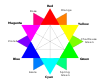
Analogous color differ depending on the color wheel used. For example, by some definitions, it would be impossible to use Goethe's color wheel for analogous colors, because they do not share a common color, such as blue-green. If you wanted to use the analogous colors blue, blue-green, and green with Boutet's color wheel on the left, you wouldn't be able to.
Application
These color schemes are most often seen in nature. For example, during the fall, one might often see the changing leaves form an analogous sort of color scheme, progressively moving through the color wheel to create a gradient in its natural pattern.
High-key analogous
High-key color schemes have a lighter value, having white added to them or water in the case of watercolors. These have a more pastel-like look to them. Having a high-key analogous color scheme can give a piece a stimulating shimmer that pleases the eye, making everything seem the same color at first until approach. The colors are pure and aren't affected by their complements which grab attention. This was commonly used in impressionism by artists such as Monet, Pissarro, and Degas. Pierre Bonnard has also been noted for using it.
"Basic Color Theory". Color Matters Welcomes You to the World of Color: Symbolism, Design, Vision, Science, Marketing and More!. Color Matters. November 22, 1995. Retrieved December 4, 2011.
This page is based on this Wikipedia article Text is available under the CC BY-SA 4.0 license; additional terms may apply. Images, videos and audio are available under their respective licenses.