Helmholtz–Kohlrausch effect

Last updated • 4 min readFrom Wikipedia, The Free Encyclopedia

The Helmholtz–Kohlrausch effect (after Hermann von Helmholtz and V. A. Kohlrausch [1] ) is a perceptual phenomenon where some hues, even when of the same lightness, appear to be bolder than others.

Contents

Each color on top has approximately the same luminance level and yet they do not appear equally bright or dark. The yellow (second from the left) appears to be much darker than the magenta (right-most). However, when the top image is converted to grayscale, we have the image on the bottom--a single shade of gray. Helmholtz-Kohlrausch effect visualized improved.png
Each color on top has approximately the same luminance level and yet they do not appear equally bright or dark. The yellow (second from the left) appears to be much darker than the magenta (right-most). However, when the top image is converted to grayscale, we have the image on the bottom--a single shade of gray.

Explanation

Any colored lights will seem brighter to human observers than pure white light. Oftentimes this makes more saturated colors actually seem lighter than shades of gray, no matter how bright they are. Certain colors do not have significant effect, however; any hue of colored lights still seem brighter than white light of the same brightness. Two colors that do not have as great of an Helmholtz–Kohlrausch effect as the others are green and yellow. [2]

The Helmholtz–Kohlrausch effect is affected by the viewing environment. This includes the surroundings of the object and the lighting that the object is being viewed under. The Helmholtz–Kohlrausch effect works best in darker environments where there are not any other outside factors influencing the colors. For example, this is why theaters are all dark environments, so more saturated colors on the screen can "pop out" even more than they would normally. [2]

An example of this lightness factor would be if there were different colors on a grey background that all are of the same lightness as it is, as in the image above right. Obviously the colors look different because they are different hues, not just gray, but if the image were converted all to grayscale, all of the colors would match the grey background because they all have the same lightness as it does. [2]

Brightness

Perceived brightness is affected most by what is surrounding the object. In other words, the object can look lighter or darker depending on what is around it. In addition, the brightness can also appear different depending on the color of the object. For example, an object of a grayer color than the exact same object, but this time in a less gray color, will look darker, even when both are just as bright. [3]

The difference between brightness and lightness is that the brightness is the intensity of the object independent of the light source. Lightness is the brightness of the object in respect to the light reflecting on it. This is important because the Helmholtz–Kohlrausch effect is a measure of the ratio between the two. [3]

Helmholtz color coordinates

Similar to the Munsell color system, Helmholtz designed a color coordinate system, where chromaticity is defined by dominant wavelength and purity (chroma). [4]

The percentage of purity for each wavelength can be determined by the equation below: [4]

where %P is the percent of purity, S is the point being assessed, N is the position of the white point, and DW the dominant wavelength. [4]

Modelling

The Helmholtz–Kohlrausch effect has been described in mathematical models by Fairchild and Pirrotta 1991, Nayatani 1997, and most recently High, Green, and Nussbamm 2023. Given a color's CIELAB coordinates, these methods produce an adjusted "equivalent achromatic lightness" L*EAL, i.e. the shade of grey humans think is as bright as the color. [5]

Effects on industry

Entertainment

It is essential for lighting technicians to be aware of the Helmholtz–Kohlrausch effect when working in theaters or in other venues where lighting is often used. In order to get the greatest effect to illuminate their stage or theater, the lighting users need to understand that color has an effect on brightness. For example, one color may appear brighter than another but really they have the same brightness. On stage, lighting users have the ability to make a white light appear much brighter by adding a color gel. This occurs even though gels can only absorb some of the light. [2] When lighting a stage, the lighting users tend to choose reds, pinks, and blues because they are highly saturated colors and are really very dim. However, we perceive them as being brighter than the other colors because they are most affected by the Helmholtz–Kohlrausch effect. We perceive that the color white does not look any brighter to us than individual colors. LED lights are a good example of this.

Aviation

The Helmholtz–Kohlrausch effect influences the use of LED lights in different technological practices. Aviation is one field that relies upon the results of the Helmholtz–Kohlrausch effect. A comparison of runway LED lamps and filtered and unfiltered incandescent lights all at the same luminance shows that in order to accomplish the same brightness, the white reference incandescent lamp needs to have twice the luminance of the red LED lamp, therefore suggesting that the LED lights do appear to have a greater brightness than the traditional incandescent lights. One condition that affects this theory is the presence of fog. [4]

Automotive

Another field that uses this is the automotive industry. LEDs in the dashboard and instrument lighting are designed for use in mesopic luminance. In studies, it has been found that red LEDs appear brighter than green LEDs under these conditions, which means that a driver would be able to see red light more intensely and would thus be more alerting than green lights when driving at night. [4] [ better source needed ]

See also

Related Research Articles

<span class="mw-page-title-main">Color</span> Visual perception of the light spectrum

Color is the visual perception based on the electromagnetic spectrum. Though color is not an inherent property of matter, color perception is related to an object's light absorption, reflection, emission spectra, and interference. For most humans, colors are perceived in the visible light spectrum with three types of cone cells (trichromacy). Other animals may have a different number of cone cell types or have eyes sensitive to different wavelengths, such as bees that can distinguish ultraviolet, and thus have a different color sensitivity range. Animal perception of color originates from different light wavelength or spectral sensitivity in cone cell types, which is then processed by the brain.

<span class="mw-page-title-main">Color temperature</span> Property of light sources related to black-body radiation

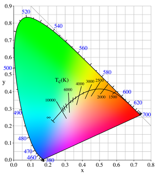
Color temperature is a parameter describing the color of a visible light source by comparing it to the color of light emitted by an idealized opaque, non-reflective body. The temperature of the ideal emitter that matches the color most closely is defined as the color temperature of the original visible light source. The color temperature scale describes only the color of light emitted by a light source, which may actually be at a different temperature.

<span class="mw-page-title-main">Natural Color System</span> Proprietary perceptual color model

The Natural Colour System (NCS) is a proprietary perceptual color model. It is based on the color opponency hypothesis of color vision, first proposed by German physiologist Ewald Hering. The current version of the NCS was developed by the Swedish Colour Centre Foundation, from 1964 onwards. The research team consisted of Anders Hård, Lars Sivik and Gunnar Tonnquist, who in 1997 received the AIC Judd award for their work. The system is based entirely on the phenomenology of human perception and not on color mixing. It is illustrated by a color atlas, marketed by NCS Colour AB in Stockholm.

<span class="mw-page-title-main">Munsell color system</span> Color space

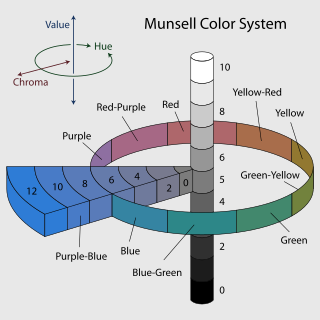
In colorimetry, the Munsell color system is a color space that specifies colors based on three properties of color: hue, value (lightness), and chroma. It was created by Albert H. Munsell in the first decade of the 20th century and adopted by the United States Department of Agriculture (USDA) as the official color system for soil research in the 1930s.

<span class="mw-page-title-main">Photometry (optics)</span> Science of the measurement of visible light

Photometry is a branch of optics that deals with measuring light in terms of its perceived brightness to the human eye. It is concerned with quantifying the amount of light that is emitted, transmitted, or received by an object or a system.

<span class="mw-page-title-main">Color term</span> Word or phrase that refers to a specific color

A color term is a word or phrase that refers to a specific color. The color term may refer to human perception of that color which is usually defined according to the Munsell color system, or to an underlying physical property. There are also numerical systems of color specification, referred to as color spaces.

<span class="mw-page-title-main">Colorfulness</span> Perceived intensity of a specific color

Colorfulness, chroma and saturation are attributes of perceived color relating to chromatic intensity. As defined formally by the International Commission on Illumination (CIE) they respectively describe three different aspects of chromatic intensity, but the terms are often used loosely and interchangeably in contexts where these aspects are not clearly distinguished. The precise meanings of the terms vary by what other functions they are dependent on.

<span class="mw-page-title-main">Spectral color</span> Color evoked by a single wavelength of light in the visible spectrum

A spectral color is a color that is evoked by monochromatic light, i.e. either a spectral line with a single wavelength or frequency of light in the visible spectrum, or a relatively narrow spectral band. Every wave of visible light is perceived as a spectral color; when viewed as a continuous spectrum, these colors are seen as the familiar rainbow. Non-spectral colors are evoked by a combination of spectral colors.

<span class="mw-page-title-main">Purkinje effect</span> Tendency for sight to shift toward blue colors at low light levels

The Purkinje effect or Purkinje phenomenon is the tendency for the peak luminance sensitivity of the eye to shift toward the blue end of the color spectrum at low illumination levels as part of dark adaptation. In consequence, reds will appear darker relative to other colors as light levels decrease. The effect is named after the Czech anatomist Jan Evangelista Purkyně. While the effect is often described from the perspective of the human eye, it is well established in a number of animals under the same name to describe the general shifting of spectral sensitivity due to pooling of rod and cone output signals as a part of dark/light adaptation.

In color science, a color model is an abstract mathematical model describing the way colors can be represented as tuples of numbers, typically as three or four values or color components. When this model is associated with a precise description of how the components are to be interpreted, taking account of visual perception, the resulting set of colors is called "color space."

The Bezold–Brücke shift or luminance-on-hue effect is a change in hue perception as light intensity changes. As intensity increases, spectral colors shift more towards blue or yellow. At lower intensities, the red/green axis dominates. This means that reds become more yellow with increasing brightness. Light may change in the perceived hue as its brightness changes, despite the fact that it retains a constant spectral composition. It was discovered by Wilhelm von Bezold and M.E. Brücke.

<span class="mw-page-title-main">Color solid</span> Three-dimensional representation of a color space

A color solid is the three-dimensional representation of a color space or model and can be thought as an analog of, for example, the one-dimensional color wheel, which depicts the variable of hue ; or the 2D chromaticity diagram, which depicts the variables of hue and spectral purity. The added spatial dimension allows a color solid to depict the three dimensions of color: lightness, hue, and colorfulness, allowing the solid to depict all conceivable colors in an organized three-dimensional structure.

<span class="mw-page-title-main">Lightness</span> Property of a color

Lightness is a visual perception of the luminance of an object. It is often judged relative to a similarly lit object. In colorimetry and color appearance models, lightness is a prediction of how an illuminated color will appear to a standard observer. While luminance is a linear measurement of light, lightness is a linear prediction of the human perception of that light.

<span class="mw-page-title-main">Coloroid</span> Color space

The Coloroid Color System is a color space developed between 1962 and 1980 by Antal Nemcsics at the Budapest University of Technology and Economics for use by "architects and visual constructors". Since August 2000, the Coloroid has been registered as Hungarian Standard MSZ 7300.

<span class="mw-page-title-main">Color space</span> Standard that defines a specific range of colors

A color space is a specific organization of colors. In combination with color profiling supported by various physical devices, it supports reproducible representations of color – whether such representation entails an analog or a digital representation. A color space may be arbitrary, i.e. with physically realized colors assigned to a set of physical color swatches with corresponding assigned color names, or structured with mathematical rigor. A "color space" is a useful conceptual tool for understanding the color capabilities of a particular device or digital file. When trying to reproduce color on another device, color spaces can show whether shadow/highlight detail and color saturation can be retained, and by how much either will be compromised.

<span class="mw-page-title-main">Impossible color</span> Color that cannot be perceived under ordinary viewing conditions

Impossible colors are colors that do not appear in ordinary visual functioning. Different color theories suggest different hypothetical colors that humans are incapable of perceiving for one reason or another, and fictional colors are routinely created in popular culture. While some such colors have no basis in reality, phenomena such as cone cell fatigue enable colors to be perceived in certain circumstances that would not be otherwise.

<span class="mw-page-title-main">Neon color spreading</span> Optical illusion

Neon color spreading is an optical illusion in the category of transparency effects, characterized by fluid borders between the edges of a colored object and the background in the presence of black lines. The illusion was first documented in 1971 and was eventually rediscovered in 1975 by Van Tuijl.

A color appearance model (CAM) is a mathematical model that seeks to describe the perceptual aspects of human color vision, i.e. viewing conditions under which the appearance of a color does not tally with the corresponding physical measurement of the stimulus source.

<span class="mw-page-title-main">Hunt effect (color)</span>

The Hunt effect or Luminance-on-colorfulness effect comprises an increase in colorfulness of a color with increasing luminance. The effect was first described by RWG Hunt in 1952.

References

  1. Kohlrausch, V. A. (1935). "Zur photometrie farbiger lichtern". Das Licht. 6: 259–279.
  2. 1 2 3 4 Wood, Mike (2012). "Lightness – The Helmholtz-Kohlrausch effect" (PDF). Out of the Wood. Retrieved 11 November 2015.
  3. 1 2 Corney, D; Haynes, JD; Rees, G; Lotto, RB (2009). "The Brightness of Colour". PLOS ONE. 4 (3): e5091. Bibcode:2009PLoSO...4.5091C. doi: 10.1371/journal.pone.0005091 . PMC   2659800 . PMID   19333398.
  4. 1 2 3 4 5 Donofrio, Robert L. (2011). "Review Paper: The Helmholtz-Kohlrausch Effect". Journal of the Society for Information Display. 19 (10): 658–664. doi:10.1889/JSID19.10.658. S2CID   53735017.
  5. High, Gregory; Green, Phil; Nussbaum, Peter (March 2023). "The Helmholtz-Kohlrausch effect on display-based light colors and simulated substrate colors". Color Research & Application. 48 (2): 167–177. doi: 10.1002/col.22839 .

Further reading