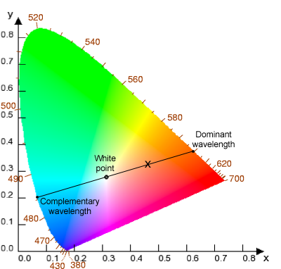
In color science, the dominant wavelength is a method of approximating a color's hue. Along with purity, it makes up one half of the Helmholtz coordinates. A color's dominant wavelength is the wavelength of monochromatic spectral light that, if plotted in a chromaticity diagram, the straight line that passes through the color in question and the white point will also pass through this wavelength. [1]
The Helmholtz coordinates are a polar coordinate system for defining a 2D chromaticity plane. The circumferential coordinate is the dominant wavelength, which is analogous to hue of the HSV color space. The radial coordinate is the purity, which is analogous to saturation of the HSV color space. [2]
Not all color spaces can be used for determining the dominant wavelength of a color, because in most approximately perceptually uniform color spaces (such as CIELAB, Oklab, CIECAM02, etc) two colors with the same hue can have slightly different dominant wavelengths. Unless otherwise stated, the CIE 1931 color space (CIEXYZ) is used., [3] but the CIELUV color space is sometimes used. [1] : 66 The LMS color space can also be used for this purpose.
To calculate the dominant wavelength of a chromaticity (or color), a half straight line is drawn on the chromaticity diagram that passes through the chromaticity's coordinates and starts in the white point (almost always, illuminant E, which is the equal energy white point). The line is then extrapolated so it intersects the perimeter of the diagram at one point, where the perimeter comprises the spectral locus or the line of purples. The point of intersection of that line and the spectral locus is the dominant wavelength. [4] If the line intersects with the line of purples and not the spectral locus, the complementary wavelength is used. The purity can then be calculated as defined here. [1]
The white point is generally defined as—or assumed to be—equal energy white (illuminant E). This is defined as [x, y] = (1/3, 1/3) in CIE xyY, and as [X, Y, Z] = (1, 1, 1) in XYZ color space. However, other white points may be used, generally defined by "white" standard illuminants or a color temperature such as 6500 K (D65). [1]
When the chromaticity lies within the triangle with vertices at the white point, extreme spectral violet (360 nm), and extreme spectral red (780 nm), the dominant wavelength is indeterminate because the half straight line that passes through the white point and that chromaticity point intersects the limit of the visible gamut in the line of purples instead of the spectral locus. The colors on the line of purples cannot be defined by wavelength because they do not represent monochromatic light. [1]
Instead, the dominant wavelength is replaced with the complementary wavelength, which will represent the complementary color. To calculate it, the half straight line that starts on that chromaticity and passes through the white point is used; the intersection between this line and the spectral locus is the complementary wavelength. If a color doesn't have a dominant wavelength (and it is not achromatic), its complementary color will.
Dominant wavelength is used to define the color of light sources, such as the LEDs, that do not lie along the Planckian locus (which would otherwise be defined by color temperature). These light sources are also often described by their peak wavelength—the wavelength of highest radiometric spectral flux (highest peak in the power spectrum)—but the dominant wavelength is a photometric quantity, and therefore intuitively conveys what color the light will appear without relying on inexact color naming. [5]
Color or colour is the visual perception based on the electromagnetic spectrum. Though color is not an inherent property of matter, color perception is related to an object's light absorption, reflection, emission spectra, and interference. For most humans, colors are perceived in the visible light spectrum with three types of cone cells (trichromacy). Other animals may have a different number of cone cell types or have eyes sensitive to different wavelengths, such as bees that can distinguish ultraviolet, and thus have a different color sensitivity range. Animal perception of color originates from different light wavelength or spectral sensitivity in cone cell types, which is then processed by the brain.
In color theory, hue is one of the main properties of a color, defined technically in the CIECAM02 model as "the degree to which a stimulus can be described as similar to or different from stimuli that are described as red, orange, yellow, green, blue, violet," within certain theories of color vision.
Chromaticity is an objective specification of the quality of a color regardless of its luminance. Chromaticity consists of two independent parameters, often specified as hue (h) and colorfulness (s), where the latter is alternatively called saturation, chroma, intensity, or excitation purity. This number of parameters follows from trichromacy of vision of most humans, which is assumed by most models in color science.
Colorimetry is "the science and technology used to quantify and describe physically the human color perception". It is similar to spectrophotometry, but is distinguished by its interest in reducing spectra to the physical correlates of color perception, most often the CIE 1931 XYZ color space tristimulus values and related quantities.
In color reproduction and colorimetry, a gamut, or color gamut, is a convex set containing the colors that can be accurately represented, i.e. reproduced by an output device or measured by an input device. Devices with a larger gamut can represent more colors. Similarly, gamut may also refer to the colors within a defined color space, which is not linked to a specific device. A trichromatic gamut is often visualized as a color triangle. A less common usage defines gamut as the subset of colors contained within an image, scene or video.
The RGB chromaticity space, two dimensions of the normalized RGB space, is a chromaticity space, a two-dimensional color space in which there is no intensity information.
Colorfulness, chroma and saturation are attributes of perceived color relating to chromatic intensity. As defined formally by the International Commission on Illumination (CIE) they respectively describe three different aspects of chromatic intensity, but the terms are often used loosely and interchangeably in contexts where these aspects are not clearly distinguished. The precise meanings of the terms vary by what other functions they are dependent on.
A spectral color is a color that is evoked by monochromatic light, i.e. either a spectral line with a single wavelength or frequency of light in the visible spectrum, or a relatively narrow spectral band. Every wave of visible light is perceived as a spectral color; when viewed as a continuous spectrum, these colors are seen as the familiar rainbow. Non-spectral colors are evoked by a combination of spectral colors.
A color rendering index (CRI) is a quantitative measure of the ability of a light source to reveal the colors of various objects faithfully in comparison with a natural or standard light source.
In physics and color science, the Planckian locus or black body locus is the path or locus that the color of an incandescent black body would take in a particular chromaticity space as the blackbody temperature changes. It goes from deep red at low temperatures through orange, yellowish, white, and finally bluish white at very high temperatures.
A white point is a set of tristimulus values or chromaticity coordinates that serve to define the color "white" in image capture, encoding, or reproduction. Depending on the application, different definitions of white are needed to give acceptable results. For example, photographs taken indoors may be lit by incandescent lights, which are relatively orange compared to daylight. Defining "white" as daylight will give unacceptable results when attempting to color-correct a photograph taken with incandescent lighting.
Correlated color temperature refers to the temperature of a Planckian radiator whose perceived color most closely resembles that of a given stimulus at the same brightness and under specified viewing conditions."
In 1931 the International Commission on Illumination (CIE) published the CIE 1931 color spaces which define the relationship between the visible spectrum and the visual sensation of specific colors by human color vision. The CIE color spaces are mathematical models that create a "standard observer", which attempts to predict the perception of unique hues of color. These color spaces are essential tools that provide the foundation for measuring color for industry, including inks, dyes, and paints, illumination, color imaging, etc. The CIE color spaces contributed to the development of color television, the creation of instruments for maintaining consistent color in manufacturing processes, and other methods of color management.
The Abney effect or the purity-on-hue effect is the perceived hue shift that occurs when white light is added to a monochromatic light source.
A color solid is the three-dimensional representation of a color space or model and can be thought as an analog of, for example, the one-dimensional color wheel, which depicts the variable of hue ; or the 2D chromaticity diagram, which depicts the variables of hue and spectral purity. The added spatial dimension allows a color solid to depict the three dimensions of color: lightness, hue, and colorfulness, allowing the solid to depict all conceivable colors in an organized three-dimensional structure.
A standard illuminant is a theoretical source of visible light with a spectral power distribution that is published. Standard illuminants provide a basis for comparing images or colors recorded under different lighting.
In colorimetry, the CIE 1976L*, u*, v*color space, commonly known by its abbreviation CIELUV, is a color space adopted by the International Commission on Illumination (CIE) in 1976, as a simple-to-compute transformation of the 1931 CIE XYZ color space, but which attempted perceptual uniformity. It is extensively used for applications such as computer graphics which deal with colored lights. Although additive mixtures of different colored lights will fall on a line in CIELUV's uniform chromaticity diagram, such additive mixtures will not, contrary to popular belief, fall along a line in the CIELUV color space unless the mixtures are constant in lightness.
The Coloroid Color System is a color space developed between 1962 and 1980 by Antal Nemcsics at the Budapest University of Technology and Economics for use by "architects and visual constructors". Since August 2000, the Coloroid has been registered as Hungarian Standard MSZ 7300.
Deane Brewster Judd was an American physicist who made important contributions to the fields of colorimetry, color discrimination, color order, and color vision.
In color theory, the line of purples or purple boundary is the locus on the edge of the chromaticity diagram formed between extreme spectral red and violet. Except for these endpoints of the line, colors on the line are non-spectral. Rather, every color on the line is a unique mixture in a ratio of fully saturated red and fully saturated violet, the two spectral color endpoints of visibility on the spectrum of pure hues. Colors on the line and spectral colors are the only ones that are fully saturated in the sense that, for any point on the line, no other possible color being a mixture of red and violet is more saturated than it.