Information design

Last updated

Information design is the practice of presenting information in a way that fosters an efficient and effective understanding of the information. The term has come to be used for a specific area of graphic design related to displaying information effectively, rather than just attractively or for artistic expression. Information design is closely related to the field of data visualization and is often taught as part of graphic design courses. [1] The broad applications of information design along with its close connections to other fields of design and communication practices have created some overlap in the definitions of communication design, data visualization, and information architecture.

Contents

According to Per Mollerup, information design is explanation design. It explains facts of the universe and leads to knowledge and informed action. [2]

History

The term 'information design' emerged as a multidisciplinary area of study in the 1970s. Use of the term is said to have started with graphic designers and it was solidified with the publication of the Information Design Journal in 1979. Later, the related International Institute for Information Design (IIID) was set up in 1987 and Information Design Association (IDA) established in 1991. [3] In 1982, Edward Tufte produced a book on information design called The Visual Display of Quantitative Information. The term information graphics tends to be used by those primarily concerned with diagramming and display of quantitative information, such as technical communicators and graphic designers.


In technical communication, information design refers to creating an information structure for a set of information aimed at specified audiences. It can be practised on different scales.

There are many similarities between information design and information architecture. The title of information designer is sometimes used by graphic designers who specialize in creating websites. The skillset of the information designer, as the title is applied more globally, is closer to that of the information architect in the U.S. Similar skills for organization and structure are brought to bear in designing web sites and digital media, with additional constraints and functions that earn a designer the title information architect.

In computer science and information technology, 'information design' is sometimes a rough synonym for (but is not necessarily the same discipline as) information architecture, the design of information systems, databases, or data structures. This sense includes data modeling and process analysis.

Early examples

Charles Joseph Minard's 1861 diagram of Napoleon's March - an early example of an information graphic. Minard.png
Charles Joseph Minard's 1861 diagram of Napoleon's March - an early example of an information graphic.

Information design is associated with the age of technology but it does have historical roots. Early instances of modern information design include these effective examples:

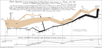
The Minard diagram shows the losses suffered by Napoleon's army in the 1812–1813 period. Six variables are plotted: the size of the army, its location on a two-dimensional surface (x and y), time, direction of movement, and temperature. This multivariate display on a two-dimensional surface tells a story that can be grasped immediately while identifying the source data to build credibility. Edward Tufte wrote in 1983 that: "It may well be the best statistical graphic ever drawn." [5]

Applications

A visual definition of Disability Adjusted Life Year DALY disability affected life year infographic.svg
A visual definition of Disability Adjusted Life Year
Visualization of the frequency of outbound trains from Bangalore, India. Based on the work of Etienne-Jules Marey Bangalore Outbound Trains Frequency Chart.png
Visualization of the frequency of outbound trains from Bangalore, India. Based on the work of Étienne-Jules Marey

Information design can be used for broad audiences (such as signs in airports) or specific audiences (such as personalized telephone bills). [11] The resulting work often seeks to improve a user's trust of a product (such as medicine packaging inserts, operational instructions for industrial machinery and information for emergencies). The example of signs also highlights a niche category known as wayfinding.

Governments and regulatory authorities have legislated about a number of information design issues, such as the minimum size of type in financial small print, the labelling of ingredients in processed food, and the testing of medicine labelling. Examples of this are the Truth in Lending Act in the USA, which introduced the Schumer box (a concise summary of charges for people applying for a credit card), and the Guideline on the Readability of the Labelling and Package Leaflet of Medicinal Products for Human Use (European Commission, Revision 1, 12 January 2009).

Professor Edward Tufte explained that users of information displays are executing particular analytical tasks such as making comparisons or determining causality. The design principle of the information graphic should support the analytical task, showing the comparison or causality. [12]

Simplicity

Simplicity is a major concern in information design. The aim is clarity and understanding. Simplification of messages may imply quantitative reduction but is not restricted to that. Sometimes more information means more clarity. Also, simplicity is a highly subjective matter and should always be evaluated with the information user in mind. Simplicity can be easy when following five simple steps when it comes to information design:

  1. Tell the truth,
  2. Get to the point,
  3. Pick the right tool for the job,
  4. Highlight what is important,
  5. Of course, keep it simple.

These steps will help an information designer narrow down results, as well as keeping their audience engaged. [13]

See also

Related Research Articles

<span class="mw-page-title-main">Graphic design</span> Interdisciplinary branch of design and of the fine arts

Graphic design is a profession, academic discipline and applied art whose activity consists in projecting visual communications intended to transmit specific messages to social groups, with specific objectives. Graphic design is an interdisciplinary branch of design and of the fine arts. Its practice involves creativity, innovation and lateral thinking using manual or digital tools, where it is usual to use text and graphics to communicate visually.

<span class="mw-page-title-main">Chart</span> Graphical representation of data

A chart is a graphical representation for data visualization, in which "the data is represented by symbols, such as bars in a bar chart, lines in a line chart, or slices in a pie chart". A chart can represent tabular numeric data, functions or some kinds of quality structure and provides different info.

<span class="mw-page-title-main">Edward Tufte</span> American statistician

Edward Rolf Tufte, sometimes known as "ET", is an American statistician and professor emeritus of political science, statistics, and computer science at Yale University. He is noted for his writings on information design and as a pioneer in the field of data visualization.

A small multiple is a series of similar graphs or charts using the same scale and axes, allowing them to be easily compared. It uses multiple views to show different partitions of a dataset. The term was popularized by Edward Tufte.

A diagram is a symbolic representation of information using visualization techniques. Diagrams have been used since prehistoric times on walls of caves, but became more prevalent during the Enlightenment. Sometimes, the technique uses a three-dimensional visualization which is then projected onto a two-dimensional surface. The word graph is sometimes used as a synonym for diagram.

<span class="mw-page-title-main">Visualization (graphics)</span> Set of techniques for creating images, diagrams, or animations to communicate a message

Visualization or visualisation is any technique for creating images, diagrams, or animations to communicate a message. Visualization through visual imagery has been an effective way to communicate both abstract and concrete ideas since the dawn of humanity. from history include cave paintings, Egyptian hieroglyphs, Greek geometry, and Leonardo da Vinci's revolutionary methods of technical drawing for engineering and scientific purposes.

<span class="mw-page-title-main">Pie chart</span> Circular statistical graph that illustrates numerical proportion

A pie chart is a circular statistical graphic which is divided into slices to illustrate numerical proportion. In a pie chart, the arc length of each slice is proportional to the quantity it represents. While it is named for its resemblance to a pie which has been sliced, there are variations on the way it can be presented. The earliest known pie chart is generally credited to William Playfair's Statistical Breviary of 1801.

<span class="mw-page-title-main">Chartjunk</span> Term for unnecessary visual elements in charts

Chartjunk consists of all visual elements in charts and graphs that are not necessary to comprehend the information represented on the graph, or that distract the viewer from this information.

<span class="mw-page-title-main">Infographic</span> Graphic visual representation of information

Infographics are graphic visual representations of information, data, or knowledge intended to present information quickly and clearly. They can improve cognition by using graphics to enhance the human visual system's ability to see patterns and trends. Similar pursuits are information visualization, data visualization, statistical graphics, information design, or information architecture. Infographics have evolved in recent years to be for mass communication, and thus are designed with fewer assumptions about the readers' knowledge base than other types of visualizations. Isotypes are an early example of infographics conveying information quickly and easily to the masses.

<span class="mw-page-title-main">Data and information visualization</span> Visual representation of data

Data and information visualization is the practice of designing and creating easy-to-communicate and easy-to-understand graphic or visual representations of a large amount of complex quantitative and qualitative data and information with the help of static, dynamic or interactive visual items. Typically based on data and information collected from a certain domain of expertise, these visualizations are intended for a broader audience to help them visually explore and discover, quickly understand, interpret and gain important insights into otherwise difficult-to-identify structures, relationships, correlations, local and global patterns, trends, variations, constancy, clusters, outliers and unusual groupings within data. When intended for the general public to convey a concise version of known, specific information in a clear and engaging manner, it is typically called information graphics.

<span class="mw-page-title-main">Charles Joseph Minard</span> French civil engineer (1781–1870)

Charles Joseph Minard was a French civil engineer recognized for his significant contribution in the field of information graphics in civil engineering and statistics. Minard was, among other things, noted for his representation of numerical data on geographic maps, especially his flow maps.

<span class="mw-page-title-main">Chernoff face</span> Human-face shaped display of data

Chernoff faces, invented by applied mathematician, statistician and physicist Herman Chernoff in 1973, display multivariate data in the shape of a human face. The individual parts, such as eyes, ears, mouth and nose represent values of the variables by their shape, size, placement and orientation. The idea behind using faces is that humans easily recognize faces and notice small changes without difficulty. Chernoff faces handle each variable differently. Because the features of the faces vary in perceived importance, the way in which variables are mapped to the features should be carefully chosen.

<span class="mw-page-title-main">Thematic map</span> Type of map that visualizes data

A thematic map is a type of map that portrays the geographic pattern of a particular subject matter (theme) in a geographic area. This usually involves the use of map symbols to visualize selected properties of geographic features that are not naturally visible, such as temperature, language, or population. In this, they contrast with general reference maps, which focus on the location of a diverse set of physical features, such as rivers, roads, and buildings. Alternative names have been suggested for this class, such as special-subject or special-purpose maps, statistical maps, or distribution maps, but these have generally fallen out of common usage. Thematic mapping is closely allied with the field of Geovisualization.

Statistical graphics, also known as statistical graphical techniques, are graphics used in the field of statistics for data visualization.

<span class="mw-page-title-main">Flow map</span> Thematic map visualizing linear flow

A flow map is a type of thematic map that uses linear symbols to represent movement. It may thus be considered a hybrid of a map and a flow diagram. The movement being mapped may be that of anything, including people, highway traffic, trade goods, water, ideas, telecommunications data, etc. The wide variety of moving material, and the variety of geographic networks through they move, has led to many different design strategies. Some cartographers have expanded this term to any thematic map of a linear network, while others restrict its use to maps that specifically show movement of some kind.

Cultural analytics refers to the use of computational, visualization, and big data methods for the exploration of contemporary and historical cultures. While digital humanities research has focused on text data, cultural analytics has a particular focus on massive cultural data sets of visual material – both digitized visual artifacts and contemporary visual and interactive media. Taking on the challenge of how to best explore large collections of rich cultural content, cultural analytics researchers developed new methods and intuitive visual techniques that rely on high-resolution visualization and digital image processing. These methods are used to address both the existing research questions in humanities, to explore new questions, and to develop new theoretical concepts that fit the mega-scale of digital culture in the early 21st century.

<span class="mw-page-title-main">Bubble chart</span> Type of chart

A bubble chart is a type of chart that displays three dimensions of data. Each entity with its triplet (v1, v2, v3) of associated data is plotted as a disk that expresses two of the vi values through the disk's xy location and the third through its size. Bubble charts can facilitate the understanding of social, economical, medical, and other scientific relationships.

<span class="mw-page-title-main">Motion chart</span>

A motion chart is a dynamic bubble chart which allows efficient and interactive exploration and visualization of longitudinal multivariate data. Motion charts provide mechanisms for mapping ordinal, nominal and quantitative variables onto time, 2D coordinate axes, size, colors, glyphs and appearance characteristics, which facilitate the interactive display of multidimensional and temporal data.

The International Business Communication Standards (IBCS) are practical proposals for the design of business communication published for free use under a Creative-Commons-Lizenz. In most cases, applying IBCS means the proper conceptual, perceptual and semantic design of charts and tables.

<span class="mw-page-title-main">Per Mollerup</span> Danish designer, academic, and author (born 1942)

Per Mollerup is a Danish designer, academic, and author. He is known for his emphasis on simplicity in design and for his wayshowing design at airports in Copenhagen, Oslo, and Stockholm, as well as the Copenhagen Metro. He is currently a Professor of Communication Design at Swinburne University of Technology's School of Design.

References

  1. "Graphic Design | Graphic Design Degree | BA & MA Degree Programs | CCSU".
  2. Per Mollerup, Data Design: Visualising quantities, locations, connections, Bloomsbury Academic, 2015
  3. "The Origins of the Information Design Association" (PDF). University of Reading. 2008. Archived from the original (PDF) on 2016-03-03. Retrieved 2013-01-30.
  4. "First Ever Area Charts Created 200+ Years Ago". AnyChart. 23 December 2015. Retrieved 25 December 2015.
  5. 1 2 Tufte, Edward (1983). The Visual Display of Quantitative Information . Cheshire, Connecticut: Graphics Press. ISBN   0961392142.
  6. Crosier, Scott. "John Snow: The London Cholera Epidemic of 1854". University of California, Santa Barbara. Archived from the original on 2017-12-11. Retrieved 2015-12-30.
  7. Corbett, John. "Charles Joseph Minard: Mapping Napoleon's March, 1861". Center for Spatially Integrated Social Science. Archived from the original on 12 March 2017. Retrieved 21 September 2014.
  8. Mansky, Jackie (15 November 2018). "W.E.B. Du Bois' Visionary Infographics Come Together for the First Time in Full Color". Smithsonian Magazine. Retrieved 15 March 2021.
  9. Popova, Maria (8 March 2011). "The Invention of ISOTYPE: How a Vintage Visual Language Paved the Way for the Infographics Age". Brain Pickings. Retrieved 25 December 2015.
  10. Small, Hugh. "Florence Nightingale's statistical diagrams".
  11. "Information Design FAQ" . Retrieved 9 January 2013.
  12. Edward Tufte-Presentation-August 2013
  13. Duarte, Nancy. Slide:ology: The Art and Science of Creating Great Presentations. Beijing: O'Reilly Media, 2008. Print.