Scatter plot

Last updated
Scatter plot
Scatter diagram for quality characteristic XXX.svg
One of the Seven Basic Tools of Quality
First described by John Herschel [1]
PurposeTo identify the type of relationship (if any) between two quantitative variables
Waiting time between eruptions and the duration of the eruption for the Old Faithful Geyser in Yellowstone National Park, Wyoming, USA. This chart suggests there are generally two types of eruptions: short-wait-short-duration, and long-wait-long-duration. Oldfaithful3.png
Waiting time between eruptions and the duration of the eruption for the Old Faithful Geyser in Yellowstone National Park, Wyoming, USA. This chart suggests there are generally two types of eruptions: short-wait-short-duration, and long-wait-long-duration.
A 3D scatter plot allows the visualization of multivariate data. This scatter plot takes multiple scalar variables and uses them for different axes in phase space. The different variables are combined to form coordinates in the phase space and they are displayed using glyphs and coloured using another scalar variable. Scatter plot.jpg
A 3D scatter plot allows the visualization of multivariate data. This scatter plot takes multiple scalar variables and uses them for different axes in phase space. The different variables are combined to form coordinates in the phase space and they are displayed using glyphs and coloured using another scalar variable.

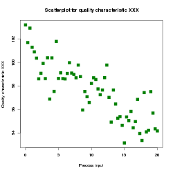
A scatter plot, also called a scatterplot, scatter graph, scatter chart, scattergram, or scatter diagram, [3] is a type of plot or mathematical diagram using Cartesian coordinates to display values for typically two variables for a set of data. If the points are coded (color/shape/size), one additional variable can be displayed. The data are displayed as a collection of points, each having the value of one variable determining the position on the horizontal axis and the value of the other variable determining the position on the vertical axis. [4]

Contents

Overview

A scatter plot can be used either when one continuous variable is under the control of the experimenter and the other depends on it or when both continuous variables are independent. If a parameter exists that is systematically incremented and/or decremented by the other, it is called the control parameter or independent variable and is customarily plotted along the horizontal axis. The measured or dependent variable is customarily plotted along the vertical axis. If no dependent variable exists, either type of variable can be plotted on either axis and a scatter plot will illustrate only the degree of correlation (not causation) between two variables.

A scatter plot can suggest various kinds of correlations between variables with a certain confidence interval. For example, weight and height would be on the y-axis, and height would be on the x-axis. Correlations may be positive (rising), negative (falling), or null (uncorrelated). If the dots' pattern slopes from lower left to upper right, it indicates a positive correlation between the variables being studied. If the pattern of dots slopes from upper left to lower right, it indicates a negative correlation. A line of best fit (alternatively called 'trendline') can be drawn to study the relationship between the variables. An equation for the correlation between the variables can be determined by established best-fit procedures. For a linear correlation, the best-fit procedure is known as linear regression and is guaranteed to generate a correct solution in a finite time. No universal best-fit procedure is guaranteed to generate a correct solution for arbitrary relationships. A scatter plot is also very useful when we wish to see how two comparable data sets agree to show nonlinear relationships between variables. The ability to do this can be enhanced by adding a smooth line such as LOESS. [5] Furthermore, if the data are represented by a mixture model of simple relationships, these relationships will be visually evident as superimposed patterns.

The scatter diagram is one of the seven basic tools of quality control. [6]

Scatter charts can be built in the form of bubble, marker, or/and line charts. [7]

Example

For example, to display a link between a person's lung capacity, and how long that person could hold their breath, a researcher would choose a group of people to study, then measure each one's lung capacity (first variable) and how long that person could hold their breath (second variable). The researcher would then plot the data in a scatter plot, assigning "lung capacity" to the horizontal axis, and "time holding breath" to the vertical axis.

A person with a lung capacity of 400  cl who held their breath for 21.7 s would be represented by a single dot on the scatter plot at the point (400, 21.7) in the Cartesian coordinates. The scatter plot of all the people in the study would enable the researcher to obtain a visual comparison of the two variables in the data set and will help to determine what kind of relationship there might be between the two variables.

Scatter plot matrices

For a set of data variables (dimensions) X1, X2, ... , Xk, the scatter plot matrix shows all the pairwise scatter plots of the variables on a single view with multiple scatterplots in a matrix format. For k variables, the scatterplot matrix will contain k rows and k columns. A plot located on the intersection of row and jth column is a plot of variables Xi versus Xj. [8] This means that each row and column is one dimension, and each cell plots a scatter plot of two dimensions.

A generalized scatter plot matrix [9] offers a range of displays of paired combinations of categorical and quantitative variables. A mosaic plot, fluctuation diagram, or faceted bar chart may be used to display two categorical variables. Other plots are used for one categorical and one quantitative variables.

Visualization of 3D data along with the correspondent scatterplot matrix Matriz de graficos de dispersao.svg
Visualization of 3D data along with the correspondent scatterplot matrix

See also

Related Research Articles

<span class="mw-page-title-main">Chart</span> Graphical representation of data

A chart is a graphical representation for data visualization, in which "the data is represented by symbols, such as bars in a bar chart, lines in a line chart, or slices in a pie chart". A chart can represent tabular numeric data, functions or some kinds of quality structure and provides different info.

<span class="mw-page-title-main">Bar chart</span> Type of chart

A bar chart or bar graph is a chart or graph that presents categorical data with rectangular bars with heights or lengths proportional to the values that they represent. The bars can be plotted vertically or horizontally. A vertical bar chart is sometimes called a column chart.

A diagram is a symbolic representation of information using visualization techniques. Diagrams have been used since prehistoric times on walls of caves, but became more prevalent during the Enlightenment. Sometimes, the technique uses a three-dimensional visualization which is then projected onto a two-dimensional surface. The word graph is sometimes used as a synonym for diagram.

<span class="mw-page-title-main">Infographic</span> Graphic visual representation of information

Infographics are graphic visual representations of information, data, or knowledge intended to present information quickly and clearly. They can improve cognition by using graphics to enhance the human visual system's ability to see patterns and trends. Similar pursuits are information visualization, data visualization, statistical graphics, information design, or information architecture. Infographics have evolved in recent years to be for mass communication, and thus are designed with fewer assumptions about the readers' knowledge base than other types of visualizations. Isotypes are an early example of infographics conveying information quickly and easily to the masses.

<span class="mw-page-title-main">Data and information visualization</span> Visual representation of data

Data and information visualization is the practice of designing and creating easy-to-communicate and easy-to-understand graphic or visual representations of a large amount of complex quantitative and qualitative data and information with the help of static, dynamic or interactive visual items. Typically based on data and information collected from a certain domain of expertise, these visualizations are intended for a broader audience to help them visually explore and discover, quickly understand, interpret and gain important insights into otherwise difficult-to-identify structures, relationships, correlations, local and global patterns, trends, variations, constancy, clusters, outliers and unusual groupings within data. When intended for the general public to convey a concise version of known, specific information in a clear and engaging manner, it is typically called information graphics.

<span class="mw-page-title-main">Line chart</span> Chart type

A line chart or line graph, also known as curve chart, is a type of chart which displays information as a series of data points called 'markers' connected by straight line segments. It is a basic type of chart common in many fields. It is similar to a scatter plot except that the measurement points are ordered and joined with straight line segments. A line chart is often used to visualize a trend in data over intervals of time – a time series – thus the line is often drawn chronologically. In these cases they are known as run charts.

<span class="mw-page-title-main">Radar chart</span> Type of chart

A radar chart is a graphical method of displaying multivariate data in the form of a two-dimensional chart of three or more quantitative variables represented on axes starting from the same point. The relative position and angle of the axes is typically uninformative, but various heuristics, such as algorithms that plot data as the maximal total area, can be applied to sort the variables (axes) into relative positions that reveal distinct correlations, trade-offs, and a multitude of other comparative measures.

A dot chart or dot plot is a statistical chart consisting of data points plotted on a fairly simple scale, typically using filled in circles. There are two common, yet very different, versions of the dot chart. The first has been used in hand-drawn graphs to depict distributions going back to 1884. The other version is described by William S. Cleveland as an alternative to the bar chart, in which dots are used to depict the quantitative values associated with categorical variables.

<span class="mw-page-title-main">GeoDa</span> Free geovisualization and analysis software

GeoDa is a free software package that conducts spatial data analysis, geovisualization, spatial autocorrelation and spatial modeling.

GGobi is a free statistical software tool for interactive data visualization. GGobi allows extensive exploration of the data with Interactive dynamic graphics. It is also a tool for looking at multivariate data. R can be used in sync with GGobi. The GGobi software can be embedded as a library in other programs and program packages using an application programming interface (API) or as an add-on to existing languages and scripting environments, e.g., with the R command line or from a Perl or Python scripts. GGobi prides itself on its ability to link multiple graphs together.

<span class="mw-page-title-main">Biplot</span> Type of exploratory graph used in statistics

Biplots are a type of exploratory graph used in statistics, a generalization of the simple two-variable scatterplot. A biplot overlays a score plot with a loading plot. A biplot allows information on both samples and variables of a data matrix to be displayed graphically. Samples are displayed as points while variables are displayed either as vectors, linear axes or nonlinear trajectories. In the case of categorical variables, category level points may be used to represent the levels of a categorical variable. A generalised biplot displays information on both continuous and categorical variables.

Statistical graphics, also known as statistical graphical techniques, are graphics used in the field of statistics for data visualization.

<span class="mw-page-title-main">Plot (graphics)</span> Graphical technique for data sets

A plot is a graphical technique for representing a data set, usually as a graph showing the relationship between two or more variables. The plot can be drawn by hand or by a computer. In the past, sometimes mechanical or electronic plotters were used. Graphs are a visual representation of the relationship between variables, which are very useful for humans who can then quickly derive an understanding which may not have come from lists of values. Given a scale or ruler, graphs can also be used to read off the value of an unknown variable plotted as a function of a known one, but this can also be done with data presented in tabular form. Graphs of functions are used in mathematics, sciences, engineering, technology, finance, and other areas.

<span class="mw-page-title-main">Bubble chart</span> Type of chart

A bubble chart is a type of chart that displays three dimensions of data. Each entity with its triplet (v1, v2, v3) of associated data is plotted as a disk that expresses two of the vi values through the disk's xy location and the third through its size. Bubble charts can facilitate the understanding of social, economical, medical, and other scientific relationships.

In statistics, bivariate data is data on each of two variables, where each value of one of the variables is paired with a value of the other variable. It is a specific but very common case of multivariate data. The association can be studied via a tabular or graphical display, or via sample statistics which might be used for inference. Typically it would be of interest to investigate the possible association between the two variables. The method used to investigate the association would depend on the level of measurement of the variable. This association that involves exactly two variables can be termed a bivariate correlation, or bivariate association.

In statistics, several scatterplot smoothing methods are available to fit a function through the points of a scatterplot to best represent the relationship between the variables.

<span class="mw-page-title-main">Motion chart</span>

A motion chart is a dynamic bubble chart which allows efficient and interactive exploration and visualization of longitudinal multivariate data. Motion charts provide mechanisms for mapping ordinal, nominal and quantitative variables onto time, 2D coordinate axes, size, colors, glyphs and appearance characteristics, which facilitate the interactive display of multidimensional and temporal data.

<span class="mw-page-title-main">Bivariate analysis</span> Concept in statistical analysis

Bivariate analysis is one of the simplest forms of quantitative (statistical) analysis. It involves the analysis of two variables, for the purpose of determining the empirical relationship between them.

<span class="mw-page-title-main">Horizon chart</span>

A horizon chart or horizon graph is a 2-dimensional data visualisation displaying a quantitative data over a continuous interval, most commonly a time period. The horizon chart is valuable for enabling readers to identify trends and extreme values within large datasets. Similar to sparklines and ridgeline plot, horizon chart may not be the most suitable visualisation for precisely pinpointing specific values. Instead, its strength lies in providing an overview and highlighting patterns and outliers in the data.

References

  1. Friendly, Michael; Denis, Dan (2005). "The early origins and development of the scatterplot". Journal of the History of the Behavioral Sciences. 41 (2): 103–130. doi:10.1002/jhbs.20078. PMID   15812820.
  2. Visualizations that have been created with VisIt at wci.llnl.gov. Last updated: November 8, 2007.
  3. Jarrell, Stephen B. (1994). Basic Statistics (Special pre-publication ed.). Dubuque, Iowa: Wm. C. Brown Pub. p. 492. ISBN   978-0-697-21595-6. When we search for a relationship between two quantitative variables, a standard graph of the available data pairs (X,Y), called a scatter diagram, frequently helps...
  4. Utts, Jessica M. Seeing Through Statistics 3rd Edition, Thomson Brooks/Cole, 2005, pp 166-167. ISBN   0-534-39402-7
  5. Cleveland, William (1993). Visualizing data . Murray Hill, N.J. Summit, N.J: At & T Bell Laboratories Published by Hobart Press. ISBN   978-0963488404.
  6. Nancy R. Tague (2004). "Seven Basic Quality Tools". The Quality Toolbox. Milwaukee, Wisconsin: American Society for Quality. p. 15. Retrieved 2010-02-05.
  7. "Scatter Chart – AnyChart JavaScript Chart Documentation". AnyChart. Archived from the original on 1 February 2016. Retrieved 3 February 2016.
  8. Scatter Plot Matrix at itl.nist.gov.
  9. Emerson, John W.; Green, Walton A.; Schoerke, Barret; Crowley, Jason (2013). "The Generalized Pairs Plot". Journal of Computational and Graphical Statistics. 22 (1): 79–91. doi:10.1080/10618600.2012.694762. S2CID   28344569.