Violin plot

Last updated
Example of a violin plot Violin plot.gif
Example of a violin plot
Example of a violin plot in a scientific publication in PLOS Pathogens. Violinplot-hiv-paper-plot-pathogens.svg
Example of a violin plot in a scientific publication in PLOS Pathogens.

A violin plot is a statistical graphic for comparing probability distributions. It is similar to a box plot, with the addition of a rotated kernel density plot on each side. [1]

Contents

History

The violin plot was proposed in 1997 by Jerry L. Hintze and Ray D. Nelson as a way to display even more information than box plots, which were created by John Tukey in 1977. [2] The name comes from the plot's alleged resemblance to a violin. [2]

About

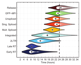
Violin plots are similar to box plots, except that they also show the probability density of the data at different values, usually smoothed by a kernel density estimator. A violin plot will include all the data that is in a box plot: a marker for the median of the data; a box or marker indicating the interquartile range; and possibly all sample points, if the number of samples is not too high.

While a box plot shows a summary statistics such as mean/median and interquartile ranges, the violin plot shows the full distribution of the data. The violin plot can be used in multimodal data (more than one peak). In this case a violin plot shows the presence of different peaks, their position and relative amplitude.

Like box plots, violin plots are used to represent comparison of a variable distribution (or sample distribution) across different "categories" (for example, temperature distribution compared between day and night, or distribution of car prices compared across different car makers).

A violin plot can have multiple layers. For instance, the outer shape represents all possible results. The next layer inside might represent the values that occur 95% of the time. The next layer (if it exists) inside might represent the values that occur 50% of the time.

Violin plots are less popular than box plot. Violin plots may be harder to understand for readers not familiar with them. In this case, a more accessible alternative is to plot a series of stacked histograms or kernel density distributions.

Related Research Articles

Biostatistics is a branch of statistics that applies statistical methods to a wide range of topics in biology. It encompasses the design of biological experiments, the collection and analysis of data from those experiments and the interpretation of the results.

<span class="mw-page-title-main">Histogram</span> Graphical representation of the distribution of numerical data

A histogram is an approximate representation of the distribution of numerical data. The term was first introduced by Karl Pearson. To construct a histogram, the first step is to "bin" the range of values—that is, divide the entire range of values into a series of intervals—and then count how many values fall into each interval. The bins are usually specified as consecutive, non-overlapping intervals of a variable. The bins (intervals) must be adjacent and are often of equal size.

<span class="mw-page-title-main">Interquartile range</span> Measure of statistical dispersion

In descriptive statistics, the interquartile range (IQR) is a measure of statistical dispersion, which is the spread of the data. The IQR may also be called the midspread, middle 50%, fourth spread, or H‑spread. It is defined as the difference between the 75th and 25th percentiles of the data. To calculate the IQR, the data set is divided into quartiles, or four rank-ordered even parts via linear interpolation. These quartiles are denoted by Q1 (also called the lower quartile), Q2 (the median), and Q3 (also called the upper quartile). The lower quartile corresponds with the 25th percentile and the upper quartile corresponds with the 75th percentile, so IQR = Q3 − Q1.

<span class="mw-page-title-main">Median</span> Middle quantile of a data set or probability distribution

In statistics and probability theory, the median is the value separating the higher half from the lower half of a data sample, a population, or a probability distribution. For a data set, it may be thought of as "the middle" value. The basic feature of the median in describing data compared to the mean is that it is not skewed by a small proportion of extremely large or small values, and therefore provides a better representation of the center. Median income, for example, may be a better way to describe center of the income distribution because increases in the largest incomes alone have no effect on median. For this reason, the median is of central importance in robust statistics.

In statistics, a quartile is a type of quantile which divides the number of data points into four parts, or quarters, of more-or-less equal size. The data must be ordered from smallest to largest to compute quartiles; as such, quartiles are a form of order statistic. The three main quartiles are as follows:

Statistics is a field of inquiry that studies the collection, analysis, interpretation, and presentation of data. It is applicable to a wide variety of academic disciplines, from the physical and social sciences to the humanities; it is also used and misused for making informed decisions in all areas of business and government.

<span class="mw-page-title-main">Box plot</span> Data visualization

In descriptive statistics, a box plot or boxplot is a method for graphically demonstrating the locality, spread and skewness groups of numerical data through their quartiles. In addition to the box on a box plot, there can be lines extending from the box indicating variability outside the upper and lower quartiles, thus, the plot is also called the box-and-whisker plot and the box-and-whisker diagram. Outliers that differ significantly from the rest of the dataset may be plotted as individual points beyond the whiskers on the box-plot. Box plots are non-parametric: they display variation in samples of a statistical population without making any assumptions of the underlying statistical distribution. The spacings in each subsection of the box-plot indicate the degree of dispersion (spread) and skewness of the data, which are usually described using the five-number summary. In addition, the box-plot allows one to visually estimate various L-estimators, notably the interquartile range, midhinge, range, mid-range, and trimean. Box plots can be drawn either horizontally or vertically.

The five-number summary is a set of descriptive statistics that provides information about a dataset. It consists of the five most important sample percentiles:

  1. the sample minimum (smallest observation)
  2. the lower quartile or first quartile
  3. the median
  4. the upper quartile or third quartile
  5. the sample maximum
<span class="mw-page-title-main">Order statistic</span> Kth smallest value in a statistical sample

In statistics, the kth order statistic of a statistical sample is equal to its kth-smallest value. Together with rank statistics, order statistics are among the most fundamental tools in non-parametric statistics and inference.

Nonparametric statistics is the type of statistics that is not restricted by assumptions concerning the nature of the population from which a sample is drawn. This is opposed to parametric statistics, for which a problem is restricted a priori by assumptions concerning the specific distribution of the population and parameters. Nonparametric statistics is based on either not assuming a particular distribution or having a distribution specified but with the distribution's parameters not specified in advance. Nonparametric statistics can be used for descriptive statistics or statistical inference. Nonparametric tests are often used when the assumptions of parametric tests are evidently violated.

The mode is the value that appears most often in a set of data values. If X is a discrete random variable, the mode is the value x at which the probability mass function takes its maximum value. In other words, it is the value that is most likely to be sampled.

<span class="mw-page-title-main">Kernel density estimation</span> Estimator

In statistics, kernel density estimation (KDE) is the application of kernel smoothing for probability density estimation, i.e., a non-parametric method to estimate the probability density function of a random variable based on kernels as weights. KDE answers a fundamental data smoothing problem where inferences about the population are made, based on a finite data sample. In some fields such as signal processing and econometrics it is also termed the Parzen–Rosenblatt window method, after Emanuel Parzen and Murray Rosenblatt, who are usually credited with independently creating it in its current form. One of the famous applications of kernel density estimation is in estimating the class-conditional marginal densities of data when using a naive Bayes classifier, which can improve its prediction accuracy.

This glossary of statistics and probability is a list of definitions of terms and concepts used in the mathematical sciences of statistics and probability, their sub-disciplines, and related fields. For additional related terms, see Glossary of mathematics and Glossary of experimental design.

Robust statistics are statistics with good performance for data drawn from a wide range of probability distributions, especially for distributions that are not normal. Robust statistical methods have been developed for many common problems, such as estimating location, scale, and regression parameters. One motivation is to produce statistical methods that are not unduly affected by outliers. Another motivation is to provide methods with good performance when there are small departures from a parametric distribution. For example, robust methods work well for mixtures of two normal distributions with different standard deviations; under this model, non-robust methods like a t-test work poorly.

<span class="mw-page-title-main">Q–Q plot</span> Plot of the empirical distribution of p-values against the theoretical one

In statistics, a Q–Q plot (quantile-quantile plot) is a probability plot, a graphical method for comparing two probability distributions by plotting their quantiles against each other. A point (x, y) on the plot corresponds to one of the quantiles of the second distribution (y-coordinate) plotted against the same quantile of the first distribution (x-coordinate). This defines a parametric curve where the parameter is the index of the quantile interval.

In statistics, the frequency or absolute frequency of an event is the number of times the observation has occurred/recorded in an experiment or study. These frequencies are often depicted graphically or in tabular form.

<span class="mw-page-title-main">Plot (graphics)</span>

A plot is a graphical technique for representing a data set, usually as a graph showing the relationship between two or more variables. The plot can be drawn by hand or by a computer. In the past, sometimes mechanical or electronic plotters were used. Graphs are a visual representation of the relationship between variables, which are very useful for humans who can then quickly derive an understanding which may not have come from lists of values. Given a scale or ruler, graphs can also be used to read off the value of an unknown variable plotted as a function of a known one, but this can also be done with data presented in tabular form. Graphs of functions are used in mathematics, sciences, engineering, technology, finance, and other areas.

<span class="mw-page-title-main">Statistical dispersion</span> Statistical property quantifying how much a collection of data is spread out

In statistics, dispersion is the extent to which a distribution is stretched or squeezed. Common examples of measures of statistical dispersion are the variance, standard deviation, and interquartile range. For instance, when the variance of data in a set is large, the data is widely scattered. On the other hand, when the variance is small, the data in the set is clustered.

In statistical graphics and scientific visualization, the contour boxplot is an exploratory tool that has been proposed for visualizing ensembles of feature-sets determined by a threshold on some scalar function. Analogous to the classical boxplot and considered an expansion of the concepts defining functional boxplot, the descriptive statistics of a contour boxplot are: the envelope of the 50% central region, the median curve and the maximum non-outlying envelope.

References

  1. "Violin Plot". NIST DataPlot. National Institute of Standards and Technology. 2015-10-13.
  2. 1 2 Hintze, Jerry L.; Nelson, Ray D. (May 1998). "Violin Plots: A Box Plot-Density Trace Synergism". The American Statistician. 52 (2): 181–184. doi:10.1080/00031305.1998.10480559. ISSN   0003-1305.

PD-icon.svg This article incorporates public domain material from Dataplot reference manual: Violin plot. National Institute of Standards and Technology.