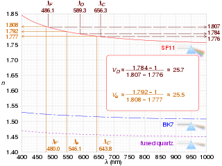
In optics and lens design, the Abbe number, also known as the V-number or constringence of a transparent material, is an approximate measure of the material's dispersion, with high values of V indicating low dispersion. It is named after Ernst Abbe (1840–1905), the German physicist who defined it. The term V-number should not be confused with the normalized frequency in fibers.

A descriptive statistic is a summary statistic that quantitatively describes or summarizes features from a collection of information, while descriptive statistics is the process of using and analysing those statistics. Descriptive statistics is distinguished from inferential statistics by its aim to summarize a sample, rather than use the data to learn about the population that the sample of data is thought to represent. This generally means that descriptive statistics, unlike inferential statistics, is not developed on the basis of probability theory, and are frequently non-parametric statistics. Even when a data analysis draws its main conclusions using inferential statistics, descriptive statistics are generally also presented. For example, in papers reporting on human subjects, typically a table is included giving the overall sample size, sample sizes in important subgroups, and demographic or clinical characteristics such as the average age, the proportion of subjects of each sex, the proportion of subjects with related co-morbidities, etc.
In statistics, a quartile is a type of quantile which divides the number of data points into four parts, or quarters, of more-or-less equal size. The data must be ordered from smallest to largest to compute quartiles; as such, quartiles are a form of order statistic. The three main quartiles are as follows:
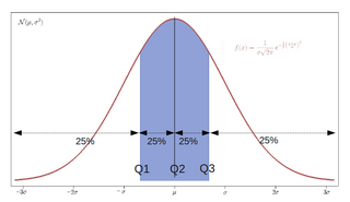
In statistics and probability, quantiles are cut points dividing the range of a probability distribution into continuous intervals with equal probabilities, or dividing the observations in a sample in the same way. There is one fewer quantile than the number of groups created. Common quantiles have special names, such as quartiles, deciles, and percentiles. The groups created are termed halves, thirds, quarters, etc., though sometimes the terms for the quantile are used for the groups created, rather than for the cut points.

In descriptive statistics, a box plot or boxplot is a method for graphically demonstrating the locality, spread and skewness groups of numerical data through their quartiles. In addition to the box on a box plot, there can be lines extending from the box indicating variability outside the upper and lower quartiles, thus, the plot is also termed as the box-and-whisker plot and the box-and-whisker diagram. Outliers that differ significantly from the rest of the dataset may be plotted as individual points beyond the whiskers on the box-plot. Box plots are non-parametric: they display variation in samples of a statistical population without making any assumptions of the underlying statistical distribution. The spacings in each subsection of the box-plot indicate the degree of dispersion (spread) and skewness of the data, which are usually described using the five-number summary. In addition, the box-plot allows one to visually estimate various L-estimators, notably the interquartile range, midhinge, range, mid-range, and trimean. Box plots can be drawn either horizontally or vertically.
In fluid dynamics, the Darcy–Weisbach equation is an empirical equation that relates the head loss, or pressure loss, due to friction along a given length of pipe to the average velocity of the fluid flow for an incompressible fluid. The equation is named after Henry Darcy and Julius Weisbach. Currently, there is no formula more accurate or universally applicable than the Darcy-Weisbach supplemented by the Moody diagram or Colebrook equation.
In statistics, exploratory data analysis is an approach of analyzing data sets to summarize their main characteristics, often using statistical graphics and other data visualization methods. A statistical model can be used or not, but primarily EDA is for seeing what the data can tell us beyond the formal modeling or hypothesis testing task. Exploratory data analysis has been promoted by John Tukey since 1970 to encourage statisticians to explore the data, and possibly formulate hypotheses that could lead to new data collection and experiments. EDA is different from initial data analysis (IDA), which focuses more narrowly on checking assumptions required for model fitting and hypothesis testing, and handling missing values and making transformations of variables as needed. EDA encompasses IDA.

A pie chart is a circular statistical graphic, which is divided into slices to illustrate numerical proportion. In a pie chart, the arc length of each slice, is proportional to the quantity it represents. While it is named for its resemblance to a pie which has been sliced, there are variations on the way it can be presented. The earliest known pie chart is generally credited to William Playfair's Statistical Breviary of 1801.
The following is a glossary of terms used in the mathematical sciences statistics and probability.

In software engineering, a class diagram in the Unified Modeling Language (UML) is a type of static structure diagram that describes the structure of a system by showing the system's classes, their attributes, operations, and the relationships among objects.
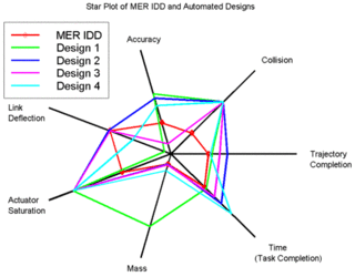
A radar chart is a graphical method of displaying multivariate data in the form of a two-dimensional chart of three or more quantitative variables represented on axes starting from the same point. The relative position and angle of the axes is typically uninformative, but various heuristics, such as algorithms that plot data as the maximal total area, can be applied to sort the variables (axes) into relative positions that reveal distinct correlations, trade-offs, and a multitude of other comparative measures.
In mathematics and statistics, deviation is a measure of difference between the observed value of a variable and some other value, often that variable's mean. The sign of the deviation reports the direction of that difference. The magnitude of the value indicates the size of the difference.
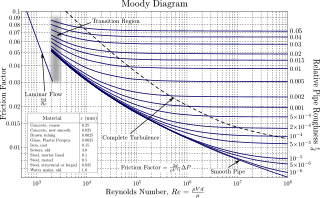
In engineering, the Moody chart or Moody diagram is a graph in non-dimensional form that relates the Darcy–Weisbach friction factor fD, Reynolds number Re, and surface roughness for fully developed flow in a circular pipe. It can be used to predict pressure drop or flow rate down such a pipe.

A plot is a graphical technique for representing a data set, usually as a graph showing the relationship between two or more variables. The plot can be drawn by hand or by a computer. In the past, sometimes mechanical or electronic plotters were used. Graphs are a visual representation of the relationship between variables, which are very useful for humans who can then quickly derive an understanding which may not have come from lists of values. Given a scale or ruler, graphs can also be used to read off the value of an unknown variable plotted as a function of a known one, but this can also be done with data presented in tabular form. Graphs of functions are used in mathematics, sciences, engineering, technology, finance, and other areas.
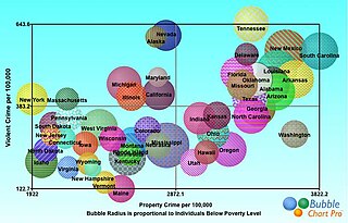
A bubble chart is a type of chart that displays three dimensions of data. Each entity with its triplet of associated data is plotted as a disk that expresses two of the vi values through the disk's xy location and the third through its size. Bubble charts can facilitate the understanding of social, economical, medical, and other scientific relationships.

In statistics, dispersion is the extent to which a distribution is stretched or squeezed. Common examples of measures of statistical dispersion are the variance, standard deviation, and interquartile range. For instance, when the variance of data in a set is large, the data is widely scattered. On the other hand, when the variance is small, the data in the set is clustered.
Rattle GUI is a free and open source software package providing a graphical user interface (GUI) for data mining using the R statistical programming language. Rattle is used in a variety of situations. Currently there are 15 different government departments in Australia, in addition to various other organisations around the world, which use Rattle in their data mining activities and as a statistical package.
The following comparison of Adobe Flex charts provides charts classification, compares Flex chart products for different chart type availability and for different visual features like 3D versions of charts.
Ordinal data is a categorical, statistical data type where the variables have natural, ordered categories and the distances between the categories are not known. These data exist on an ordinal scale, one of four levels of measurement described by S. S. Stevens in 1946. The ordinal scale is distinguished from the nominal scale by having a ranking. It also differs from the interval scale and ratio scale by not having category widths that represent equal increments of the underlying attribute.

